

Introduction
Modern client-side architecture demands the need to create efficient user interfaces (UI) for end-users.
Products need to be adopted by different categories of users based on screen sizes, accessibility, and device types. Thus, users demand different appearances and behaviour for a single component.
Storybook helps to solve this challenge by enabling developers to build an agreed-upon component libraries that are parts of a design system.
In this guide, you will:
- Learn how a design system can be beneficial to your team's Next.js application.
- Build and document a component library using Storybook.
- Deploy your design system to enhance collaboration between the developers and the designers in your team.
What is a Design System?
A design system is a set of standardised design principles and guidelines that allows users to have a consistent experience with a product. It is an approach to building UI components.
A design system consists of design resources, including typography, colour, icons, forms, buttons, layouts, patterns, and components.
These resources are reusable, documented, can be tested, and do not need to be rebuilt from scratch when needed.
The Strapi Design System is an example of a design system.
Benefits of a Design System
- It enables the engineering team to focus on building the application logic without having to worry about design decisions.
- A deployed design system enhances communication and collaboration between designers and engineers. Thus, reducing workflow friction.
- A company that has different products can maintain brand consistency and alignment when teams share a design system.
- A well-documented design system helps to improve developer onboarding without the need for newer team members to feel confused with their tasks.
Getting Started with Storybook
Storybook is a UI development tool that helps to build design systems. It allows developers to build, document, test, and deploy isolated UI components.
It offers the ability for developers to view and interact with their components, while the components are not yet rendered in their application. Each component has stories that define the appearance and behaviour of that component.
Later in this article, you will gain hands-on experience with stories. Now, let us move on to how to set up our project.
Project Setup and Installation
Install Next.js
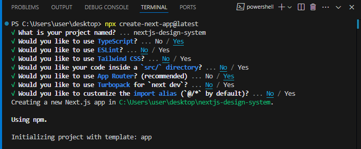
Create an initial Next.js project setup by running the command below on your terminal:
npx create-next-app@latest
# or
yarn create next-app
# or
pnpm create next-app
# or
bunx create-next-app
Select TypeScript as the programming language so you can follow up with this article.
Install Storybook
Navigate to the root directory of your Next.js project, and install Storybook with the command:
npm create storybook@latest
# or
pnpm create storybook@latest
# or
yarn create storybook
# or
bunx storybook@latest init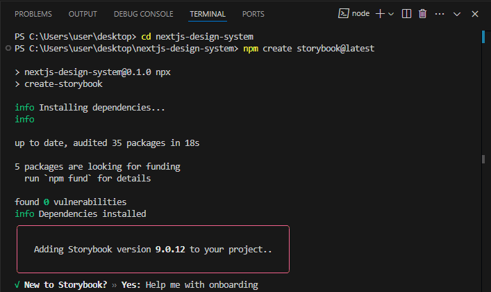
Run your Next.js Application
Run your Next.js application development server with the command:
npm run dev
# or
pnpm dev
# or
yarn dev
# or
# bun run dev
Run your Storybook UI
To simultaneously view, edit, and interact with your Storybook on a different browser tab alongside your Next.js app, open a separate terminal on your IDE.
Navigate to the root directory of your project and run your Storybook with the command below:
npm run storybook
# or
pnpm run storybook
# or
yarn storybook
Configure your Storybook Project
To specify the folder path from which your stories will run, update the .storybook/main.ts|js configuration file to this:
// .storybook/main.ts

import type { StorybookConfig } from '@storybook/nextjs';

const config: StorybookConfig = {
  "stories": [
    // add the folder path
    "../app/**/*.mdx",
    "../app/**/*.stories.@(js|jsx|mjs|ts|tsx)"
  ],
  // ...
  };
export default config;
This allows Storybook to run all the .stories or .mdx files that are located inside the app directory only. Files that end with .mdx are created for documentation purposes.
Remove Storybook Example Code
The stories folder that is located inside the root directory of your project contains the Storybook sample code that can be deleted when not needed in your project.
How to Write Stories in Storybook
Stories are created in a story file that is saved in the same directory as the component. Story files follow the .stories.tsx|jsx name saving convention.
A story represents the appearance and behaviour of a component. It is an object that describes the props and mock data that are passed into a component.
We will be declaring our default export as meta. Stories are declared using the UpperCamelCase letters.
The sample code below demonstrates how to write stories:
// Sample.stories.tsx

import type { Meta, StoryObj } from "@storybook/nextjs"

import MyComponent from './Components/MyComponent.tsx'


type MyComponentMeta = Meta<typeof MyComponent>

const meta = {
    title: 'ComponentsGroup/ComponentOne',
    component: MyComponent,
} satisfies MyComponentMeta


export default meta;

type MyStory = StoryObj<typeof meta>


export const StoryOne = {} satisfies MyStory

export const StoryTwo = {} satisfies MyStory

export const StoryThree = {} satisfies MyStory

export const StoryFour = {} satisfies MyStory
Since we are writing our project in TypeScript, the default export needs to satisfy the imported component using the Meta type.
Then, each story needs to satisfy the default export using the StoryObj type.
Meta: helps to describe and configure the component.StoryObj: helps to configure the component's stories.satisfies: is a strict type checking operator.component: represents the imported component that will be rendered in the story file.title: allows you to group multiple components into a single folder on the Storybook UI. The/separator distinguishes the folder-to-file pathname.
How to Render Stories in Storybook
You can render your stories either by passing the component's props as args, or by using the render function.
1. args: is an object that contains the values for the props that can be passed into a component.
Create an Article component:
// app/UI/Article/Article.tsx
import React from 'react'
export interface ArticleProps {
text: string;
children: React.ReactNode;
}
export default function Article({...props}: ArticleProps) {
const {text, children} = props
return(
<article style={{border: '1px solid black', padding: '20px'}}>
<h1>{text}</h1>
{children}
</article>
)
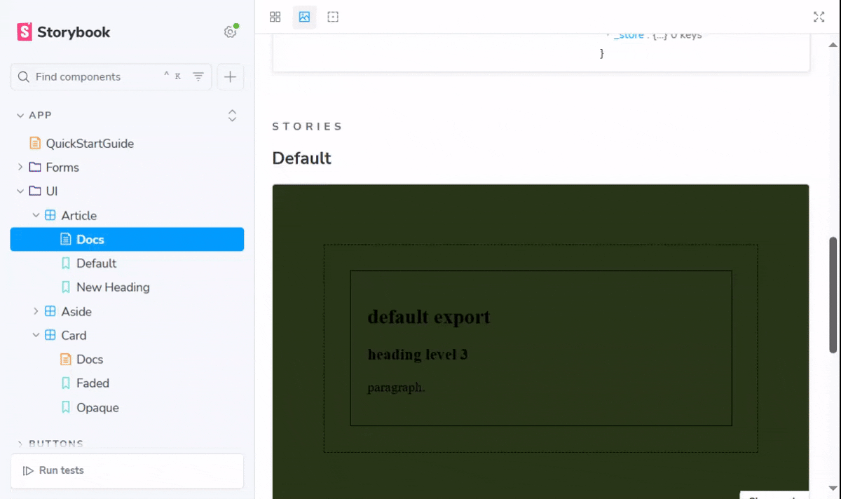
}Next, create an Article.stories.tsx file:
// app/UI/Article/Article.stories.tsx

import type { Meta, StoryObj } from '@storybook/nextjs'
import Article from './Article'


const meta = {
    component: Article,
    args: {
        text: 'default export',
        children: (
            <div>
                <h3>heading level 3</h3>
                <p>paragraph.</p>
            </div>
        ),
    },
} satisfies Meta<typeof Article>


export default meta

type Story = StoryObj<typeof meta>


export const Default = {
    args: {
        ...meta.args
    }
} satisfies Story
In the story file above, we passed the text and children props for the Article component into the args property for the default export. Then, we create a Default story that inherits the same args as the default export.
Here, let us create a NewHeading story with args that are different from the other story. Update the Article.stories.tsx file with the code below:
// app/UI/Article/Article.stories.tsx


// ...

export const NewHeading = {
    args: {
        text: 'new story',
        children: (
            <div>
                <h3>new heading level 3</h3>
                <p>new paragraph.</p>
            </div>
        ),
    },
} satisfies Story
The args for the NewHeading story override that of the default export.
Stories can also inherit args from other stories, using the object spread operator {...}. For example, we want the args to inherit from the BehaviourOne story that has already been created in a SampleComponent.stories.tsx file:
// app/UI/Article/Article.stories.tsx

// ...
import * as SampleStories from '../SampleComponent.stories.tsx'


// ...

// inherits all args from the imported story
export const BehaviourOneDuplicate = {
    args: {
        ...SampleStories.BehaviourOne.args
    }
}

// inherits only children args from the imported story
export const ChildrenDuplicateOnly = {
    args: {
        text: 'text is not a duplicate',
        children: ...SampleStories.BehaviourOne.args.children
    }
}
2. render: is a function that accepts args as parameters.
In some cases, you may need to create a new story with args that have not already been defined inside the component. For example, let us create an Aside component:
// app/UI/Aside/Aside.tsx
import React from 'react'
export interface AsideProps {
paragraphText: string
children?: React.ReactNode
}
export default function Aside({paragraphText, children, ...props}: AsideProps) {
return(
<aside style={{border: '1px solid black', padding: '20px'}}>
<h3>aside component</h3>
<p>{paragraphText}</p>
{children}
</aside>
)
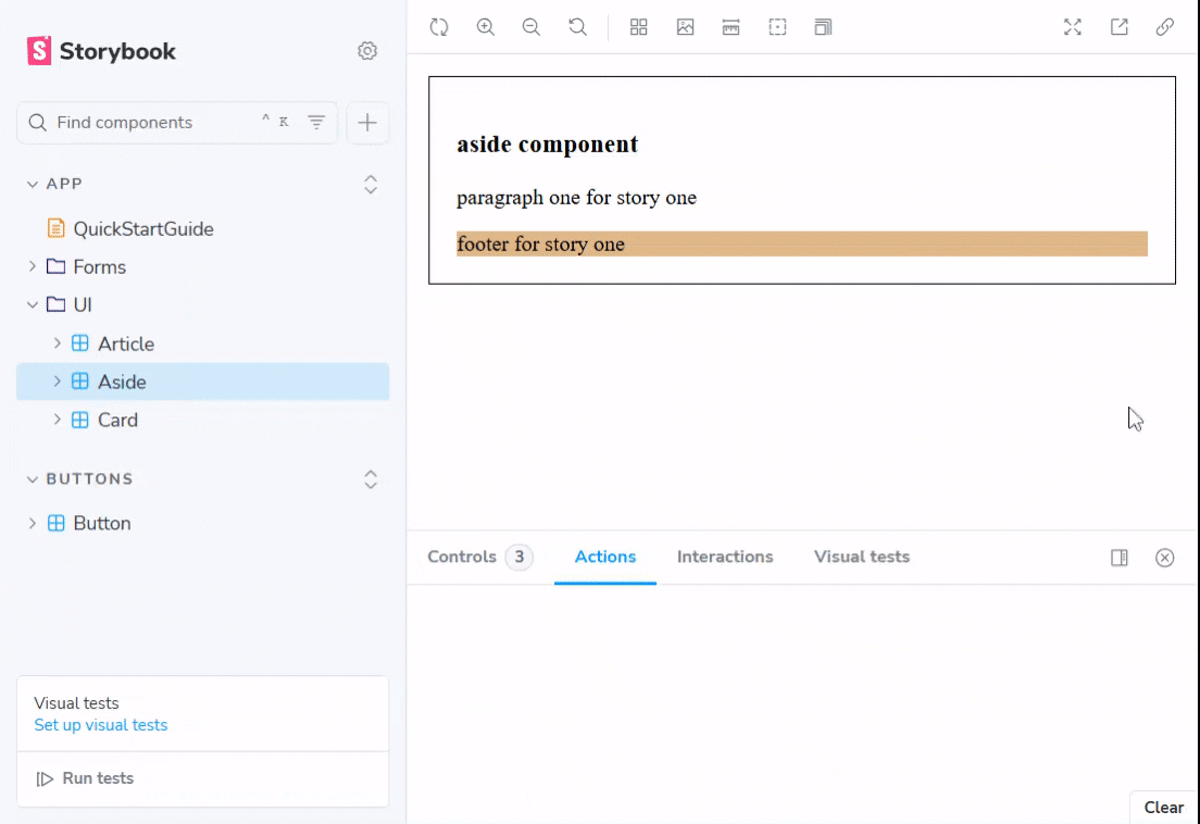
}Observe that the Aside component does not have the footer element. Create an Aside.stories.tsx story file and create a footerText args using the render function:
// app/UI/Aside/Aside.stories.tsx

import React from 'react'
import type { Meta, StoryObj } from '@storybook/nextjs'

import Aside from './Aside'


export interface ExtraAsideProps {
    footerText?: string,
}

type CustomComponentPropsAndArgs = React.ComponentProps<typeof Aside> & {footerText?: string}


const meta = {
    component: Aside,
    args: {
        paragraphText: 'main paragraph',
    },
    render: ({footerText, ...args}) => (
        <Aside {...args}>
            <footer style={{backgroundColor: 'burlywood'}}>{footerText}</footer>
        </Aside>
    )
} satisfies Meta<CustomComponentPropsAndArgs>

export default meta

type Story = StoryObj<typeof meta>


export const StoryOne = {
    args: {
        paragraphText: 'paragraph one for story one',
        footerText: 'footer for story one',
    }
} satisfies Story

export const StoryTwo = {
    args: {
        paragraphText: 'paragraph two for story two',
        footerText: 'footer for story two'
    }
} satisfies Story
In the story file above, we created a TypeScript interface for type checking. Then, we passed footerText and other possible but optional args that are not yet declared, into the render function as parameters. Then, we rendered the Aside component and passed the footerText arg as a footer element. The footerText args are then defined inside each story.
type CustomComponentPropsAndArgs = React.ComponentProps<typeof Aside> & {footerText?: string}In the code snippet above, the CustomComponentPropsandArgs type satisfies the default export strictly, by allowing us to configure our custom props and args for the Aside component. You can replace {footerText?: string} with the ExtraAsideProps, if you would like to include additional props inside your component.
Updating args for Interactive Components Using useArgs()
Create a Checkbox component:
// app/Forms/Checkbox/Checkbox.tsx
'use client'
export interface CheckboxProps {
label: string
onChange?: (event: React.ChangeEvent<HTMLInputElement>) => void
isChecked: boolean
}
export default function Checkbox({...props}: CheckboxProps) {
const { label, onChange, isChecked } = props
return(
<div>
<label htmlFor='custom-checkbox'>{label}</label>
<input
type='checkbox'
id='custom-checkbox'
name='custom-checkbox'
value='custom-checkbox'
onChange={onChange}
checked={isChecked}
/>
</div>
)
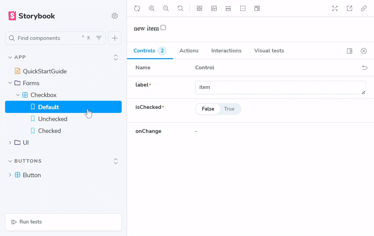
}Next, create a Checkbox.stories.tsx story file:
// app/Forms/Checkbox/Checkbox.stories.tsx

import type { Meta, StoryObj } from '@storybook/nextjs'
import { useArgs } from 'storybook/preview-api';

import Checkbox from './Checkbox'


const meta = {
    component: Checkbox,
    args: {
        label: 'item',
        isChecked: false,
    }

} satisfies Meta<typeof Checkbox>

export default meta

type Story = StoryObj<typeof meta>

export const Default = {
    args: {
        ...meta.args
    },
    render: function Render(args) {
        const [ {isChecked}, updateArgs ] = useArgs()

        function onChange() {
            updateArgs(
                {
                    isChecked: !isChecked
                }
            )
        }

        return (
            <Checkbox {...args} label='new item' onChange={onChange} isChecked={isChecked} />
        )
    }
} satisfies Story

export const Unchecked = {
    args: {
        label: 'unchecked item',
        isChecked: false,
    }
}


export const Checked = {
    args: {
        label: 'checked item',
        isChecked: true,
    }
}
In the story file above,
useArgs(): works like React hooks. It helps to update theargsvalue that requires user interaction.
How to Write Component Stories for Colours and Sizes
In this section, we will be writing stories for our Button component.
Create a Button.css file:
// app/UI/Button/Button.css

.custom-button {
	font-family: 'Nunito Sans', 'Helvetica Neue', Helvetica, Arial, sans-serif;
	font-weight: 700;
	border: 0;
	border-radius: 3em;
	cursor: pointer;
	display: inline-block;
	line-height: 1;
}

.custom-button--primary {
	color: white;
	background-color: #1ea7fd;
}

.custom-button--secondary {
	color: #333;
	background-color: transparent;
	box-shadow: rgba(0, 0, 0, 0.15) 0px 0px 0px 1px inset;
}

.custom-button--small {
	font-size: 12px;
	padding: 10px 16px;
}

.custom-button--medium {
	font-size: 14px;
	padding: 11px 20px;
}

.custom-button--large {
	font-size: 16px;
	padding: 12px 24px;
}
Next, create a Button component:
// app/UI/Button/Button.tsx
import './Button.css'
export interface ButtonProps{
label: string;
mode?: 'primary' | 'secondary';
size?: 'small' | 'medium' | 'large';
className?: string;
onClick?: () => void;
}
export default function Button({...props}: ButtonProps) {
const {label, mode, className, size, ...rest} = props
const buttonMode = mode === 'primary' ? `custom-button--primary` : `custom-button--secondary`;
const buttonSize = size === 'small' ? 'custom-button--small' : size === 'large' ? 'custom-button--large' : 'custom-button--medium'
const buttonClass = className
return(
<button
type='button'
className={[`custom-button`, buttonMode, buttonSize, buttonClass].join(' ')}
>
{label}
</button>
)
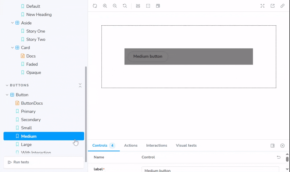
}The Button component above can be rendered in different colours as Primary and Secondary, and in different sizes as Small, Medium, or Large. Create a Button.stories.tsxstory file:
// app/UI/Button/Button.stories.tsx

import type { Meta, StoryObj } from '@storybook/react'
import { action } from 'storybook/actions'

import Button from './Button'

const meta = {
    title: 'Buttons/Button',
    component: Button,
    args: {
        label: 'button'
    }
} satisfies Meta<typeof Button>

export default meta;

type Story = StoryObj<typeof meta>


export const Primary = {
    args: {
        label: 'Primary button',
        mode: 'primary'
    }
} satisfies Story


export const Secondary = {
    args: {
        label: 'Secondary button',
        mode: 'secondary'
    }
} satisfies Story


export const Small = {
    args: {
        label: 'Small button',
        size: 'small'
    }
} satisfies Story


export const Medium = {
    args: {
        label: 'Medium button',
        size: 'medium'
    }
} satisfies Story


export const Large = {
    args: {
        label: 'Large button',
        size: 'large'
    }
} satisfies Story


export const WithInteraction = {
    args: {
        label: 'click me',
        onClick: action('button is clicked')
    }
} satisfies Story
Modifying Stories Visualisation using decorators in Storybook
decoratorsis an array that includes single or multiple functions. The functions allow you to render your stories by wrapping them with a markup.
In the Button.stories.tsx file above, we want all our stories to be rendered with a margin space:
// app/UI/Button/Button.tsx

// ...

const meta = {
    title: 'Buttons/Button',
    component: Button,
    args: {
        label: 'button'
    },
    decorators: [
        (ButtonComponent) => (
            <div style={{margin: '3em', padding: '10px', backgroundColor: 'grey'}}>
                <ButtonComponent />
            </div>
        )
    ],
} satisfies Meta<typeof Button>

// ...
The decorator function accepts the ButtonComponent parameter. The parameter is rendered as a React component that is wrapped with the div markup. The markup is styled in the way we want to visualise our stories on the Storybook UI.
How to Use decorators at the Global level
Inside the .storybook folder that is inside the root directory of your project, rename the preview.ts file to preview.tsx. Run your Storybook again using the npm run storybook command on your terminal.
Apply the withDashedBorder decorator function as shown in the code below:
// .storybook/preview.tsx

import type { Preview, Decorator } from '@storybook/nextjs'

const withDashedBorder: Decorator = (Decoration) => (
    <div style={{border: '1px dashed black', padding: '30px', margin: '30px'}}>
        <Decoration />
    </div>
)

const preview: Preview = {
    parameters: {
        controls: {
            matchers: {
                color: /(background|color)$/i,
                date: /Date$/i,
            },
        },
    },
    decorators: [withDashedBorder]
}

export default preview
The global decorator is applied to all the stories.
Configure args values using argTypes
argTypes is an object that contains single or multiple args. It allows us to restrict the values that each args can accept. argTypes includes the following:
control:argTypes.[argsName].controlallows you to update yourargsdirectly from the Storybook UI based on the values already declared. It includes thetype,min,max,step,accept,labels, or thepresetColorsproperty.options: allows you to provide a list of options for eachargstype.description: enables you to provide additional contextual information about eachargs.mapping: enables you to map the exact value for eachargsto their respective string-values that have been listed incontrol.options.name: enables you to change the name of theargs. The new name will be displayed on the Storybook UI.
argTypes follows the syntax:
argTypes: {
argsOne: {},
argsTwo: {},
argsThree: {},
argsFour: {},
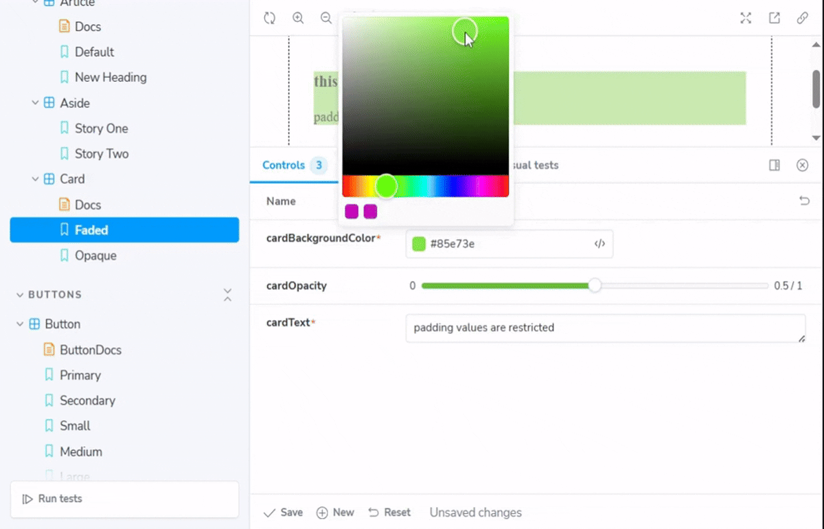
}Create a Card component that can appear based on different background colours and opacity levels:
// app/UI/Card/Card.tsx

export interface CardProps {
    cardBackgroundColor: string
    cardOpacity?: number
    cardText: string
}

export default function Card({cardBackgroundColor, cardOpacity, cardText}: CardProps) {

    return (
        <div style={{backgroundColor: `${cardBackgroundColor}`, opacity: `${cardOpacity}`}}>
            <h3>this is a card component</h3>
            <p>{cardText}</p>
        </div>
    )
}
Next, create a Card.stories.tsx story file:
// app/UI/Card/Card.stories.tsx

import  type { Meta, StoryObj } from '@storybook/nextjs'
import Card from './Card'


const meta = {
    component: Card,
    argTypes: {
        cardBackgroundColor: {
            control: {
                type: 'color',
            }
        },
        cardOpacity: {
            control: {
                type: 'range',
                min: 0,
                max: 1,
                step: 0.1,
            }
        },
        cardText: {
            control: 'text'
        }
    }
} satisfies Meta<typeof Card>

export default meta

type Story = StoryObj<typeof meta>

export const Faded = {
    args: {
        cardBackgroundColor: '#c40cb7',
        cardOpacity: 0.5,
        cardText: 'padding values are restricted'
    }
} satisfies Story

export const Opaque = {
    args: {
        cardBackgroundColor: '#c40cb7',
        cardOpacity: 0.9,
        cardText: 'padding values are restricted'
    }
} satisfies Story
In the story file above:
-
The
cardBackgroundColorarg type can be indicated on the Storybook UI with the use of a color picker. -
The
cardOpacityarg type can be picked from a range of values that increase with a common difference of 0.1, while starting with a minimum value of 0 and ending with a maximum value of 1. -
The
cardTextarg type can be edited as texts that are not restricted to limited options.
Other control.type values in argTypes include: object, boolean, check, inline-check, radio, inline-radio, select, multi-select, number, range, file, object, color, date, and text. You can read more on argTypes.
For example, the sample code below demonstrates the description of the imageSrc arg type, and restricts the arg type to accept a .png file only:
argTypes: {
    imageSrc: {
        description: 'additional information about the imageSrc args'
        control: {
            type: 'file',
            accept: '.png'
        }
    }
}
To render an arg type conditionally, use the if property. The sample code below demonstrates how to render the modalText arg type only if the value of the isChecked args is truthy. If the truthy value is omitted, Storybook automatically makes the condition true.
argTypes: {
    isChecked: {control: 'boolean'},
    modalText: {
        if: {
            arg: 'isChecked',
            // you can equally omit the truthy value
            truthy: true,
        }}
}
Other values for the if condition include:
exists: used to indicate ifargexists. It can be set totrueorfalse.eq: used to indicate strict equality for theargvalue. It can be set to the required value for thearg.neq: used to indicate strict inequality for theargvalue. It can be set to a value that is not required for thearg.global: used to indicate that theargcan only be rendered based on a specific configuredglobalvalue.
The sample code below allows you to map the children args to a specific name-value option:
argTypes: {
    children: {
        control: 'radio',
        options: ['paragraph', 'heading', 'footer']
        mapping: {
            paragraph: <p>paragraph text</p>,
            heading: <h3>heading text</h3>,
            footer: <footer>footer text</footer>,
        }
    }
}
Modify Storybook Features using parameters
parameters is an array of different configuration settings for the Storybook features and addons. These features include:
-
layouts: allows you to position your stories on the Storybook UI canvas. It can be set tocentered,fullscreen, orpadded. -
backgrounds: allows you to specify the background color and grid display for the component stories. -
actions:parameters.actionsconfigures the same pattern for all event handlers in a story file. -
docs: for modifying the documentation pages that are rendered on the Storybook UI. -
options: indicates the order in which the stories are displayed on the Storybook UI. It is applied at the global level in thepreview.tsfile only. -
controls:parameters.controlsallows you to configure:-
the preset colors using the
presetColorsfield. -
the restricted control panel for each story that will be displayed or not on the Storybook UI using the
includeorexcludeproperty. -
the order of arrangement for each args on the control panel using
sort.
-
In the preview.tsx global file below, we want to configure all the stories to display in the center position on the Storybook UI. Also, we want to enable additional background color settings as a parameter.
import type { Preview, Decorator } from '@storybook/nextjs'


// ...

const preview: Preview = {
    parameters: {
        controls: {
            matchers: {
                color: /(background|color)$/i,
                date: /Date$/i,
            },
        },
        backgrounds: {
            layouts: 'centered',
            options: {
                darkGreen: {name: 'dark green', value: '#283618'},
                burntSienna: {name: 'burnt sienna', value: '#bc6c25'},
                strongRed: {name: 'strong red', value: '#c1121f'},
            },
        },
    },
    decorators: [withDashedBorder],
}

export default preview
You can specify the initial background color for your stories by setting the initialGlobals.backgrounds property to an already defined background color:
// preview.tsx

// ...

const preview: Preview = {
    parameters: {
        // ...
    },
    decorators: [withDashedBorder],
    // add the initial global value
    initialGlobals: {
        backgrounds: {value: 'darkGreen'},
  }
}
export default preview
In some cases, you may want to set the background color for a specific component story. Add the globals.backgrounds property:
// Aside.stories.tsx

// ...

const meta = {
    component: Aside,
    // ...
    // add the background color from the global values, and the grid display
    globals: {
        backgrounds: {value: 'burntSienna', grid: true}
    },
} satisfies Meta<CustomComponentPropsAndArgs>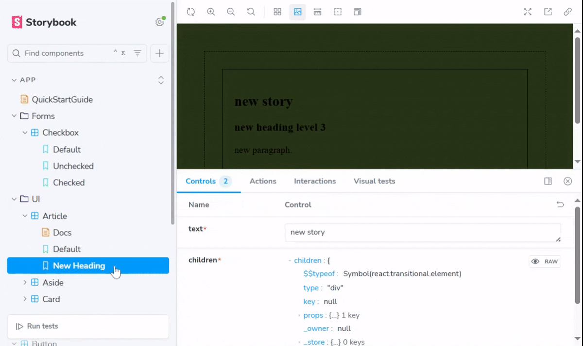
If you want to disable the background color and the grid display for each component story, set the parameters.backgrounds.disable property and the parameters.grid.disable property to the boolean value false respectively, as shown in the code sample below:
// SampleComponent.Stories.tsx

import { Meta, Storyobj } from '@storybook/nextjs'
import SampleComponent from './SampleComponent'

const meta = {
    component: SampleComponent,
    parameter: {
        backgrounds: {disable: true},
        grid: {disable: true},
    }
} satsifies Meta<typeof SampleComponent>
How to Document Stories in Storybook
When you write documentation for the resources in your design system, you enable frictionless collaboration among every member of your team, including the designers and engineers who build the design system, and the designers and engineers who use the design system. In Storybook, you can enable documentation either automatically using the autodocs tag or by creating a .mdx documentation file.
Enabling Automatic Documentation with autodocs
You can configure your stories to automatically create documentation either at the global level in the .storybook/preview.tsx file, or at the component stories level in the .stories.tsx file, by using the autodocs tag. The documentation is generated based on the data that is derived from the stories, such as the args, argTypes, and parameters.
Update the Article.stories.tsx story file to enable automatic documentation:
// app/UI/Article/Article.stories.tsx

// ...

const meta = {
    component: Article,
    // add the autodocs tag
    tags: ['autodocs'],
    args: {
        // ...
    },
} satisfies Meta<typeof Article>

export default meta

// ...
You can locate the documentation for the component stories inside the sidebar on the Storybook UI.
Disable Automatic Documentation for Specific Component Story
If you configured automatic documentation at the global level using the tags property: const preview: Preview = preview { tags: ['autodocs'], // ... }, you can disable the autodocs tag in your preferred story file by setting the tags value as shown: tags: ['!autodocs']. The automatic documentation page for the component stories will be removed from the Storybook UI sidebar.
Create templates for Automatic Documentation
In some cases, you want your documentation to be rendered based on a defined set of templates. Templates help to form the structure of a documentation page on the Storybook UI. To create templates inside an automatic documentation, include the page property inside the docs parameter that is included in your story file, as shown below:
// app/UI/Article/Article.stories.tsx

// ...

import { Title, Subtitle, Description, Primary, Controls, Stories, } from '@storybook/addon-docs/blocks';

const meta = {
    component: Article,
    tags: ['autodocs'],
    parameters: {
        docs: {
            // add the page property
            page: () => (
                <>
                    <Title />
                    <Subtitle />
                    <Description />
                    <Primary />
                    <Controls />
                    <Stories />
                </>
            )
        },
    },
    args: {
        // ...
    },
} satisfies Meta<typeof Article>

export default meta-
page: is a function that returns multiple doc blocks as a single React component. The doc blocks are rendered on the Storybook UI documentation page. Doc blocks help to define the documentation structure and layout. Doc blocks are imported from@storybook/addon-docs/blocks. As demonstrated in the story file above, each doc block has a different purpose from the other:-
<Title />: provides the primary heading for the documentation. -
<Subtitle />: provides the secondary heading for the documentation. -
<Description />: displays the description for the default export and the component stories. -
<Primary />: provides the story that is the first to be defined in the story file. -
<Controls />: displays the args for a single story as a table.
-
Equally, you can create a separate .mdx template file that is specific to generating templates only, and then import the template file inside the .stories.tsx story file, or inside the .storybook/preview.tsx global file.
Create a CardDocsTemplate.mdx template file:
// app/UI/Card/CardDocsTemplate.mdx

import { Meta, Title, Primary, Controls, Stories } from '@storybook/addon-docs/blocks';

<Meta isTemplate />

<Title />

<Primary />

<Controls />

<Stories />
In the template file above, we need to indicate that the .mdx file is for generating templates only by adding the isTemplate props inside the <Meta /> doc block.
Next, import the template file and render it on the parameters.docs.page property:
// app/UI/Card/Card.stories.tsx

// ...

import CardDocsTemplate from './CardDocsTemplate.mdx'

const meta = {
    component: Card,
    tags:['autodocs'],
    parameters: {
        docs: {
            page: CardDocsTemplate,
        },
    },
    // ...
} satisfies Meta<typeof Card>

export default meta
Create table of contents for automatic documentation
You can generate a table of contents for easy navigation on the documentation page. Add the parameters.docs.toc property inside the story file. The toc value is set to the boolean value true.
Update the Article.stories.tsx story file:
// app/UI/Article/Article.stories.tsx

// ...

const meta = {
    component: Article,
    tags: ['autodocs'],
    parameters: {
        docs: {
            page: () => (
                // ...
            ),
            // add the toc property
            toc: true,
        },
    },
    args: {
        // ...
    },
} satisfies Meta<typeof Article>

export default meta
The table of contents is generated based on the heading levels inside the documentation file.
Disable table of contents for a specific documentation page
If you configured the table of contents at the global level inside the .storybook/preview.tsx file for all your automatic documentation pages, you can disable the toc for a specific documentation page by setting the parameters.docs.toc.disable property to true, inside your preferred story file as shown: toc: { disable: true }.
Enable Manual Documentation for Stories
To manually write the documentation for your stories, create a .mdx documentation file inside the root folder of your component stories.
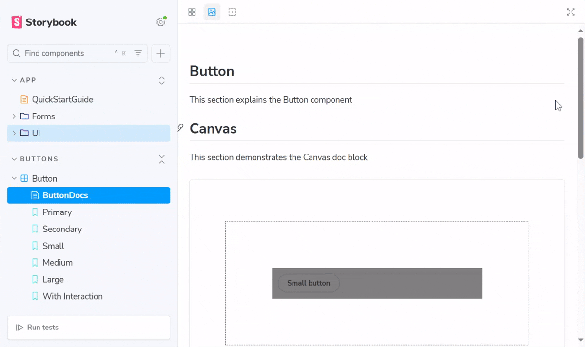
Create a ButtonDocs.mdx documentation file:
// app/UI/Button/ButtonDocs.mdx

import { Meta, Canvas, Story } from '@storybook/addon-docs/blocks'

import * as ButtonStories from './Button.stories';


<Meta of={ButtonStories} />


## Button

This section explains the Button component

## Canvas

This section demonstrates the Canvas doc block

<Canvas of={ButtonStories.Small} />


## usage

This section

explains how to usage

the Button component


## Button stories

This section explains the Button stories

### Primary Button

This section displays the Primary Button

<Story of={ButtonStories.Primary} />
In the documentation file above, we included the following doc blocks:
-
Meta: references the component that is being documented on the documentation page. -
Canvas: allows you to view the code snippet for the story. -
Story: displays the story.
Enable Custom Documentation
As your design system becomes increasingly complex with a set of principles and guidelines, you may need to create a separate documentation file outside the default documentation that is specific to component stories. Custom documentation include: quickstart guide, best practices guide, changelogs, and other markdown files that can be imported into documentation files.
To allow custom documentation in Storybook, confirm that the .storybook/main.ts configuration file includes the docs addon. Otherwise, install the docs addon by running the command:
npm install @storybook/addon-docsThen, add the addon to the configuration file:
// .storybook/main.ts

import type { StorybookConfig } from '@storybook/your-framework';

const config: StorybookConfig = {
    // ...
    // add the docs addon
    addons: ['@storybook/addon-docs'],
};

export default config;
The docs addon allows us to write and extend custom documentation for our stories using Markdown.
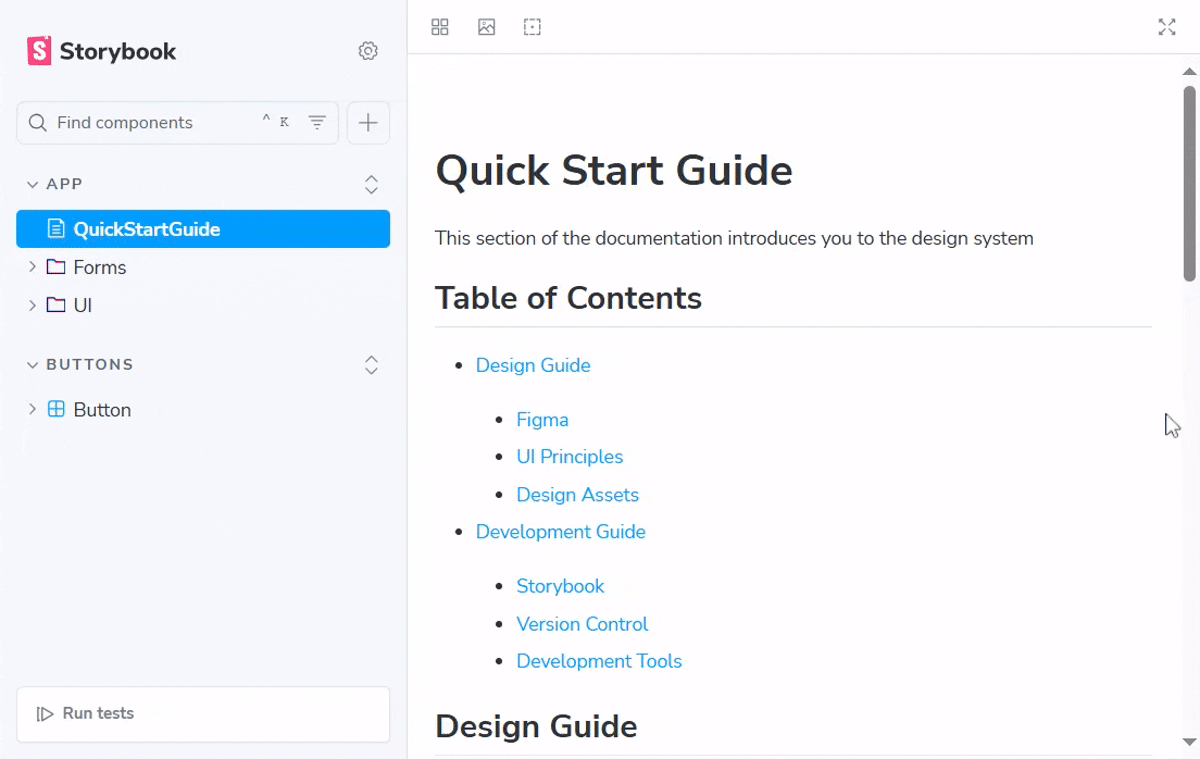
Next, create a QuickStarteGuide.mdx documentation file inside the app directory in our Next.js project:
// app/QuickStartGuide.mdx

# Quick Start Guide

This section of the documentation introduces you to the design system.

## Table of Contents

- [Design Guide](#design-guide)
    - [Figma](#figma)
    - [UI Principles](#ui-principles)
    - [Design Assets](#design-assets)

- [Development Guide](#development-guide)
    - [Storybook](#storybook)
    - [Version Control](#version-control)
    - [Development Tools](#development-tools)


## Design Guide

This section is for the designers

### figma

This section explains Figma

### UI Principles

This section explains the UI principles.

### Design Assets

This section explains the design assets

## Development Guide

This section is for the developers

### Storybook

This section explains Storybook

### Version Control

This section explains version control

### Development Tools

This section explains the development tools
Import other Documentation files
You can import and render other documentation files into an existing documentation file by using the <Markdown /> doc block.
Inside the app directory, create a BestPractices.md documentation file:
// app/BestPractices.md

## Best Practices

This section explains

the best practices

regarding the design system
Next, import and render the BestPractices.md file inside the QuickStartGuide.mdx file:
// app/QuickStartGuide.mdx

import BestPractices from './BestPractices.md'
import { Markdown } from '@storybook/addon-docs/blocks';

// ...

<Markdown>
    {BestPractices}
</Markdown>
Enable linking within Documentation files
You can redirect a documentation page to another documentation page, or to another story by using the markdown hyperlink method [](). Append the docs or story id to the query string: ?path=docs/[id] for docs and ?path=story/[id] for stories. The query string for all stories or documentations can be recognised from the browser tab based on the Next.js project's file structure.
For example, the QuickStartGuide docs have the query string ?path=/docs/app-quickstartguide--docs, the Default Checkbox story has the query string ?path=/story/app-forms-checkbox--default.
Story id can be generated:
- automatically from the story file, starting from the value of the
titleproperty in the default export, to the name of each story. In the demo code below, the id forStoryOneisfolder-file--storyone, the id forStoryTwoisfolder-file--storytwo:
// SampleComponent.stories.tsx

import { Meta, Storyobj } from `@storybook/nextjs`
import SampleComponent from './SampleComponent.tsx'

const meta = {
    title: 'Folder/file',
    component: SampleComponent,
    args: {},
} satisfies Meta<typeof SampleComponent>

export default meta
type Story = Storyobj<typeof meta>

const StoryOne = {} satsifies Story

const StoryTwo = {} satsifies Story- manually from the
idproperty in the default export and thenameproperty in each story. In the updatedSampleComponent.stories.tsxstory file below, the url forStoryOneisnewfolder-newfile--newstoryone, the url forStoryTwoisnewfolder-newfile--newstorytwo:
// SampleComponent.stories.tsx

// ...

const meta = {
    title: 'Folder/file',
    component: SampleComponent,
    // add the id property
    id: 'newfolder-newfile',
    args: {},
} satisfies Meta<typeof SampleComponent>

export default meta
type Story = Storyobj<typeof meta>

const StoryOne = {
    name: 'new-storyone',
    args: {},
} satsifies Story

const StoryTwo = {
    name: 'new-storytwo',
    args: {},
} satsifies Story
Documentation id is generated from the name of the documentation file and its parent folders. Update the QuickStartGuide.mdx file to enable linking within our design system documentation:
// app/QuickStartGuide.mdx

// ...

[Visit the Card doc page](?path=/docs/app-ui-card--docs)

[Visit the usage section on the Button doc page](?path=/docs/buttons-button--buttondocs#usage)

[Visit the Article.Default component story](?path=/story/app-ui-article--default)

[Visit the Aside.StoryOne component story](?path=/story/app-ui-aside--story-one)

[Visit the Checkbox.DefaultDuplicate component story](?path=/story/app-forms-checkbox--default-duplicate)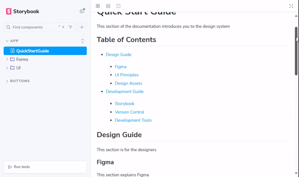
Change the default name for documentation pages
Inside the sidebar of the Storybook UI, you would observe that the default name for each documentation page is Docs. You can change the default name for all the pages by adding the docs property inside the ./storybook/main.ts configuration file. Next, inside the docs property, include the defaultName property. As demonstrated in the code below, the default name is changed to 'my docs':
// .storybook/main.ts

//...

const config: StorybookConfig = {
  framework: '@storybook/your-framework',
  stories: ['../src/**/*.mdx', '../src/**/*.stories.@(js|jsx|mjs|ts|tsx)'],
  addons: ['@storybook/addon-docs'],
  // add the docs property
  docs: {
    defaultName: 'my docs',
  },
}

export default config;
How to Deploy your Storybook Design System
Before you deploy your design system to any cloud service, you will need to build Storybook as a static web application by running any of the following commands on your terminal inside the root directory of our Next.js project:
npm run build-storybook
# or
pnpm run build-storybook
# or
yarn build-storybook
Then, preview the static web application locally on your web server by running the command:
npx serve storybook-staticHere, we will be deploying our design system to Chromatic. Ensure that you have the project pushed to a GitHub repository.
Deploy to Chromatic
Chromatic is a visual testing & review tool that can catch both visual and functional bugs.
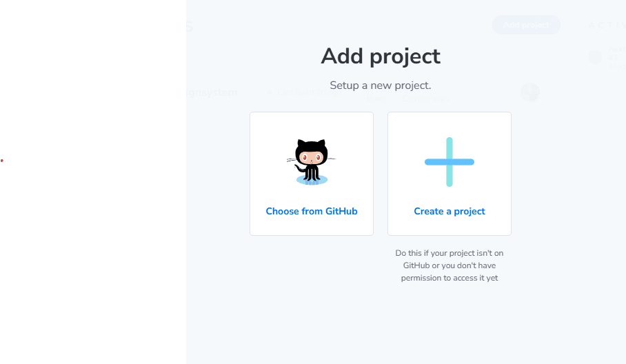
Create a Chromatic account and login to your account. Click on the Add Project button on the Chromatic UI and select your project from the GitHub repository.
Next, inside the root directory for your project, install Chromatic by running the command:
npm install --save-dev chromatic
# or
yarn add --dev chromatic
Then, add the project token. The project token allows you to connect your project to Chromatic securely. The project token can be identified from the Chromatic website after you have created your project. Click the manage tab, next, click the configure tab to view your project token.
Run this command on your terminal:
npx chromatic --project-token=<project token>Visit the deployed design system on the website
Setup Continuous Integration
Continuous Integration (CI) allows you to automatically merge the changes made to your code repository before your project is deployed again.
Create a chromatic.yml file inside a .github/workflows directory. We will be setting up our project with GitHub Actions.
// .github/workflows/chromatic.yml

name: "Chromatic"

on: push

jobs:
  chromatic:
    name: Run Chromatic
    runs-on: ubuntu-latest
    steps:
      - name: Checkout code
        uses: actions/checkout@v4
        with:
          fetch-depth: 0
      - uses: actions/setup-node@v4
        with:
          node-version: 22.17.0
      - name: Install dependencies
        # ⚠️ See your package manager's documentation for the correct command to install dependencies in a CI environment.
        run: npm ci
      - name: Run Chromatic
        uses: chromaui/action@latest
        with:
          # ⚠️ Make sure to configure a `CHROMATIC_PROJECT_TOKEN` repository secret
          projectToken: ${{ secrets.CHROMATIC_PROJECT_TOKEN }}
To connect your project token to GitHub, navigate to the settings tab on GitHub. Then, navigate to Security, click on Secrets and variables, click Actions, then click New repository secret. Set the Name of the secret as CHROMATIC_PROJECT_TOKEN. Paste the project token that you copied from the Chromatic website.
If you would like to deploy your design system to Vercel, check this guide.
Conclusion
In this article, we have defined the reasons we need to build design systems and the approach to building, documenting, and deploying design systems. We implemented the use of Storybook APIs such as args, argTypes, decorators, and parameters to build a maintainable design system.