

Learn how to build a modern mobile app with Expo Router, NativeWind (Tailwind CSS), and Strapi CMS. This step-by-step guide covers everything from project setup to implementing a blog with infinite scroll.
What We're Building
By the end of this tutorial, you'll have a fully functional React Native app that:
- Fetches content from a Strapi headless CMS
- Renders dynamic block-based landing pages
- Displays a blog with infinite scroll
- Uses tab navigation between Home and Blog screens
- Works on iOS, Android, and web
Tech Stack:
- Expo - React Native framework with great DX
- Expo Router - File-based routing
- NativeWind - Tailwind CSS for React Native
- Strapi - Headless CMS for content management
- React Query - Data fetching and caching
- TypeScript - Type safety throughout
Why Expo, React Native, and Strapi?
Building mobile apps traditionally meant learning separate languages for iOS (Swift) and Android (Kotlin/Java), doubling your development effort. React Native changes that by letting you write once in JavaScript/TypeScript and deploy to both platforms - plus the web.
Expo takes React Native further by removing the complexity of native tooling. No Xcode or Android Studio headaches for most development. Just write code and scan a QR code to see it running on your phone. It's the fastest way to go from idea to working app.
Strapi is an open-source headless CMS that gives you a complete backend without writing server code. You get:
- A visual admin panel to manage content
- Auto-generated REST and GraphQL APIs
- User authentication built-in
- Full control over your data (self-hosted or cloud)
Why this stack works well together:
| Concern | Solution | Benefit |
|---|---|---|
| Cross-platform UI | React Native + Expo | One codebase for iOS, Android, and web |
| Styling | NativeWind (Tailwind) | Familiar utility classes, rapid prototyping |
| Content management | Strapi | Non-developers can update content without code changes |
| Data fetching | React Query | Caching, background updates, offline support |
| Navigation | Expo Router | File-based routing |
This combination is ideal for content-driven apps like blogs, news apps, e-commerce, portfolios, or any app where content changes frequently and you want marketing teams to update it without developer involvement.
Prerequisites
Before starting, make sure you have:
- Node.js (v20 or higher)
- npm or yarn
- A code editor (VS Code recommended)
- iOS Simulator (Mac) or Android Emulator, or Expo Go app on your phone
Part 1: Setting Up the Expo Project
Step 1.1: Create the Project
We'll use create-expo-app to scaffold a new Expo project:
npx create-expo-app@latestWhen prompted, name your app client. This creates a fully configured React Native project with TypeScript support.
Navigate to your project:
cd clientStep 1.2: Test the Setup
Start the Expo development server:
npx expo start --goThe --go flag ensures you're running in Expo Go mode. You'll see a QR code in your terminal.
Running on your phone:
- Download "Expo Go" from the App Store (iOS) or Play Store (Android)
- Scan the QR code with your camera (iOS) or Expo Go app (Android)
- Make sure your phone and computer are on the same WiFi network
Tip: If connection fails, press
sin the terminal to switch to Tunnel mode.
Part 2: Setting Up NativeWind (Tailwind CSS)
NativeWind lets you use Tailwind CSS utility classes in React Native, making styling faster and more consistent.
Step 2.1: Install Dependencies
# Runtime dependencies
npx expo install nativewind react-native-reanimated react-native-safe-area-context

# Dev dependencies
npm install --dev tailwindcss@^3.4.17 prettier-plugin-tailwindcss@^0.5.11
Important: Use
npx expo installfor React Native packages - Expo automatically selects compatible versions.
Step 2.2: Generate Config Files
npx expo customize metro.config.js
npx expo customize babel.config.js
npx tailwindcss init
Step 2.3: Configure tailwind.config.js
/** @type {import('tailwindcss').Config} */
module.exports = {
  content: [
    "./app/**/*.{js,jsx,ts,tsx}",
    "./components/**/*.{js,jsx,ts,tsx}",
  ],
  presets: [require("nativewind/preset")],
  theme: {
    extend: {},
  },
  plugins: [],
};
Step 2.4: Configure metro.config.js
const { getDefaultConfig } = require("expo/metro-config");
const { withNativeWind } = require("nativewind/metro");

const config = getDefaultConfig(__dirname);

module.exports = withNativeWind(config, { input: "./global.css" });
Step 2.5: Configure babel.config.js
module.exports = function (api) {
  api.cache(true);
  return {
    presets: [
      ["babel-preset-expo", { jsxImportSource: "nativewind" }],
      "nativewind/babel",
    ],
  };
};
Step 2.6: Create global.css
Create a global.css file in your project root:
@tailwind base;
@tailwind components;
@tailwind utilities;

:root {
  --primary: #0d6c9a;
  --secondary: #f3cf36;
  --tertiary: #1d6976;
  --dark: #132134;
}
Step 2.7: Add TypeScript Support
Create nativewind-env.d.ts in your project root:
/// <reference types="nativewind/types" />Part 3: Reset and Configure the Project
Step 3.1: Reset to a Clean Slate
Run the reset script to remove the boilerplate:
npm run reset-projectChoose n to delete the example files completely.
Step 3.2: Configure the Root Layout
Update app/_layout.tsx:
import "@/global.css";
import { Stack } from "expo-router";
import { SafeAreaProvider } from "react-native-safe-area-context";

export default function RootLayout() {
  return (
    <SafeAreaProvider>
      <Stack />
    </SafeAreaProvider>
  );
}
Step 3.3: Add Custom Colors to Tailwind
Update tailwind.config.js to use your CSS variables:
/** @type {import('tailwindcss').Config} */
module.exports = {
  content: ["./app/**/*.{js,jsx,ts,tsx}", "./components/**/*.{js,jsx,ts,tsx}"],
  presets: [require("nativewind/preset")],
  theme: {
    extend: {
      colors: {
        primary: "var(--primary)",
        secondary: "var(--secondary)",
        tertiary: "var(--tertiary)",
        dark: "var(--dark)",
      },
    },
  },
  plugins: [],
};
Step 3.4: Test NativeWind
Update app/index.tsx:
import { Text, View } from "react-native";

export default function Index() {
  return (
    <View className="flex-1 items-center justify-center gap-4 bg-dark p-8">
      <Text className="text-2xl font-bold text-white">
        NativeWind is working!
      </Text>
      <View className="w-full rounded-lg bg-primary p-4">
        <Text className="text-center font-semibold text-white">
          Primary Color
        </Text>
      </View>
    </View>
  );
}
Start the app to verify:
npx expo start --go --clear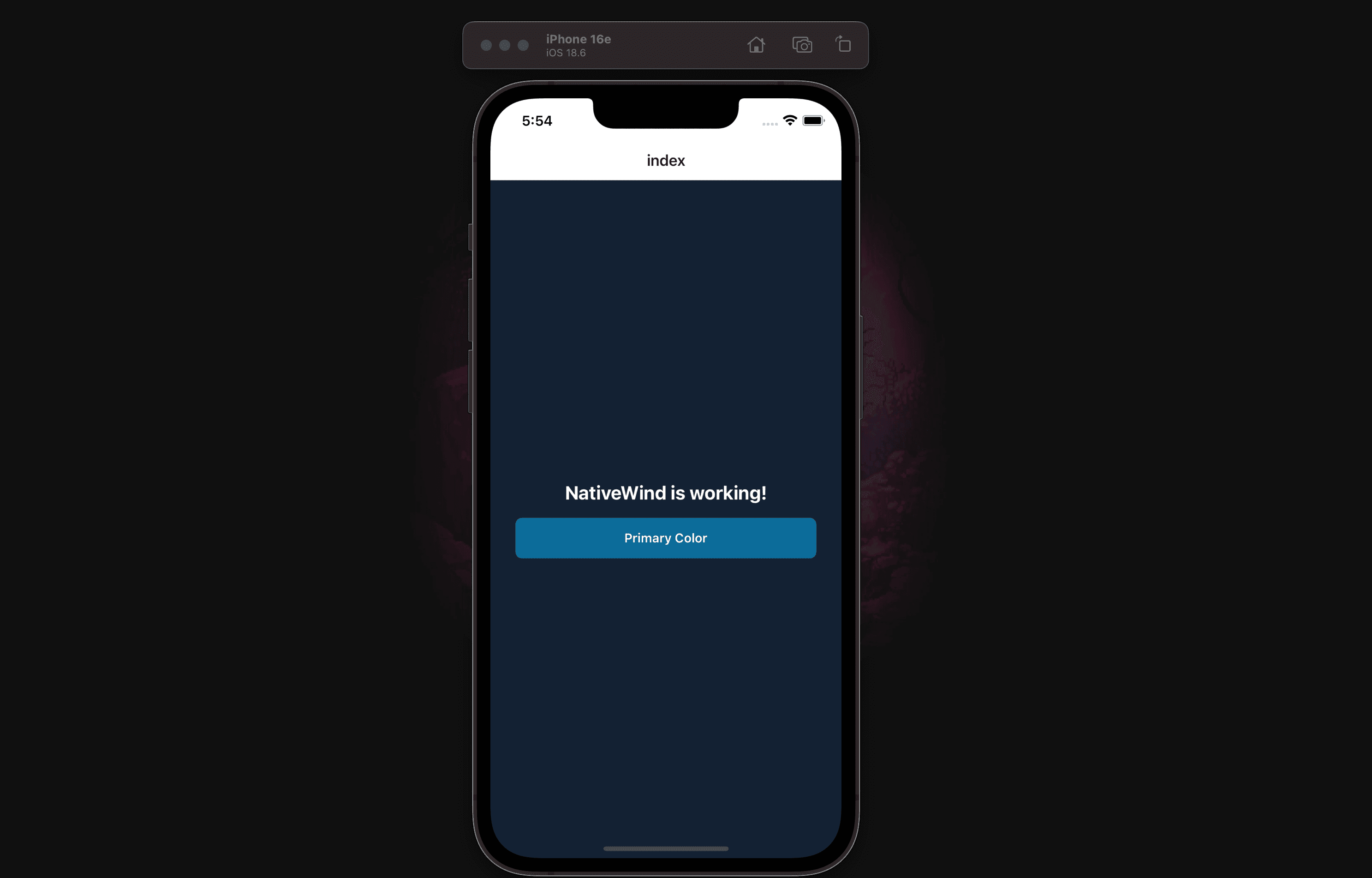
Part 4: Setting Up Strapi Backend

Instead of building from scratch, we'll use a pre-configured Strapi starter with sample data.
Step 4.1: Clone the Starter
From your project root (not inside client):
git clone https://github.com/PaulBratslavsky/pauls-strapi-crashcourse.git serverYour folder structure should now be:
your-project/
├── client/     # React Native app
└── server/     # Strapi backend
Step 4.2: Install and Configure
cd server
npm install
cp .env.example .env
Step 4.3: Import Sample Data
npm run strapi -- import -f ./seed-data.tar.gzType Yes when prompted. This imports articles, authors, tags, and a landing page.
Step 4.4: Start Strapi
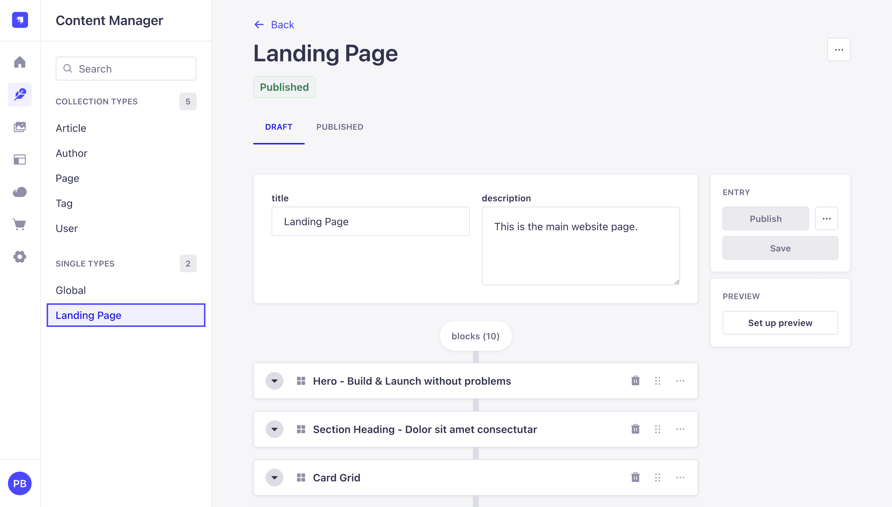
npm run develop
Create your admin account when prompted, then navigate to Content Manager to see the seeded content.
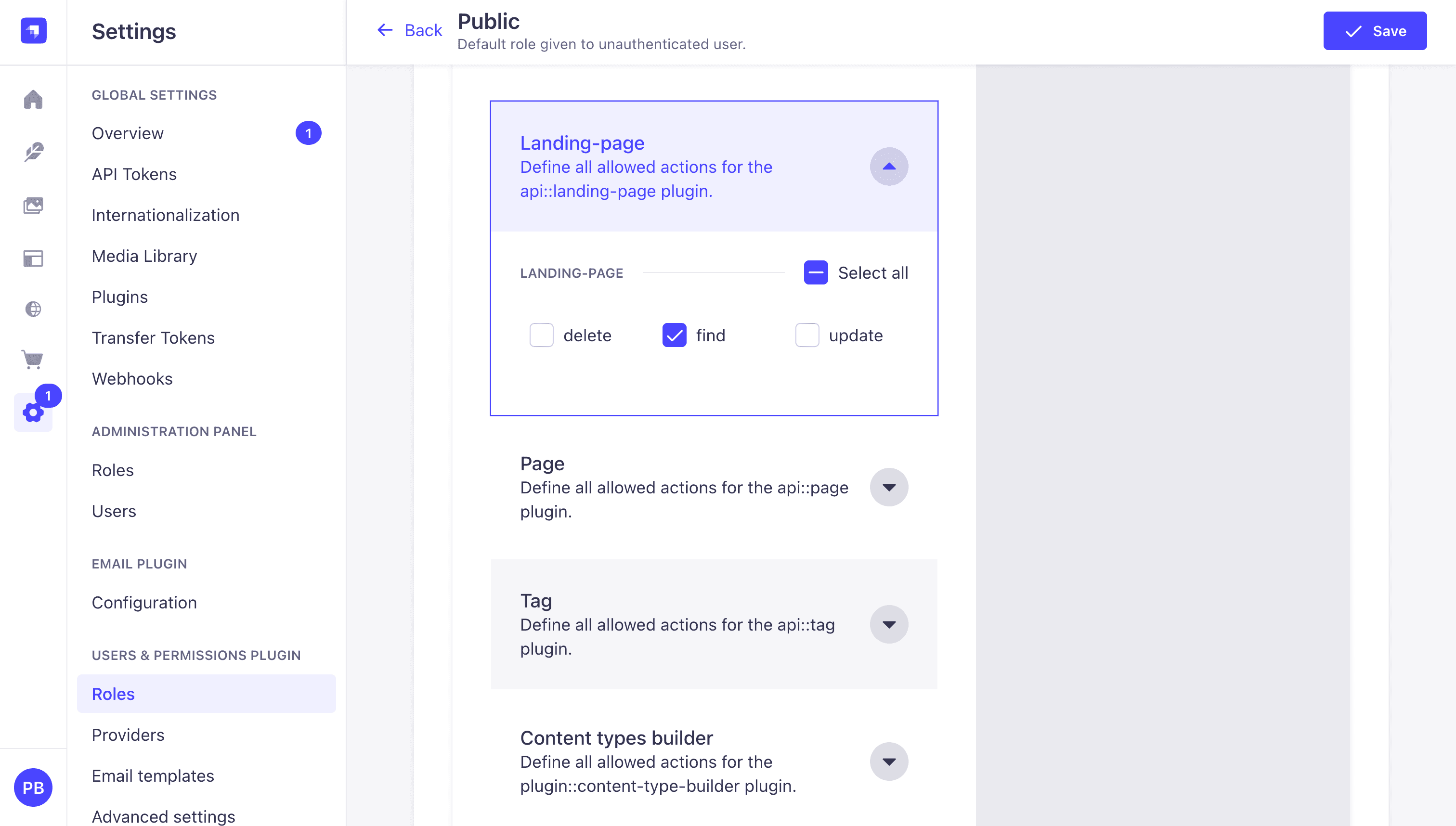
Step 4.5: Configure API Permissions
- Go to Settings → Users & Permissions Plugin → Roles
- Click Public
- Under each content type, check find and findOne
- Click Save
Should already be enabled.
Part 5: Data Fetching Setup
We'll use fetch to get data from our Strapi API, with the qs library for building query strings and React Query for caching.
Step 5.1: Install Dependencies
In your client directory:
npm install qs @tanstack/react-query
npm install --save-dev @types/qs
Step 5.2: Create Utility Functions
Create lib/utils.ts:
const STRAPI_URL = process.env.EXPO_PUBLIC_STRAPI_URL || "http://localhost:1337";

export function getStrapiURL(): string {
  return STRAPI_URL;
}

export function getStrapiMedia(url: string | null): string | null {
  if (!url) return null;
  if (url.startsWith("http")) return url;
  return `${getStrapiURL()}${url}`;
}
For Physical Devices: Create a
.envfile with your computer's IP address:EXPO_PUBLIC_STRAPI_URL=http://192.168.1.100:1337
Step 5.3: Create the Strapi API Helper
We'll create a simple API helper using fetch and the qs library for query string formatting.
Create lib/strapi-api.ts:
import qs from "qs";
import { getStrapiURL } from "@/lib/utils";

const BASE_URL = getStrapiURL();

interface QueryOptions {
  populate?: object | boolean;
  filters?: object;
  sort?: string[];
  pagination?: {
    page?: number;
    pageSize?: number;
  };
  fields?: string[];
}

async function fetchAPI<T>(endpoint: string, options?: QueryOptions): Promise<T> {
  const url = new URL(`/api/${endpoint}`, BASE_URL);
  if (options) {
    url.search = qs.stringify(options, { encode: false });
  }

  const response = await fetch(url.href, {
    headers: {
      "Content-Type": "application/json",
    },
  });

  if (!response.ok) {
    const text = await response.text();
    console.error("API error response:", text);
    throw new Error(`API error: ${response.status} ${response.statusText}`);
  }

  return response.json();
}

function single(singularApiId: string) {
  return {
    find: <T>(options?: QueryOptions) => fetchAPI<T>(singularApiId, options),
  };
}

function collection(pluralApiId: string) {
  return {
    find: <T>(options?: QueryOptions) => fetchAPI<T>(pluralApiId, options),
  };
}

export const strapiApi = {
  single,
  collection,
};
This helper provides:
strapiApi.single()- for fetching single-type content (like Landing Page)strapiApi.collection()- for fetching collection-type content (like Articles)
Step 5.4: Define TypeScript Types
Create types/index.ts:
// Strapi Response Types
export interface StrapiMeta {
  pagination?: {
    page: number;
    pageSize: number;
    pageCount: number;
    total: number;
  };
}

export interface StrapiResponse<T> {
  data: T;
  meta: StrapiMeta;
}

export interface StrapiCollectionResponse<T> {
  data: T[];
  meta: StrapiMeta;
}

// Media Types
export interface TImage {
  id: number;
  documentId: string;
  alternativeText: string | null;
  url: string;
  width?: number;
  height?: number;
}

// Common Types
export interface TLink {
  id: number;
  href: string;
  label: string;
  isExternal: boolean;
  type: string | null;
}

export interface TCard {
  id: number;
  heading: string;
  text: string;
}

export interface TTag {
  id: number;
  documentId: string;
  title: string;
}

export interface TAuthor {
  id: number;
  documentId: string;
  fullName: string;
  bio?: string;
  image?: TImage;
}

// Block Types
export interface IHero {
  __component: "blocks.hero";
  id: number;
  subHeading?: string;
  heading: string;
  highlightedText?: string;
  text: string;
  links: TLink[];
  image: TImage;
}

export interface ISectionHeading {
  __component: "blocks.section-heading";
  id: number;
  subHeading: string;
  heading: string;
}

export type TCardGridItem = TCard & {
  icon?: TImage;
};

export interface ICardGrid {
  __component: "blocks.card-grid";
  id: number;
  subHeading?: string;
  heading?: string;
  cards: TCardGridItem[];
}

export interface IContentWithImage {
  __component: "blocks.content-with-image";
  id: number;
  reversed: boolean;
  heading: string;
  subHeading?: string;
  content: string;
  link?: TLink;
  image: TImage;
}

export interface IMarkdownText {
  __component: "blocks.markdown";
  id: number;
  content: string;
}

export interface IFaqItem {
  id: number;
  heading: string;
  text: string;
}

export interface IFaqs {
  __component: "blocks.faqs";
  id: number;
  heading?: string;
  subHeading?: string;
  faq: IFaqItem[];
}

export type Block =
  | IHero
  | ISectionHeading
  | ICardGrid
  | IContentWithImage
  | IMarkdownText
  | IFaqs;

// Page Types
export interface LandingPage {
  id: number;
  documentId: string;
  title: string;
  description: string;
  createdAt: string;
  updatedAt: string;
  blocks: Block[];
}

// Article Types
export interface Article {
  id: number;
  documentId: string;
  title: string;
  slug: string;
  description: string;
  content: string;
  createdAt: string;
  updatedAt: string;
  publishedAt: string;
  featuredImage?: TImage;
  author?: TAuthor;
  contentTags?: TTag[];
}
Step 5.5: Create Data Loaders
Create data/loaders.ts:
import { strapiApi } from "@/lib/strapi-api";
import type {
  LandingPage,
  Article,
  StrapiResponse,
  StrapiCollectionResponse,
} from "@/types";

const PAGE_SIZE = 10;

// Landing Page (Single Type)
export async function getLandingPageData(): Promise<StrapiResponse<LandingPage>> {
  const response = await strapiApi.single("landing-page").find({
    populate: {
      blocks: {
        populate: {
          image: { fields: ["url", "alternativeText", "width", "height"] },
          link: { fields: ["url", "text", "isExternal"] },
          feature: { fields: ["heading", "subHeading", "icon"] },
        },
      },
    },
  });
  return response as StrapiResponse<LandingPage>;
}

// Articles (Collection Type)
const articles = strapiApi.collection("articles");

export interface GetArticlesParams {
  page?: number;
  pageSize?: number;
  tag?: string;
}

export async function getArticles(
  params?: GetArticlesParams
): Promise<StrapiCollectionResponse<Article>> {
  const { page = 1, pageSize = PAGE_SIZE, tag } = params || {};

  const filters = tag
    ? {
        contentTags: {
          title: { $containsi: tag },
        },
      }
    : undefined;

  const response = await articles.find({
    sort: ["createdAt:desc"],
    pagination: {
      page,
      pageSize,
    },
    filters,
  });

  return response as StrapiCollectionResponse<Article>;
}

export async function getArticleBySlug(
  slug: string
): Promise<StrapiCollectionResponse<Article>> {
  const response = await articles.find({
    filters: {
      slug: { $eq: slug },
    },
  });

  return response as StrapiCollectionResponse<Article>;
}
Step 5.6: Create React Query Hook for Landing Page
Create hooks/useLandingPage.ts:
import { useQuery } from "@tanstack/react-query";
import { getLandingPageData } from "@/data/loaders";

export function useLandingPage() {
  return useQuery({
    queryKey: ["landing-page"],
    queryFn: getLandingPageData,
  });
}
Step 5.7: Setup React Query Provider
Update app/_layout.tsx:
import "@/global.css";
import { Stack } from "expo-router";
import { SafeAreaProvider } from "react-native-safe-area-context";
import { QueryClient, QueryClientProvider } from "@tanstack/react-query";
const queryClient = new QueryClient({
defaultOptions: {
queries: {
staleTime: 1000 * 60 * 5, // 5 minutes
retry: 3,
},
},
});
export default function RootLayout() {
return (
<QueryClientProvider client={queryClient}>
<SafeAreaProvider>
<Stack />
</SafeAreaProvider>
</QueryClientProvider>
);
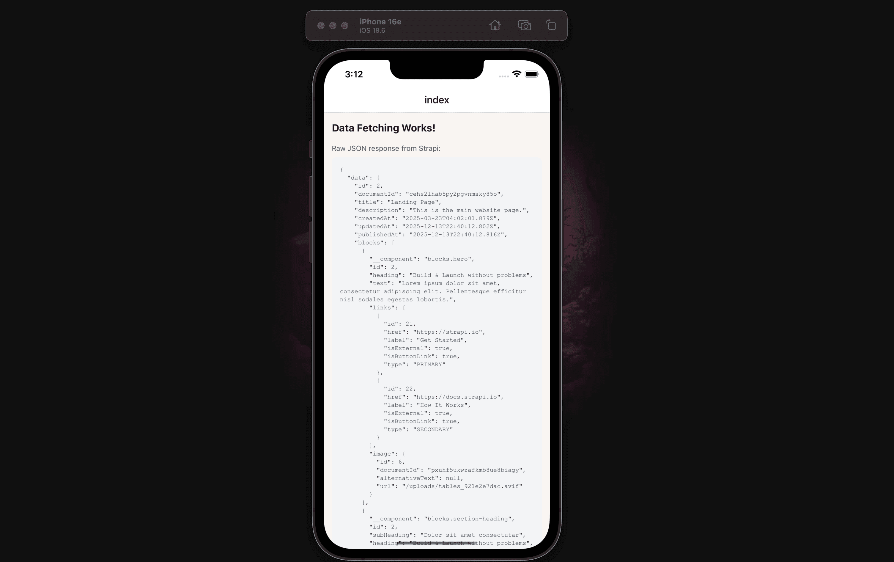
}Step 5.8: Verify Data Fetching - Display Raw JSON
Before building the UI components, let's verify our data fetching is working by displaying the raw JSON response. This is an important step to confirm the API connection works.
Update app/index.tsx to display the raw data:
import { Text, View, ActivityIndicator, ScrollView } from "react-native";
import { useLandingPage } from "@/hooks/useLandingPage";

export default function Index() {
  const { data, isLoading, error } = useLandingPage();

  if (isLoading) {
    return (
      <View className="flex-1 items-center justify-center bg-[#F9F5F2]">
        <ActivityIndicator size="large" color="#c4a1ff" />
        <Text className="mt-4 text-gray-600">Loading...</Text>
      </View>
    );
  }

  if (error) {
    return (
      <View className="flex-1 items-center justify-center bg-[#F9F5F2] p-8">
        <Text className="text-xl font-bold text-red-500">Error</Text>
        <Text className="mt-2 text-center text-gray-700">
          {error.message || "Failed to load landing page"}
        </Text>
        <Text className="mt-4 text-sm text-gray-500">
          Make sure Strapi is running at http://localhost:1337
        </Text>
      </View>
    );
  }

  // Display raw JSON to verify data is coming through
  return (
    <ScrollView className="flex-1 bg-[#F9F5F2] p-4">
      <Text className="text-xl font-bold mb-4 text-gray-900">
        Data Fetching Works!
      </Text>
      <Text className="text-sm text-gray-600 mb-2">
        Raw JSON response from Strapi:
      </Text>
      <View className="bg-gray-100 p-4 rounded-lg">
        <Text className="text-xs font-mono text-gray-800">
          {JSON.stringify(data, null, 2)}
        </Text>
      </View>
    </ScrollView>
  );
}
Run the app:
npx expo start --go --clearYou should see the raw JSON data from your Strapi landing page displayed on screen. This confirms:
- The API connection is working
- Data is being fetched successfully
- React Query is caching properly
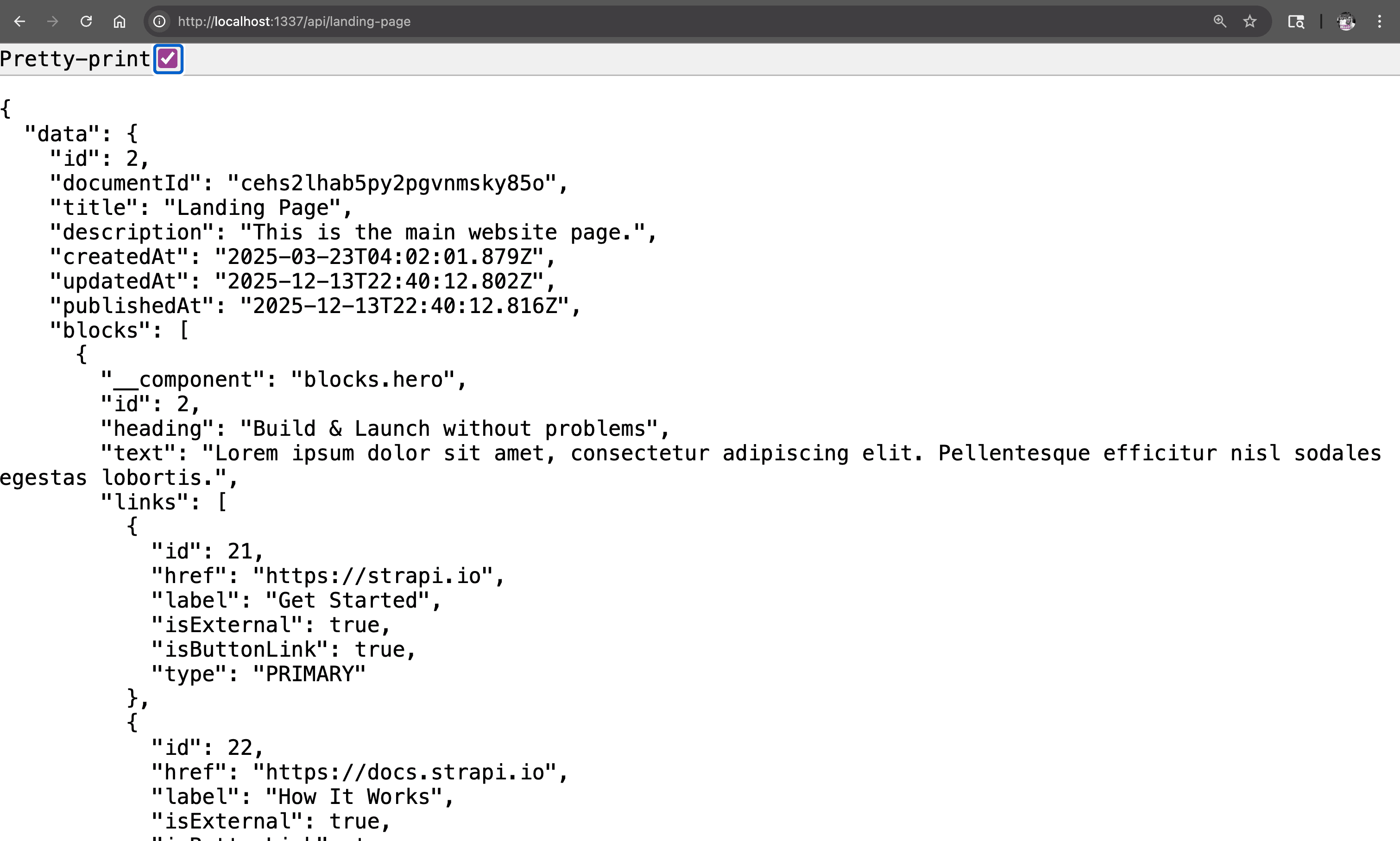
Test the API by making a GET request to http://localhost:1337/api/landing-page.
If you see an error, check:
- Strapi is running (
npm run developin the server folder) - API permissions are set (Settings → Roles → Public → check find/findOne)
- For physical devices, use your computer's IP address
Part 6: Building the Landing Page UI - Step by Step
Now that we've confirmed data fetching works, let's build the UI progressively. We'll start with the Hero component, test it, then add the remaining blocks.
Step 6.1: Install Image Dependencies
npx expo install expo-imageStep 6.2: Create StrapiImage Component
Create components/strapi-image.tsx:
import { Image, ImageProps } from "expo-image";
import { getStrapiMedia } from "@/lib/utils";

interface StrapiImageProps extends Omit<ImageProps, "source"> {
  src: string;
  alt?: string;
}

export function StrapiImage({ src, alt, ...props }: StrapiImageProps) {
  const imageUrl = getStrapiMedia(src);

  if (!imageUrl) return null;

  return (
    <Image
      source={{ uri: imageUrl }}
      accessibilityLabel={alt}
      placeholder={{ blurhash: "L6PZfSi_.AyE_3t7t7R**0o#DgR4" }}
      transition={200}
      {...props}
    />
  );
}
Important: Unlike web, you must use explicit
styledimensions (notclassName) for images to display on iOS/Android.
Step 6.3: Create the Hero Component
Let's start with just the Hero block. Create components/blocks/hero.tsx:
import { View, Text, Pressable, Linking } from "react-native";
import { Ionicons } from "@expo/vector-icons";
import { StrapiImage } from "@/components/strapi-image";
import type { IHero } from "@/types";

export function Hero({
  subHeading,
  heading,
  highlightedText,
  text,
  links,
  image,
}: Readonly<IHero>) {
  const handlePress = (href: string, isExternal: boolean) => {
    if (isExternal) {
      Linking.openURL(href);
    }
  };

  return (
    <View className="bg-[#F9F5F2] py-12 px-4">
      <View className="w-full max-w-6xl mx-auto">
        {/* Image */}
        <View className="w-full mb-8">
          <StrapiImage
            src={image.url}
            alt={image.alternativeText || heading}
            style={{ width: "100%", height: 192, borderRadius: 8 }}
            contentFit="cover"
          />
        </View>

        {/* Content */}
        <View className="items-center">
          {subHeading && (
            <Text className="text-base text-gray-600 mb-2">{subHeading}</Text>
          )}

          <Text className="text-3xl font-bold text-center text-gray-900">
            {heading}
          </Text>

          {highlightedText && (
            <View className="bg-[#e7f192] px-3 py-1 mt-3 rotate-2 border-2 border-black">
              <Text className="text-2xl font-bold">{highlightedText}</Text>
            </View>
          )}

          <Text className="text-base text-gray-600 text-center mt-4 px-4">
            {text}
          </Text>

          {links.length > 0 && (
            <View className="flex-row flex-wrap justify-center gap-3 mt-6">
              {links.map((link, index) => (
                <Pressable
                  key={`link-${link.id}-${index}`}
                  onPress={() => handlePress(link.href, link.isExternal)}
                  className={`flex-row items-center px-6 py-3 rounded-lg border-2 border-black ${
                    index === 0 ? "bg-[#c4a1ff]" : "bg-white"
                  }`}
                >
                  <Text className="font-semibold text-base">{link.label}</Text>
                  {index === 0 && (
                    <Ionicons
                      name="arrow-forward"
                      size={18}
                      color="black"
                      style={{ marginLeft: 8 }}
                    />
                  )}
                </Pressable>
              ))}
            </View>
          )}
        </View>
      </View>
    </View>
  );
}
Step 6.4: Create a Simple Block Renderer with Just Hero
Create components/blocks/block-renderer.tsx:
import { View, Text } from "react-native";
import { Hero } from "./hero";
import type { Block } from "@/types";

interface BlockRendererProps {
  blocks: Block[];
}

export function BlockRenderer({ blocks }: Readonly<BlockRendererProps>) {
  const renderBlock = (block: Block) => {
    switch (block.__component) {
      case "blocks.hero":
        return <Hero {...block} />;
      default:
        // Show a placeholder for unimplemented blocks
        return (
          <View className="p-4 m-4 bg-yellow-100 border border-yellow-400 rounded">
            <Text className="text-yellow-800">
              Block not implemented: {block.__component}
            </Text>
          </View>
        );
    }
  };

  return (
    <View>
      {blocks.map((block, index) => (
        <View key={`${block.__component}-${block.id}-${index}`}>
          {renderBlock(block)}
        </View>
      ))}
    </View>
  );
}
Create components/blocks/index.ts:
export { BlockRenderer } from "./block-renderer";
export { Hero } from "./hero";
Step 6.5: Update Index to Use BlockRenderer
Now update app/index.tsx to render the blocks:
import { Text, View, ActivityIndicator, ScrollView } from "react-native";
import { useLandingPage } from "@/hooks/useLandingPage";
import { BlockRenderer } from "@/components/blocks";
import type { Block } from "@/types";

export default function Index() {
  const { data, isLoading, error } = useLandingPage();

  if (isLoading) {
    return (
      <View className="flex-1 items-center justify-center bg-[#F9F5F2]">
        <ActivityIndicator size="large" color="#c4a1ff" />
        <Text className="mt-4 text-gray-600">Loading...</Text>
      </View>
    );
  }

  if (error) {
    return (
      <View className="flex-1 items-center justify-center bg-[#F9F5F2] p-8">
        <Text className="text-xl font-bold text-red-500">Error</Text>
        <Text className="mt-2 text-center text-gray-700">
          {error.message || "Failed to load landing page"}
        </Text>
      </View>
    );
  }

  const landingPage = data?.data;
  const blocks = (landingPage?.blocks || []) as Block[];

  return (
    <ScrollView className="flex-1 bg-[#F9F5F2]">
      <BlockRenderer blocks={blocks} />
    </ScrollView>
  );
}
Run the app now. You should see:
- The Hero block rendered properly with image, heading, text, and buttons
- Yellow placeholder boxes for the other blocks (SectionHeading, CardGrid, etc.)
Step 6.6: Add the Remaining Block Components
Now let's add all the other block components.
Create components/blocks/section-heading.tsx:
import { View, Text } from "react-native";
import type { ISectionHeading } from "@/types";

export function SectionHeading({
  subHeading,
  heading,
}: Readonly<ISectionHeading>) {
  return (
    <View className="bg-[#F9F5F2] pt-12 pb-6 px-4">
      <View className="w-full max-w-6xl mx-auto">
        <Text className="text-lg text-gray-600 mb-2">{subHeading}</Text>
        <Text className="text-2xl font-bold text-gray-900">{heading}</Text>
      </View>
    </View>
  );
}
Create components/blocks/card-grid.tsx:
import { View, Text, ScrollView } from "react-native";
import { Ionicons } from "@expo/vector-icons";
import { StrapiImage } from "@/components/strapi-image";
import type { ICardGrid } from "@/types";

const cardVariants = [
  "bg-[#C4A1FF]",
  "bg-[#E7F193]",
  "bg-[#C4FF83]",
  "bg-[#FFB3BA]",
  "bg-[#A1D4FF]",
  "bg-[#FFDAA1]",
] as const;

const fallbackIcons = [
  "star",
  "heart",
  "flash",
  "rocket",
  "bulb",
  "diamond",
] as const;

function getCardVariant(index: number) {
  return cardVariants[index % cardVariants.length];
}

function getFallbackIcon(index: number) {
  return fallbackIcons[index % fallbackIcons.length];
}

export function CardGrid({
  subHeading,
  heading,
  cards,
}: Readonly<ICardGrid>) {
  return (
    <View className="bg-[#F9F5F2] py-12">
      {(subHeading || heading) && (
        <View className="px-4 mb-6">
          <View className="w-full max-w-6xl mx-auto">
            {subHeading && (
              <Text className="text-lg text-gray-600 mb-2">{subHeading}</Text>
            )}
            {heading && (
              <Text className="text-2xl font-bold text-gray-900">{heading}</Text>
            )}
          </View>
        </View>
      )}

      <ScrollView
        horizontal
        showsHorizontalScrollIndicator={false}
        contentContainerClassName="px-4 gap-4"
      >
        {cards.map((card, index) => (
          <View
            key={`card-${card.id}-${index}`}
            className="w-64 p-5 bg-white border-2 border-black rounded-lg"
          >
            <View
              className={`w-14 h-14 rounded-full border-2 border-black items-center justify-center mb-4 ${getCardVariant(index)}`}
            >
              {card.icon ? (
                <StrapiImage
                  src={card.icon.url}
                  alt={card.icon.alternativeText || card.heading}
                  style={{ width: 32, height: 32 }}
                  contentFit="contain"
                />
              ) : (
                <Ionicons
                  name={getFallbackIcon(index)}
                  size={24}
                  color="black"
                />
              )}
            </View>

            <Text className="text-lg font-bold text-gray-900 mb-2">
              {card.heading}
            </Text>
            <Text className="text-sm text-gray-600 leading-relaxed">
              {card.text}
            </Text>
          </View>
        ))}
      </ScrollView>
    </View>
  );
}
Create components/blocks/content-with-image.tsx:
import { View, Text, Pressable, Linking } from "react-native";
import { StrapiImage } from "@/components/strapi-image";
import type { IContentWithImage } from "@/types";

export function ContentWithImage({
  reversed,
  heading,
  subHeading,
  content,
  link,
  image,
}: Readonly<IContentWithImage>) {
  const handlePress = () => {
    if (link?.href) {
      if (link.isExternal) {
        Linking.openURL(link.href);
      }
    }
  };

  return (
    <View className="bg-white py-12 px-4">
      <View className="w-full max-w-6xl mx-auto">
        <View className="mb-8">
          <View className="relative">
            <View className="absolute inset-0 bg-[#c4a1ff] translate-x-2 translate-y-2 rounded-lg" />
            <View className="relative border-2 border-black rounded-lg overflow-hidden bg-white">
              <StrapiImage
                src={image.url}
                alt={image.alternativeText || heading}
                style={{ width: "100%", height: 192 }}
                contentFit="cover"
              />
            </View>
          </View>
        </View>

        <View>
          {subHeading && (
            <View className="bg-[#e7f192] self-start px-3 py-1 mb-4 border border-black rounded">
              <Text className="text-sm font-medium">{subHeading}</Text>
            </View>
          )}

          <Text className="text-2xl font-bold text-gray-900 mb-4">
            {heading}
          </Text>

          <Text className="text-base text-gray-600 leading-relaxed mb-6">
            {content}
          </Text>

          {link?.href && link.label && (
            <Pressable
              onPress={handlePress}
              className="self-start bg-black px-6 py-3 rounded-lg"
            >
              <Text className="text-white font-semibold">
                {link.label} →
              </Text>
            </Pressable>
          )}
        </View>
      </View>
    </View>
  );
}
Install markdown dependencies:
npm install react-native-markdown-displayCreate components/blocks/markdown-text.tsx:
import { View, StyleSheet } from "react-native";
import Markdown from "react-native-markdown-display";
import type { IMarkdownText } from "@/types";

const markdownStyles = StyleSheet.create({
  body: { fontSize: 16, lineHeight: 24, color: "#374151" },
  heading1: { fontSize: 32, fontWeight: "bold", color: "#111827", marginBottom: 16, marginTop: 24 },
  heading2: { fontSize: 24, fontWeight: "bold", color: "#111827", marginBottom: 12, marginTop: 20 },
  heading3: { fontSize: 20, fontWeight: "bold", color: "#111827", marginBottom: 8, marginTop: 16 },
  paragraph: { fontSize: 16, lineHeight: 26, color: "#4B5563", marginBottom: 16 },
  link: { color: "#7C3AED", textDecorationLine: "underline" },
  blockquote: {
    backgroundColor: "#F3F4F6",
    borderLeftWidth: 4,
    borderLeftColor: "#7C3AED",
    paddingLeft: 16,
    paddingVertical: 8,
    marginVertical: 16,
    fontStyle: "italic",
  },
  fence: {
    backgroundColor: "#1F2937",
    borderRadius: 8,
    padding: 16,
    marginVertical: 16,
    color: "#F9FAFB",
    fontFamily: "monospace",
    fontSize: 14,
  },
});

export function MarkdownText({ content }: Readonly<IMarkdownText>) {
  return (
    <View className="py-12 px-4">
      <View className="w-full max-w-4xl mx-auto">
        <Markdown style={markdownStyles}>{content}</Markdown>
      </View>
    </View>
  );
}
Create components/blocks/faqs.tsx:
import { useState } from "react";
import { View, Text, Pressable } from "react-native";
import { Ionicons } from "@expo/vector-icons";
import type { IFaqs } from "@/types";

export function Faqs({ heading, subHeading, faq }: Readonly<IFaqs>) {
  const [openIndex, setOpenIndex] = useState<number | null>(null);

  const toggleFAQ = (index: number) => {
    setOpenIndex(openIndex === index ? null : index);
  };

  return (
    <View className="w-full py-12 bg-[#f5f3e8] px-4">
      <View className="items-center mb-8">
        <Text className="text-2xl font-bold text-gray-900 text-center mb-2">
          {heading || "Frequently Asked Questions"}
        </Text>
        {subHeading && (
          <Text className="text-base text-gray-600 text-center max-w-lg">
            {subHeading}
          </Text>
        )}
      </View>

      <View className="w-full max-w-3xl mx-auto">
        {faq.map((item, index) => (
          <View
            key={`faq-${item.id}-${index}`}
            className={`mb-4 border-2 border-black bg-white rounded-lg overflow-hidden ${
              openIndex === index ? "shadow-lg" : "shadow-md"
            }`}
          >
            <Pressable
              onPress={() => toggleFAQ(index)}
              className="flex-row justify-between items-center p-4"
            >
              <Text className="flex-1 font-bold text-base text-gray-900 pr-4">
                {item.heading}
              </Text>
              <Ionicons
                name={openIndex === index ? "chevron-up" : "chevron-down"}
                size={24}
                color="black"
              />
            </Pressable>

            {openIndex === index && (
              <View className="px-4 pb-4 border-t border-dashed border-gray-300">
                <Text className="text-base text-gray-600 pt-4 leading-relaxed">
                  {item.text}
                </Text>
              </View>
            )}
          </View>
        ))}
      </View>
    </View>
  );
}
Step 6.7: Update BlockRenderer with All Blocks
Update components/blocks/block-renderer.tsx:
import { View } from "react-native";
import { Hero } from "./hero";
import { SectionHeading } from "./section-heading";
import { CardGrid } from "./card-grid";
import { ContentWithImage } from "./content-with-image";
import { MarkdownText } from "./markdown-text";
import { Faqs } from "./faqs";
import type { Block } from "@/types";

interface BlockRendererProps {
  blocks: Block[];
}

export function BlockRenderer({ blocks }: Readonly<BlockRendererProps>) {
  const renderBlock = (block: Block) => {
    switch (block.__component) {
      case "blocks.hero":
        return <Hero {...block} />;
      case "blocks.section-heading":
        return <SectionHeading {...block} />;
      case "blocks.card-grid":
        return <CardGrid {...block} />;
      case "blocks.content-with-image":
        return <ContentWithImage {...block} />;
      case "blocks.markdown":
        return <MarkdownText {...block} />;
      case "blocks.faqs":
        return <Faqs {...block} />;
      default:
        return null;
    }
  };

  return (
    <View>
      {blocks.map((block, index) => (
        <View key={`${block.__component}-${block.id}-${index}`}>
          {renderBlock(block)}
        </View>
      ))}
    </View>
  );
}
Update components/blocks/index.ts:
export { BlockRenderer } from "./block-renderer";
export { Hero } from "./hero";
export { SectionHeading } from "./section-heading";
export { CardGrid } from "./card-grid";
export { ContentWithImage } from "./content-with-image";
export { MarkdownText } from "./markdown-text";
export { Faqs } from "./faqs";
Run the app again. You should now see the complete landing page with all blocks rendering properly!

Part 7: Adding Tab Navigation and Blog List
Now let's add a second screen to display blog articles with tab navigation.
Step 7.1: Create Article Hooks
Create hooks/useArticles.ts:
import { useQuery, useInfiniteQuery } from "@tanstack/react-query";
import { getArticles, getArticleBySlug } from "@/data/loaders";

export function useArticles(params?: { page?: number; tag?: string }) {
  return useQuery({
    queryKey: ["articles", params],
    queryFn: () => getArticles(params),
  });
}

export function useInfiniteArticles(tag?: string) {
  return useInfiniteQuery({
    queryKey: ["articles", "infinite", tag],
    queryFn: ({ pageParam = 1 }) => getArticles({ page: pageParam, tag }),
    initialPageParam: 1,
    getNextPageParam: (lastPage) => {
      const { page, pageCount } = lastPage.meta.pagination || { page: 1, pageCount: 1 };
      return page < pageCount ? page + 1 : undefined;
    },
  });
}

export function useArticleBySlug(slug: string) {
  return useQuery({
    queryKey: ["article", slug],
    queryFn: () => getArticleBySlug(slug),
    enabled: !!slug,
  });
}
Step 7.2: Create Tab Navigation Layout
Create the tabs folder and layout. First, create app/(tabs)/_layout.tsx:
import { Tabs } from "expo-router";
import { Ionicons } from "@expo/vector-icons";

export default function TabLayout() {
  return (
    <Tabs
      screenOptions={{
        tabBarActiveTintColor: "#c4a1ff",
        tabBarInactiveTintColor: "#6B7280",
        tabBarStyle: {
          backgroundColor: "#F9F5F2",
          borderTopColor: "#E5E7EB",
          borderTopWidth: 1,
        },
        headerStyle: {
          backgroundColor: "#F9F5F2",
        },
        headerTintColor: "#111827",
        headerTitleStyle: {
          fontWeight: "bold",
        },
      }}
    >
      <Tabs.Screen
        name="index"
        options={{
          title: "Home",
          tabBarIcon: ({ color, size }) => (
            <Ionicons name="home" size={size} color={color} />
          ),
        }}
      />
      <Tabs.Screen
        name="blog"
        options={{
          title: "Blog",
          tabBarIcon: ({ color, size }) => (
            <Ionicons name="newspaper" size={size} color={color} />
          ),
        }}
      />
    </Tabs>
  );
}
Step 7.3: Move Home Screen to Tabs
Move your index screen to app/(tabs)/index.tsx:
import { Text, View, ActivityIndicator, ScrollView } from "react-native";
import { useLandingPage } from "@/hooks/useLandingPage";
import { BlockRenderer } from "@/components/blocks";
import type { Block } from "@/types";

export default function HomeScreen() {
  const { data, isLoading, error } = useLandingPage();

  if (isLoading) {
    return (
      <View className="flex-1 items-center justify-center bg-[#F9F5F2]">
        <ActivityIndicator size="large" color="#c4a1ff" />
        <Text className="mt-4 text-gray-600">Loading...</Text>
      </View>
    );
  }

  if (error) {
    return (
      <View className="flex-1 items-center justify-center bg-[#F9F5F2] p-8">
        <Text className="text-xl font-bold text-red-500">Error</Text>
        <Text className="mt-2 text-center text-gray-700">
          {error.message || "Failed to load landing page"}
        </Text>
      </View>
    );
  }

  const landingPage = data?.data;
  const blocks = (landingPage?.blocks || []) as Block[];

  return (
    <ScrollView className="flex-1 bg-[#F9F5F2]">
      <BlockRenderer blocks={blocks} />
    </ScrollView>
  );
}
Delete the old app/index.tsx file if it exists.
Step 7.4: Create Article Card Component
Create components/article-card.tsx:
import { View, Text, Pressable } from "react-native";
import { useRouter, Href } from "expo-router";
import { StrapiImage } from "@/components/strapi-image";
import type { Article } from "@/types";

interface ArticleCardProps {
  article: Article;
}

export function ArticleCard({ article }: ArticleCardProps) {
  const router = useRouter();

  const handlePress = () => {
    router.push(`/article/${article.slug}` as Href);
  };

  const formattedDate = new Date(article.publishedAt).toLocaleDateString("en-US", {
    year: "numeric",
    month: "short",
    day: "numeric",
  });

  return (
    <Pressable
      onPress={handlePress}
      className="bg-white border-2 border-black rounded-lg overflow-hidden mb-4 active:opacity-80"
    >
      {article.featuredImage && (
        <StrapiImage
          src={article.featuredImage.url}
          alt={article.featuredImage.alternativeText || article.title}
          style={{ width: "100%", height: 160 }}
          contentFit="cover"
        />
      )}

      <View className="p-4">
        {article.contentTags && article.contentTags.length > 0 && (
          <View className="flex-row flex-wrap gap-2 mb-2">
            {article.contentTags.slice(0, 3).map((tag) => (
              <View
                key={tag.id}
                className="bg-[#e7f192] px-2 py-1 rounded border border-black"
              >
                <Text className="text-xs font-medium">{tag.title}</Text>
              </View>
            ))}
          </View>
        )}

        <Text className="text-lg font-bold text-gray-900 mb-2" numberOfLines={2}>
          {article.title}
        </Text>

        <Text className="text-sm text-gray-600 mb-3" numberOfLines={2}>
          {article.description}
        </Text>

        <View className="flex-row items-center justify-between">
          {article.author && (
            <Text className="text-xs text-gray-500">
              By {article.author.fullName}
            </Text>
          )}
          <Text className="text-xs text-gray-400">{formattedDate}</Text>
        </View>
      </View>
    </Pressable>
  );
}
Step 7.5: Create Blog List Screen with Infinite Scroll
Create app/(tabs)/blog.tsx:
import { Text, View, ActivityIndicator, FlatList, RefreshControl } from "react-native";
import { useState, useCallback, useMemo } from "react";
import { useInfiniteArticles } from "@/hooks/useArticles";
import { ArticleCard } from "@/components/article-card";
import type { Article } from "@/types";

export default function BlogScreen() {
  const [refreshing, setRefreshing] = useState(false);
  const {
    data,
    isLoading,
    error,
    refetch,
    fetchNextPage,
    hasNextPage,
    isFetchingNextPage,
  } = useInfiniteArticles();

  const onRefresh = useCallback(async () => {
    setRefreshing(true);
    await refetch();
    setRefreshing(false);
  }, [refetch]);

  const onEndReached = useCallback(() => {
    if (hasNextPage && !isFetchingNextPage) {
      fetchNextPage();
    }
  }, [hasNextPage, isFetchingNextPage, fetchNextPage]);

  const articles = useMemo(() => {
    return data?.pages.flatMap((page) => page.data) || [];
  }, [data]);

  const totalCount = data?.pages[0]?.meta?.pagination?.total || 0;

  if (isLoading && !refreshing) {
    return (
      <View className="flex-1 items-center justify-center bg-[#F9F5F2]">
        <ActivityIndicator size="large" color="#c4a1ff" />
        <Text className="mt-4 text-gray-600">Loading articles...</Text>
      </View>
    );
  }

  if (error) {
    return (
      <View className="flex-1 items-center justify-center bg-[#F9F5F2] p-8">
        <Text className="text-xl font-bold text-red-500">Error</Text>
        <Text className="mt-2 text-center text-gray-700">
          {error.message || "Failed to load articles"}
        </Text>
      </View>
    );
  }

  const renderItem = ({ item }: { item: Article }) => (
    <ArticleCard article={item} />
  );

  const renderHeader = () => (
    <View className="mb-4">
      <Text className="text-2xl font-bold text-gray-900">Latest Articles</Text>
      <Text className="text-gray-600 mt-1">
        {totalCount} article{totalCount !== 1 ? "s" : ""}
      </Text>
    </View>
  );

  const renderFooter = () => {
    if (!isFetchingNextPage) return null;
    return (
      <View className="py-4">
        <ActivityIndicator size="small" color="#c4a1ff" />
      </View>
    );
  };

  return (
    <View className="flex-1 bg-[#F9F5F2]">
      <FlatList
        data={articles}
        renderItem={renderItem}
        keyExtractor={(item) => item.documentId}
        contentContainerStyle={{ padding: 16 }}
        ListHeaderComponent={renderHeader}
        ListFooterComponent={renderFooter}
        refreshControl={
          <RefreshControl
            refreshing={refreshing}
            onRefresh={onRefresh}
            tintColor="#c4a1ff"
          />
        }
        onEndReached={onEndReached}
        onEndReachedThreshold={0.5}
        showsVerticalScrollIndicator={false}
      />
    </View>
  );
}
Run the app now. You should see:
- Tab navigation at the bottom with Home and Blog tabs
- Home tab showing the landing page with all blocks
- Blog tab showing the list of articles with infinite scroll

This confirms our BlockRenderer pattern is working!
Part 8: Article Detail Page
Finally, let's create the article detail page to view full articles.
Step 8.1: Create Article Detail Screen
Create app/article/[slug].tsx:
import { Text, View, ActivityIndicator, ScrollView, StyleSheet } from "react-native";
import { useLocalSearchParams, Stack } from "expo-router";
import Markdown from "react-native-markdown-display";
import { useArticleBySlug } from "@/hooks/useArticles";
import { StrapiImage } from "@/components/strapi-image";

const markdownStyles = StyleSheet.create({
  body: { fontSize: 16, lineHeight: 26, color: "#374151" },
  heading1: { fontSize: 28, fontWeight: "bold", color: "#111827", marginBottom: 16, marginTop: 24 },
  heading2: { fontSize: 22, fontWeight: "bold", color: "#111827", marginBottom: 12, marginTop: 20 },
  paragraph: { fontSize: 16, lineHeight: 26, color: "#4B5563", marginBottom: 16 },
  link: { color: "#7C3AED", textDecorationLine: "underline" },
  blockquote: {
    backgroundColor: "#F3F4F6",
    borderLeftWidth: 4,
    borderLeftColor: "#c4a1ff",
    paddingLeft: 16,
    paddingVertical: 8,
    marginVertical: 16,
    fontStyle: "italic",
  },
  fence: {
    backgroundColor: "#1F2937",
    borderRadius: 8,
    padding: 16,
    marginVertical: 16,
    color: "#F9FAFB",
    fontFamily: "monospace",
    fontSize: 14,
  },
});

export default function ArticleDetailScreen() {
  const { slug } = useLocalSearchParams<{ slug: string }>();
  const { data, isLoading, error } = useArticleBySlug(slug || "");

  if (isLoading) {
    return (
      <View className="flex-1 items-center justify-center bg-[#F9F5F2]">
        <ActivityIndicator size="large" color="#c4a1ff" />
        <Text className="mt-4 text-gray-600">Loading article...</Text>
      </View>
    );
  }

  if (error || !data?.data?.[0]) {
    return (
      <View className="flex-1 items-center justify-center bg-[#F9F5F2] p-8">
        <Text className="text-xl font-bold text-red-500">Error</Text>
        <Text className="mt-2 text-center text-gray-700">
          {error?.message || "Article not found"}
        </Text>
      </View>
    );
  }

  const article = data.data[0];

  const formattedDate = new Date(article.publishedAt).toLocaleDateString("en-US", {
    year: "numeric",
    month: "long",
    day: "numeric",
  });

  return (
    <>
      <Stack.Screen
        options={{
          title: "",
          headerStyle: { backgroundColor: "#F9F5F2" },
          headerTintColor: "#111827",
        }}
      />
      <ScrollView className="flex-1 bg-[#F9F5F2]">
        {article.featuredImage && (
          <StrapiImage
            src={article.featuredImage.url}
            alt={article.featuredImage.alternativeText || article.title}
            style={{ width: "100%", height: 220 }}
            contentFit="cover"
          />
        )}

        <View className="p-4">
          {article.contentTags && article.contentTags.length > 0 && (
            <View className="flex-row flex-wrap gap-2 mb-3">
              {article.contentTags.map((tag) => (
                <View
                  key={tag.id}
                  className="bg-[#e7f192] px-3 py-1 rounded border border-black"
                >
                  <Text className="text-xs font-medium">{tag.title}</Text>
                </View>
              ))}
            </View>
          )}

          <Text className="text-2xl font-bold text-gray-900 mb-2">
            {article.title}
          </Text>

          <View className="flex-row items-center mb-4">
            {article.author && (
              <Text className="text-sm text-gray-600">
                By {article.author.fullName}
              </Text>
            )}
            <Text className="text-sm text-gray-400 mx-2">•</Text>
            <Text className="text-sm text-gray-400">{formattedDate}</Text>
          </View>

          <Text className="text-base text-gray-600 mb-6 leading-relaxed">
            {article.description}
          </Text>

          <View className="border-t border-gray-200 pt-6">
            <Markdown style={markdownStyles}>{article.content}</Markdown>
          </View>
        </View>
      </ScrollView>
    </>
  );
}
Step 8.2: Update Root Layout for Navigation
Update app/_layout.tsx to configure the stack navigation:
import "@/global.css";
import { Stack } from "expo-router";
import { SafeAreaProvider } from "react-native-safe-area-context";
import { QueryClient, QueryClientProvider } from "@tanstack/react-query";

const queryClient = new QueryClient({
  defaultOptions: {
    queries: {
      staleTime: 1000 * 60 * 5,
      retry: 3,
    },
  },
});

export default function RootLayout() {
  return (
    <QueryClientProvider client={queryClient}>
      <SafeAreaProvider>
        <Stack>
          <Stack.Screen name="(tabs)" options={{ headerShown: false }} />
          <Stack.Screen
            name="article/[slug]"
            options={{
              headerBackTitle: "Back",
              headerStyle: { backgroundColor: "#F9F5F2" },
              headerTintColor: "#111827",
            }}
          />
        </Stack>
      </SafeAreaProvider>
    </QueryClientProvider>
  );
}
Part 9: Running the Complete App
Start Both Servers
Open two terminal windows:
Terminal 1 - Strapi:
cd server
npm run develop
Terminal 2 - Expo:
cd client
npx expo start --go --clear
Test the Complete Flow
- Scan the QR code with Expo Go
- Home Tab: See the landing page with Hero, CardGrid, FAQs, etc.
- Blog Tab: See the list of articles with infinite scroll
- Tap an article: Navigate to the detail page with full content
- Pull to refresh: Reload the article list
- Scroll to bottom: Load more articles automatically
Troubleshooting
Images Not Loading on iOS/Android
-
Use explicit style dimensions:
// Wrong <StrapiImage className="w-full h-48" ... /> // Correct <StrapiImage style={{ width: "100%", height: 192 }} ... /> -
Use your computer's IP instead of localhost:
# .env EXPO_PUBLIC_STRAPI_URL=http://192.168.1.100:1337 -
Restart with cleared cache:
npx expo start --go --clear
Network Request Failed
- Ensure Strapi is running
- Check your phone and computer are on the same WiFi
- Verify API permissions in Strapi admin
"(tabs)" Showing in Navigation
Add headerShown: false to the tabs Stack.Screen in your root layout.
Final Project Structure
your-project/
├── client/
│   ├── app/
│   │   ├── _layout.tsx
│   │   ├── (tabs)/
│   │   │   ├── _layout.tsx
│   │   │   ├── index.tsx
│   │   │   └── blog.tsx
│   │   └── article/
│   │       └── [slug].tsx
│   ├── components/
│   │   ├── article-card.tsx
│   │   ├── strapi-image.tsx
│   │   └── blocks/
│   │       ├── index.ts
│   │       ├── block-renderer.tsx
│   │       ├── hero.tsx
│   │       ├── section-heading.tsx
│   │       ├── card-grid.tsx
│   │       ├── content-with-image.tsx
│   │       ├── markdown-text.tsx
│   │       └── faqs.tsx
│   ├── data/
│   │   └── loaders.ts
│   ├── hooks/
│   │   ├── useArticles.ts
│   │   └── useLandingPage.ts
│   ├── lib/
│   │   ├── strapi-api.ts
│   │   └── utils.ts
│   ├── types/
│   │   └── index.ts
│   ├── global.css
│   ├── tailwind.config.js
│   └── package.json
└── server/
    └── ... (Strapi)
Next Steps
Now that you have a working app, consider:
- Add Authentication - Implement user login with Strapi's auth
- Create Development Builds - Build custom native apps for production
- Add More Block Types - Extend the block renderer with new components
- Implement Search - Add article search functionality
- Deploy Strapi - Host your backend on a cloud provider
Resources
- Expo Documentation
- NativeWind Documentation
- Strapi Documentation
- React Query Documentation
- Expo Router Documentation
Happy coding! If you have questions or run into issues, check the Expo and Strapi Discord communities for help.