

You're building a React application that needs Markdown editing—documentation platform, CMS, or collaborative writing tool. The challenge is finding an editor that integrates cleanly with React, maintains active development, and avoids extensive workarounds for toolbar customization or edge cases.
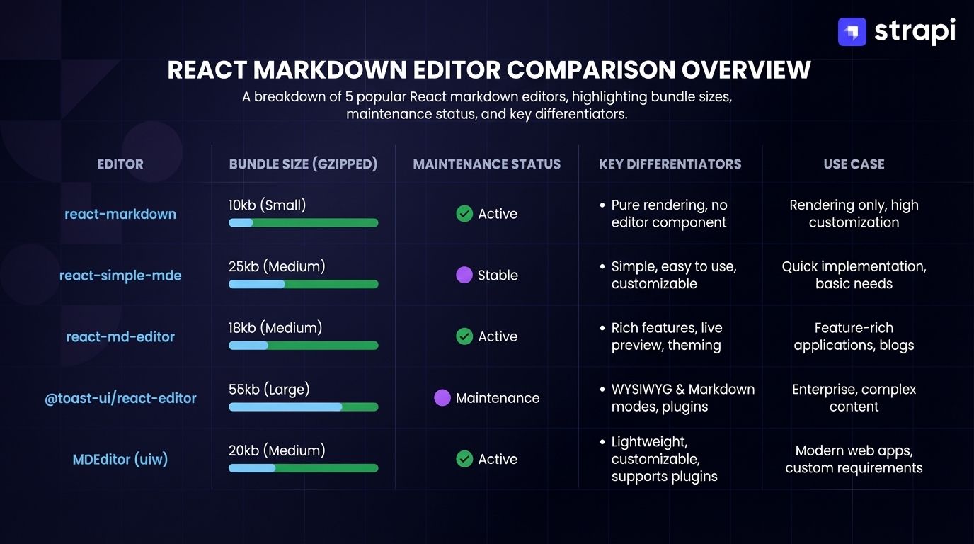
Markdown editors provide formatting for non-technical users without HTML complexity, storing content as portable plain text. They appear in documentation sites, content management systems, and forums. In Strapi's React-based admin panel, these editors integrate as custom field types. This guide evaluates five React Markdown editors on maintenance status, integration complexity, bundle size, TypeScript support, and documented limitations.
 In brief:
- @uiw/react-md-editor offers the fastest path to a working editor at around 4.6 kB gzipped, though CSS customization requires working around
!importantrules. - MDXEditor enables component embedding in Markdown content but ships at 851.1 kB gzipped with documented inline rendering issues.
react-markdown-editor-liteandreact-simplemde-editorshow no recent commits, making them risky choices despite continued download numbers.- Milkdown provides extensive customization on ProseMirror's foundation but requires significant development investment and manual UI construction.
@uiw/react-md-editor
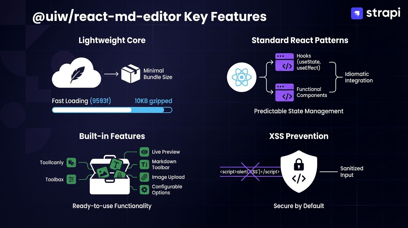
@uiw/react-md-editor builds directly on HTML's native textarea instead of pulling in CodeMirror or Monaco, keeping things lightweight. You get GitHub Flavored Markdown parsing, live preview, and toolbar customization in a single React component that follows standard controlled patterns with full TypeScript definitions included.
Why Developers Use It
Developers choose @uiw/react-md-editor for several key reasons:
- Minimal bundle impact: ~4.6 kB gzipped makes it one of the smallest full-featured options.
- Standard React patterns: Uses familiar
valueandonChangeprops without custom state management requirements. - Built-in features: Includes tab indentation, automatic list continuation, line duplication (Ctrl+D), and line movement (Alt+↑/↓).
- Cross-Site Scripting (XSS) prevention: Requires explicit integration of the
rehype-sanitizeplugin for safe HTML rendering. - Active maintenance: Frequent commits with December 2024 release addressing recent issues.
These features combine to deliver a lightweight, production-ready editor that fits naturally into React applications.
How It Integrates With React
It follows React's controlled component pattern using typical hooks for state management. You'll need to install:
npm i @uiw/react-md-editor@4.0.11However, documented Next.js compatibility issues with @uiw/react-md-editor may require additional configuration:
import dynamic from 'next/dynamic';

const MDEditor = dynamic(
  () => import('@uiw/react-md-editor'),
  { ssr: false }
);
The library splits editing (MDEditor) and preview-only rendering (MDEditor.Markdown) into separate components for flexible layouts.
For Strapi integration, register @uiw/react-md-editor as a custom field through Strapi's plugin API, passing the editor component to the field registration with value and onChange props mapped to Strapi's field state management.
Strengths and Limitations
Strengths:
- Complete feature set including live preview, syntax highlighting, and GitHub Flavored Markdown support without requiring external dependencies.
- Customizable toolbar with selective plugin enabling.
- Dark mode support added in version 3.11.0.
- Native TypeScript definitions enable IntelliSense and compile-time checking.
- Standalone package doesn't require installing broader component library.
- Controlled component architecture with standard React hooks integration.
- Lightweight at 4.6 kB gzipped bundle size.
Limitations:
- CSS customization in @uiw/react-md-editor is typically straightforward, as the default styles do not make extensive use of !important rules.
- Next.js 13 issues require workarounds beyond standard dynamic imports.
- Accessibility issues documented in GitHub issues.
- Cursor position bugs and syntax highlighting failures reported in edge cases.
Best Use Cases
@uiw/react-md-editor works best for comment sections, blog post editors, and documentation platforms where you accept the default styling without extensive customization. When working with standardized content types, whether created manually or through content modeling tools, this editor's predictable structure integrates cleanly.
The lightweight footprint makes it ideal for content management applications where developers need fast implementation without extensive customization. Its extensive use of !important CSS rules creates barriers to style overrides, making it less suitable for design-system-strict implementations, Next.js 13 applications, projects where accessibility compliance is critical, or server-side rendering scenarios.
MDXEditor
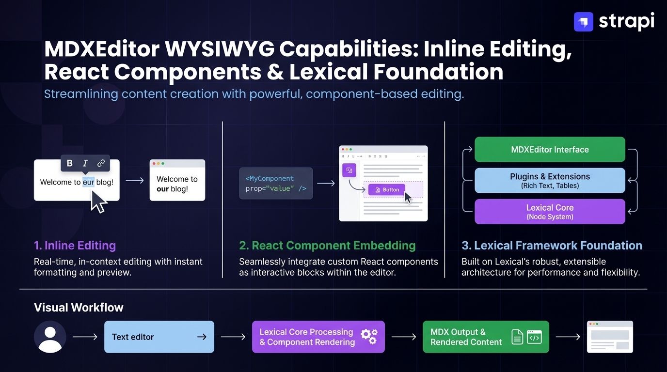
MDXEditor is a WYSIWYG editor for MDX content built on the Lexical framework. Unlike traditional Markdown editors with separate edit and preview modes, MDXEditor provides inline editing: formatting appears as you type, no preview pane needed.
It handles standard Markdown and JavaScript XML (JSX) components, so you can embed React components directly in your Markdown, though the GenericJsxEditor has documented issues rendering ReactNode components inline.
Why Developers Use It
Developers choose MDXEditor when they need advanced WYSIWYG capabilities:
- WYSIWYG editing: Eliminates the need for separate preview panes with inline formatting.
- React component embedding: Enables interactive documentation and content with JSX components.
- Lexical foundation: Built on Meta's modern Lexical framework for editing primitives.
- Plugin architecture: Compose precise feature sets through plugin-based design.
- Advanced features: Built-in table editor, YAML front-matter editing, code block syntax highlighting, and diff/source view modes.
These capabilities make it particularly valuable for content-driven applications that require component integration.
How It Integrates With React
MDXEditor uses a plugin-based architecture where you import and pass only the plugin functions you need to the plugins prop:
import { MDXEditor, headingsPlugin, listsPlugin, linkPlugin } from '@mdxeditor/editor';
import '@mdxeditor/editor/style.css';

export default function App() {
  return (
    <MDXEditor
      markdown={'# Hello World'}
      plugins={[
        headingsPlugin(),
        listsPlugin(),
        linkPlugin()
      ]}
    />
  );
}
You'll need to install:
npm i @mdxeditor/editor@3.45.1For state management integration, MDXEditor uses Gurx graph-based reactive state management with dedicated hooks:
import { useCellValue, useCellValues, usePublisher } from '@mdxeditor/editor';

function CustomToolbar() {
  const [markdown, rootEditor] = useCellValues([markdown$, rootEditor$]);
  const applyBlockType = usePublisher(applyBlockType$);
  // Implement custom toolbar UI and event handlers
}
Strengths and Limitations
Strengths:
- True WYSIWYG experience eliminates preview pane need.
- Built-in table editor with cell merging and formatting.
- YAML front-matter editing for metadata management.
- Code block syntax highlighting with Sandpack integration for live preview.
- Custom directive support for extending Markdown syntax.
Limitations:
- 851.1 kB gzipped bundle size impacts initial load time.
- GenericJsxEditor component fails to render ReactNode components inline, requiring workarounds for documented features.
- Markdown pasting issues reported in GitHub discussions.
- Limited community discussion volume compared to established editors.
- Custom markdown visitors required for extending import/export behavior.
Best Use Cases
MDXEditor excels in content-driven React applications like blogs, documentation sites, and knowledge bases where embedding interactive React components adds value. The WYSIWYG editing eliminates separate edit/preview modes.
In Strapi's Admin Panel, MDXEditor handles component-rich content types effectively, whether manually created or generated by content modeling tools. You'll want to consider alternatives if you're working with constrained timelines that can't accommodate workaround implementation, have strict performance budgets that make an 851.1 kB gzipped bundle problematic, or need stable out-of-the-box inline component rendering.
react-markdown-editor-lite
react-markdown-editor-lite provides a lightweight Markdown editor with split-screen editing and preview through a parser-agnostic design where you provide your own Markdown rendering library: markdown-it, marked, or custom implementations. This package hasn't seen a commit in 2 years, leaving 58 issues unresolved [TKTK]. That's a deal-breaker for production work that needs ongoing support.
Why Developers Use It
Historically, developers chose react-markdown-editor-lite for specific advantages:
- Lightweight core with parser flexibility: 20KB editor core (60-90KB total with parser) providing complete editor functionality, works with markdown-it, marked, or custom parsers.
- TypeScript support with plugin system: Full native TypeScript support with 17 built-in plugins including headers, formatting, lists, tables, images, and links.
- Synchronized scrolling with image upload: Editor and preview panes maintain scroll position alignment with built-in file handling.
These features made it attractive before active maintenance ceased.
How It Integrates With React
You'll need to install both the editor package and your chosen Markdown parser:
npm install react-markdown-editor-lite@1.3.4 --save
npm install markdown-it --save
Basic implementation:
import React from 'react';
import MdEditor from 'react-markdown-editor-lite';
import MarkdownIt from 'markdown-it';
import 'react-markdown-editor-lite/lib/index.css';

const mdParser = new MarkdownIt({ html: true, linkify: true });

function App() {
  const handleEditorChange = ({ html, text }) => {
    console.log('handleEditorChange', html, text);
  };

  return (
    <MdEditor
      value=""
      style={{ height: '500px' }}
      renderHTML={(text) => mdParser.render(text)}
      onChange={handleEditorChange}
      plugins={['header', 'font-bold', 'font-italic', 'image', 'link']}
    />
  );
}
Strengths and Limitations
Strengths:
- Lightweight (20KB editor, 60-90KB total with parser).
- TypeScript support with built-in definitions.
- Pluggable architecture (17 built-in plugins).
- Custom markdown parser capability.
Limitations:
- No active maintenance for 2 years with 58 unresolved issues [TKTK].
- Does not natively support server-side rendering per npm documentation.
- CSS customization barriers with extensive use of
!importantrules. - Limited plugin ecosystem compared to actively maintained alternatives.
- Rendering inconsistencies across browsers with limited fix frequency.
Best Use Cases
react-markdown-editor-lite made sense for client-side rendered applications when it received active maintenance. Today, the lack of maintenance for 2 years makes it unsuitable for production applications requiring ongoing support, security updates, or compatibility with future React versions.
Modern development workflows require actively maintained editors that can integrate with evolving React patterns and framework updates.
react-simplemde-editor
react-simplemde-editor is a React wrapper for EasyMDE, which itself is a maintained fork of the original SimpleMDE editor. The package provides Markdown editing with live preview, toolbar customization, and autosaving functionality through React-friendly props.
However, the package has not been actively maintained for 3 years, with known issues including partial TypeScript support (lacking dedicated .d.ts type definition files), React ref problems with function components, and mobile browser compatibility bugs.
Why Developers Use It
When the package was actively maintained, developers chose it for:
- React wrapper for EasyMDE: Provides familiar API with established codebase.
- Core editing features: Markdown editing with live preview and customizable toolbar.
- Autosaving and React-friendly patterns: Built-in autosaving with controlled component state management.
These features supported basic Markdown editing needs before maintenance ceased.
How It Integrates With React
You'll need both the wrapper and peer dependency:
npm install --save react-simplemde-editor@5.2.0 easymdeBasic integration:
import React from "react";
import SimpleMDE from "react-simplemde-editor";
import "easymde/dist/easymde.min.css";

export default function App() {
  const [value, setValue] = React.useState("**Hello world!!!**");

  return (
    <SimpleMDE
      value={value}
      onChange={setValue}
      options={{
        spellChecker: false,
        toolbar: ["bold", "italic", "heading", "|", "preview"]
      }}
    />
  );
}
The options prop exposes full EasyMDE configuration, including toolbar customization, autosave settings, spell checker configuration, and preview rendering options.
Strengths and Limitations
Strengths:
- React wrapper for EasyMDE with familiar configuration API.
- Examples written in TypeScript demonstrate intended usage.
Limitations:
- No active maintenance for 3 years (version 5.2.0 unchanged since 2022) creates significant risk for production applications.
- No dedicated TypeScript files despite TypeScript examples in documentation.
- Significant React ref problems with function components reported in GitHub issues, particularly with hooks-based implementation.
- Known mobile issues that remain unfixed.
- Preview rendering bugs in various scenarios.
- Bundle size not officially documented on npm or GitHub, requiring independent analysis.
Best Use Cases
Starting a new project with an unmaintained library that has known bugs across multiple areas doesn't make technical sense when actively maintained alternatives exist. The 3-year maintenance gap eliminates it for desktop-only applications, while documented issues with function components create friction with modern React patterns, and mobile browser bugs make it unsuitable for responsive applications.
Milkdown
Milkdown is a plugin-based editor framework built on ProseMirror that provides Markdown editing with extensive customization capabilities. Unlike opinionated editors with fixed UIs, Milkdown gives you ProseMirror's document model and transformation architecture wrapped in a plugin system, though React integration is bare-bones and requires manual UI component construction.
Why Developers Use It
Developers choose Milkdown when they need maximum control and advanced capabilities:
- Plugin-driven architecture on ProseMirror's foundation: Enables composing precise feature sets with predictable state management.
- ProseMirror's transformation architecture: Provides predictable state management and collaborative editing through Y.js integration.
- Theme system and advanced features: Customizable styling with math rendering, diagrams, and advanced table support.
- Modular design: Tree-shaking support reduces bundle size for minimal configurations.
These architectural advantages appeal to teams building highly customized editing experiences.
How It Integrates With React
Installation requires:
npm i @milkdown/core@7.17.2
npm i @milkdown/react@7.17.2
Production usage with hooks for editor state access:
import { MilkdownProvider, useEditor } from '@milkdown/react';
import { commonmark } from '@milkdown/preset-commonmark';

function EditorComponent() {
  const { editor } = useEditor((root) =>
    Editor.make().config((ctx) => {
      ctx.set(rootCtx, root);
    }).use(commonmark)
  );

  return <div ref={editor} />;
}

function App() {
  return (
    <MilkdownProvider>
      <EditorComponent />
    </MilkdownProvider>
  );
}
React integration gets messy here: GitHub Discussion #1120 documents that React integration is "bare-bones and unconventional," with no native React event props, no built-in controlled component behavior, and limited prop forwarding, requiring manual event handling via the listener plugin and useEditor hook instead of standard React props.
Strengths and Limitations
Strengths:
- Plugin-driven architecture enables composing precise feature sets.
- ProseMirror's transformation and command architecture provides predictable state management.
- Collaborative editing capabilities through Y.js integration.
- Theme system for styling customization.
- Math rendering, diagrams, and advanced table support.
- Modular design with tree-shaking support reduces bundle size for minimal configurations.
Limitations:
- Significant learning curve compared to simpler alternatives, with bare-bones React integration lacking native event props and controlled component support.
- Limited HTML tag support affects image rendering in certain scenarios.
- Manual UI construction required for toolbar and editor chrome.
- Limited comprehensive implementation examples increases time to working prototype.
- Bundle size not officially documented (though modular architecture enables optimization).
Best Use Cases
Milkdown makes sense for projects with dedicated development resources. Consider it when you need highly customized editing experiences, scientific documentation with math rendering, real-time collaboration, or complex table manipulation.
Teams with tight timelines, small development capacity, or those needing rapid prototyping should prioritize @uiw/react-md-editor (~4.6 kB gzipped, straightforward React integration, active maintenance) or MDXEditor (out-of-the-box WYSIWYG editing with component embedding, though requiring documented workarounds at 851.1 kB gzipped).
How Do Markdown Editors Integrate With Strapi?
Strapi's Admin Panel is a React SPA, making React Markdown editor integration straightforward through custom field plugins. You create a plugin in /src/plugins/[plugin-name], register the field type, and map the editor's value/onChange props to Strapi's field APIs. The editor stores Markdown as plain text in the database and appears in Strapi's Content-Type Builder.
@uiw/react-md-editor's 26.9 kB bundle keeps the admin panel responsive, while MDXEditor's component embedding suits content-rich sites despite its 851.1 kB footprint. Both integrate with Strapi AI-generated schemas, handling content input after structural decisions are made.