
Introduction & What You'll Build
In many industries, PDF generation has become a core requirement, whether it's for invoices, reports, or certificates, which are very important.
In this article, you will learn how to use Next.js, Puppeteer, and Strapi to build a PDF generation engine. The engine seamlessly integrates content from the Strapi backend, server-side rendering using Next.js, and web to PDF using Puppeteer.
Prerequisites
- You are expected to be familiar with Node.js and Next.js.
- Node.js version requirements (e.g., "Node.js 18.x or higher")
- npm or yarn version
- Basic TypeScript knowledge
- Understanding of REST APIs
- Familiarity with React hooks
- Terminal/command line basics
- A code editor (VS Code recommended)
What you will learn
By the end of this article, you will be able to easily build the frontend pages below, populate them with data from Strapi, and serve them to your users as PDFs.
- How to fetch Strapi data dynamically
- How to render print-optimized pages in Next.js
- How to automate PDF generation with Puppeteer
- How to document the API with Swagger & Zod
Setting up Project Folder
Open up your terminal and create a pdf-engine folder to store your project files.
mkdir pdf-engineNavigate into the pdf-engine directory.
cd pdf-engineStrapi 5 Backend Setup
Create your Strapi app in a folder named backend.
npx create-strapi-app@latest backend --quickstartThe --quickstart flag sets up your Strapi app with an SQLite database and automatically starts your server on port 1337.
If the server is not already running in your terminal, cd into the backend folder and run npm develop to launch it.
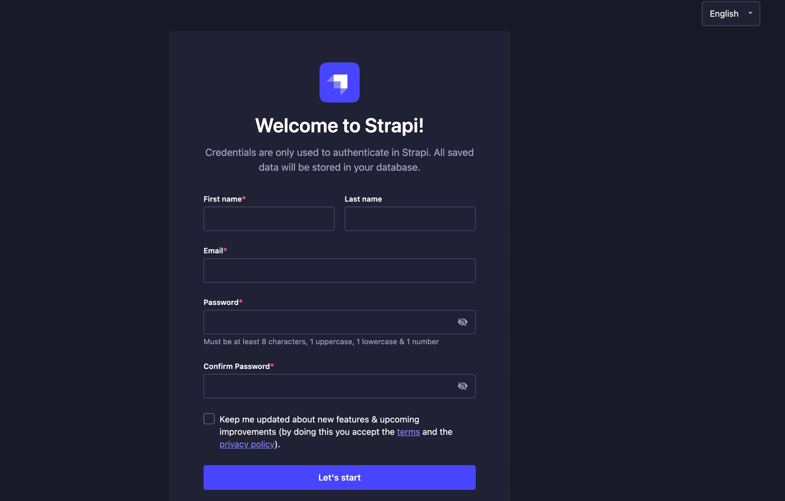
Visit http://localhost:1337/admin in your browser and register in the Strapi Admin Registration Form.
Design the Content Model for the PDF generation engine
Now that your Strapi application is set up and running, fill the form with your personal information to get authenticated to the Strapi Admin Panel.
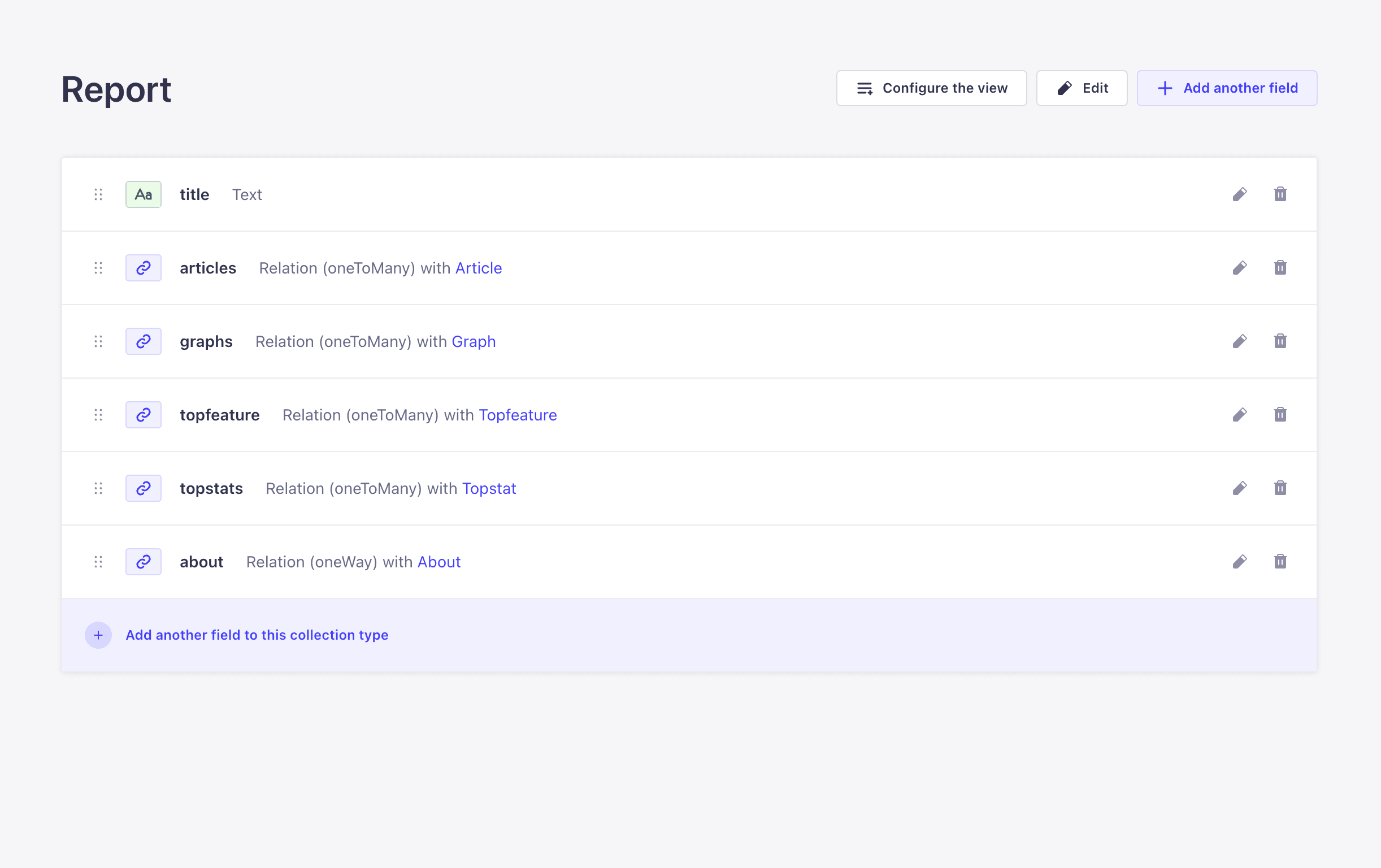
From your admin panel, click on Content-Type Builder > Create new collection type tab to create a collection and its field types for your application. In this case, you are creating the following collections: About, Article, Graph, topfeature, topstat, and report. These collections will help us create types for the Strapi report PDF.
Collections Overview
Here is a table showing all collection types, their fields, and relations.
| Collection Type | Field | Type | Relation | Notes |
|---|---|---|---|---|
| About | Description | Long Text | – | |
| Funded | Boolean | – | ||
| Size | Short Text | – | ||
| Returns | Enum | – | Options: daily, weekly, monthly, quarterly | |
| Report | Relation | One to One with Report | Each About entry belongs to one Report | |
| Article | Picture | Media | – | |
| Title | Text | – | ||
| Report | Relation | Many to One with Report | Each Report can have many Articles | |
| Graph | Year | Number | – | |
| Ratio | Number | – | ||
| Report | Relation | Many to One with Report | Each Report can have many Graphs | |
| Topfeature | Icon | Media | – | |
| Title | Short Text | – | ||
| Description | Long Text | – | ||
| Report | Relation | Many to One with Report | Each Report can have many Topfeatures | |
| Topstat | Title | Text | – | |
| Description | Long Text | – | ||
| Report | Relation | Many to One with Report | Each Report can have many Topstats | |
| Report | Title | Short Text | – | |
| Articles | Relation | One to Many with Article | A Report can have many Articles | |
| Graphs | Relation | One to Many with Graph | A Report can have many Graphs | |
| Topfeatures | Relation | One to Many with Topfeature | A Report can have many Topfeatures | |
| Topstats | Relation | One to Many with Topstat | A Report can have many Topstats | |
| About | Relation | One to One with About | A Report has one About section |
For more on this, see Understanding and Using Relations in Strapi to learn more.
Allowing Public API Access in Strapi
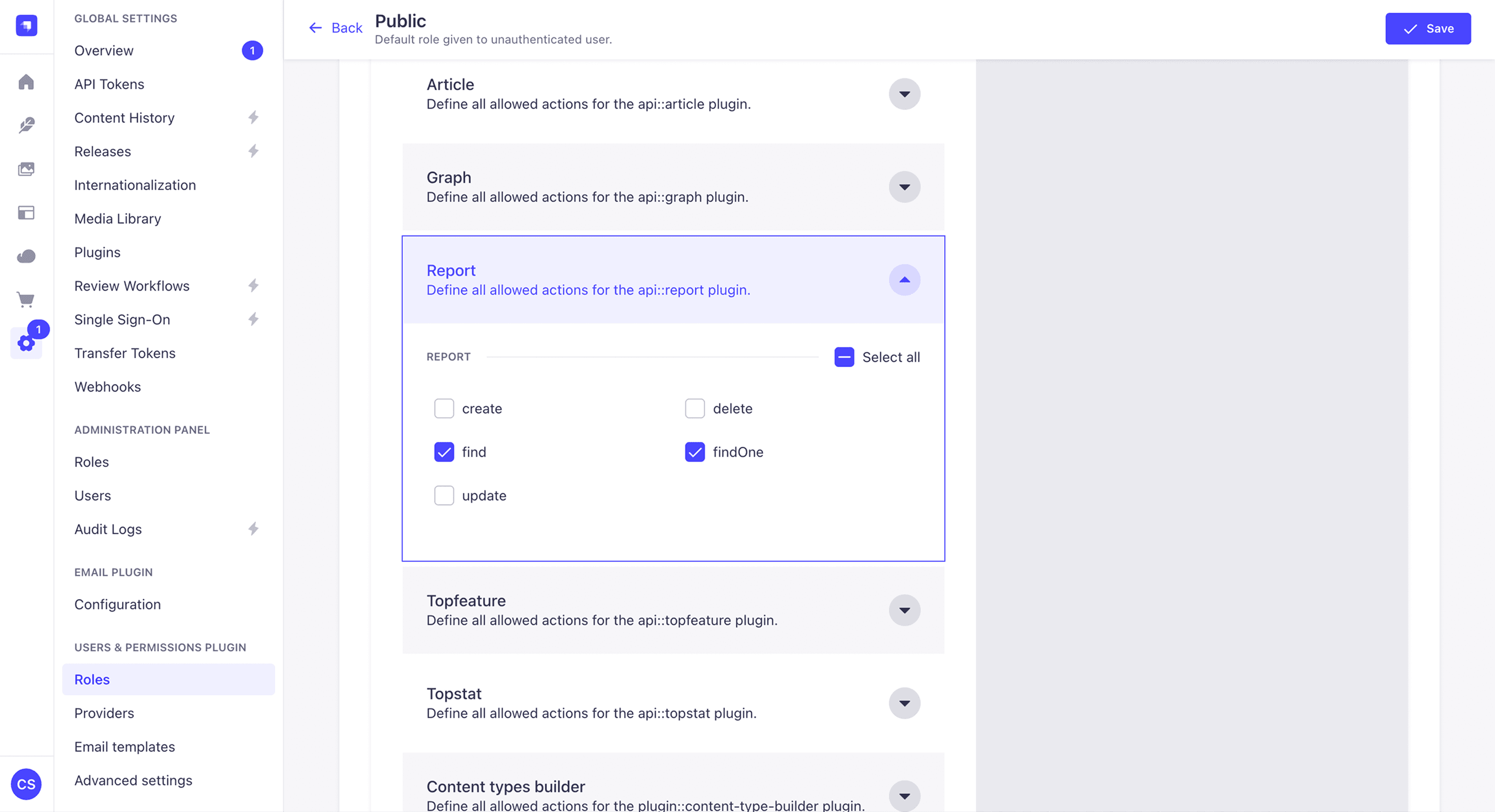
Now, let's allow API access to your blog to allow you to access the blog posts via your API on the frontend. To do that, click on Settings > Roles > Public.
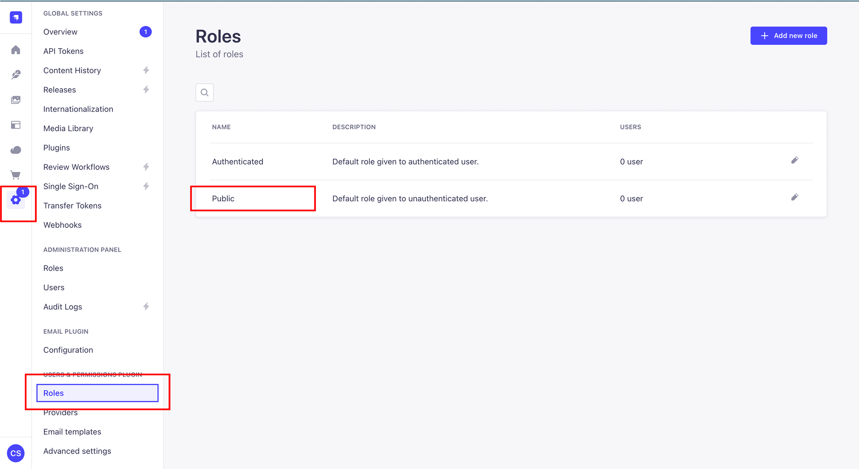
Then expand the Report and click on find and findOne.
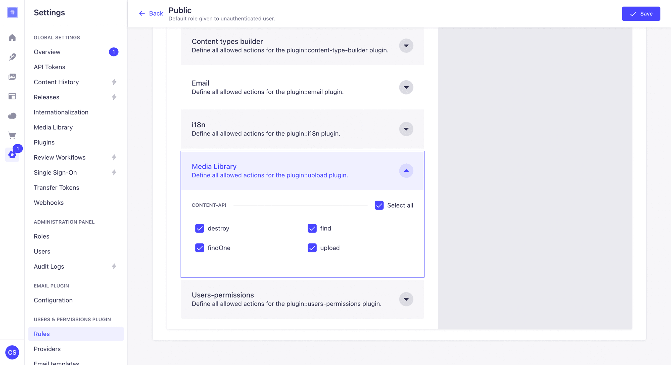
Scroll downwards and do the same for the media library Permission tab to enable us to upload images to our Strapi backend.
Next.js Frontend Setup
Strapi supports frontend frameworks including React, Next.js, Gatsby, Svelte, Vue.js etc. but for this application you will be making use of Next.js.
In a new terminal session, change the directory to pdf-engine and run the following command:
npx create-next-app@latestOn installation, you'll see some prompts. Name your project frontend and select Typescript, app router with Tailwind, and other config of your choice.
Install Necessary Dependencies
Add the following dependencies to your Next.js frontend app, you will use them later:
cd frontend
npm install zod puppeteer recharts @asteasolutions/zod-to-openapi- Zod: A TypeScript schema validation library that ensures data matches expected structures.
- Puppeteer: A Node.js library for automating and controlling Chrome/Chromium, ideal for tasks like scraping, PDF generation, and automated testing.
- Recharts: A composable charting library for React, built with SVG, perfect for creating interactive and responsive data visualizations.
- @asteasolutions/zod-to-openapi: A tool that converts Zod schemas into OpenAPI specifications, keeping API documentation in sync with your validation logic
Folder Structure
The directory structure looks like this:
.
├── README.md
├── app
│   ├── api
│   │   ├── docs
│   │   │   └── route.ts
│   │   └── pdf
│   │       └── route.ts
│   ├── favicon.ico
│   ├── globals.css
│   ├── layout.tsx
│   └── page.tsx
├── component
│   ├── annual-returns.tsx
│   ├── article-count-ratio.tsx
│   ├── details-card.tsx
│   ├── last-page.tsx
│   ├── page.tsx
│   └── portfolio-about.tsx
├── eslint.config.mjs
├── lib
│   ├── http.ts
│   ├── openapi.ts
│   ├── schemas
│   │   └── pdf.ts
│   └── util.ts
├── modules
│   ├── about-page.tsx
│   ├── front-page.tsx
│   └── return-details-page.tsx
├── next-env.d.ts
├── next.config.ts
├── package-lock.json
├── package.json
├── postcss.config.mjs
├── public
│   ├── file.svg
│   ├── globe.svg
│   ├── next.svg
│   ├── vercel.svg
│   └── window.svg
└── tsconfig.json
Set Up your Frontend CSS Rules
Open the app/globals.css file in your Next.js project and replace its contents with the following code:
1. Import Tailwind
@import 'tailwindcss'Brings in Tailwind CSS so you can use its utility classes along with your custom print styles.
2. Set Print Page
@page {
  size: A4;
  margin: 0;
}
The size: A4; sets the print page size to standard A4 dimensions (210mm × 297mm). And the margin: 0; removes default printer margins so your content fills the page edge-to-edge (printer permitting).
3. HTML & Body reset
html,
body {
  width: 210mm;
  height: 297mm;
  margin: 0;
  padding: 0;
  counter-reset: page;
}
The width/height forces the document’s physical dimensions to A4 size for accurate print scaling. The margin:0; padding: 0; Removes browser default spacing. And counter-reset: page; Initializes a CSS counter named page at zero, so you can number pages.
4. Page number counter
.pageNumber::after {
  counter-increment: page;
  content: counter(page);
}
The style above targets elements with .pageNumber and appends the current page number using CSS counters. The counter-increment: page; increases the page counter each time the element appears. And content: counter(page); inserts the counter’s value into the document.
5. Page break handling
.print-page {
  break-after: page;
  page-break-after: always;
}

.print-page:last-of-type {
  page-break-after: auto;
}
The .print-page forces a hard page break after this element when printing. And the .print-page:last-of-type Removes the page break for the very last page, so you don’t get an empty page at the end.
6. @media print rules
@media print {
  html,
  body {
    width: 210mm;
    height: 297mm;
  }

  * {
    -webkit-print-color-adjust: exact !important;
    print-color-adjust: exact !important;
  }

  .pageNumber::after {
    counter-increment: page;
    content: counter(page);
  }
}
The html and body elements enforce the A4 size specifically for print mode. The -webkit-print-color-adjust: exact / print-color-adjust: exact: ensures colors are printed exactly as defined, preventing browsers from lightening or ignoring background colors. And .pageNumber::after Repeats the counter rule inside @media print to ensure page numbering still works during print rendering.
Set up environment variables
Create a .env file in the root of your frontend directory and add the following environment variables:
NEXT_PUBLIC_STRAPI_URL=http://localhost:1337/Building Core Application Components and Data Flow
This section explains how the application’s core components work together to manage data, display dynamic content, and generate PDFs.
1. Content Management with Strapi
The application integrates with Strapi CMS running on localhost:1337 to fetch dynamic content:
// Path: ./lib/http.ts

export const getAllReports = async () => {
  const res = await fetch(`http://localhost:1337/api/reports?populate=*`);
  return res.json();
};

export const getSingleReport = async (id: number | string) => {
  const res = await fetch(
    `http://localhost:1337/api/reports/${id}?populate[0]=articles.picture&populate[1]=topfeature.icon&populate[2]=graphs&populate[3]=topstats&populate[4]=about`
  );
  return res.json();
};

//lib/util.ts
export const getImageUrl = (url: string) => {
  return `${process.env.NEXT_PUBLIC_STRAPI_URL}${url}`;
};
This design allows content editors to manage reports, articles, and statistics through Strapi's intuitive interface, while the Next.js application consumes this content via REST API calls.
2. Dynamic Page Composition
This is the main page (app/page.tsx) where you will put all the pages together, with each wrapped in the page component.
Each page section is a modular component that receives specific data from Strapi, enabling flexible content layouts and easy maintenance.
// Path: ./app/page.tsx

import { LastPage } from '@/component/last-page';
import { Page } from '@/component/page';
import { getSingleReport } from '@/lib/http';
import { AboutPage } from '@/modules/about-page';
import { FrontPage } from '@/modules/front-page';
import { ReturnDetailsPage } from '@/modules/return-details-page';

export default async function Home({
  searchParams,
}: {
  searchParams: { documentId: string };
}) {
  const singleReport = await getSingleReport(searchParams?.documentId);

  return (
    <>
      <Page noPadding>
        <FrontPage
          title={singleReport?.data?.title}
          about={singleReport?.data?.about}
        />
      </Page>
      <Page>
        <AboutPage
          about={singleReport?.data?.about}
          articles={singleReport?.data?.articles}
        />
      </Page>
      <Page>
        <ReturnDetailsPage
          topStats={singleReport?.data?.topstats}
          graph={singleReport?.data?.graphs}
          topFeatures={singleReport?.data?.topfeature}
        />
      </Page>
      <Page noPadding>
        <LastPage />
      </Page>
    </>
  );
}
3. PDF Generation Engine
The heart of the application lies in the PDF generation API (app/api/pdf/route.ts), which leverages Puppeteer for high-quality document creation. See code in the "Next.js + Puppeteer: Generate and Download PDFs via API Routes" section of "PDF Generation Implementation" heading.
Key Features of the PDF Engine
- Route-based Generation: Accepts a
routequery parameter to generate PDFs from any frontend route - Print-Optimized Rendering: Uses
page.emulateMediaType('print')for optimal PDF output - A4 Format Support: Configures viewport and page settings for standard document formats
- Font Loading Optimization: Ensures all fonts are loaded before PDF generation
- Error Handling: Comprehensive error handling with proper browser cleanup
Browser Configuration:
The application uses optimized Puppeteer arguments for production environments:
- Disables unnecessary features for performance
- Sets specific window dimensions (595x842 for A4)
- Configures font rendering and color profiles
- Disables audio and speech APIs
Building Application Data Visualization
This section shows how the UI is brought together from small, reusable components and how they come to be a printable report. Skim the visuals, then check the code to see props and structure.
What’s below:
- Reusable chart/content blocks built with Recharts and simple React components
- Page-level modules that assemble those blocks into A4-ready sections
- Short, high-signal explanations for every image and code sample
1. App layout
In the code block below, we gave our app its default layout and set Geist as the font; this layout here affects other pages in the Next app.
// Path: ./app/layout.tsx
import type { Metadata } from 'next';
import { Geist, Geist_Mono } from 'next/font/google';
import './globals.css';
const geistSans = Geist({
variable: '--font-geist-sans',
subsets: ['latin'],
});
const geistMono = Geist_Mono({
variable: '--font-geist-mono',
subsets: ['latin'],
});
export const metadata: Metadata = {
title: 'Create Next App',
description: 'Generated by create next app',
};
export default function RootLayout({
children,
}: Readonly<{
children: React.ReactNode;
}>) {
return (
<html lang='en'>
<body
className={`${geistSans.variable} ${geistMono.variable} antialiased`}
>
{children}
</body>
</html>
);
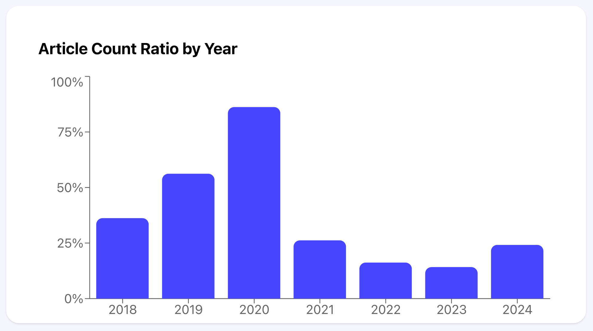
}2. Article count ratio Component
Explanation
- Purpose: Small, focused chart for “Article Count Ratio by Year”.
- Props:
{ data: { year: string; ratio: number }[] }. - Notes: Self-contained sizing and style to keep print output consistent.
Code walkthrough
- "use client": Recharts renders on the client; needed for this chart.
ResponsiveContainer: Keeps the chart responsive on screen and stable in print.BarChart/Bar: Plotsratio; rounded corners (radius) look better when printed.XAxis/YAxis: Minimal axis labels;unit='%' adds a percent suffix.Tooltip: Helpful in the browser; ignored by Puppeteer when generating PDF.
// Path: ./component/article-count-ratio

'use client';

import {
  BarChart,
  Bar,
  XAxis,
  YAxis,
  Tooltip,
  ResponsiveContainer,
} from 'recharts';

export type IArticleRatioData = {
  year: string;
  ratio: number;
};

export default function ArticleCountRatioChart({
  data,
}: {
  data: IArticleRatioData[];
}) {
  return (
    <div className='w-full h-[400px] bg-white p-10 rounded-2xl shadow'>
      <h2 className='text-xl font-bold mb-4'>Article Count Ratio by Year</h2>
      <ResponsiveContainer width='100%' height='100%'>
        <BarChart data={data}>
          <XAxis dataKey='year' />
          <YAxis unit='%' />
          <Tooltip />
          <Bar dataKey='ratio' fill='#4845fe' radius={[8, 8, 0, 0]} />
        </BarChart>
      </ResponsiveContainer>
    </div>
  );
}
3. Annual returns Component
Explanation
- Purpose: Section wrapper around the chart with heading and spacing.
- Use: Drop into pages to present annual performance.
Code walkthrough
- Branding row: Simple logo above the chart for visual anchoring.
- Composition: Forwards
datato the chart without transforming it.
// Path: ./component/annual-returns

import ArticleCountRatioChart, {
  IArticleRatioData,
} from '@/component/article-count-ratio';
import React from 'react';

export const AnnualReturns = ({ data }: { data: IArticleRatioData[] }) => {
  return (
    <div className='w-full'>
      <div className='flex items-center mb-10'>
        <img
          src='https://strapi.io/assets/strapi-logo-dark.svg'
          height={42}
          alt=''
        />
      </div>

      <ArticleCountRatioChart data={data} />
    </div>
  );
};
4. Details card component
Explanation
- Purpose: Compact card for an item (e.g., article) with image and dates.
- Notes: Fixed image box ensures alignment in print; date formatting handled locally.
Code walkthrough
formatDate(...): Shared function for human-readable dates.- Left column: Fixed-size media box prevents uneven rows when images vary.
- Right column: Title and small, muted meta details for clean print hierarchy.
// Path: ./component/details-card

import React from 'react';

export const DetailsCard = ({
  title,
  img,
  createdAt,
  updatedAt,
}: {
  title: string;
  img?: string;
  updatedAt: Date;
  createdAt: Date;
}) => {
  const formatDate = (date: Date) => {
    return new Intl.DateTimeFormat('en-US', {
      month: 'long',
      day: 'numeric',
      year: 'numeric',
    }).format(new Date(date));
  };

  return (
    <div className='flex gap-2 my-2 bg-white border border-gray-200 rounded-md overflow-hidden'>
      <div className='w-[200px] h-[100px] flex-shrink-0'>
        {img && (
          <img src={img} alt='img-fd' className='w-full h-full object-cover' />
        )}
      </div>
      <div className='p-3 text-[#032b69] flex flex-col justify-center'>
        <h3 className='text-lg font-semibold'>{title}</h3>
        <p className='text-[10pt] text-gray-500'>
          {formatDate(createdAt)} · Updated {formatDate(updatedAt)}
        </p>
      </div>
    </div>
  );
};
5. Last page component
Explanation
- Purpose: Closing page with brand CTA and supportive copy.
- Notes: Uses brand artwork, single CTA, and supportive bullet blocks.
Code walkthrough
- Background block: Inline
backgroundImagekeeps the hero visual in print mode. - CTA: High-contrast button for clear calls-to-action.
- Benefit items: Repeated pattern (icon + heading + paragraph) improves skimmability.
// Path: ./component/last-page

import Link from 'next/link';
import React from 'react';

export const LastPage = () => {
  return (
    <div className='h-full w-full bg-[#f6f6ff] relative overflow-hidden'>
      <div className='p-8'>
        <img
          src='https://strapi.io/assets/strapi-logo-dark.svg'
          height={42}
          alt=''
        />
        <div
          style={{
            backgroundImage:
              'url(https://strapi.io/assets/use-case/strapi5_hero.svg)',

            backgroundColor: '#181826',
          }}
          className='text-white my-8 p-4 rounded-md'
        >
          <h4 className='text-[25pt] font-bold leading-normal'>
            Build modern websites with the most customizable Headless CMS
          </h4>
          <p className='text-sm leading-5 mt-3 w-[90%]'>
            Open-source Headless CMS for developers that makes API creation
            easy, and supports your favorite frameworks. Customize and host your
            projects in the cloud or on your own servers.
          </p>
          <Link
            href='https://strapi.io/'
            className='cursor-pointer'
            target='_blank'
          >
            <button className='bg-[#4845fe] text-white p-2 px-4 mt-4 rounded-md font-[500]'>
              Get started
            </button>
          </Link>
        </div>
        <div>
          {[
            {
              title: 'Improved Productivity',
              description:
                'An intuitive interface simplifies content creation, so your marketing team can work more efficiently, freeing up your time for more complex development tasks.',
            },
            {
              title: 'Simplify Content Editing and Layouts',
              description:
                'Dynamic zones allow marketers to create adaptable and creative designs. This means less back-and-forth with developers for frontend changes.',
            },
            {
              title: 'Internationalization and Media Management',
              description:
                'Publish content in multiple languages with I18N and organize media files using the Media Library.',
            },
          ].map((item) => (
            <div
              key={item?.title}
              className='bg-[#fff] border border-[#e9e9ff] mb-3 p-6 rounded-md'
            >
              <div className='flex gap-2'>
                <img
                  src='https://delicate-dawn-ac25646e6d.media.strapiapp.com/Check_5f2ef36f5a.svg'
                  alt=''
                />
                <h4 className='text-[#292875] text-[15pt] font-bold'>
                  {item?.title}
                </h4>
              </div>
              <p className='text-[10pt] text-[#292875]'>{item?.description}</p>
            </div>
          ))}
        </div>
      </div>

      <img
        src='https://delicate-dawn-ac25646e6d.media.strapiapp.com/Customization_6abc7697f5.png'
        alt=''
        className='absolute'
        style={{ bottom: -370 }}
      />
    </div>
  );
};
6. Page component
Explanation
- Purpose: Print-friendly A4 wrapper. Every section lives inside
Page. - Prop:
noPaddingfor full-bleed layouts when needed.
Code walkthrough
- A4 canvas sizing:
w-[210mm] h-[297mm]aligns with the print CSS rules. - Page counter:
.pageNumberleverages counters set in global CSS. - Padding control: Avoids clipping edge-to-edge artwork.
// Path: ./component/page
import React, { ReactNode } from 'react';
export const Page = ({
children,
noPadding,
}: {
children: ReactNode;
noPadding?: boolean;
}) => {
return (
<div
className={
'print-page bg-[#f6f6ff] relative w-[210mm] h-[297mm] box-border ' +
(noPadding ? 'p-0' : 'p-8')
}
>
<div className='h-full w-full'>{children}</div>
<div className='pageNumber absolute bottom-4 right-8 text-xs text-gray-500 print:block'>
Page <span className='inline-block'></span>
</div>
</div>
);
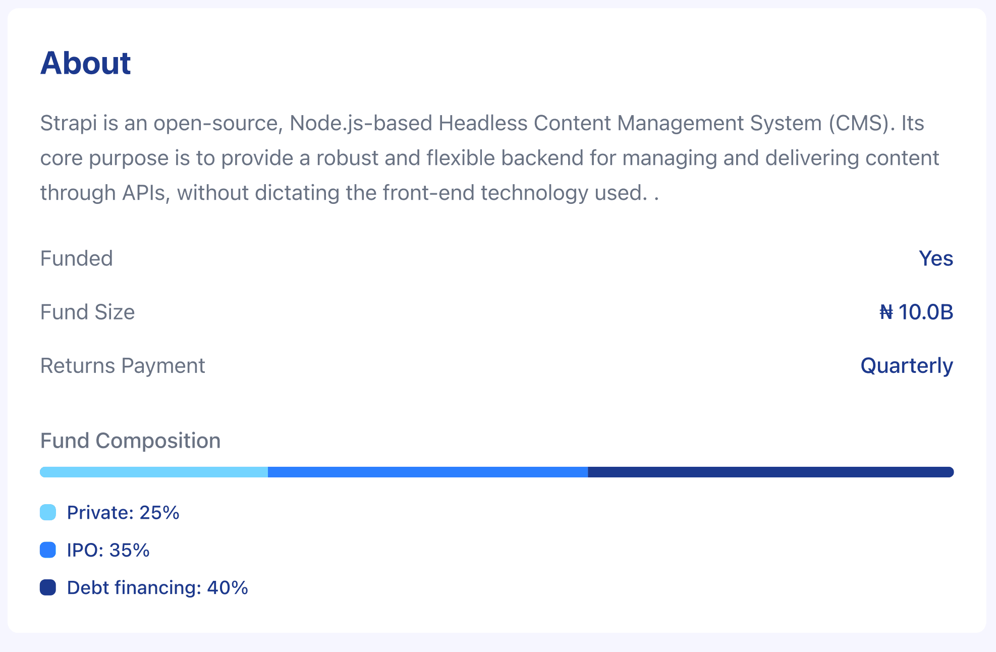
};7. About component
Explanation
- Purpose: Shows “About” description and key attributes in a neat card.
- Inputs:
aboutobject; values formatted for compact print.
Code walkthrough
Infosub-component: Centralizes label/value alignment to avoid duplication.- Truncation + max width: Prevents long values from overflowing in print.
// Path: ./component/portfolio-about

import React, { FC } from 'react';

export const PortfolioAbout: FC<{
  about: {
    description: string;
    funded: boolean;
    returns: string;
    size: string;
  };
}> = async ({ about }) => {
  return (
    <div className='mt-10 p-6 bg-white rounded-lg'>
      <h2 className='text-2xl font-bold text-blue-900 mb-4'>About</h2>
      <p className='text-gray-500 mb-6 leading-relaxed'>{about?.description}</p>

      <div className='space-y-4'>
        <Info label='Funded' value={about?.funded ? 'Yes' : 'No'} />
        <Info label='Fund Size' value={`₦ ${about?.size}`} />
        <Info label='Returns Payment' value='Quarterly' />
      </div>
    </div>
  );
};

const Info = ({ label, value }: { label: string; value: string }) => (
  <div className='flex justify-between text-gray-500'>
    <span>{label}</span>
    <span className='text-blue-900 font-medium truncate max-w-[150px] text-right'>
      {value}
    </span>
  </div>
);
8. Front page module
You’ll assemble these into full pages via the modules folder.
Explanation
- Purpose: Hero/front page of the PDF with title, short description, and CTA.
- Notes: Background artwork declared in inline style for print stability.
Code walkthrough
- Inline background style: Ensures Puppeteer includes the hero image.
- Large display title: Establishes typographic hierarchy for first-page impact.
- CTA via
Link: Easy to replace with your own destination.
// Path: ./modules/front-page.tsx

import Link from 'next/link';
import React from 'react';

interface IFrontPageProps {
  title: string;
  about: {
    description: string;
    funded: boolean;
    returns: string;
    size: string;
  };
}

export const FrontPage = ({ title, about }: IFrontPageProps) => {
  return (
    <div
      style={{
        backgroundImage:
          'url(https://strapi.io/assets/use-case/strapi5_hero.svg)',
      }}
      className='bg-[#181826] text-white w-full h-full relative overflow-hidden'
    >
      <div className='p-8'>
        <h4 className='text-[48pt] pt-[100px] font-bold leading-16'>{title}</h4>
        <p className='text-sm leading-5 mt-3 w-[80%]'>{about?.description}</p>
        <Link
          href='https://strapi.io/'
          className='cursor-pointer'
          target='_blank'
        >
          <button className='bg-[#4845fe] text-white p-2 px-4 mt-4 rounded-md font-[500]'>
            Get started
          </button>
        </Link>
      </div>
      <img
        src='https://delicate-dawn-ac25646e6d.media.strapiapp.com/Content_Management_cfd037fcc2.png'
        alt='cowry-test'
        style={{
          //  scale: 2.5,
          position: 'absolute',
          bottom: -150,
          right: 0,
        }}
      />
    </div>
  );
};
9. About page module
Explanation
- Purpose: Combines “About” with a list of article cards under a section header.
- Flow: Logo → About card → “Top articles” list using
DetailsCard.
Code walkthrough
getImageUrl(...): Resolves Strapi media URLs to absolute paths.- Mapping
articles: Each item becomes a stable-widthDetailsCardrow.
// Path: ./modules/about-page.tsx

import { DetailsCard } from '@/component/details-card';
import { PortfolioAbout } from '@/component/portfolio-about';
import { getImageUrl } from '@/lib/util';
import React from 'react';

export const AboutPage = ({
  articles,
  about,
}: {
  articles: Array<{
    title: string;
    createdAt: Date;
    updatedAt: Date;
  }>;
  about: {
    description: string;
    funded: boolean;
    returns: string;
    size: string;
  };
}) => {
  return (
    <div>
      <div className='flex items-center'>
        <img
          src='https://strapi.io/assets/strapi-logo-dark.svg'
          height={28}
          alt=''
        />
      </div>
      <PortfolioAbout about={about} />
      <h2 className='text-2xl font-bold text-blue-900 mt-8 my-4'>
        Top articles last year
      </h2>
      <div className='grid grid-cols-1'>
        {articles?.map((details: any, item) => (
          <DetailsCard
            img={getImageUrl(details?.picture?.url as string)}
            {...details}
            key={item}
          />
        ))}
      </div>
    </div>
  );
};
10. Return Details Page
Explanation
- Purpose: Composite section featuring the returns chart, key stats, and top features.
- Notes: Simple grid layouts that also print cleanly on A4.
Code walkthrough
- Chart first: Reuses
AnnualReturnsto set context with a quick visual. - 2-col stats grid: Clear, compact layout for key metrics.
- 3-col features grid: Icon + title + description blocks; images via
getImageUrl.
// Path: ./modules/return-details-page

import { AnnualReturns } from '@/component/annual-returns';
import { IArticleRatioData } from '@/component/article-count-ratio';
import { getImageUrl } from '@/lib/util';
import React from 'react';

export const ReturnDetailsPage = ({
  topStats,
  graph,
  topFeatures,
}: {
  topStats: Array<{ title: string; description: string }>;
  graph: Array<IArticleRatioData>;
  topFeatures: Array<{
    icon: {
      url: string;
    };
    title: string;
    description: string;
  }>;
}) => {
  return (
    <div>
      <AnnualReturns data={graph} />
      <h2 className='text-2xl font-bold text-blue-900 mt-8 mb-2'>Top stats</h2>
      <div className='grid grid-cols-2 gap-4'>
        {topStats?.map((item) => (
          <div
            key={item?.title}
            className='bg-white p-2 rounded-md border border-gray-100'
          >
            <h4 className='text-[#ac56f5] text-xl font-black'>
              {item?.description}
            </h4>
            <p className='text-[#666687] text-[10pt]'>{item?.title}</p>
          </div>
        ))}
      </div>
      <h2 className='text-2xl font-bold text-blue-900 mt-6 mb-2'>
        Top features
      </h2>
      <div className='grid grid-cols-3 gap-4'>
        {topFeatures?.map((feature, item) => (
          <div key={item} className='bg-white p-3 rounded-md'>
            <div className='flex gap-2 items-center mb-3'>
              <img
                src={getImageUrl(feature?.icon?.url)}
                alt=''
                width={30}
                height={30}
              />
              <h6 className='text-[12pt] text-[#292875] font-bold'>
                {feature?.title}
              </h6>
            </div>
            <p className='text-[#666687] text-[8pt]'>{feature?.description}</p>
          </div>
        ))}
      </div>
    </div>
  );
};
PDF Generation Implementation: Next.js API/Server modules for PDF Generation
PDF Generation Flow
You will be building a dummy Strapi end-of-year report PDF with top articles, top stats, etc.
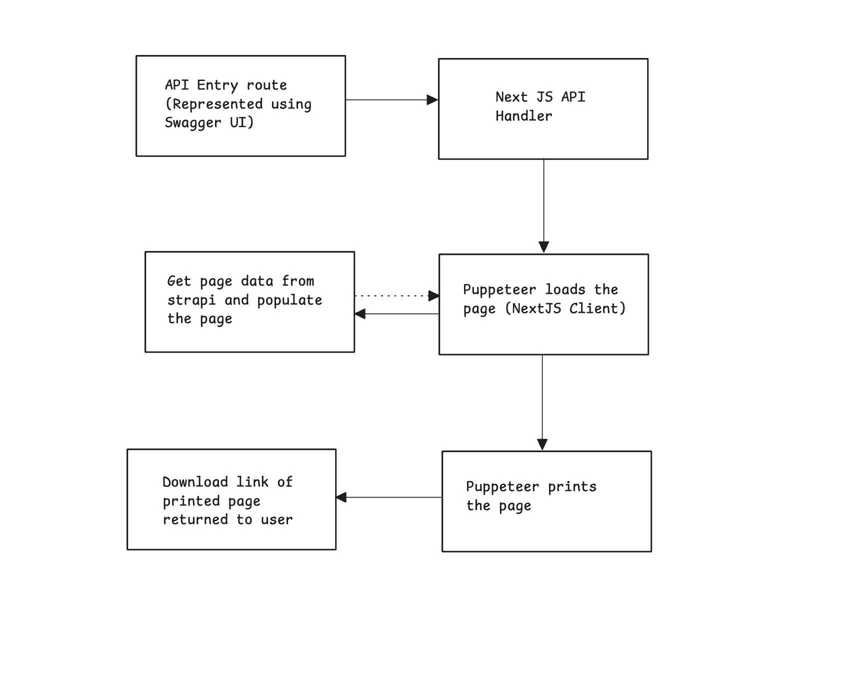
TLDR; A request comes in → Next.js figures out the target page → Puppeteer renders it → PDF gets generated → PDF gets sent back.
- API Entry point (Swagger UI): The flow starts when a request hits our API endpoint in the Next.js app. The request usually carries parameters like which page (route) you want to render and the specific data (e.g., document ID).
- Next.js Handler: Next.js provides the handler that interprets the request and prepares the environment. Here, you extract query parameters (route and document ID) and build the target URL that Puppeteer should load.
- Puppeteer Loads the Page: Puppeteer opens the target URL you built earlier. That page itself pulls content from Strapi (our CMS), so Puppeteer is effectively loading a fully dynamic webpage just like a real user’s browser would. Puppeteer waits until the page has finished loading all fonts, styles, and data before moving forward.
- Puppeteer Prints the Page: Once the page looks exactly like it should, Puppeteer switches into “print mode.” It then generates a PDF version of the page, keeping things like layout, fonts, and background colors intact. This is equivalent to you (Ctrl P) Print - Save as PDF in Chrome, but automated.
- Download Link Sent to User: Finally, the server responds with the PDF file as an attachment. The browser prompts the user to download it (output.pdf).
Next.js + Puppeteer: Generate and Download PDFs via API Routes
In this module, you will use Next.js api features to process the Puppeteer, create a route for generating the API, and send it back to the users.
Let's dive into the PDF generation route.
// Path: ./app/api/pdf/route.ts

import { NextRequest } from 'next/server';
import puppeteer from 'puppeteer';

const browserArgs = [
  '--no-sandbox',
  '--disable-setuid-sandbox',
  '--disable-dev-shm-usage',
  '--disable-gpu',
  '--disable-software-rasterizer',
  '--disable-extensions',
  '--disable-features=IsolateOrigins,site-isolation-trials',
  '--no-zygote',
  '--font-render-hinting=medium',
  '--force-color-profile=srgb',
  '--window-size=595,842',
  '--hide-scrollbars',
  '--mute-audio',
  '--disable-speech-api',
];

export async function GET(req: NextRequest) {
  const url = new URL(req.url);
  const route = url.searchParams.get('route') || '/';
  const documentId = url.searchParams.get('documentId') || '';
  const targetUrl = `http://localhost:3000${route}?documentId=${documentId}`;

  const browser = await puppeteer.launch({
    headless: 'shell',
    args: browserArgs,
    userDataDir: '/tmp/puppeteer-cache',
  });
  try {
    const page = await browser.newPage();
    await page.emulateMediaType('print');
    await page.setViewport({ width: 595, height: 842 });
    await page.evaluate(() => document.fonts.ready);
    await page.goto(targetUrl, {
      waitUntil: 'networkidle0',
      timeout: 5 * 60 * 6000,
    });

    const pdfBuffer = await page.pdf({
      format: 'A4',
      printBackground: true,
      margin: { top: 0, right: 0, bottom: 0, left: 0 },
      preferCSSPageSize: true,
    });

    await browser.close();

    return new Response(pdfBuffer, {
      headers: {
        'Content-Type': 'application/pdf',
        'Content-Disposition': `attachment; filename="output.pdf"`,
      },
    });
  } catch (err) {
    await browser.close();
    return new Response(`Error generating PDF: ${err}`, { status: 500 });
  } finally {
    await browser?.close();
  }
}
Our function in the API route exposes a GET endpoint in the Next.js app (App Router) then it;
- Reads the route (e.g.
/invoice) and adocumentIdquery param. - Launches Puppeteer with a hardened set of Chromium flags tailored for server/cloud environments.
- Opens a real, headless Chrome page at
http://localhost:3000{route}?documentId=. - Forces print media rules, waits for fonts and network to settle, and then prints to PDF on an A4 canvas with background graphics.
- Streams the resulting PDF back to the client with proper response headers.
Why these Chromium flags?
Serverless and containerized setups can behave unpredictably. These flags help Chrome run more reliably while keeping it lightweight.
Visit Chromium Commandline Flags to learn more.
The print-to-PDF Flow Configurations
page.emulateMediaType('print'): Forces CSS @media print rules—vital for page breaks, print-specific layouts, and hiding UI.page.setViewport({ width: 595, height: 842 }): Aligns the rendering area with A4 dimensions at 72 DPI. This prevents layout reflow between screen and print.- Ensure that webfonts have fully loaded before rendering. Without this, you’ll get FOUT/FOIT or incorrect text metrics in the PDF:
await page.evaluate(() => document.fonts.ready);networkidle0waits until there are 0 network connections for at least 500 ms—useful when your page fetches data (e.g., from Strapi) before rendering.
await page.goto(targetUrl, {
  waitUntil: 'networkidle0',
  timeout: 5 * 60 * 6000,
});- Generate a PDF in A4 format that includes backgrounds and colors, uses zero margins since the layout handles its own spacing, respects any CSS @page size rules (falling back to A4 if none are set), and return it with headers specifying Content-Type: application/pdf and Content-Disposition: attachment; filename="output.pdf" to prompt a downloadable file with a friendly name.
await page.pdf({
format: 'A4',
printBackground: true,
margin: { top: 0, right: 0, bottom: 0, left: 0 },
preferCSSPageSize: true,
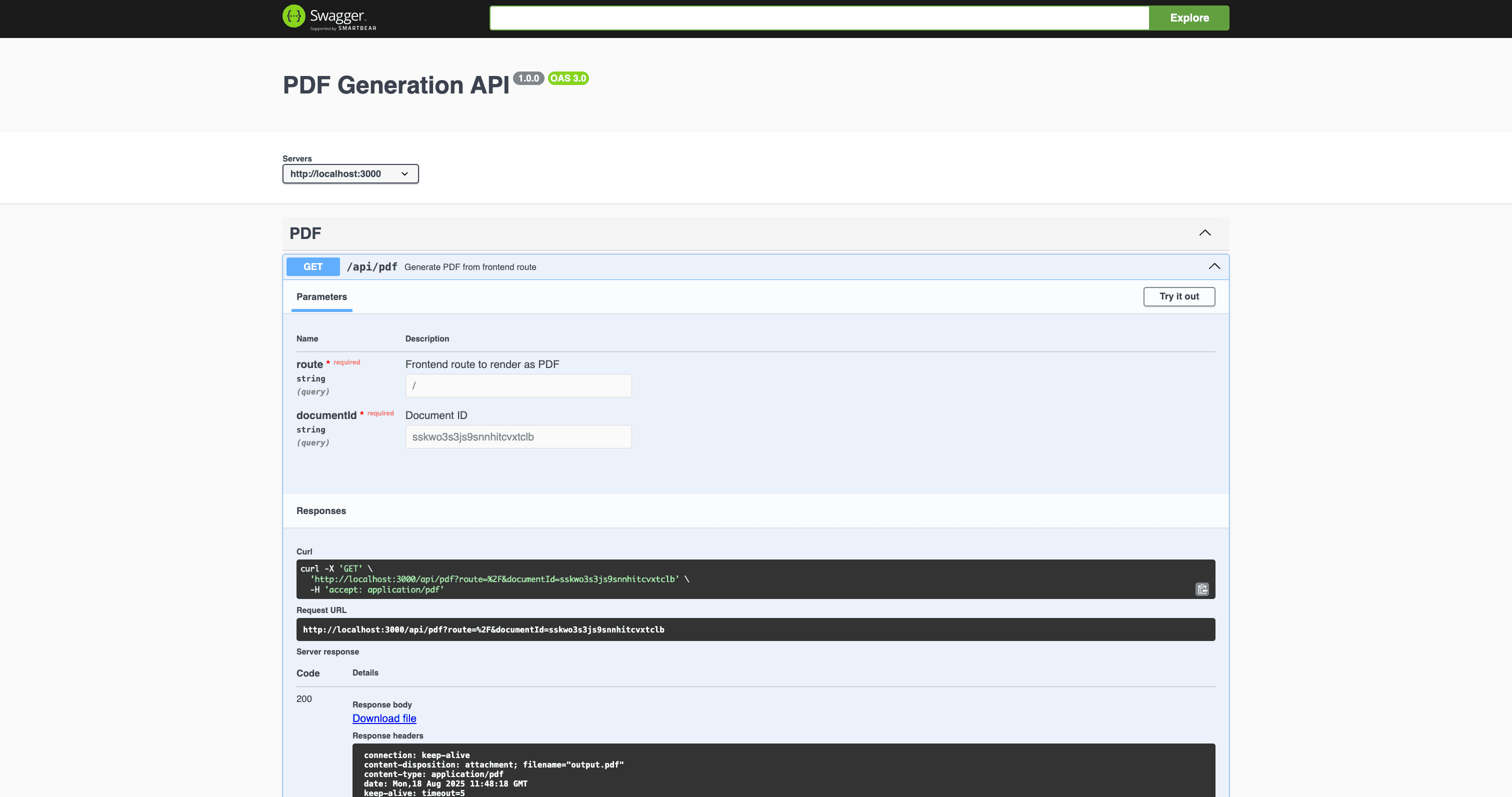
});API Documentation with Swagger: PDF Routes
In this section, you will be documenting the routes using Swagger to make this engine accessible and serve it via the API route.
Validation and Documentation with Zod
You are defining a Zod schema for query parameters in a Next.js API endpoint. This schema is also annotated so it can be turned into an OpenAPI spec for documentation.
// Path: ./lib/schema/pdf.ts

import { z } from 'zod';
import { extendZodWithOpenApi } from '@asteasolutions/zod-to-openapi';

extendZodWithOpenApi(z);

export const PdfQuerySchema = z.object({
  route: z.string().openapi({
    description: 'Frontend route to render as PDF',
    example: '/invoice',
  }),
  documentId: z.string().openapi({
    description: 'Document ID',
    example: '123',
  }),
});
This code does the following:
- Zod: A TypeScript-first schema validation library. Let's define the shape of data and validate it at runtime.
- @asteasolutions/zod-to-openapi: A library that lets us convert Zod schemas into OpenAPI-compatible schemas, so your validation rules automatically become API documentation.
extendZodWithOpenApi(z);: This function extends Zod so can attach .openapi({...}) metadata to your schemas. Without this, Zod wouldn’t know how to output OpenAPI descriptions/examples.z.object({...})defines an object schema. In this case, the query parameters must include:route: must be a string, with OpenAPI description and example provided. Example: /invoicedocumentId: must be a string, also documented with OpenAPI metadata. E.g. 123.
Create Utility function to Generate OpenAPI 3.0 Specification
The code below defines a utility function generateOpenApiSpec() that automatically generates the OpenAPI 3.0 specification document for your endpoint that creates PDFs.
It uses the @asteasolutions/zod-to-openapi library, which converts Zod schemas into OpenAPI-compliant documentation.
// Path: ./lib/openapi.ts

import {
  OpenAPIRegistry,
  OpenApiGeneratorV3,
} from '@asteasolutions/zod-to-openapi';
import { PdfQuerySchema } from '@/lib/schemas/pdf';

export function generateOpenApiSpec() {
  const registry = new OpenAPIRegistry();

  registry.registerPath({
    method: 'get',
    path: '/api/pdf',
    request: {
      query: PdfQuerySchema,
    },
    responses: {
      200: {
        description: 'PDF generated successfully',
        content: {
          'application/pdf': {
            schema: { type: 'string', format: 'binary' },
          },
        },
      },
      400: {
        description: 'Invalid request',
      },
    },
    summary: 'Generate PDF from frontend route',
    tags: ['PDF'],
  });

  const generator = new OpenApiGeneratorV3(registry.definitions);

  return generator.generateDocument({
    openapi: '3.0.0',
    info: {
      title: 'PDF Generation API',
      version: '1.0.0',
    },
    servers: [{ url: 'http://localhost:3000' }],
  });
}
The code above contains the following:
OpenAPIRegistry: Lets you register schemas, routes, and responses.OpenApiGeneratorV3: Converts the registry into a valid OpenAPI v3 document.PdfQuerySchema: The Zod schema you created earlier for query validation.Method & Path: Defines a GET /api/pdf route.request.query: Uses your Zod schema (PdfQuerySchema) for validation + documentation.responses: 200 → A successful response returns a PDF (application/pdf) in binary format. 400 → Client error (invalid query params).summary&tags: Human-readable info for Swagger UI.Swagger UI: This creates a JSON object that represents your API in OpenAPI 3.0 format.
You can now properly define our documentation schema here. And export the generateOpenApiSpec to be used as our spec in the SwaggerUIBundle, as seen below.
// Path: ./app/api/docs/route.ts

import { generateOpenApiSpec } from '@/lib/openapi';
import { NextResponse } from 'next/server';

export async function GET() {
  const openApiSpec = generateOpenApiSpec();

  const htmlContent = `
    <!doctype html>
    <html>
      <head>
        <title>PDF Generation engine</title>
        <meta charset="utf-8" />
        <meta name="viewport" content="width=device-width, initial-scale=1" />
        <link rel="stylesheet" type="text/css" href="https://unpkg.com/swagger-ui-dist@5.10.5/swagger-ui.css" />
        <style>
          html {
            box-sizing: border-box;
            overflow: -moz-scrollbars-vertical;
            overflow-y: scroll;
          }
          *, *:before, *:after {
            box-sizing: inherit;
          }
          body {
            margin:0;
            background: #fafafa;
          }
        </style>
      </head>
      <body>
        <div id="swagger-ui"></div>
        <script src="https://unpkg.com/swagger-ui-dist@5.10.5/swagger-ui-bundle.js"></script>
        <script src="https://unpkg.com/swagger-ui-dist@5.10.5/swagger-ui-standalone-preset.js"></script>
        <script>
          window.onload = function() {
            const ui = SwaggerUIBundle({
              spec: ${JSON.stringify(openApiSpec)},
              dom_id: '#swagger-ui',
              deepLinking: true,
              presets: [
                SwaggerUIBundle.presets.apis,
                SwaggerUIStandalonePreset
              ],
              plugins: [
                SwaggerUIBundle.plugins.DownloadUrl
              ],
              layout: "StandaloneLayout"
            });
          };
        </script>
      </body>
    </html>
  `;

  return new NextResponse(htmlContent, {
    headers: {
      'Content-Type': 'text/html',
    },
  });
}
You will use the Swagger HTML and serve our openApiSpec to the spec key in the script, and return the htmlContent as what the route resolves to.
Testing Your Application
Here is a demo of what our application does.
Hosting Your Strapi Application With Strapi Cloud
Check out the official documentation to read up on hosting your Strapi application to Strapi Cloud.
GitHub Repository
Feel free to clone the application from the GitHub repository and extend its functionality.
Conclusion
In this guide, you went through the steps of creating a PDF generation engine using Strapi, how you could build it as pages, and then use Next.js routes to serve them as pages. You also learned how to use Swagger and Zod to document the PDF generation endpoint.
This setup can be extended for invoices, receipts, certificates, and reports and deployed to Strapi Cloud for production scalability.
To learn more about Strapi and its other impressive features, you can visit the official documentation.