
Web designers often create beautiful layouts that break the moment content editors start using them. A perfectly aligned grid collapses when an editor adds a sixth content block instead of five. A navigation system designed for five categories becomes unusable when the site grows to twenty.
AI prompts help solve this problem, but only if they account for how content is actually structured and managed.
Generic design prompts produce generic layouts. Prompts that reference content types, workflow states, and CMS capabilities produce designs that work with real content systems like Strapi v5.
Mastering CMS-aware prompt techniques transforms AI from a general design assistant into a specialized partner that understands Dynamic Zones, content relationships, workflow states, and dual-interface design requirements.
In this guide, you'll learn:
- How to use external AI tools (ChatGPT, Claude, etc.) to generate CMS-aware designs
- When to use Strapi AI's built-in features to accelerate content type creation
- Structured prompts referencing content types, field definitions, and relationships that produce implementable designs
- CMS-specific prompts that address real challenges like nested categories, workflow states, and media management
- Complete workflows combining design AI and Strapi AI for rapid prototyping
The prompt patterns in this guide focus on headless CMS platforms like Strapi v5, where content structure directly affects design decisions.
The Design-to-CMS Workflow: External AI + Strapi AI
Before diving into specific prompts, understand how external AI tools and Strapi AI work together in a modern development workflow:
External AI Tools (ChatGPT, Claude, etc.):
- Generate design concepts and layouts
- Create component specifications
- Produce Figma-ready designs
- Define user interfaces
Strapi AI (Built-in):
- Generate content types from designs
- Create collection types and components automatically
- Import Figma files to generate schemas
- Import frontend code to reverse-engineer content models
Complete Workflow Example:
- Use ChatGPT/Claude to generate a design prompt:
   "Create a design for a SaaS marketing site with customer case studies,
testimonials, and dynamic feature sections"- Generate frontend with v0 or Lovable from that design prompt
- Use Strapi AI to import the frontend project:
- Upload the ZIP file to Strapi AI
- AI automatically identifies needed content types (blog posts, testimonials, services, pricing tiers, FAQs)
- Generates complete content structure with relationships
- Refine with follow-up prompts in Strapi AI:
   "Add a markdown rich text field called content to the blog post"
   "Organize the homepage content with blocks dynamic zone"
This integrated approach means you're not choosing between tools—you're using each for its strength. External AI excels at design and visual creativity. Strapi AI excels at understanding content structure and generating matching backend schemas.
1. Generating Layouts for Dynamic Content Zones
Prompts for layout design need specificity. Generic requests like "design a homepage" produce generic results. The difference between useful AI output and useless suggestions depends on how clearly you define your requirements.
Before prompting AI, gather the details that make your project specific: content types, user goals, business constraints, and technical requirements.
Asking for "a tech company homepage" gets you stock layouts. Asking for "a SaaS homepage for IT directors that needs to highlight security features" gives AI something concrete to work with.
I'm designing a [type of website/app] for [target audience] that needs to display [specific content types]. The brand is [adjective describing brand personality]. Generate 3 distinct layout concepts that prioritize [primary goal: readability/conversion/engagement].

Content structure:
- Primary content: [e.g., blog posts, product listings, case studies]
- Key user actions: [e.g., search, filter, purchase]
- Design constraints: [e.g., must accommodate video, needs mobile-first approach, content managed through Strapi v5 with Dynamic Zones]

For each concept, explain:
1. Content hierarchy decisions
2. Responsive behavior approach
3. How the layout supports the primary user goal
Strapi v5's Dynamic Zones let content editors mix and arrange text, media, and CTAs in any order. When designing for platforms with this flexibility, your layouts need to be modular rather than rigid.
Specify in your prompts that designs must accommodate varying content arrangements. AI can then suggest component-based systems that work whether a page has 3 content blocks or 12.
I'm designing a SaaS marketing site for technical decision-makers that displays customer case studies. The brand is modern and data-driven. Generate 3 layout concepts that emphasize social proof while maintaining scannability.

Content structure:
- Primary content: case studies with customer quotes, success metrics, video testimonials, technical implementation details
- Key user actions: filter by industry, view detailed case studies, download PDFs, contact sales
- Design constraints: Strapi v5 manages content through Dynamic Zones where editors arrange reusable blocks differently per page. Design needs modular flexibility to accommodate pages with 3 blocks and pages with 12 blocks.

For each concept, explain:
1. How the modular approach maintains visual consistency across varying content lengths
2. Responsive behavior for video content on mobile
3. How the layout guides users from overview to detail without overwhelming them
Workflow Tip: After generating your design, use Strapi AI to create matching content types. Simply chat with Strapi AI:
"Create a content structure for a SaaS marketing site with case studies,
testimonials, and feature sections"
Strapi AI will generate Collection Types, Single Types, and Components with appropriate relationships—saving hours of manual schema creation.
Start with clear problem statements in your prompts. Ask follow-up questions to refine AI output as your design direction develops. Effective layouts emerge from iterative prompting, not single attempts.
2. Designing for Structured Content Types
Content management systems like Strapi v5 organize content into structured types with defined fields. A blog post might have fields for title, author, publication date, featured image, body content, and tags.
This structure influences design decisions; your layouts must accommodate these specific content components.
Effective prompts reference the content structure you're designing for. If you're designing a product card and the CMS stores products with specific fields (name, price, SKU, categories, images), specify this in your prompt.
AI can then generate designs that work with your actual content model rather than hypothetical layouts that break when content doesn't fit the expected structure.
Design a [component type] for displaying [Strapi content type] with the following fields.

Content type structure:
- Field 1: [field name and type, e.g., title (short text, required)]
- Field 2: [field name and type, e.g., featured image (media, optional)]
- Field 3: [field name and type]
- Relations: [any related content types]

Design requirements:
- Visual hierarchy: [which fields are most prominent]
- Required vs. optional fields: [how to handle missing optional content]
- Content length variations: [how to handle long titles, descriptions, etc.]
- Responsive behavior: [desktop and mobile considerations]

Please provide:
1. Visual design description
2. How the design handles missing optional fields
3. Content overflow strategies for variable-length fields
4. Accessibility considerations
When Strapi's Content Type Builder defines specific fields and relationships, your designs need to account for this reality.
A design that assumes every product has an image breaks when editors publish products without images. A card layout that looks perfect with 50-character titles becomes unusable with 150-character titles.
Design a product card component for an e-commerce site using Strapi v5 content types.

Content type structure:
- name (short text, required, max 100 characters)
- price (number, required)
- featured_image (media, optional - not all products have images)
- short_description (long text, optional, max 200 characters)
- categories (relation, multiple - products can belong to several categories)
- availability (enumeration: in_stock, low_stock, out_of_stock)

Design requirements:
- Visual hierarchy: name and price most prominent, categories and availability secondary
- Required vs. optional fields: must gracefully handle products without images or descriptions
- Content length variations: names vary from 20-100 characters, some products have no short_description
- Responsive behavior: cards appear in 4-column grid on desktop, 2-column on tablet, 1-column on mobile

Please provide:
1. Visual design description including how to handle missing images (placeholder? icon? text-only?)
2. How the design displays 1 category vs. 5 categories
3. Visual treatment for each availability state
4. How cards maintain consistent height when content varies
5. Typography scale that works for both short (20 char) and long (100 char) product names
6. Spacing system that keeps cards visually consistent regardless of content present
Strapi AI Integration: Once you have your design spec, you can generate the matching content type in Strapi AI by uploading your design as an image or Figma file:
- Save your AI-generated design mockup
- In Strapi v5 Content-Type Builder, click the Strapi AI icon
- Upload your design image
- Prompt: "Generate content types based on this product card design"
- Strapi AI creates the collection type with all specified fields
This ensures your backend structure perfectly matches your frontend design.
3. Building Reusable Component Systems
Component systems in Strapi v5 enable content reusability across different contexts. A well-designed component system reduces duplication, maintains consistency, and makes it easier for editors to compose pages.
When designing component libraries for Strapi, distinguish between components that should be global (used everywhere), shared (used in multiple places), and dynamic zones (used flexibly by editors).
Design a component system for [project type] that includes [list component types].

Component categories:
- Global components: [e.g., Header, Footer, SEO metadata]
- Shared components: [e.g., Address, Link, Button, Card]
- Dynamic Zone components: [e.g., Hero Section, Testimonial, FAQ Block, Feature Grid]

For each component, specify:
1. Required fields and optional fields
2. Nesting rules (can components contain other components?)
3. Responsive behavior
4. Accessibility requirements
5. When editors should use this component vs. alternatives
Strapi v5 organizes components into categories. Your designs should reflect this organizational structure, helping editors understand when to use each component type.
Design a component system for a company website using Strapi v5.

Component categories:

Global components (used site-wide):
- Header: logo (media), navigation links (repeatable Link component), CTA button
- Footer: logo (media), social links (repeatable Link component), copyright text, sitemap links
- SEO: metaTitle (short text, 60 char max), metaDescription (long text, 160 char max), ogImage (media), canonical URL

Shared components (reusable building blocks):
- Link: label (short text), url (short text), icon (media, optional), opensInNewTab (boolean)
- Address: streetNumber (number), streetName (short text), city (short text), state (relation to State collection), country (relation to Country collection)
- Button: text (short text), url (short text), style (enum: primary, secondary, tertiary), size (enum: small, medium, large)

Dynamic Zone components (flexible page sections):
- HeroSection: title (short text), subtitle (long text), image (media), ctaButtons (repeatable Button component)
- Testimonial: quote (long text), authorName (short text), authorRole (short text), authorPhoto (media), companyLogo (media)
- FAQBlock: title (short text), faqs (relation to FAQ collection, multiple)
- FeatureGrid: title (short text), features (relation to Feature collection, multiple), displayStyle (enum: grid, list, carousel)

For each component, provide:
1. Visual design showing component with all fields populated
2. Visual design showing component with only required fields (how optional fields degrade gracefully)
3. Sizing behavior (fixed width? responsive? full-width?)
4. Spacing between nested components
5. Mobile responsive behavior
6. Component variants (if applicable: light/dark mode, different layouts)
Component Design Best Practices:
- Keep components atomic: Each component should have a single, clear purpose
- Design for missing optionals: Show how components look when optional fields are empty
- Test with real content: Use varying lengths, missing images, different quantities
- Document nesting rules: Specify which components can contain other components
Using Strapi AI for Component Generation:
After designing your component system, Strapi AI can generate the backend structure:
- Create a visual diagram of your component hierarchy in Figma
- Import the Figma file into Strapi AI (Settings → Security → Generate API token)
- Strapi AI automatically creates:
- Component categories (global, shared, dynamic-zone)
- All component fields with correct types
- Relationships between components
- Proper nesting structures
Example Strapi AI workflow:
[In Strapi AI after importing Figma file]
"Create component system with global Header/Footer, shared Link/Address components,
and dynamic zone Hero/Testimonial components based on the provided design"
4. Handling Optional Fields and Content Variations
One of the most common design failures in CMS projects is assuming content will always be complete. In reality, editors often publish entries with missing optional fields. Your designs must handle these variations gracefully.
When some fields are optional in Strapi v5, your interface design needs fallback patterns. A blog post might have an optional featured image—what does the card look like without it? A team member might not have a bio—how does the profile display?
Design [component/layout] that handles optional fields gracefully.

Content structure:
- Required fields: [list fields that always exist]
- Optional fields: [list fields that may be empty]
- Content variations: [describe different combinations]

Design requirements:
- Default state: all fields populated
- Degraded states: [specific combinations of missing fields]
- Visual consistency: maintain layout integrity regardless of content present
- Editor guidance: how design communicates which fields are optional vs. required

Provide designs for:
1. All fields populated (ideal state)
2. Optional field 1 missing
3. Optional field 2 missing
4. Multiple optional fields missing
5. Only required fields present (minimal state)
Consider these scenarios when designing for optional content:
Scenario 1: Blog Posts with Optional Featured Images
Design a blog post card for Strapi v5 collection type.

Content structure:
- title (short text, required, max 100 characters)
- excerpt (long text, required, max 200 characters)
- featured_image (media, optional - 40% of posts don't have images)
- author (relation to User, required)
- published_date (date, required)
- category (relation to Category, required)
- read_time (number, optional - calculated for some posts)

Design variations:
1. With featured image (60% of posts)
2. Without featured image (40% of posts)

Design requirements:
- Cards must maintain consistent height in grid layout
- Without image: use category color block or illustration
- Both variations should feel complete, not "broken"
- Mobile: cards stack vertically, need consistent spacing
Scenario 2: Team Member Profiles with Variable Content
Design team member profile cards with highly variable content.

Content structure:
- name (short text, required)
- role (short text, required)
- photo (media, optional - 30% don't have photos)
- bio (long text, optional - 50% don't have bios)
- email (email, optional - 80% include)
- linkedin (short text, optional - 40% include)
- twitter (short text, optional - 20% include)

Content variation scenarios:
1. Complete profile: photo + bio + all social links
2. Photo only: photo + no bio + no social
3. No photo: use initials avatar + has bio + has social
4. Minimal: no photo + no bio + email only
5. Social only: photo + no bio + social links

Design requirements:
- Maintain visual weight across all variations
- Initials avatars for missing photos (use name field)
- Social icons only appear if links exist
- Bio area collapses gracefully when empty
- Cards in grid maintain consistent height or use masonry
Design Pattern: Collapsing Sections
When optional content is missing, sections should collapse rather than show empty space:
css
/* GOOD: Section collapses when bio is empty */
.team-member-bio {
  display: [bio exists] ? block : none;
}

/* BAD: Section shows empty space */
.team-member-bio {
  min-height: 100px; /* Always reserves space */
}
Strapi AI for Content Variation Testing:
After designing your optional field patterns, use Strapi AI to generate realistic test content:
- Generate your content types in Strapi AI
- Populate with sample data (Strapi AI can suggest realistic examples)
- In content editor, create entries with different field combinations
- Test your designs against real data variations
5. Designing Content Editor Interfaces
While external designers focus on the public-facing site, Strapi's admin interface needs design consideration too. Content editors spend hours in the Strapi admin panel—its usability directly affects content quality and publishing speed.
The Strapi admin interface is where editors create, edit, and manage content. Your design decisions about content structure directly impact editor experience.
Design an editor interface for [Strapi content type] optimized for [editor persona].

Content type structure:
- [List all fields with types]
- [Note any complex fields: relations, components, dynamic zones]

Editor persona:
- Role: [content writer, marketing manager, technical editor]
- Technical skill: [low, medium, high]
- Frequency of use: [daily, weekly, occasional]
- Common tasks: [create new, bulk edit, review drafts]
- Pain points: [current frustrations with CMS editing]

Interface requirements:
- Field organization: [logical grouping of related fields]
- Help text: [when and where to provide guidance]
- Validation: [field requirements, character limits, format rules]
- Autosave: [handling long-form content]
- Preview: [ability to see published appearance while editing]

Provide:
1. Field layout with sections/tabs for complex content types
2. Help text examples for complicated fields
3. Validation message patterns
4. How to handle dynamic zones in the editor view
5. Mobile editing considerations (if editors use tablets)
Example: Blog Post Editor Interface
Design a blog post editor interface in Strapi v5 for content marketing team.

Content type structure:
- title (short text, required, max 100 char) - SEO optimized
- slug (UID, auto-generated from title)
- excerpt (long text, required, max 200 char) - used in cards
- body (rich text markdown, required) - main content
- featured_image (media, optional) - shown in cards and article header
- author (relation to User, required) - current user auto-selected
- category (relation to Category, required) - single select
- tags (relation to Tag, optional) - multi-select, max 5
- seo (component: SEO fields) - collapsible section
- dynamic_zone (FAQBlock component) - optional add-on sections
- published_at (date/time) - draft & publish workflow

Editor persona:
- Role: Content marketing writers (3-5 people)
- Technical skill: Low to medium - familiar with Word, Google Docs
- Frequency: Daily use, publishing 2-3 articles per week
- Common tasks: Write draft → Add images → Preview → Submit for review
- Pain points: Often forget SEO fields, confused by markdown, want quick preview

Interface requirements:
- Organize fields into logical sections: Content / Media / Metadata / SEO
- Real-time character counters for title and excerpt
- Markdown toolbar for body field (bold, italic, link, heading buttons)
- Image upload with drag-and-drop
- SEO section collapsed by default but shows validation icon if empty
- Preview button opens draft in modal matching published appearance
- Autosave every 30 seconds with "Last saved" indicator

Provide:
1. Field layout showing 3 main tabs: Content, SEO & Settings, Preview
2. Content tab design with title at top, markdown editor with toolbar, character counters
3. Media section with image upload zone and alt text field
4. SEO section design (collapsed by default, expandable)
5. Top bar with: Autosave status, Draft/Published indicator, Save Draft/Publish buttons
6. Validation patterns (e.g., "Title is too long (120/100 characters)" in red)
7. Preview modal design matching published article appearance
8. How dynamic zone editor allows adding optional FAQ sections
Editor Experience Principles:
- Progressive disclosure: Show essential fields first, advanced options in collapsible sections
- Helpful validation: Explain why something is invalid and how to fix it
- Visual feedback: Loading states, save confirmations, error messages
- Contextual help: Tooltips and help text where editors need guidance
- Keyboard shortcuts: Power users benefit from quick actions (Cmd+S to save)
6. Visualizing Workflow States
Strapi v5's Draft & Publish system enables content workflow management. Content can exist in different states: draft, published, scheduled, archived. Your design needs to communicate these states clearly to both editors and end users.
Content workflow states affect both the admin interface (how editors see content status) and public interface (what visitors see). Design systems need visual language for these states.
Design workflow state indicators for [content type] with [workflow states].

Workflow states:
- Draft: content being created, not visible to public
- In Review: submitted for editorial review
- Published: live and visible to public
- Scheduled: set to publish at future date/time
- Archived: no longer published but preserved

Design requirements:
- State visibility in content list view
- State visibility in content editor
- Visual differentiation using color, icons, and labels
- Accessibility: states must be identifiable without color alone
- Editor actions available in each state
- Preview mode for draft content

Provide:
1. Color system for each state (with WCAG AA contrast ratios)
2. Icon set for states
3. Badge designs for content list view
4. Editor header design showing current state
5. State transition button designs
6. Preview mode design for viewing draft content
7. How scheduled content displays countdown or publish date
Example: Blog Article Workflow States
Design workflow state system for blog articles in Strapi v5.

Workflow states:
- Draft: Writers creating content, can save and return later
- In Review: Submitted to editor for approval
- Scheduled: Approved and scheduled for future publication
- Published: Live on site
- Archived: Previously published, now removed from site but preserved

Design requirements:
- State visibility: Editors need to see state at a glance in article list (showing 50+ articles)
- State visibility in editor: Prominent indicator in editor showing current state
- Visual differentiation: Color, icon, and text label for each state
- Accessibility: Must work for colorblind users (not color alone)
- Editor actions: Clear buttons for state transitions (Save Draft, Submit for Review, Publish Now, Schedule, Archive)
- Preview mode: Draft and scheduled articles need preview that looks like published version but with clear indicator "DRAFT - Not Public"
- Scheduled articles: Show publish date/time prominently

Provide:
1. Color coding with specific hex values for each workflow state, ensuring WCAG AA contrast
2. Badge designs specifying size (24px height), shape (rounded rectangle), placement (left of article title in lists), typography (12px semi-bold uppercase)
3. How states display in article list table (colored vertical bar on left edge + text badge + last modified timestamp)
4. State indicator in article editor (prominent banner at top with current state, available actions as buttons, last published date if applicable)
5. Action buttons for each state (Draft shows "Publish Now" primary button + "Schedule" secondary button, Published shows "Unpublish" + "Archive")
6. Accessibility: state indicated by color, icon, and text label (not color alone), keyboard shortcuts for state changes (Cmd+P to publish)
7. Preview mode design (when viewing draft in preview, prominent banner says "DRAFT - Not visible to public" with styling distinct from published view)
Workflow State Design System:
| State | Color | Icon | Badge Style | Available Actions |
|---|---|---|---|---|
| Draft | Gray #6B7280 | 📝 | Gray background, dark text | Save, Submit for Review, Publish Now, Delete |
| In Review | Yellow #F59E0B | 👁️ | Yellow background, dark text | Approve & Publish, Request Changes, Reject |
| Scheduled | Blue #3B82F6 | 🗓️ | Blue background, white text | Edit Schedule, Publish Now, Cancel Schedule |
| Published | Green #10B981 | ✓ | Green background, white text | Unpublish, Archive, Edit |
| Archived | Purple #8B5CF6 | 📦 | Purple background, white text | Restore, Delete Permanently |
Strapi AI and Workflow Design:
When using Strapi AI to generate content types, the Draft & Publish workflow is enabled by default for Collection Types. Your design system needs to account for this:
[In external AI tool like ChatGPT]
"Design a workflow state system for Strapi v5 blog articles with
Draft, In Review, Scheduled, Published, and Archived states. Include
color coding, badges, and state transition buttons."

[Then in Strapi AI]
"Create a blog collection type with Draft & Publish enabled"
The combination ensures your visual design aligns with Strapi's built-in workflow capabilities.
7. Creating Navigation for Nested Content Relationships
Navigation design becomes complex when content has hierarchical relationships. Categories contain subcategories.
Topics have child topics. Products belong to department, then category, then subcategory. Your navigation needs to communicate these relationships clearly while remaining usable.
Strapi v5 supports nested content relationships through its relational fields. A technology news site might structure content with parent categories (Technology), child categories (Artificial Intelligence), and grandchild categories (Machine Learning).
When designing navigation for these structures, consider how users discover and filter content at each level.
Design navigation for [content type] with nested relationships.

Content structure:
- Parent level: [top-level categories]
- Child level: [subcategories under each parent]
- Grandchild level: [if applicable]
- Relationship type: [one-to-many, many-to-many]

Navigation requirements:
- Desktop navigation: [mega menu, dropdown, sidebar]
- Mobile navigation: [drawer, accordion, drill-down]
- Visual hierarchy: [how to show parent-child relationships]
- Current location: [how users know where they are]
- Breadcrumbs: [showing navigation path]

Provide:
1. Navigation structure showing all levels
2. How hierarchy is communicated visually
3. Mobile navigation pattern
4. Breadcrumb design
5. How navigation handles varying numbers of items at each level
When mapping flows for content-driven applications using Strapi v5's nested categories, your navigation should reflect content relationships.
If a user browses from Technology → Artificial Intelligence → Machine Learning, the interface needs to show this path clearly and allow easy movement between levels.
Design navigation for a technology news site using Strapi v5 nested categories.

Content structure from Strapi:
- Parent level: 6 main topics (Technology, Business, Science, Culture, Politics, Sports)
- Child level: Technology has 8 subtopics (Artificial Intelligence, Cloud Computing, Cybersecurity, Hardware, Mobile, Software, Startups, Web Development)
- Grandchild level: Artificial Intelligence has 4 subtopics (Machine Learning, Natural Language Processing, Computer Vision, Robotics)
- Relationship type: one-to-many (each child belongs to one parent)

Navigation requirements:
- Desktop navigation: horizontal main nav with mega-menu dropdowns showing child and grandchild categories
- Mobile navigation: 70% of traffic is mobile, needs touch-friendly navigation
- Visual hierarchy: users need to understand they're viewing Technology > AI > Machine Learning articles
- Current location: active category highlighted in navigation
- Breadcrumbs: showing full path on article pages and category pages

Provide:
1. Desktop mega-menu structure showing how 3 levels display (does AI section show all 4 grandchild topics inline?)
2. Visual hierarchy using typography, color, or indentation to show parent-child relationships
3. Mobile navigation pattern (hamburger menu opening drawer? accordion showing nested levels? drill-down where tapping Technology shows its 8 children?)
4. Breadcrumb design with specific styling (Home > Technology > Artificial Intelligence > Machine Learning)
5. How navigation handles categories with no children (Sports has no subcategories) vs. categories with many children (Technology has 8)
6. Active state design showing current category at all levels
7. How filters integrate with nested navigation (filter AI articles by date/author while maintaining category context)
Strapi AI for Nested Relationships:
When building nested category systems, Strapi AI can generate the structure:
[In Strapi AI]
"Create a category collection type with self-referential relationship
for parent/child categories, supporting 3 levels of nesting"
Strapi AI will create:
- Category collection type
- Self-referential relation (parent_category → Category)
- Inverse relation (child_categories → Category, multiple)
This matches your navigation design's hierarchical structure.
8. Designing Media Management Interfaces
Websites use various media types: images, videos, PDFs, and documents. Content editors need to upload, organize, search, and insert these assets.
Media management interfaces need to balance visual browsing (editors want to see images) with efficient organization (editors need to find specific files quickly).
Strapi v5's Media Library stores and organizes uploaded assets. When designing interfaces that work with Strapi's media management, consider how editors browse assets, search for specific files, view file details, and insert media into content. Your design needs to work with hundreds or thousands of assets.
Design a media management interface for [content type/use case].

Media requirements:
- File types: [images, videos, PDFs, documents]
- Volume: [approximate number of assets]
- Organization: [folders, tags, categories]
- Common tasks: [upload, search, filter, insert into content]

Design requirements:
- View options: [grid view for visual browsing, list view for file details]
- Search and filter: [by file type, upload date, dimensions, tags]
- File details: [metadata display, preview, file info]
- Upload flow: [single file, bulk upload, drag and drop]
- Selection: [single select, multi-select for bulk actions]

Provide:
1. Layout supporting both grid and list views
2. Search and filter interface
3. File detail panel design
4. Upload interface and progress indicators
5. How design scales with hundreds or thousands of assets
When designing media management for Strapi v5 projects, editors need to organize assets by content type, campaign, or date. They need to find the right image among hundreds. They need to see file dimensions before inserting images into articles. Your interface needs to make these tasks efficient.
Example: Media Library for Content Marketing Team
Design a media library interface for a content marketing team managing blog images, video content, and downloadable resources.

Media requirements:
- File types: Images (PNG, JPG, WebP), Videos (MP4, WebM), PDFs, Documents (DOCX)
- Volume: 2,000+ assets, growing by 50-100 per month
- Organization: Folders by content type (Blog Images, Video, Downloads, Brand Assets)
- Common tasks: Upload blog featured images, find previous campaign images, bulk tag assets, insert media into articles

Design requirements:
- View options: Grid view (default) with image previews, List view showing file details, Board view grouped by folder
- Search and filter: Full-text search of filenames and alt text, filter by file type/size/upload date, filter by tags
- File details: Preview, dimensions, file size, upload date, alt text editor, tags, used in (which articles use this image)
- Upload flow: Drag-and-drop zone, bulk upload with progress indicators, folder selection during upload
- Selection: Single select for inserting, multi-select for bulk tagging/moving/deleting

Provide:
1. Grid view layout (4 columns on desktop) with thumbnails, filename, file type icon, quick actions (edit, delete, insert)
2. Search bar with advanced filters dropdown (file type checkboxes, date range picker, tag selector)
3. File detail panel (slides in from right) showing large preview, metadata form (alt text, tags, folder), usage information
4. Upload interface: Drop zone covering grid when dragging files, progress indicators showing individual file upload status, success/error messages
5. How grid maintains performance with 2,000+ assets (virtual scrolling, infinite scroll, pagination?)
6. Bulk actions bar appearing when multiple files selected (Move to Folder, Add Tags, Delete)
Media Library Best Practices:
- Thumbnail quality: Generate high-quality thumbnails for visual browsing
- Alt text workflow: Prompt editors to add alt text during upload
- Smart search: Search filenames, alt text, and tags simultaneously
- Visual organization: Folder colors, type icons, clear file indicators
- Performance: Lazy load images, virtualize long lists, paginate results
Strapi AI Media Library Feature:
Strapi v5 includes AI-powered media features that your design should account for:
- AI-generated alt text: Automatically generates accessibility-friendly alt text
- AI-generated captions: Creates descriptive captions for images
- AI-generated tags: Suggests relevant tags for content categorization
Design your media library interface to show:
- AI-generated suggestions (with option to edit)
- Confidence indicators for AI suggestions
- Quick accept/reject buttons for AI-generated metadata
- Batch processing status for bulk AI generation
Example design element:
[Image thumbnail]
📸 product-photo.jpg
Alt text: [AI-generated: "Modern laptop on wooden desk with coffee mug"] ✓ Accept ✏️ Edit
Tags: #workspace #laptop #productivity [+Add tag]
9. Designing for Internationalization (i18n)
Modern websites serve global audiences. Strapi v5's internationalization (i18n) plugin enables content in multiple languages. Your design needs to accommodate different locales, text lengths, and reading directions.
When designing for i18n, consider how content length varies between languages (German text is often 30% longer than English), how dates and numbers format differently, and how right-to-left languages (Arabic, Hebrew) affect layout.
Design an internationalized interface for [content type] supporting [list of locales].

Localization requirements:
- Supported locales: [e.g., English, Spanish, French, German, Arabic, Japanese]
- Content fields: [which fields are translatable vs. shared across locales]
- Translation workflow: [simultaneous translation, progressive rollout]
- Default locale: [which language is primary]
- Fallback behavior: [what happens when translation doesn't exist]

Design requirements:
- Locale switcher: [how users select language in editor and on public site]
- Translation status: [visual indicators for complete/incomplete translations]
- Content length variations: [German 30% longer, Japanese more compact]
- RTL support: [layout adjustments for Arabic/Hebrew]
- Date/number formatting: [locale-specific formats]

Provide:
1. Locale switcher design for editor and public site
2. Translation status indicators in content list
3. Side-by-side translation interface
4. Layout flexibility for varying text lengths
5. RTL layout examples
6. How to handle shared vs. translatable fields
Example: Blog Platform with Multi-Language Support
Design an internationalized blog platform in Strapi v5 supporting English, Spanish, French, German, and Japanese.

Localization requirements:
- Supported locales: en (English - default), es (Spanish), fr (French), de (German), ja (Japanese)
- Content fields: title, slug, body, excerpt are translatable; featured_image and published_date shared across locales
- Translation workflow: English content created first, then progressively translated to other languages
- Default locale: English (en)
- Fallback behavior: If translation doesn't exist, show English version with language indicator

Design requirements:
- Locale switcher: Dropdown showing language names in native script (English, Español, Français, Deutsch, 日本語)
- Translation status: Show completion percentage for each article (e.g., "3/5 languages complete")
- Content length variations: German headlines often 30% longer, Japanese more compact, Spanish similar to English
- Date formatting: US format (MM/DD/YYYY) for English, European format (DD/MM/YYYY) for Spanish/French/German, Japanese format (YYYY/MM/DD)

Provide:
1. Editor locale switcher at top of page (current: English | Translate to: [Spanish] [French] [German] [Japanese])
2. Translation status in article list showing badges (🟢 Complete | 🟡 3/5 | 🔴 1/5)
3. Side-by-side translation interface showing English source on left, editable translation on right
4. Flexible card layout that accommodates German titles up to 120 characters vs. English 80 characters
5. How featured image (shared field) appears in all locale editors vs. title (translatable field) per locale
6. Public site locale switcher in header (globe icon + dropdown)
7. URL structure for locales (example.com/en/article vs. example.com/es/articulo)
i18n Design Patterns:
- Flexible layouts: Use min-width instead of fixed widths to accommodate text length variations
- Truncation strategies: Long German titles may need ellipsis, but provide full text on hover
- Icon universality: Icons should be culturally neutral and universally understood
- RTL mirroring: For Arabic/Hebrew, mirror navigation, text alignment, and directional icons
- Translation workflows: Show which locales are complete, partial, or missing
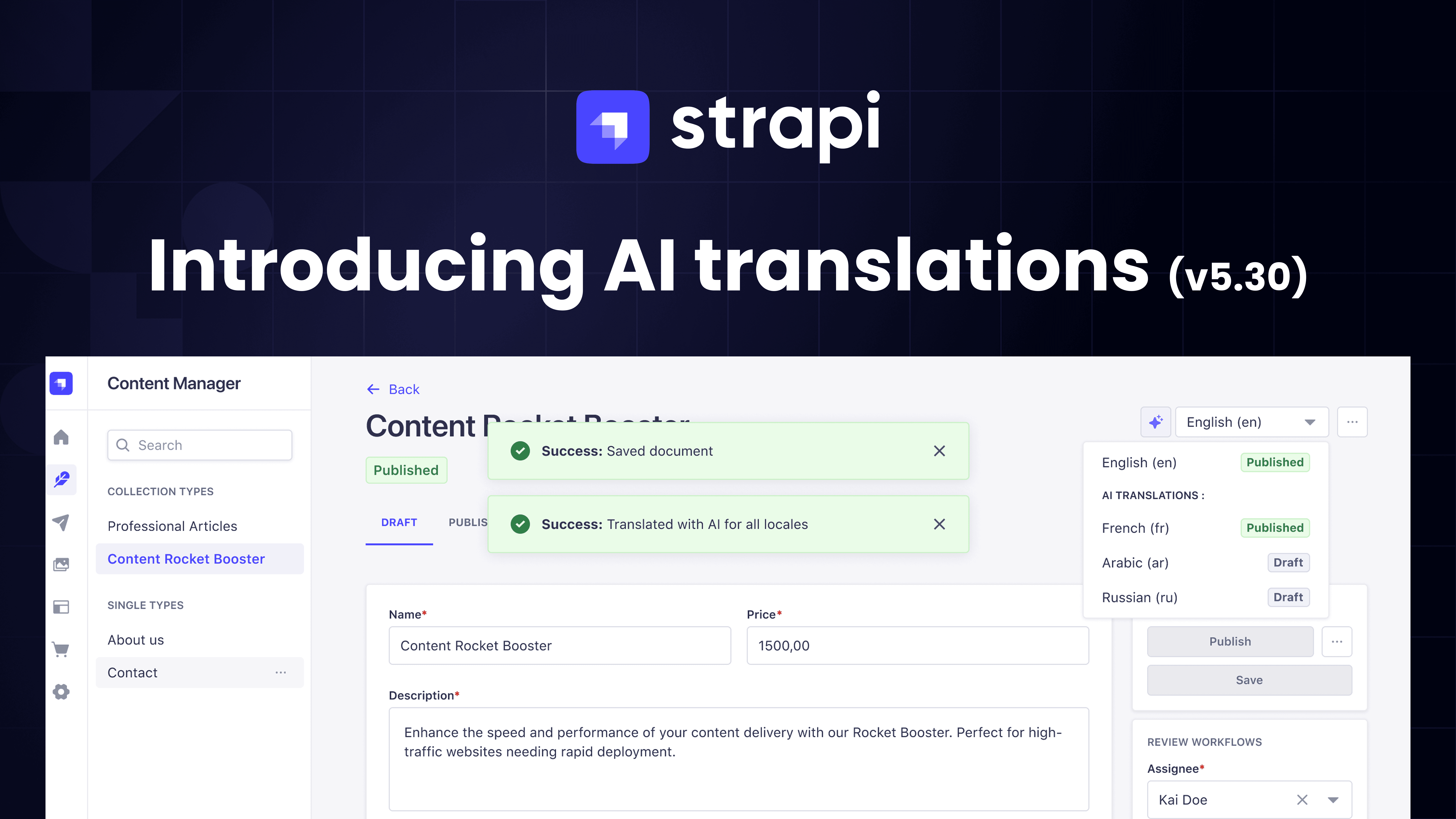
Strapi AI i18n Feature (Coming Soon):
Strapi AI will include automatic translation features. Design your interface to support:
[In Strapi AI - future feature]
"Automatically translate this blog post from English to Spanish, French, and German"
Your design should show:
- AI translation progress indicators
- Quality confidence scores
- Quick edit buttons for AI-generated translations
- Original text reference while editing translations
10. Integrating Figma-to-Strapi Workflows
Many design teams work in Figma. Strapi AI can import Figma files directly to generate content types. This creates a seamless design-to-development workflow.
Complete Figma-to-Strapi Workflow:
- Design in Figma: Create your content model as a visual diagram
- Boxes for each Collection Type
- Boxes for Components
- Arrows showing relationships
- Field lists for each content type
- Generate Figma API Token:
- Figma → Settings → Security → Generate new token
- Scope: Read access to files
- Save token securely
- Import to Strapi AI:
- Strapi v5 → Content-Type Builder → Strapi AI icon
- Click "Import from Figma"
- Paste API token and Figma file URL
- Click "Import"
- AI Generates Content Types:
- Strapi AI analyzes your design
- Creates Collection Types, Components, Relations
- Generates field structures matching your diagram
- Refine with Prompts:
   "Add SEO component to all page types"
   "Create a dynamic zone for homepage sections"
   "Add markdown rich text field to blog posts"
Example Figma Content Model Diagram:
[In Figma, create frames for:]

Collection Types:
├─ Blog Post
│  ├─ title (text)
│  ├─ slug (text)
│  ├─ body (rich text)
│  ├─ featured_image (media)
│  ├─ author (→ User)
│  └─ category (→ Category)
│
├─ Category
│  ├─ name (text)
│  └─ slug (text)
│
└─ Feature
   ├─ title (text)
   ├─ description (text)
   └─ icon (media)

Components:
├─ SEO (global)
│  ├─ metaTitle (text)
│  ├─ metaDescription (text)
│  └─ ogImage (media)
│
└─ Hero Section (dynamic-zone)
   ├─ title (text)
   ├─ subtitle (text)
   └─ background (media)

Single Types:
└─ Global Settings
   ├─ siteName (text)
   ├─ logo (media)
   └─ footer (→ Footer component)
Prompt for External AI to Create Figma Diagrams:
Create a Figma-compatible content model diagram for [project type].

Include:
- Collection Types: [list content types]
- Components: [list reusable components]
- Single Types: [list singleton content]
- Relations: [specify relationships with arrows]

For each content type, show:
- Type name in title case
- List of fields with types (text, media, relation, number, etc.)
- Required vs. optional fields (use asterisk for required)
- Relationships shown with arrows and labels (→ User, → Category)

Visual formatting:
- Use boxes/frames for each content type
- Group by type (Collection Types section, Components section, Single Types section)
- Use consistent spacing and alignment
- Color code: Collection Types (blue), Components (green), Single Types (yellow)
Then upload the generated design to Figma and import to Strapi AI.
Bringing It All Together From Prompts to Production
By applying the prompt patterns in this guide, you'll transform AI from a general design assistant into a specialized partner that understands headless CMS architecture and produces designs that work with how content is actually structured and managed.
The combination of external AI tools (for design) and Strapi AI (for content structure) creates a powerful workflow:
- Design with context - Use external AI to generate CMS-aware designs
- Generate structure - Use Strapi AI to create matching content types
- Iterate rapidly - Refine both design and structure together
- Deploy faster - Skip manual schema creation and design-development gaps
Whether you're building a company website, e-commerce platform, or content-driven application, these prompt techniques ensure your designs work in the real world—where content varies, editors make mistakes, and requirements evolve.
Start with one prompt pattern today. Apply it to your current project. Refine it based on results. Build your library. Share with your team.
The future of web design isn't choosing between creativity and structure—it's using AI to excel at both.
Ready to get started?
npx create-strapi-app@latestTry Strapi AI with a 30-day Growth plan trial and start building smarter, faster.