Next.js is one of many JavaScript frontend frameworks, but its popularity is growing due to its powerful features and flexibility.
Icons do several important jobs in your Next.js applications:
- They communicate concepts instantly without language barriers
- They save valuable screen real estate, especially on mobile devices
- They create visual rhythm and improve UI scannability
- They reinforce your brand identity and design system
- They improve accessibility when implemented correctly
Used well, a Nextjs icon library turn your interface from just functional to genuinely intuitive. They create visual shorthand that users process quickly, making everything feel easier.
Next.js brings its own icon challenges. As a framework mixing server-side rendering with client interaction, you'll need to watch for:
- Hydration mismatches: Different rendering between server and client can cause hydration errors with icon components
- Bundle size concerns: Importing entire icon libraries can significantly increase your JavaScript payload
- Server Components compatibility: With the App Router, icons need to work in both Server and Client Components
- SSR and static optimization: Icons should render correctly without JavaScript enabled initially
- Dynamic imports and code splitting: Optimizing when and how icons load affects performance
These technical hurdles make thoughtful icon implementation particularly important in Next.js applications.
Icon libraries give you several advantages over custom or one-off icon implementations:
- Consistency: Libraries provide visually cohesive sets designed to work together
- Optimization: Many libraries support tree-shaking to include only icons you use
- Accessibility: Quality libraries include proper accessibility attributes
- Integration: Libraries usually offer React components built for Next.js compatibility
- Flexibility: Most libraries provide customization options for size, color, and style
- Maintenance: Popular libraries are regularly updated to maintain compatibility
By using a good Next.js Icon Library, you can focus on building your app's unique features instead of reinventing wheels with custom icon implementations.
In brief:
- Icon libraries simplify development with pre-made, consistent visual elements that save time and improve usability
- Next.js has specific challenges for icon implementation, including server-side rendering considerations and bundle optimization needs
- The right icon library allows for proper tree-shaking, responsive styling, and accessibility features
- Different libraries offer varying tradeoffs between design flexibility, bundle size, and integration options
How to Choose the Right Next.js Icon Library for Your Project
Selecting the right Next.js Icon Library for your project is a decision that can impact performance, design flexibility, and long-term maintenance. When building with JavaScript frontend frameworks like Next.js, it's important to choose tools that align with your project needs. Let's explore the key factors you should consider before making your choice.
Nextjs Icon Library Key Selection Criteria
When evaluating icon libraries for your Next.js project, consider these essential factors:
- Bundle Size and Performance Impact: Icon libraries can significantly affect your application's bundle size. Libraries like React Icons and Heroicons allow tree-shaking and selective imports, keeping your bundle lean. In contrast, importing an entire icon library can add unnecessary weight to your application.
- Customization Options: Different libraries offer varying levels of customization:
- Color manipulation
- Size adjustments
- Stroke width modifications
- Animation capabilities
- Theme variants (outlined, filled, etc.)
- Accessibility Compliance: Ensure your chosen library provides accessibility features like proper ARIA attributes and screen reader support.
- License Restrictions: Verify the license allows for your intended use, especially for commercial projects.
- Community Support: Libraries with active communities receive regular updates and bug fixes. Open-source projects with sustainable open-source business models tend to have better long-term support. React Icons has over 9.3k GitHub stars, Heroicons boasts 18.5k+, and Material-UI Icons is part of a project with 79k+ stars.
- Integration Complexity: Some libraries integrate more seamlessly with Next.js than others. Consider how easily the library can be implemented in your specific project setup.
Understanding Performance Implications
Performance should be a primary concern when selecting a Next.js Icon Library for your project:
- Tree-shaking Support: Libraries that support tree-shaking allow you to import only the icons you need. For example, with React Icons, importing a single icon might add only 1-2 KB to your bundle size, compared to potentially megabytes for a full library.
- Selective Imports: Check if the library allows importing individual icons rather than the entire collection. This code demonstrates selective importing with React Icons:
import { FaBeer } from 'react-icons/fa';
// Instead of importing the entire library- Format Efficiency: SVG-based icons are generally more efficient than font-based icons for modern web applications.
- Loading Strategies: Consider libraries that support lazy loading for icons not immediately visible on page load.
In a case study of a large-scale Next.js e-commerce application, different icon libraries were tested:
- React Icons increased bundle size by 45 KB
- Material-UI Icons increased bundle size by 78 KB
- Custom SVG icons increased bundle size by 32 KB
For performance-critical applications, this difference could be significant, especially in markets with slower internet connections.
Many Next.js projects also use headless CMS systems to manage content and UI elements. When choosing a CMS for your project, considering factors like performance and integration is essential. Comparisons like Strapi vs Contentful can help you make an informed decision. A headless CMS for SEO like Strapi can not only manage your content but also contribute to your site's performance and search engine rankings. Strapi v5 is a versatile headless CMS that integrates seamlessly with Next.js projects. It offers customizable APIs, role-based permissions, multilingual support, and integrations with various services, which can enhance icon management strategies within your application.
Customization Requirements
The flexibility to customize icons is crucial for creating a cohesive user interface:
- Color Manipulation: All major libraries allow color changes, but some provide more advanced options like gradients or multi-color icons.
- Size Adjustments: Consider how the library handles responsive sizing across different devices and viewports.
- Style Variants: Libraries like Material-UI Icons offer multiple styles (filled, outlined, rounded, two-tone, sharp), which provides design flexibility.
- Animation Support: Some libraries include built-in animation options or make it easy to add CSS animations.
- Framework Integration: If you're using UI frameworks like Tailwind CSS or Material-UI, look for icon libraries that integrate seamlessly with these systems.
Using Strapi custom fields, you can define properties for your icons, simplifying the management of customization across your application.
When one developer switched from a custom icon set to React Icons, they reported a 15% reduction in overall bundle size and improved First Contentful Paint by 0.3 seconds, while maintaining full customization capabilities.
By carefully considering these factors, you'll be able to select a Next.js Icon Library that not only looks great but also performs well and can grow with your Next.js project. Remember that the right choice depends on your specific project requirements—there's no one-size-fits-all solution when it comes to icon libraries.
Top Icon Libraries for Next.js
Choosing the right Next.js Icon Library for your project is crucial for creating a visually appealing and performant user interface. Let's explore the most popular options, their distinctive features, and how to implement them in your Next.js applications.
React Icons
React Icons is one of the most versatile and widely-used icon libraries for Next.js projects. It aggregates icons from multiple popular sets including Font Awesome, Material Design, and Bootstrap Icons, giving you access to over 30,000 icons through a unified API.
Key features:
- Comprehensive collection from multiple icon sets
- ES6 import system allows importing only the specific icons needed
- Full customization of size, color, and style
- Regular updates with new icons
Implementation:
import { FaBeer } from 'react-icons/fa';
import { MdFavorite } from 'react-icons/md';

export default function IconExample() {
  return (
    <div>
      <FaBeer size={30} color="orange" />
      <MdFavorite size="2em" style={{ color: 'pink' }} />
    </div>
  );
}
Best for: Projects that require variety and flexibility. React Icons is perfect when you need icons from different sets but want a consistent implementation pattern. Its tree-shaking support ensures you only bundle the icons you actually use.
GitHub stats: Over 12k stars with 100+ contributors, indicating strong community support and regular maintenance.
Heroicons
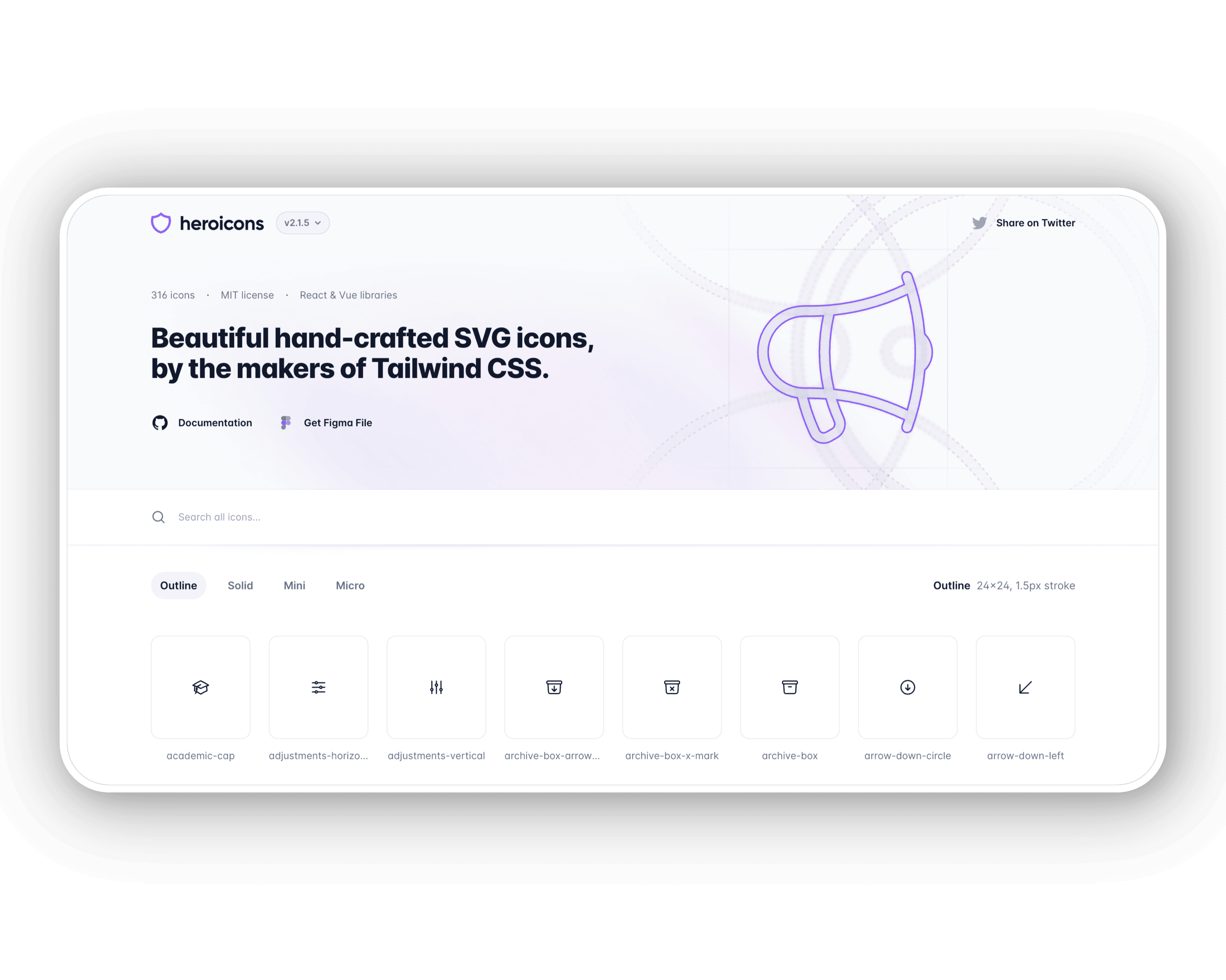
Created by the team behind Tailwind CSS, Heroicons offers a set of carefully crafted SVG icons that integrate beautifully with Tailwind CSS projects.
Key features:
- 316 high-quality SVG icons
- Available in outlined and solid styles
- Designed to work seamlessly with Tailwind CSS
- MIT License for free use in commercial projects
- Accessibility-focused design
Implementation:
import { BeakerIcon } from '@heroicons/react/solid';

export default function IconExample() {
  return <BeakerIcon className="h-5 w-5 text-blue-500" />;
}
Best for: Next.js projects using Tailwind CSS. Heroicons provides a consistent design language and integrates perfectly with Tailwind's utility classes for styling.
GitHub stats: Over 22.2k stars and 30+ contributors, with regular updates on a 1-2 month release cycle.
Lucide Icons

Lucide Icons is a community-driven fork of Feather Icons, offering an expanded set of icons while maintaining the original minimalist style.
Key features:
- Clean, minimalist design aesthetic
- Expanded collection beyond the original Feather set
- Customizable size, color, and stroke width
- Active community development
Implementation:
import { Heart } from 'lucide-react';

export default function IconExample() {
  return (
    <Heart
      size={24}
      color="red"
      strokeWidth={2}
      fill="pink"
    />
  );
}
Best for: Projects that prioritize a clean, minimal aesthetic. Lucide is ideal when you want simple, consistent icons that don't overwhelm your interface.
GitHub stats: With over 16.4k GitHub stars and over 200+ contributors, regular updates and an active community have made this a popular alternative to the original Feather Icons.
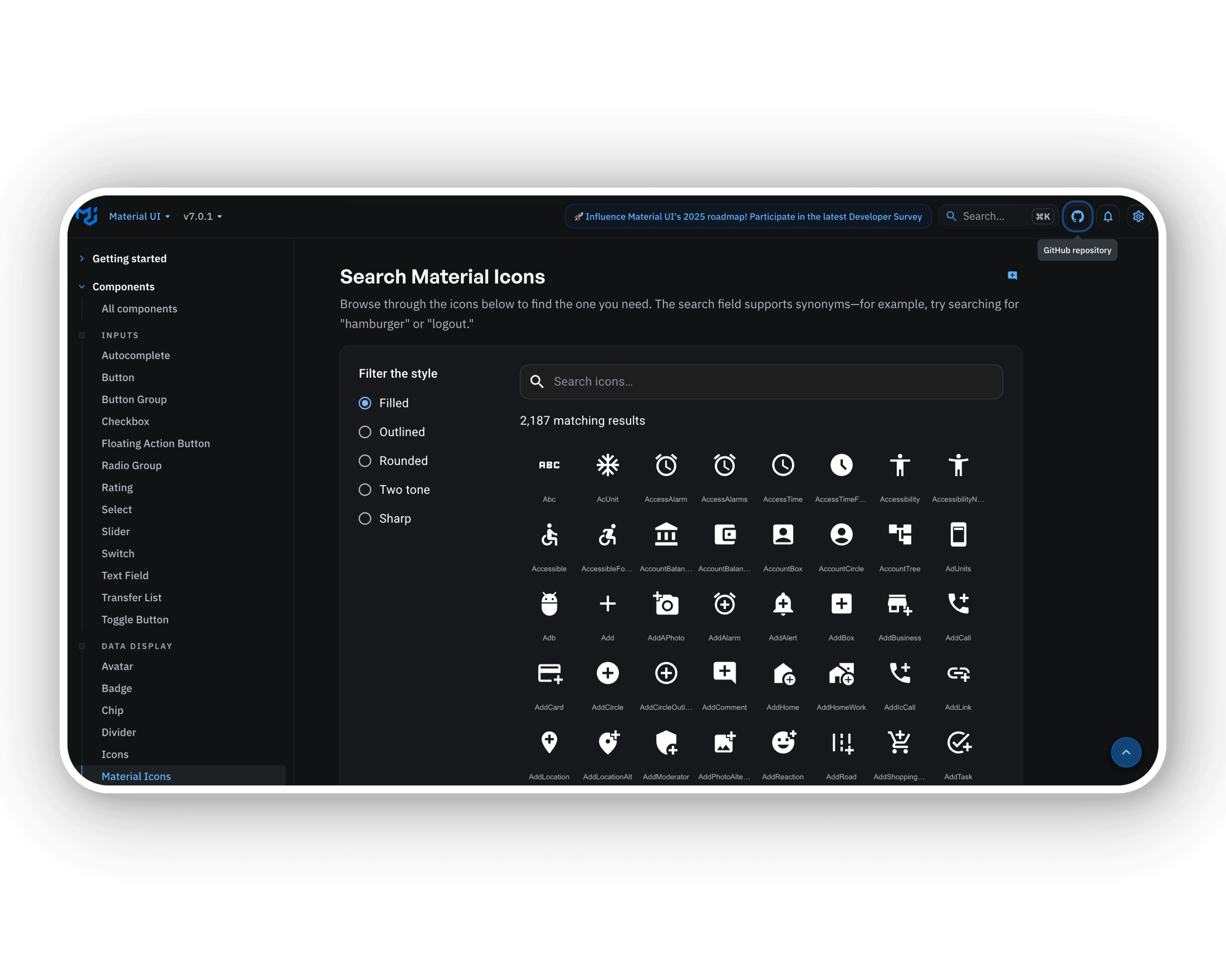
Material UI Icons
Part of the Material-UI framework, Material UI Icons provides a comprehensive set of icons following Google's Material Design guidelines.
Key features:
- Over 2,100 official Material Design icons
- Five distinct styles: filled, outlined, rounded, two-tone, and sharp
- Seamless integration with Material-UI components
- Regular updates aligning with Material Design guidelines
Implementation:
import AccessAlarmIcon from '@material-ui/icons/AccessAlarm';
import ThreeDRotationIcon from '@material-ui/icons/ThreeDRotation';

export default function IconExample() {
  return (
    <div>
      <AccessAlarmIcon />
      <ThreeDRotationIcon fontSize="large" color="primary" />
    </div>
  );
}
Best for: Projects using Material-UI or following Material Design principles. These icons create a cohesive experience for users familiar with Google's design language.
GitHub stats: As part of the Material-UI project with 79k+ stars and 2000+ contributors, this library enjoys extensive support and frequent updates.
Font Awesome
Font Awesome is one of the most comprehensive icon libraries available, offering both free and paid icon sets.
Key features:
- Extensive collection with thousands of icons
- Multiple styles (Solid, Regular, Light, Thin, Duotone)
- Advanced animations and transformations
- Official React component for Next.js integration
Implementation:
import { FontAwesomeIcon } from '@fortawesome/react-fontawesome';
import { faCoffee } from '@fortawesome/free-solid-svg-icons';

export default function IconExample() {
  return (
    <FontAwesomeIcon
      icon={faCoffee}
      size="2x"
      color="brown"
      spin
      transform={{ rotate: 42 }}
    />
  );
}
Best for: Projects requiring extensive icon options and advanced customization. Font Awesome is ideal when you need specialized icons for numerous use cases.
GitHub stats: Font Awesome has 74.9k+ GitHub stars and 7 contributors, with regular monthly updates.
Other Notable Options
Several other icon libraries are worth considering for your Next.js projects:
- Feather Icons: Known for its simple, clean design and lightweight footprint (22k+ GitHub stars)
- Ant Design Icons: Part of the Ant Design system, offering consistent enterprise-level icons
- Unicons by IconScout: Provides 4,500+ icons in multiple styles across 27 categories
- Lineicons: Offers over 30,000 icons with 10+ unique styles for various design needs
Performance Considerations
When implementing icon libraries in Next.js, consider these optimization strategies:
- Tree-shaking support: Choose libraries that allow importing individual icons to reduce bundle size.
- Dynamic imports: For icons not needed immediately, use Next.js dynamic imports.
- SVG optimization: Consider tools like SVGO to optimize SVG icons.
- Caching: Implement effective caching strategies for icons.
In a performance case study, switching from importing an entire icon library to tree-shaking with individual imports reduced a Next.js application's initial load time by 1.2 seconds.
When building content-rich applications, integrating a headless CMS like Strapi v5 with your Next.js project can help manage iconography as part of your content strategy. Strapi's media library can store SVG icons, and its API can deliver these icons, allowing for centralized management of icon assets.
For those interested in understanding performance metrics at a deeper level, understanding API analytics can provide valuable insights into how your application interfaces perform under various conditions.
Implementation Strategies for Next.js
When integrating icon libraries into your Next.js application, choosing the right implementation strategy is crucial for maintaining performance, consistency, and developer experience. Let's explore the main approaches you can take to effectively implement icons in your Next.js projects.
Basic Integration Patterns
The simplest way to use icon libraries in Next.js is through direct imports. This approach works well for smaller projects or when you're using only a few icons.
Using React Icons, for example, you can import specific icons from different icon sets:
import { FaReact } from 'react-icons/fa';
import { AiFillGithub } from 'react-icons/ai';

function MyComponent() {
  return (
    <div>
      <FaReact size={24} color="blue" />
      <AiFillGithub size={24} />
    </div>
  );
}
For SVG icons, you can also import them directly as React components:
import LogoIcon from '../public/icons/logo.svg';

function Header() {
  return (
    <header>
      <LogoIcon width={32} height={32} />
    </header>
  );
}
However, this approach can quickly become unwieldy if you're using many icons throughout your application. It also creates tight coupling between your components and specific icon libraries.
Component-Based Approaches
A more maintainable approach is to create an abstraction layer for your icons. This gives you flexibility to change icon libraries without refactoring your entire codebase.
Here's an example of a component-based approach:
// components/Icon.js
import * as FaIcons from 'react-icons/fa';
import * as AiIcons from 'react-icons/ai';

const iconSets = {
  fa: FaIcons,
  ai: AiIcons,
};

export default function Icon({ set, name, ...props }) {
  // Dynamically select the icon from the appropriate set
  const IconSet = iconSets[set];
  const IconComponent = IconSet[name];

  if (!IconComponent) {
    console.warn(`Icon ${name} not found in set ${set}`);
    return null;
  }

  return <IconComponent {...props} />;
}
You can then use this component throughout your application:
import Icon from '../components/Icon';

function MyComponent() {
  return (
    <div>
      <Icon set="fa" name="FaReact" size={24} color="blue" />
      <Icon set="ai" name="AiFillGithub" size={24} />
    </div>
  );
}
This approach gives you several advantages:
- Consistent icon usage across your application
- Ability to switch icon libraries by updating only the Icon component
- Centralized control over icon defaults, like size and color
Integrating Strapi for e-learning simplifies icon management and enhances user experience by providing consistent iconography across educational platforms. This tool allows for easy customization and management of icons, creating a more intuitive and cohesive learning environment.
Server-Side Rendering Considerations
Next.js's server-side rendering (SSR) introduces some unique challenges for icon libraries. Common issues include hydration mismatches and increased bundle sizes.
To address these issues, you can use dynamic imports to load icons only on the client side:
import dynamic from 'next/dynamic';

// Load the icon only on the client side
const DynamicIcon = dynamic(
  () => import('react-icons/fa').then((mod) => mod.FaReact),
  { ssr: false }
);

function MyComponent() {
  return <DynamicIcon size={24} color="blue" />;
}
For more complex scenarios, you might want to create a custom Icon component that handles SSR gracefully.
When building content-rich applications, integrating a headless CMS like Strapi v5 with your Next.js project can help manage iconography as part of your content strategy. Strapi's media library can store SVG icons, and its API can deliver the appropriate icons for different content types, allowing for centralized management of icon assets. Strapi enables publishing across multiple platforms, serving as a central hub for content. This allows for automatic updates on platforms like Medium, Dev.to, and Hashnode through webhooks and APIs, streamlining content management across various environments.
Optimizing Icon Performance in Next.js
Icons might be small, but they can pack a big performance punch in your Next.js app if you're not careful. Let's look at how to keep things speedy while still using all the icons you need.
Reducing Bundle Size with Tree-Shaking
One of the best ways to keep your app fast is tree-shaking—just taking the icons you actually use instead of the whole collection. Many icon libraries support this approach.
With React Icons, it's super simple:
// Good: Just grab what you need
import { FaReact } from 'react-icons/fa';
import { MdDashboard } from 'react-icons/md';

// Bad: This loads everything
// import * as FaIcons from 'react-icons/fa';
Material-UI Icons works similarly:
// Good: Pick individual icons
import AccessAlarmIcon from '@material-ui/icons/AccessAlarm';
import ThreeDRotationIcon from '@material-ui/icons/ThreeDRotation';

// Bad: This imports more than you need
// import { AccessAlarm, ThreeDRotation } from '@material-ui/icons';
This approach can make a huge difference. Some developers have seen up to 15% smaller bundle sizes just by fixing their icon imports.
Implementing Lazy Loading for Icons
For icons that aren't visible right away, why load them immediately? Next.js makes it easy to load icons only when needed:
import { useState } from 'react';
import dynamic from 'next/dynamic';

// Load this icon only when needed
const DynamicIcon = dynamic(() =>
  import('react-icons/fa').then((mod) => mod.FaUserCircle)
);

function Profile() {
  const [showProfile, setShowProfile] = useState(false);

  return (
    <div>
      <button onClick={() => setShowProfile(!showProfile)}>
        Toggle Profile
      </button>

      {showProfile && (
        <div>
          <DynamicIcon size={24} />
          <span>User Profile</span>
        </div>
      )}
    </div>
  );
}
This approach means you load icons only when users actually need them, making initial page loads much faster. It's especially helpful for pages with lots of icons or fancy animated ones.
Measuring and Monitoring Performance
You can't improve what you don't measure. Next.js gives you tools like @next/bundle-analyzer to see exactly what's in your bundle:
// next.config.js
const withBundleAnalyzer = require('@next/bundle-analyzer')({
  enabled: process.env.ANALYZE === 'true',
});

module.exports = withBundleAnalyzer({
  // Your Next.js config
});
Then run your build with:
ANALYZE=true npm run buildThis gives you a visual map of your bundle size, so you can spot if icon libraries are slowing things down.
Other good performance tricks include:
- Using SVG icons when possible, as they're generally faster than font icons
- Setting up good caching for icon assets
- Using server-side rendering for important icons so they appear instantly
- Taking advantage of Next.js image optimization for raster icons
According to a recent web performance study from 2023, optimizing icon delivery can improve your Lighthouse performance score by 5-10 points, depending on your site's configuration.
For content-heavy Next.js applications, integrating with a modern headless CMS like Strapi v5 can help optimize icon delivery. Strapi v5's asset pipeline serves icons with caching headers, setting a Cache-control header for 24 hours on CDN edge servers and 10 seconds in web browsers for static sites on Strapi Cloud. It also implements role-based access control for managing permissions, allowing custom roles and permissions through the admin dashboard to control asset access and modifications.
Creating a Consistent Icon System
Icons do more than just look pretty in your Next.js app—they help users navigate and understand your interface. But as your app grows, keeping icons consistent can get messy. Let's see how to build an icon system that scales with your project.
Building a Reusable Icon Component
The key to icon consistency is creating a flexible wrapper component that works with different icon libraries. This approach lets you switch libraries without having to update code across your entire app.
Here's a simple icon component you can build:
// components/Icon.jsx
import React from 'react';
import * as ReactIcons from 'react-icons/fa';
import * as HeroIcons from '@heroicons/react/solid';

const iconSets = {
  fa: ReactIcons,
  hero: HeroIcons,
};

const Icon = ({
  set = 'fa',
  name,
  size = 24,
  color = 'currentColor',
  className = '',
  ...props
}) => {
  const IconSets = iconSets[set];

  // Convert name to match the icon component name
  const formattedName =
    set === 'fa'
      ? `Fa${name.charAt(0).toUpperCase()}${name.slice(1)}`
      : name;

  const IconComponent = IconSets[formattedName];

  if (!IconComponent) {
    console.warn(`Icon ${formattedName} not found in set ${set}`);
    return null;
  }

  return (
    <IconComponent
      size={size}
      color={color}
      className={className}
      aria-hidden="true"
      {...props}
    />
  );
};

export default Icon;
Now you can use this component everywhere with a consistent API:
// Usage example
import Icon from '../components/Icon';

function Button({ icon, children }) {
  return (
    <button className="btn">
      {icon && <Icon set="fa" name={icon} size={16} className="mr-2" />}
      {children}
    </button>
  );
}
This approach gives you:
- A consistent way to use icons across your app
- The ability to switch icon libraries by changing one component
- Central control over icon defaults and properties
- Easy expansion to include more icon sets
When targeting different markets, localization SEO strategies can tailor iconography and content to specific audiences, enhancing user engagement and retention. By creating location-specific content and incorporating local cultural elements, these strategies make content more relevant and appealing, boosting visibility in localized search results and attracting more local customers.
Real-World Implementation Examples
Let's see how icons work in real Next.js projects. I'll show you code for different scenarios and explain why certain approaches make sense for each situation.
E-commerce Product Page
For online stores, icons help guide shoppers through product selection and checkout. Here's how you might implement product action icons using React Icons:
import { FaHeart, FaShoppingCart, FaShare } from 'react-icons/fa';
import { BsStarFill, BsStarHalf, BsStar } from 'react-icons/bs';

function ProductPage({ product }) {
  return (
    <div className="product-container">
      <div className="product-header">
        <h1>{product.name}</h1>
        <div className="product-rating">
          {/* Dynamic star rating implementation */}
          <BsStarFill />
          <BsStarFill />
          <BsStarFill />
          <BsStarHalf />
          <BsStar />
          <span>({product.reviewCount})</span>
        </div>
      </div>

      <div className="product-image">
        <img src={product.image} alt={product.name} />
      </div>

      <div className="product-actions">
        <button className="cart-button">
          <FaShoppingCart size={20} className="icon" />
          Add to Cart
        </button>
        <button className="wishlist-button">
          <FaHeart size={18} className="icon" />
        </button>
        <button className="share-button">
          <FaShare size={18} className="icon" />
        </button>
      </div>
    </div>
  );
}
React Icons works great here because:
- You can pick just the icons you need, keeping things fast
- The library gives consistent styling across different icon sets
- The icons are easy to customize with size and color props
In e-commerce applications, using effective icons can help boost eCommerce conversions by improving user experience and guiding users through product selection and checkout.
Dashboard Interface
For dashboards, Material-UI Icons shine thanks to their clean design and integration with Material-UI components. Here's a dashboard sidebar example:
import { useState } from 'react';
import {
  Dashboard as DashboardIcon,
  BarChart as AnalyticsIcon,
  People as UsersIcon,
  Settings as SettingsIcon,
  Notifications as NotificationsIcon,
  ExitToApp as LogoutIcon,
} from '@material-ui/icons';

function DashboardSidebar() {
  const [activeItem, setActiveItem] = useState('dashboard');

  const menuItems = [
    { id: 'dashboard', label: 'Dashboard', icon: <DashboardIcon /> },
    { id: 'analytics', label: 'Analytics', icon: <AnalyticsIcon /> },
    { id: 'users', label: 'Users', icon: <UsersIcon /> },
    { id: 'settings', label: 'Settings', icon: <SettingsIcon /> },
  ];

  return (
    <div className="dashboard-sidebar">
      <div className="user-profile">
        {/* User profile content */}
      </div>

      <nav className="nav-menu">
        {menuItems.map((item) => (
          <div
            key={item.id}
            className={`nav-item ${activeItem === item.id ? 'active' : ''}`}
            onClick={() => setActiveItem(item.id)}
          >
            <span className="icon">{item.icon}</span>
            <span className="label">{item.label}</span>
          </div>
        ))}
      </nav>

      <div className="sidebar-footer">
        <div className="nav-item">
          <span className="icon">
            <NotificationsIcon />
          </span>
          <span className="label">Notifications</span>
        </div>
        <div className="nav-item logout">
          <span className="icon">
            <LogoutIcon />
          </span>
          <span className="label">Logout</span>
        </div>
      </div>
    </div>
  );
}
Material-UI Icons work well for dashboards because:
- They match seamlessly with Material-UI components often used in dashboards
- All icons follow the same design style
- They come in filled and outlined versions for different states
- The icons look clear and readable at dashboard-typical sizes
AE Studio successfully created a nonprofit marketplace using Strapi and Next.js, contributing to a seamless user experience.
Mobile-Responsive Applications
For mobile-friendly apps, Heroicons provide a nice balance of clean design and performance. Here's a mobile navigation bar that adapts to different screen sizes:
import { useRouter } from 'next/router';
import {
  HomeIcon,
  SearchIcon,
  HeartIcon,
  UserIcon,
} from '@heroicons/react/outline';
import { HomeIcon as HomeIconSolid } from '@heroicons/react/solid';

function MobileNavigation() {
  const router = useRouter();
  const currentPath = router.pathname;

  return (
    <div className="fixed bottom-0 w-full bg-white border-t md:hidden">
      <div className="flex justify-around py-2">
        <button
          onClick={() => router.push('/')}
          className="flex flex-col items-center"
        >
          {currentPath === '/' ? (
            <HomeIconSolid className="h-6 w-6 text-blue-500" />
          ) : (
            <HomeIcon className="h-6 w-6 text-gray-500" />
          )}
          <span className="text-xs mt-1">Home</span>
        </button>

        <button
          onClick={() => router.push('/search')}
          className="flex flex-col items-center"
        >
          <SearchIcon className="h-6 w-6 text-gray-500" />
          <span className="text-xs mt-1">Search</span>
        </button>

        <button
          onClick={() => router.push('/favorites')}
          className="flex flex-col items-center"
        >
          <HeartIcon className="h-6 w-6 text-gray-500" />
          <span className="text-xs mt-1">Favorites</span>
        </button>

        <button
          onClick={() => router.push('/profile')}
          className="flex flex-col items-center"
        >
          <UserIcon className="h-6 w-6 text-gray-500" />
          <span className="text-xs mt-1">Profile</span>
        </button>
      </div>

      {/* Tablet/Desktop navigation would go here */}
    </div>
  );
}
Heroicons work great for mobile-responsive applications because:
- They pair perfectly with Tailwind CSS, which many responsive designs use
- The icons stay clear and readable at small sizes needed for mobile navigation
- They come in outline and solid versions to show active/inactive states
- The SVG format ensures they look crisp on high-density mobile screens
In a 2023 web performance analysis, researchers found that optimized SVG icons can reduce mobile page weight by up to 30% compared to icon fonts, while maintaining visual quality across all device sizes.
When implementing icons in your Next.js projects, always consider the specific requirements of your application context. For content-heavy sites like e-commerce, prioritize performance with libraries like React Icons. For complex interfaces like dashboards, consider the design consistency offered by Material-UI Icons. And for responsive applications, look for libraries like Heroicons that work well across all device sizes.