
Think of UI component libraries as the building blocks that keep your React applications both organized and user-friendly. In this article, we'll explore the best UI libraries that bundle pre-built, reusable components following modern design patterns, ensuring your project stays consistent throughout. With expectations for aesthetics and performance higher than ever, it's wise to keep these libraries on your radar and stay current with their updates.
Whether you're crafting a simple dashboard or tackling a complex enterprise platform, these libraries can boost efficiency and create a uniform, cohesive interface. Material UI, Chakra UI, and Ant Design are among the proven favorites. Each brings unique strengths, from accessibility features to robust community support. Understanding how they differ can help you and your team choose the ideal foundation for your next React project.
In brief:
- React UI component libraries can reduce development time by up to 40% through pre-built, standardized interface elements
- Libraries like Material UI, Chakra UI, and Ant Design offer different specializations in accessibility, design philosophy, and component variety
- The right library choice depends on project-specific factors including size, industry requirements, and existing design systems
- Modern headless CMS platforms like Strapi v5 work seamlessly with React UI libraries such as MUI (Material-UI) to create robust content management solutions. This integration supports the use of MUI components for consistent and responsive UIs, effectively presenting content from Strapi. React's hooks and libraries like Axios enable easy data fetching from Strapi's API, aiding the development of dynamic and scalable web applications.
What Are React UI Component Libraries
React UI component libraries are curated collections of ready-made interface elements for web applications. Covering everything from buttons and navigation bars to entire layouts, they free you from building each piece from scratch.
The time savings are significant. Instead of reinventing foundational components, you can plug in professionally designed and tested ones, cutting down production time. A reliable library also keeps the interface consistent, since each component follows a shared style guide. This consistency is especially valuable when multiple developers contribute to the same project.
Customization remains open-ended. Most libraries let you adjust themes, tweak component styles, and override defaults to match your branding or unique functional needs. Rather than wrestling with layout puzzles, you can focus on crafting engaging features that set your React app apart.
The Evolution of Component Libraries
Component libraries have evolved dramatically since React's introduction. Early libraries often provided basic styling with limited functionality, while today's offerings include advanced features like:
- Comprehensive theming systems
- Built-in animation capabilities
- Dark/light mode switching
- Responsive design out of the box
- Internationalization support
- State management integration
Benefits of Using React UI Component Libraries
Leveraging pre-built components from the top React UI packages can dramatically boost productivity.
Speed of Development
Leveraging pre-built components can dramatically boost productivity. Writing less repetitive code means tight deadlines are easier to meet. This efficiency also frees you to solve bigger problems in the application rather than getting bogged down in basic UI construction.
Consistency in UI/UX
When every component looks and behaves predictably, users have an easier time interacting with your app. Uniform design communicates professionalism and simplifies the QA process. It also helps teams avoid style drift. By relying on a single set of styled components, you lock in a recognizable look that spans the entire application.
This consistency extends beyond visual elements to behavioral patterns. When all dropdowns, modals, and form elements behave in expected ways, users learn your interface faster and experience fewer frustrations.
Customization and Flexibility
While libraries handle the heavy lifting with standard design elements, they rarely box you in. You can tweak colors, spacing, typography—whatever your project requires. This balance of structure and freedom gives you a head start without forcing you to sacrifice originality.
Most modern libraries offer various customization approaches:
- Theme providers for global style adjustments
- Component-level prop APIs for individual modifications
- Style override systems using CSS-in-JS
- Extension mechanisms for creating variant components
Reduced Technical Debt
Starting with well-tested components means fewer bugs, better performance, and code that's easier to maintain. Professional libraries undergo rigorous testing across browsers and devices, catching edge cases you might miss when building components yourself.
Accessibility Compliance
Building accessible applications requires specialized knowledge and careful implementation. Many UI libraries bake accessibility into their components, handling proper ARIA attributes, keyboard navigation, and screen reader compatibility.
This built-in accessibility helps meet legal requirements while serving all users better. The Web Accessibility Initiative notes that organizations facing ADA lawsuits over inaccessible websites increased by 23% in 2023, making this benefit increasingly relevant.
6 Leading React UI Component Libraries
1. Material UI
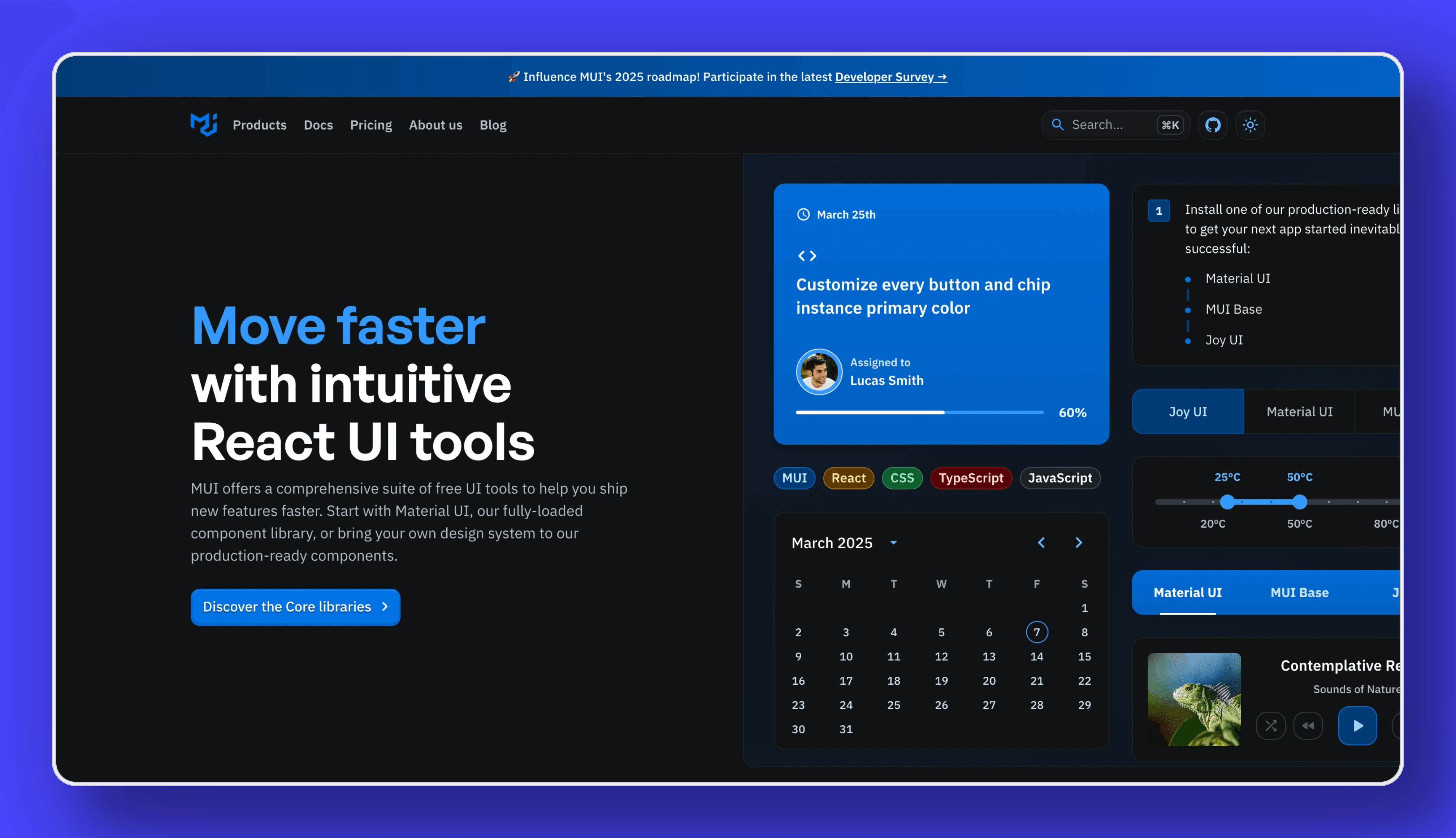 Material UI (MUI) brings Google's Material Design to React. It has over 34,000 stars on GitHub and hundreds of contributors. Its components are known for accessibility, performance, and comprehensive documentation. MUI offers a strong theming system for those who need both a sleek out-of-the-box look and room for customization.
MUI's key advantages include:
- Extensive component selection (100+ components)
- Strong TypeScript support
- Built-in responsive grid system
- Rich documentation with interactive examples
- Active community with regular updates
MUI works particularly well for applications seeking a Google-like aesthetic or those needing a comprehensive solution that handles both basic and advanced interface requirements. Setting up a Material UI integration with Strapi is straightforward, allowing developers to combine Strapi's backend capabilities with MUI's React components. This enhances development efficiency, simplifies content management, and ensures consistent styling and responsive design. The integration involves configuring your Strapi backend, incorporating MUI into your React project, and using components to display data from Strapi. For detailed steps, refer to Strapi's official website guide.
Learn more at MUI's GitHub.
2. Chakra UI
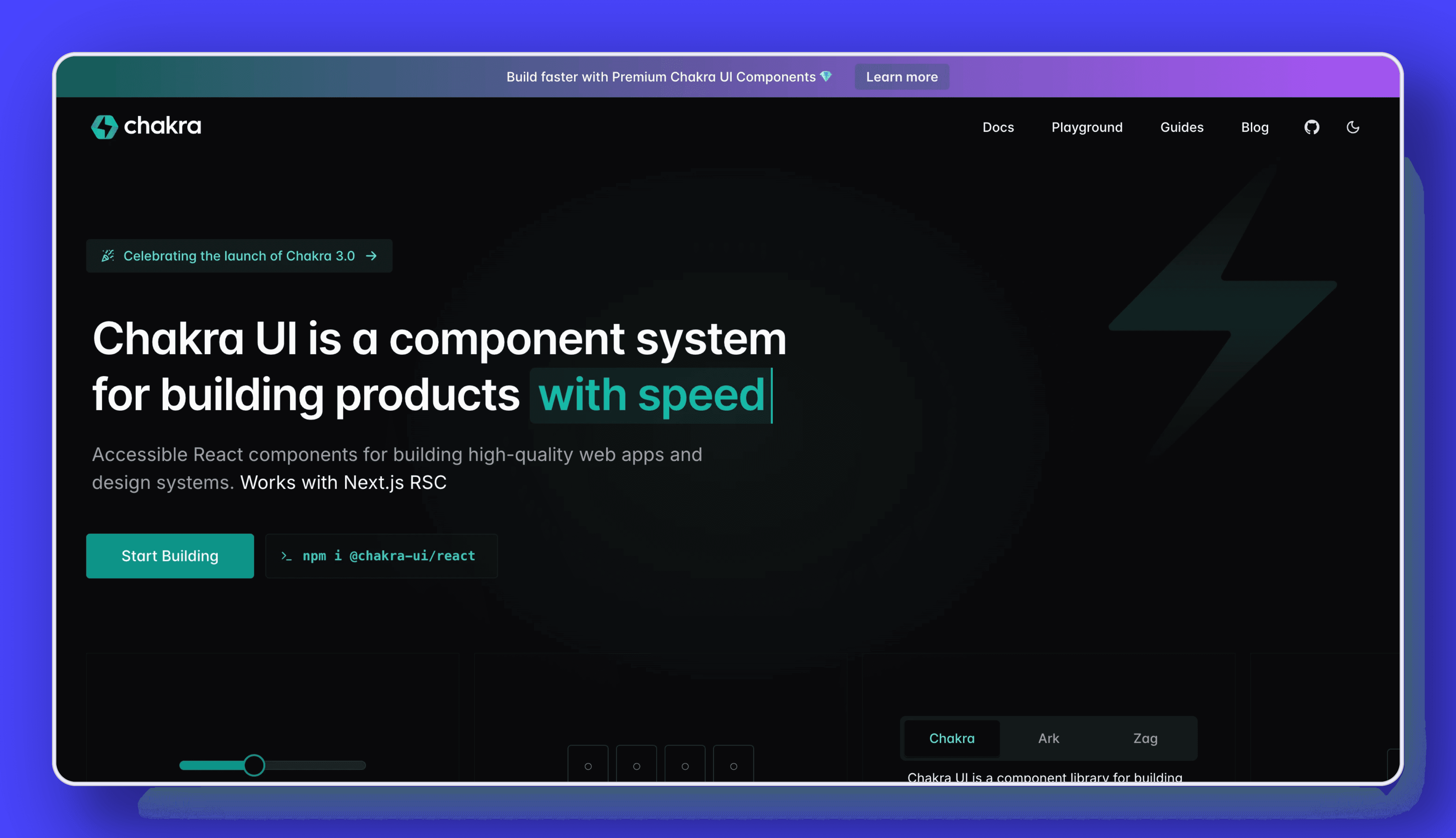 Chakra UI emphasizes simplicity, accessibility, and composable components. With more than 10,000 GitHub stars, it's gained momentum among developers craving a light but flexible system. Its theming approach makes it easy to redesign components while keeping their underlying functionality intact.
What sets Chakra UI apart:
- Style props for quick component customization
- First-class dark mode support
- Composition-based component design
- Strong focus on keyboard navigation
- Color mode toggling built-in
Chakra UI excels in projects where developer experience and rapid iteration are priorities. Its intuitive API allows for quick adjustments without diving deep into documentation. Developers can explore the integration between Chakra UI and Strapi, which combines Strapi's robust backend capabilities with Chakra UI's responsive and customizable frontend components. This setup supports efficient content management and enhances the user experience with accessible, modular, and themeable UI components from Chakra UI, easily connected to Strapi's APIs.
Check out Chakra UI at Chakra UI's GitHub.
3. Ant Design
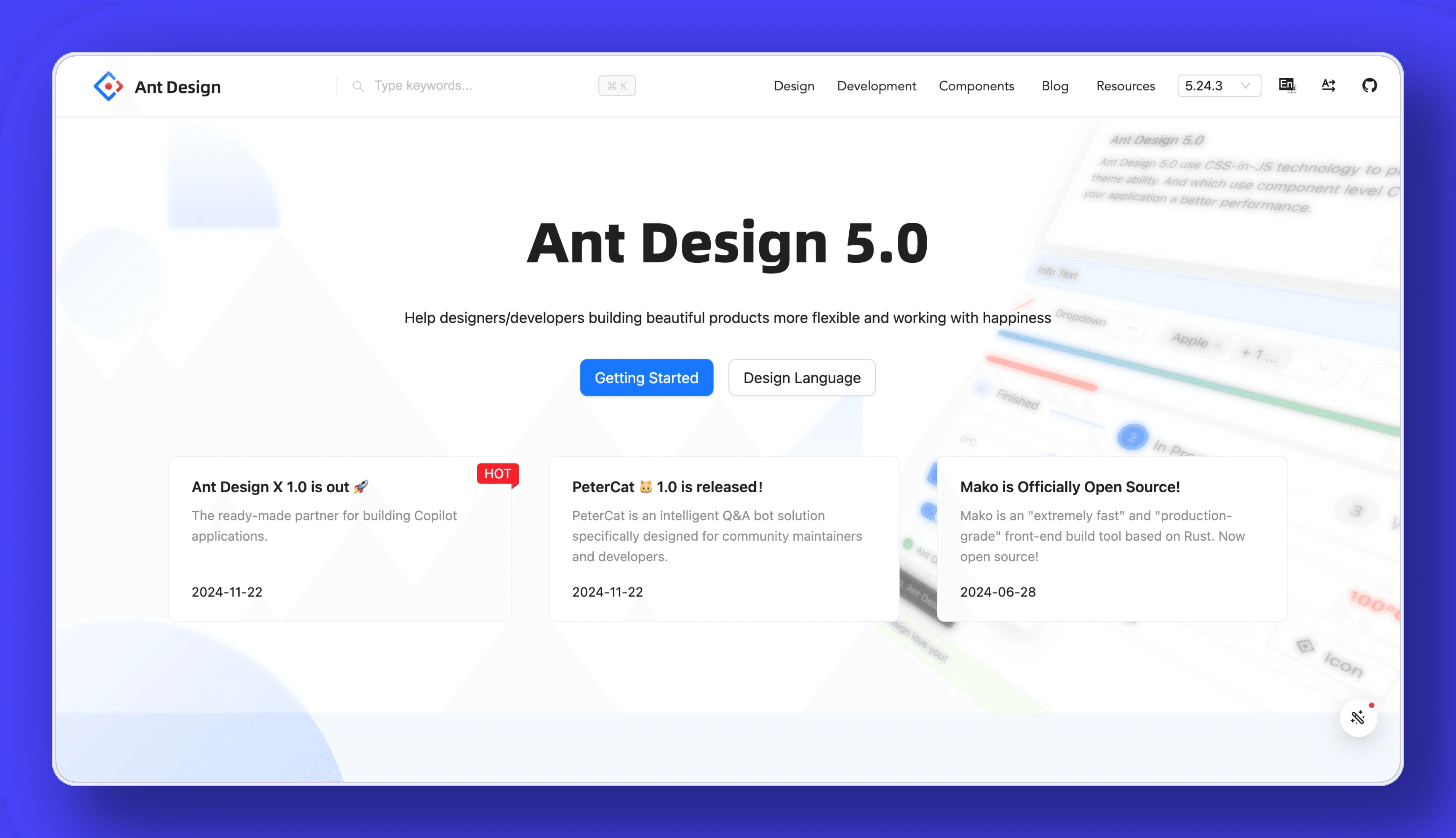 Ant Design brings a design-first perspective from Alibaba, making it well-suited for large-scale or data-heavy interfaces. Backed by over 70,000 GitHub stars, it offers an extensive component library, a polished aesthetic, and a robust design language. Ant Design's thorough documentation and dynamic community support make it an appealing choice for enterprise applications.
Ant Design stands out with:
- Enterprise-focused component set
- Advanced data display components (tables, trees, charts)
- Form validation system
- Internationalization support
- Comprehensive design system
The library shines in business applications, dashboards, and data-intensive interfaces where information density and organization are critical.
Visit Ant Design's GitHub.
4. Additional Libraries
Other notable libraries include Semantic UI for human-friendly HTML patterns, Bulma for modern, flexbox-based CSS, and Blueprint for building complex, data-dense UIs. Each offers unique strengths:
Integrating UI Libraries with Headless CMS
Modern applications often combine React UI libraries with headless content management systems. This architectural approach separates content management from presentation, allowing teams to build flexible, future-proof applications. If you're deciding between a traditional vs headless CMS, understanding how they interact with UI libraries is crucial.
Strapi v5, released on September 23, 2024, is the latest version of the popular open-source headless CMS. It brings significant performance improvements and enhancements to the developer experience, especially for React applications. Key features include a cleaner API, faster builds, and enhanced multi-environment support, all aimed at boosting performance and developer productivity. You can explore Strapi 5 features to understand how it enhances integration with UI libraries.
The combination works particularly well because:
- Strapi handles content modeling, creation, and delivery via API
- React UI libraries manage the presentation layer
- Together they create a separation of concerns that supports scaling and maintenance
Strapi v5 introduces a Static Preview feature, allowing content editors to view a live-like preview of their content changes directly within Strapi before publishing. This feature supports integration with Next.js to generate a preview URL for content previews. An iframe can also be embedded within Strapi to provide a front-end view of the content before publication. While Strapi enhances e-commerce experiences, specific tailored solutions for e-commerce projects are not detailed in the provided documents.
The comprehensive documentation at https://docs.strapi.io/dev-docs/whats-new details the capabilities of Strapi, including updates, release notes, FAQs, usage information, and additional resources.
Key Features to Look for in a React UI Library
Accessibility
An app designed for real-world use should accommodate everyone. Look for libraries that follow WAI-ARIA guidelines, ship with accessible components, and offer clear tutorials on inclusive interfaces. Material UI often wins praise by building accessibility into its core components. Additionally, improving web accessibility in your Strapi-powered websites ensures a more inclusive experience for all users.
Specific accessibility features to check for include:
- Keyboard navigation support
- Screen reader announcements
- Focus management
- Color contrast compliance
- Reduced motion options
Ease of Use
A straightforward API and clean documentation shorten the learning curve. Libraries that provide interactive examples, code samples, and robust guides keep your team's momentum going. This becomes particularly important if you're working with diverse skill levels across your dev group.
Documentation quality varies widely between libraries. The best documentation includes:
- Interactive component playgrounds
- Copy-paste code examples
- TypeScript definitions
- Usage guidelines and best practices
- Searchable API reference
Bundle Size and Performance
As web performance becomes increasingly important for SEO and user experience, the size and efficiency of your UI library matter more than ever. According to Google's 2023 Web Almanac, JavaScript remains the largest contributor to page weight on most websites.
Many modern UI libraries offer tree-shaking to include only the components you use. Some also provide component-level code splitting or server-side rendering support to optimize initial load times.
Before choosing a library, consider:
- Base bundle size (including required dependencies)
- Tree-shaking effectiveness
- Runtime performance metrics
- Server-side rendering support
- Code splitting capabilities
In addition to selecting an efficient UI library, focusing on Strapi performance optimization can further enhance your application's speed and responsiveness.
Scalability
As apps grow, so do the demands on your UI toolkit. A solid library should handle an increasing component count and complex state management. Ant Design, for instance, suits large enterprise platforms, offering a wide range of options for intricate interfaces.
Scalability factors include:
- Performance with many components on screen
- Memory usage patterns
- Support for code splitting
- Integration with state management libraries
- Rendering optimization techniques
Community Support and Development
Active communities fuel reliable, well-supported libraries. Look for open-source projects with regular commits, responsive maintainers, and thriving discussion boards. Libraries with a strong user base often spark more plugins, expansions, and real-world insights that help everyone.
GitHub metrics can provide insight into community health:
- Frequency of releases
- Issue resolution time
- Number of contributors
- Stack Overflow tagged questions
- Third-party plugins and extensions
When someone asks, "Which React UI library is best for accessibility?" Material UI consistently appears at the top of discussions. The final answer hinges on your project's goals, so focus on libraries that match your criteria.
Tips on Selecting the Right React UI Component Library
- Project Size and Complexity: A lightweight library might be enough for small apps, but larger projects often need extensive component suites.
- Industry Requirements: Certain industries, such as finance or healthcare, may call for more rigorous validation and performance checks.
- Design Consistency: Look for libraries that offer customization or theming so everything blends with your established style.
- Learning Curve and Community Support: Well-documented libraries with responsive communities help you avoid roadblocks.
- Performance Considerations: Watch bundle size and rendering speeds if your app needs to run lightning-fast.
Decision Framework
To make selection more systematic, consider using a decision matrix with weighted criteria based on your specific needs:
- List your must-have and nice-to-have features
- Assign weights to each criterion (1-5)
- Rate each library on these criteria
- Calculate weighted scores
- Evaluate the top contenders more deeply
This approach provides an objective basis for comparison while acknowledging that different projects have different priorities.
Implementation Strategies
Gradual Adoption
For existing projects, gradually adopting a UI library often works better than a wholesale replacement. Start with simple components like buttons or inputs, then progressively integrate more complex elements as your team gains comfort with the library.
This approach:
- Reduces risk
- Allows for learning and adjustment
- Maintains application stability
- Permits rollback if issues arise
Managing Library Updates
UI libraries evolve rapidly, with new features and breaking changes in major releases. Establish a clear strategy for handling updates:
- Schedule regular dependency reviews
- Test updates in isolation before application-wide adoption
- Document component usage patterns for easier migration
- Consider using a component abstraction layer to isolate library-specific code
Custom Component Development
Even the most comprehensive libraries sometimes lack specific components you need. Developing custom components that match your library's style requires:
- Understanding the library's design principles
- Matching accessibility patterns
- Consistent props API design
- Theme integration
- Proper TypeScript definitions
Advanced Usage Patterns
Composition vs. Configuration
Modern React development favors composition over configuration. The best UI libraries support this pattern by providing:
- Small, focused components
- Clear composition patterns
- Hooks for behavior extraction
- Context providers for shared state
This approach leads to more maintainable code by making component relationships explicit rather than hiding them in configuration objects.
Theming Best Practices
Design systems work best when they're systematic. When implementing themes:
- Define design tokens (colors, spacing, typography)
- Create consistent component variants
- Use semantic names rather than visual descriptions
- Test themes across all components
- Consider light/dark mode and accessibility
Testing Strategies
UI components require multiple testing approaches:
- Unit tests for props and state behavior
- Visual regression tests for appearance
- Accessibility tests for compliance
- Integration tests for component interactions
- Performance tests for rendering efficiency
Tools like Storybook, Jest, Testing Library, and Cypress can be combined to create comprehensive test coverage.
Integrating advanced features such as composing components with custom APIs can enhance your applications. Creating a custom API in Strapi allows you to define content types, adjust API permissions, and set up CORS, enabling seamless interaction with React components for efficient data management and a scalable web application development environment.
Real-World Implementation Examples
E-commerce Product Page
Building an e-commerce product page demonstrates how different libraries handle common patterns:
// Using Material UI
function ProductPage() {
  return (
    <Grid container spacing={3}>
      <Grid item xs={12} md={6}>
        <Card>
          <CardMedia component="img" image="/product.jpg" />
        </Card>
      </Grid>
      <Grid item xs={12} md={6}>
        <Typography variant="h4">Product Name</Typography>
        <Typography variant="body1">Description here</Typography>
        <Button variant="contained" color="primary">
          Add to Cart
        </Button>
      </Grid>
    </Grid>
  );
}
// Using Chakra UI
function ProductPage() {
return (
<Flex direction={{ base: "column", md: "row" }} gap={6}>
<Box flex={1}>
<Image src="/product.jpg" borderRadius="md" />
</Box>
<VStack flex={1} align="start" spacing={4}>
<Heading size="lg">Product Name</Heading>
<Text>Description here</Text>
<Button colorScheme="blue">Add to Cart</Button>
</VStack>
</Flex>
);
}These examples illustrate the different API approaches and component organization patterns between libraries. Note how Material UI uses a grid system while Chakra UI employs flex containers with responsive props.
Dashboard Layout
Another common use case is dashboard layouts, which require navigation, data visualization, and complex user interfaces:
// Using Ant Design
function Dashboard() {
  return (
    <Layout>
      <Layout.Sider>
        <Menu mode="inline">
          <Menu.Item key="1">Dashboard</Menu.Item>
          <Menu.Item key="2">Analytics</Menu.Item>
        </Menu>
      </Layout.Sider>
      <Layout>
        <Layout.Header>
          <PageHeader title="Dashboard" />
        </Layout.Header>
        <Layout.Content>
          <Row gutter={16}>
            <Col span={8}>
              <Card title="Revenue">
                <Statistic value={25630} prefix="$" />
              </Card>
            </Col>
            {/* More cards */}
          </Row>
        </Layout.Content>
      </Layout>
    </Layout>
  );
}
Ant Design excels in this scenario with specialized components for dashboards and data visualization.
These examples illustrate the different API approaches and component organization patterns between libraries. Real-world projects like Harry, built with Strapi and Ant Design, showcase the practical application of combining a headless CMS with a robust UI library. The Strapi showcase of AntStack highlights the integration of Strapi with the Astro framework, demonstrating a simplified technology stack for efficient development.
Conclusion
Choosing the right React UI component library can streamline your workflow and keep your projects on track. The React UI Component Libraries like Material UI, Chakra UI, and Ant Design remain top contenders, but others like Semantic UI or Bulma might fit better in certain situations. Focus on the attributes that matter most—accessibility, scalability, or the breadth of available components—and match them to your project's scope.
Modern development workflows increasingly combine these UI libraries with headless CMS platforms like Strapi v5, creating powerful systems that separate content management from presentation. This architectural approach offers flexibility and scalability while maintaining development speed.
As you evaluate options for your next project, remember that the best choice balances immediate productivity gains with long-term maintenance needs. With a reliable library in place, you free yourself to concentrate on the creative and functional parts of your application that truly differentiate your product in the market.