Tailwind CSS isn't just another tool in a developer's toolkit—it's a fresh approach to building user interfaces with a utility-first mindset. To help you harness its full potential, we've compiled a list of 5 Tailwind component libraries that can accelerate your development process.
Unlike traditional frameworks that box you into predefined styles, Tailwind empowers you to craft custom designs directly in your markup. These component libraries complement Tailwind by providing ready-made UI elements, allowing you to build faster while maintaining flexibility and control.
In brief:
- Tailwind CSS offers a flexible framework for custom UI design.
- Component libraries with Tailwind speed up development with pre-built elements.
- We've highlighted 5 top Tailwind component libraries to suit various needs.
- Choosing the right library involves understanding your project and evaluating features and support.
Introduction to Tailwind CSS
At its core, Tailwind CSS provides low-level utility classes that simplify styling without the headache of countless overrides. Tailwind CSS focuses on modular classes instead of heavy default components, allowing you to adapt designs effortlessly and maintain consistency throughout your site. This adaptability has earned Tailwind a dedicated community of designers and developers who appreciate both its efficiency and creative freedom.
Tailwind CSS integrates effectively with backend frameworks like Strapi v5, allowing developers to efficiently build custom web applications. The seamless integration with frontend frameworks that utilize Strapi's API offers versatile styling options. Tailwind's utility-first approach enables developers to create responsive and visually appealing interfaces while taking advantage of Strapi's robust content management features, streamlining the development process. You can even build a static blog with Strapi or create a custom API in Strapi to power your Tailwind projects. For those interested in modern development practices, integrating Tailwind with a TypeScript headless CMS like Strapi enhances both the development experience and the end product. Additionally, understanding the differences between REST vs GraphQL can help you optimize your backend for seamless integration with Tailwind.
To get the most out of Tailwind, you can integrate Tailwind with Strapi, combining a powerful frontend tool with a flexible backend. This integration allows for seamless development of responsive, dynamic websites and applications.
Moreover, Tailwind's flexibility is evident when comparing it to other frameworks. If you're deciding between popular CSS frameworks, understanding the differences is crucial—check out Bootstrap vs. Tailwind CSS to see how Tailwind's utility-first approach stands out.
What are Tailwind Component Libraries?
Tailwind component libraries are collections of reusable UI elements that standardize design and streamline development. By tapping into a well-built library, you eliminate repetitive tasks and gain reliable, tested components that keep your project on track. Pairing these libraries with Tailwind is a natural fit—each element can be fine-tuned through Tailwind’s utilities, allowing you to stay creative without reinventing established UI patterns.
Component libraries not only expedite the development process but also ensure consistency across your project. For instance, you might explore building a URL shortener with Tailwind and Strapi, leveraging component libraries to simplify the UI while focusing on functionality.
5 Tailwind Component Libraries
There's a wealth of libraries offering ready-to-use components for Tailwind. Let's explore these leading options to help you find the perfect fit for your style and requirements.
1. Tailwind UI
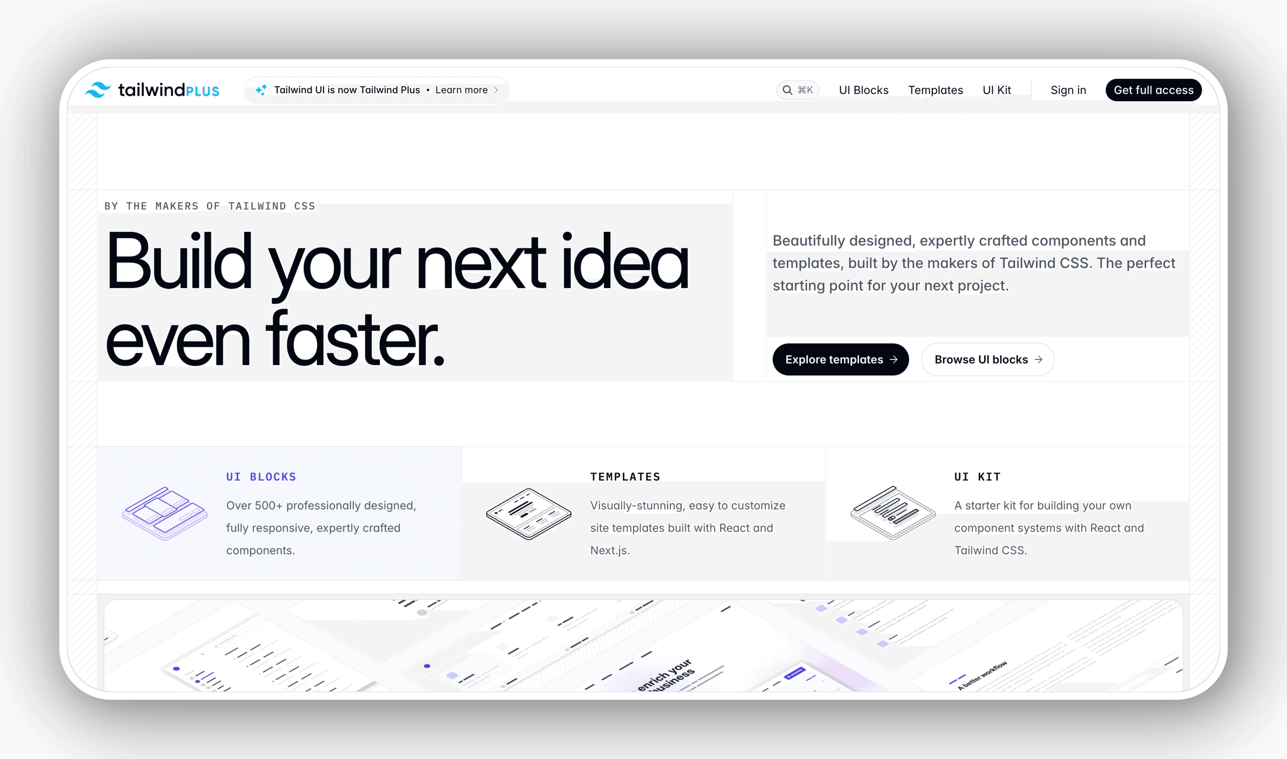
Tailwind UI is a premium collection of UI components from the creators of Tailwind CSS. It's packed with polished elements that you can easily adapt to match your brand or project style.
Features
- Wide selection of React and HTML components
- Fully responsive design across all screen sizes
- Integrates smoothly into existing codebases
Pros
- Built by Tailwind’s own developers and designers
- Regular updates with new components
- Strong community and expert guidance
Cons
- Subscription fees might be challenging for smaller budgets
Use Cases
- Ideal for teams looking to build polished UIs quickly while retaining flexibility
Support
- In-depth documentation and an active community, backed by Tailwind Labs
2. DaisyUI
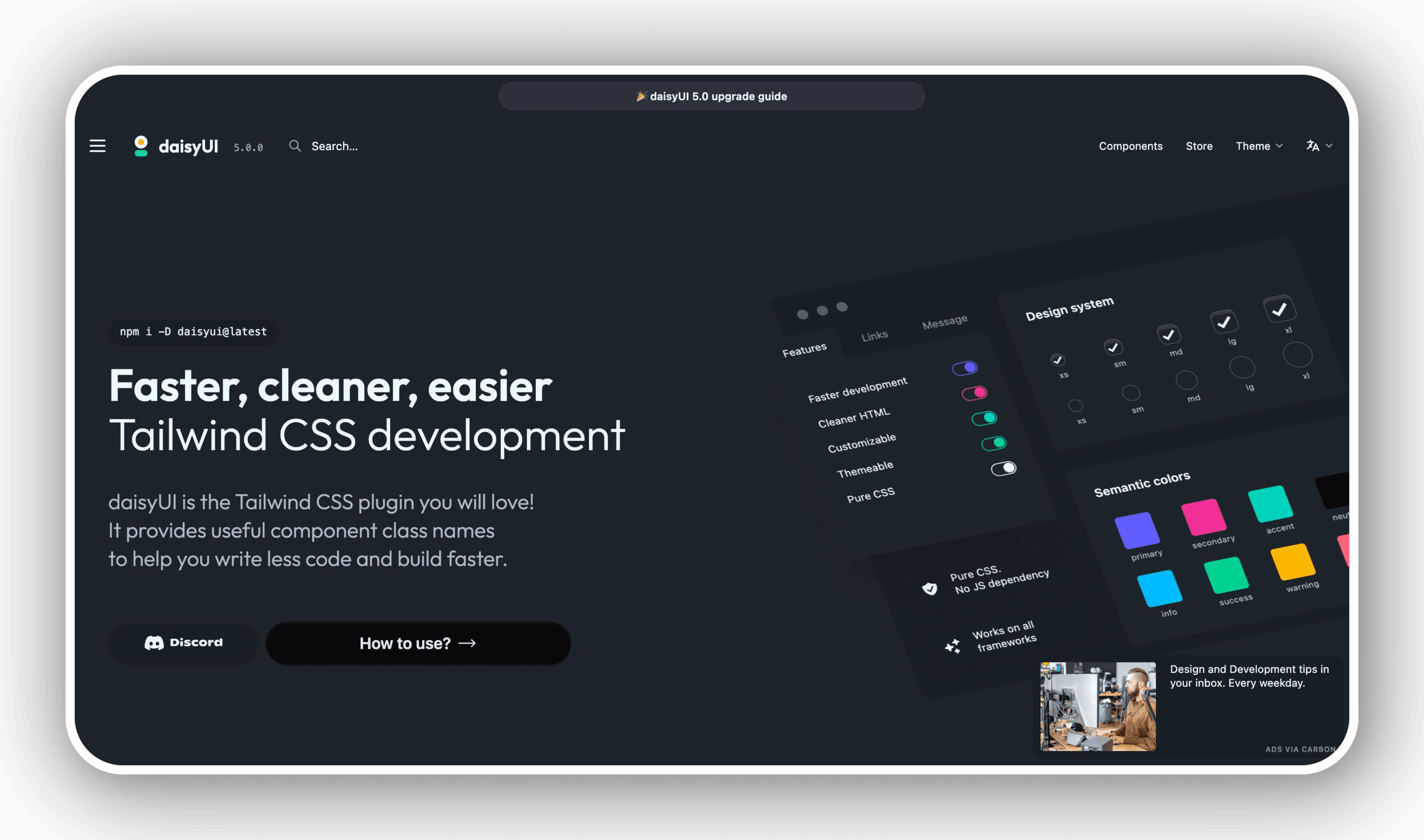
DaisyUI extends Tailwind CSS with an open-source collection of pre-styled components. It offers ready-to-use elements with minimal setup.
Features
- Extensive selection of default-styled components
- Built-in dark mode and theming capabilities
- Accessible and responsive layouts
Pros
- Completely free to use
- Quick installation and configuration
Cons
- Some components might need tweaking for a unique design
Use Cases
- Great for rapid prototyping or smaller projects needing solid UI elements
Support
- Ongoing updates and an enthusiastic contributor base
3. Flowbite
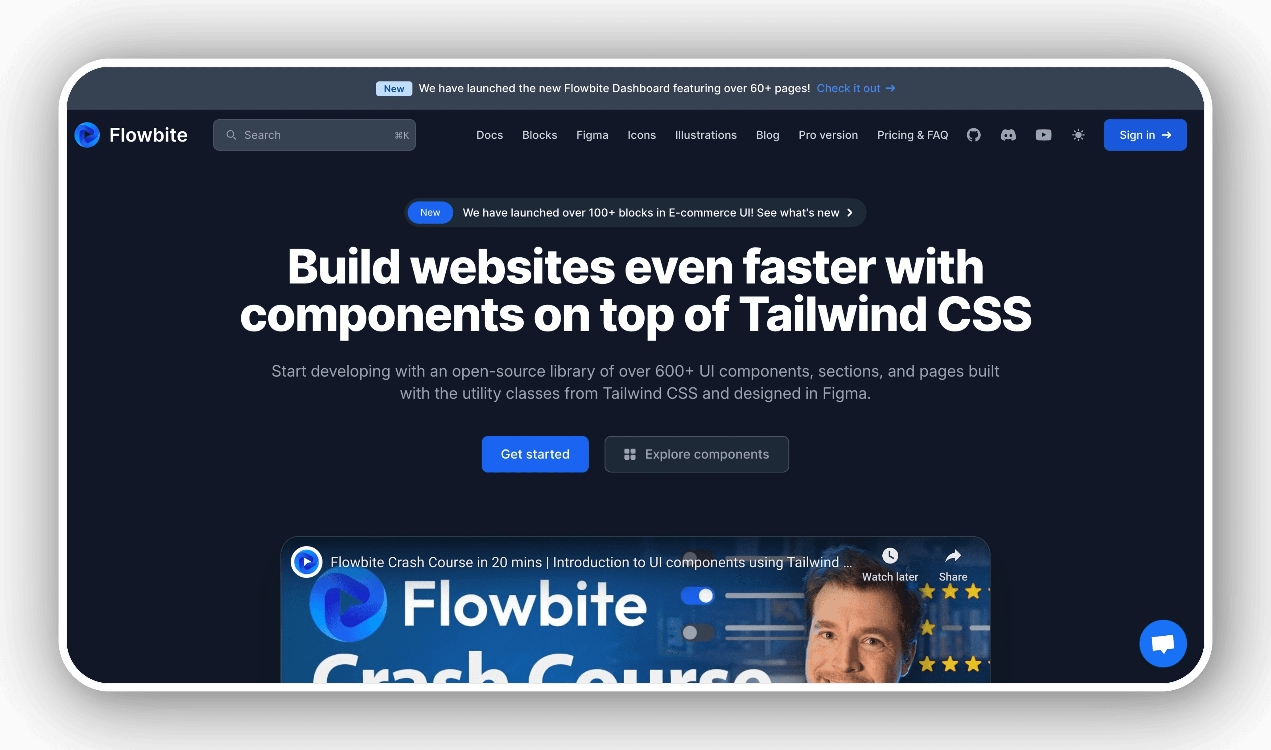
Flowbite delivers a broad set of Tailwind-ready components, covering everything from simple forms to complex modals.
Features
- Extensive UI kit: buttons, modals, carousels, and more
- Practical templates and examples for speedy setup
- Includes RTL support and responsive layouts
Pros
- Emphasizes accessibility in design
- Offers both free and premium versions
Cons
- Free version is limited compared to the paid plan
Use Cases
- Perfect for projects where accessibility standards are a priority
Support
- Comprehensive guides and responsive support team
4. Headless UI

Headless UI provides accessible, unstyled components you can adapt to any design approach.
Features
- Core logic and state management for interactive components
- Available for React and Vue
- Unstyled components, giving you full control with Tailwind classes
Pros
- Enables consistent design without sacrificing accessibility
- Maintained by Tailwind Labs
Cons
- Requires more effort to apply custom styles
Use Cases
- Projects needing deep customization while maintaining accessibility
Support
- Frequent updates and a supportive community forum
5. HyperUI
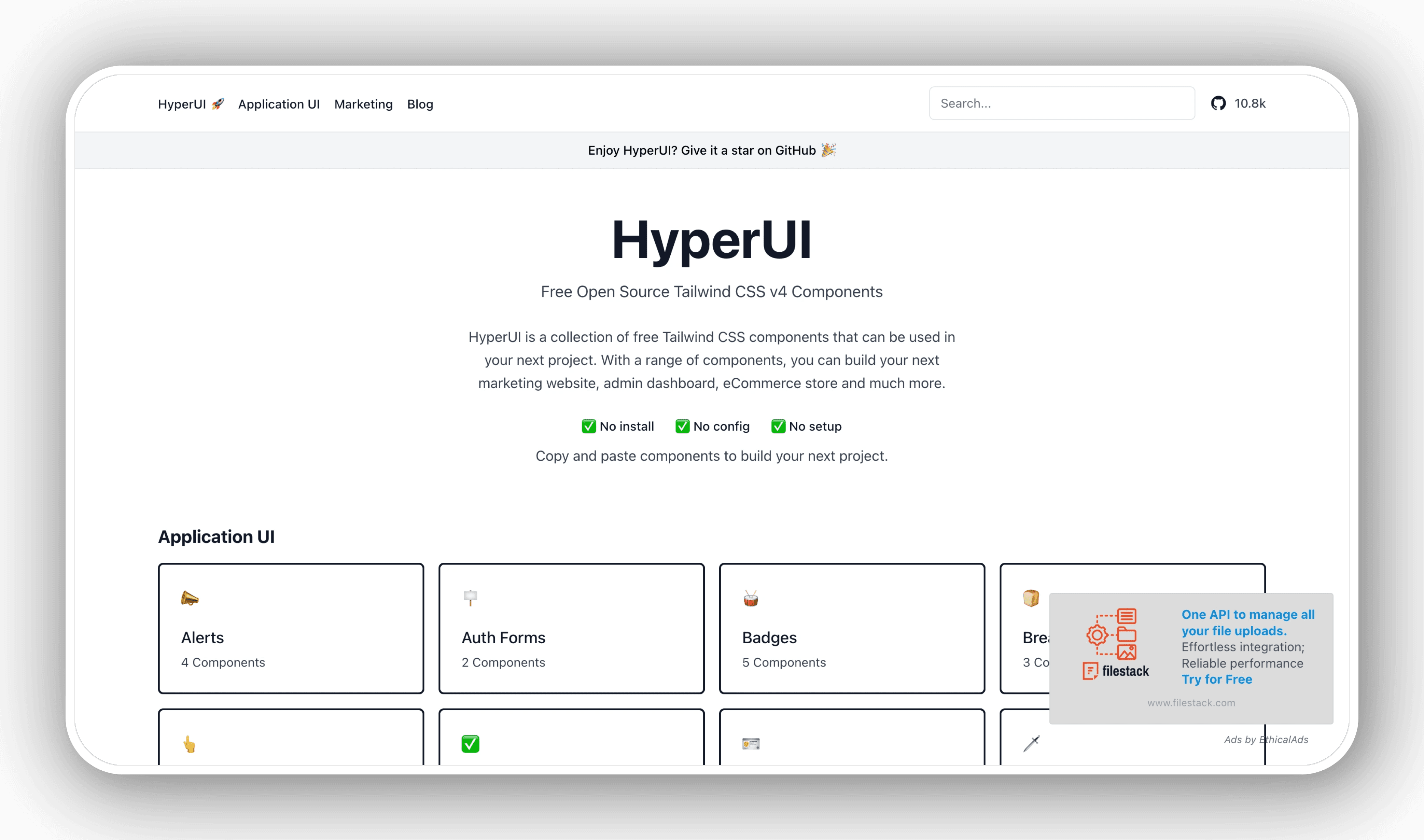
HyperUI offers a wide range of components built with Tailwind, neatly categorized for various interfaces.
Features
- Easily searchable components across multiple categories
- Straightforward theming and customization
Pros
- Community-driven with fresh design perspectives
- Free and open-source
Cons
- Design consistency may vary due to multiple contributors
Use Cases
- Developers seeking diverse layouts or wanting to mix and match styles
Support
- Regular contributions and updates from an active user base
Whether you choose premium or open-source options, these curated Tailwind component libraries can lighten your workload and help you launch engaging web experiences with less fuss.
Bonus:
Untitled UI React
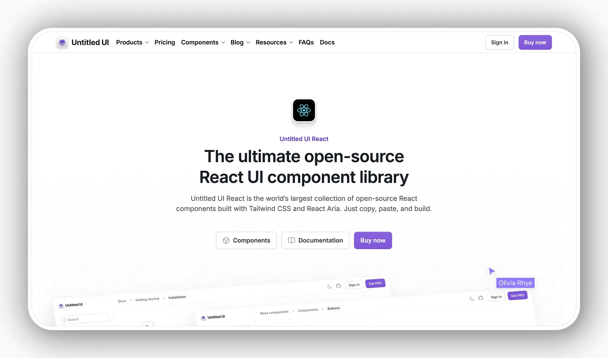
Untitled UI React is new addition to open-source Tailwind CSS libraries. Launched in July 2025, it's the world’s largest collection of open-source React components built with Tailwind CSS v4.1 and React Aria.
Features
- A huge collection of accessible, responsive, and modern components.
- Built-in dark mode and theming with CSS variables.
- Hundreds of practical and useful page examples and templates.
- Built for modern performance with Tailwind CSS v4.1, TypeScript v5.8, and React Aria.
Pros
- Quick installation and custom CLI tool to add components in seconds.
- Official starter kits and integrations for Bolt.new, Next.js, Lovable, and more.
- You own the code with no external dependencies and no vendor lock-in.
- Key focus on performance and accessibility with WAI-ARIA standards and best practices.
Cons
- A large portion of the library is open source, but "PRO" components are a paid add-on.
Use Cases
- Teams already using Tailwind CSS who want fully‑designed, accessible React components.
- Designers who use Untitled UI Figma and want code that’s in perfect sync.
Support
- Frequent updates + new open-source components.
- Fast support responses and fixes to GitHub issues.
Tips for Choosing the Right Tailwind Component Library
Selecting the right Tailwind component library can shape your project's success. Here are some guidelines to help you make the right choice.
Understanding Project Requirements
Start by pinpointing what your project truly needs. Are you developing a high-traffic app that demands advanced UI elements? Do you have strict branding guidelines? If you're working with tight deadlines or budgets, a library offering broad component coverage with minimal setup might be the way to go. If your project involves selecting a content management system, consider factors outlined in choosing a headless CMS. Clarifying these details upfront keeps you from backtracking later.
Evaluating Library Features and Support
Once you've defined your requirements, compare libraries based on:
- Variations and customizability of components
- Quality of documentation, including examples and tutorials
- Community engagement and support channels
Solid documentation saves valuable time during integration. An active GitHub repository or lively online forum suggests reliable support and ongoing development.
Long-term Maintenance and Updates
Look for libraries with a proven track record of updates and a roadmap for future development. Staying current with Tailwind’s releases helps maintain security and compatibility. Reviewing a library’s changelog or roadmap can give you insight into its longevity and reliability.
Final Thoughts
These Tailwind component libraries provide a streamlined path to building modern interfaces with speed and style. The flexibility of Tailwind works well with libraries like Tailwind UI or DaisyUI, allowing you to create high-quality UIs without getting bogged down in tedious CSS work. Choosing the right library keeps you focused on what matters most: delivering an exceptional user experience.
Summary of Key Points
- Combining Tailwind with a component library saves time and enhances design.
- Options exist for every need and budget, from premium to open-source.
- Community backing often signals reliable updates and meaningful improvements.
These libraries showcase a vibrant community dedicated to efficient UI design. Consider your project's needs, available resources, and the level of flexibility you desire in your styling process. With the right combination, you'll build interfaces that look sharp, run smoothly, and are ready for future growth.