Think of CSS frameworks as your comprehensive toolkit for modern web development. Among the best CSS frameworks for developers, you'll find ready-made CSS, HTML, and sometimes JavaScript components that speed up development. These top frameworks bring consistent design patterns and pre-packaged styles to the table, sparing you the headaches of browser quirks and tedious repetition.
Even when you're juggling multiple screen sizes and devices, CSS frameworks step up to make your life easier. Whether you're building a headless commerce site or a corporate portal, built-in responsive grids and layout systems help you maintain consistent design across desktops, tablets, and smartphones.
In brief:
- Tailwind CSS dominates with 31.1M weekly downloads (92.6% market share).
- Bundle sizes vary: Tailwind <10 KB, Bootstrap 16 KB, Foundation 34.7 KB gzipped.
- INP replaced FID in March 2024, favoring CSS-only frameworks.
- Bootstrap 5.3 and Material UI offer strongest WCAG 2.2 documentation.
- Quick start guides cover Bootstrap 5.3.8, Tailwind CSS 4.0, and Foundation 6.9.0.
What are CSS frameworks?
CSS frameworks are pre-designed libraries that kickstart your style and layout. Rather than crafting every button, grid, and typography rule from scratch, you tap into a refined system of classes and components designed to keep your project looking sharp.
They handle responsiveness too, so your site glides effortlessly across different devices. Pairing a CSS framework with a headless CMS separates your styling from content management, giving you flexibility on both fronts.
Key benefits:
- Drop in ready-made components like buttons, navigation bars, and form elements
- Maintain consistency across pages and team members
- Reduce time coding layouts that adapt from monitors to phone screens
- Update design rules in one place with changes rippling across the whole project
The evolution of CSS frameworks
CSS frameworks have transformed dramatically since 2015. Early frameworks like Bootstrap 3 relied heavily on float-based layouts and required jQuery for interactivity. The introduction of Flexbox and CSS Grid changed everything, allowing frameworks to build more intuitive layout systems.
By 2020, utility-first frameworks like Tailwind CSS challenged the component-based approach, offering granular control over styling without leaving your HTML. Today's frameworks leverage modern CSS features like cascade layers, container queries, and native nesting: features that simply didn't exist a decade ago.
Utility-first vs component-based approaches
CSS frameworks generally fall into two camps. Component-based frameworks like Bootstrap and Foundation provide pre-styled UI elements (buttons, cards, modals) that you drop into your markup with minimal customization. They're ideal for rapid prototyping and teams that need consistent design patterns out of the box. Utility-first frameworks like Tailwind CSS take the opposite approach, giving you low-level utility classes that you compose to build custom designs. Neither approach is universally better; component-based frameworks speed up initial development, while utility-first frameworks offer more design flexibility without fighting against framework defaults.
When NOT to use a CSS framework
Not every project needs a CSS framework. For small single-page sites or landing pages, the overhead of learning and configuring a framework may outweigh the benefits. A portfolio site with three pages might be more efficiently styled with custom CSS than configuring Tailwind's build process.
If you're learning CSS fundamentals, building without a framework helps you understand the underlying mechanics of layout, positioning, and the cascade. Projects with highly unique designs often benefit from custom CSS, since fighting against a framework's opinions can create more work than starting fresh. Finally, performance-critical applications where every kilobyte matters might be better served by hand-written, purpose-built stylesheets. Understanding these tradeoffs helps you appreciate when frameworks truly shine in the comparisons that follow.
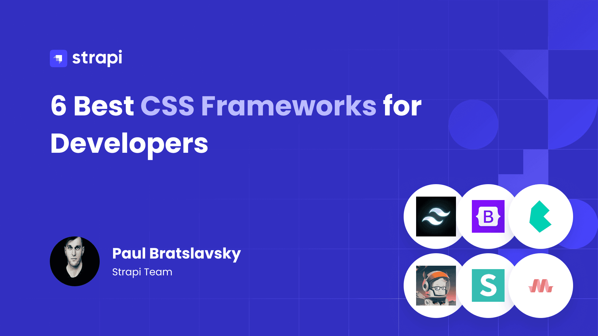
6 Best CSS frameworks for developers in 2026
From utility-first powerhouses to component-rich libraries, here's our breakdown of the top CSS frameworks that can streamline your development workflow this year.
1. Bootstrap
Bootstrap provides a solid foundation among CSS frameworks with its grid system that adapts smoothly across screen sizes. Bootstrap v5.3.8 (released August 25, 2024) brings WCAG 2.1 compliance improvements and stability patches. With 2,502,016 weekly npm downloads, it remains solid for teams needing documented accessibility compliance. Get details in the Bootstrap documentation.
Bootstrap's 12-column grid system remains its cornerstone feature. Six responsive breakpoints (xs, sm, md, lg, xl, xxl) give you precise control over layouts at every screen size. The grid uses Flexbox under the hood, making vertical alignment and equal-height columns straightforward. You can nest grids, offset columns, and reorder content visually without changing your HTML structure.
Beyond the grid, Bootstrap delivers a comprehensive component ecosystem. Modals, carousels, accordions, tooltips, and dropdowns work out of the box with minimal JavaScript. The framework includes 30+ components that cover most common UI patterns, from navigation bars to progress indicators. Build responsive admin dashboards using Bootstrap with Strapi's admin panel for a powerful content management experience.
2. Tailwind CSS
Tailwind CSS takes a utility-first approach. You sprinkle small, reusable classes directly into your HTML, tweaking spacing, sizing, and colors on the fly. Tailwind CSS v4.0 (January 2025) runs full builds up to 5x faster than v3, with incremental builds over 100x faster.
The numbers tell the story: Tailwind CSS commands 31.1 million weekly downloads, 12.5x more than Bootstrap. The State of CSS 2025 survey shows 37% of developers actively using Tailwind compared to 21.6% for Bootstrap. See Tailwind's installation guide to get started.
The utility-first philosophy changes how you think about styling. Instead of writing custom CSS classes like .card-header-primary, you compose styles directly in your markup: class="bg-blue-500 text-white p-4 rounded-lg". This approach eliminates the mental overhead of naming things and keeps styles co-located with your components. Design systems become more consistent because everyone uses the same utility vocabulary.
Tailwind's plugin ecosystem extends its capabilities significantly. The @tailwindcss/forms plugin provides sensible form element defaults, while @tailwindcss/typography handles rich text content with beautiful typographic defaults.
The @tailwindcss/container-queries plugin brings container query support to your utility classes. Create custom designs for your Strapi blog with Tailwind's utility classes for complete design freedom. Explore integrating Tailwind for seamless content delivery.
3. Foundation
Foundation takes a mobile-first mindset suited for enterprise-level projects. Foundation v6.9.0 (September 2024) modernized the build system with Dart Sass and requires Node.js 18+. With 107,641 weekly downloads, developers praise it for a clean codebase and logical structure.
Foundation extends beyond basic CSS with enterprise-focused features. Foundation for Emails provides a separate framework for building responsive HTML emails that render consistently across email clients, a notoriously difficult challenge.
Motion UI, Foundation's animation library, offers pre-built transitions and animations you can apply with simple classes. These additions make Foundation particularly attractive for organizations that need comprehensive front-end solutions.
Accessibility comes baked into Foundation's DNA. Components ship with ARIA attributes, keyboard navigation support, and semantic markup patterns. The framework's documentation emphasizes accessible patterns, and the development team actively considers assistive technology users when designing components. See how Foundation works to build accessible, enterprise-grade applications.
4. Bulma
Bulma released v1.0.0 in March 2025 with CSS variables throughout and official dark mode. With 93,369 weekly downloads, Bulma offers a modern, CSS-only framework that requires no JavaScript.
Bulma's CSS variables make theming straightforward: change a few custom properties and watch your entire design update. Its Flexbox-first grid system offers an alternative to Bootstrap's approach, with simpler class names like .columns and .column instead of .row and .col-*. The framework's modular architecture lets you import only the components you need, keeping bundle sizes lean.
5. Semantic UI
Semantic UI takes a unique approach with natural language class naming. The latest release was v2.5.0 in October 2022 with no activity since, raising maintenance concerns for long-term projects.
Despite its stalled development, Semantic UI's natural language class naming (.ui.large.blue.button) remains appealing for teams who want readable, self-documenting markup. The framework's human-friendly syntax reduces the learning curve for developers new to CSS frameworks. If you value code readability and have a project with a defined scope, Semantic UI's intuitive class structure can speed up development.
6. Materialize CSS
Materialize CSS implements Google's Material Design principles with elevation shadows, ripple effects, and the distinctive card-based layout patterns. No verifiable updates for 2024-2025 warrant careful evaluation before adoption.
Materialize provides a comprehensive set of Material Design components out of the box, including cards, floating action buttons, and toast notifications. If Material Design aesthetics align with your project requirements, consider actively maintained alternatives like Material UI for React projects. For simpler projects or prototypes where Material Design is essential, Materialize remains a viable option with its straightforward implementation.
Performance benchmarks and Core Web Vitals impact
Performance can make or break user experiences and search rankings. Understanding how CSS frameworks affect Core Web Vitals helps you make informed decisions. Monitor your Strapi API performance alongside frontend metrics for a complete picture of your application's speed.
2025 Core Web Vitals thresholds
The thresholds for "good" performance are:
- Largest Contentful Paint (LCP): ≤ 2.5 seconds
- Interaction to Next Paint (INP): ≤ 200 milliseconds
- Cumulative Layout Shift (CLS): ≤ 0.1
The shift to INP makes JavaScript bundle sizes more critical. CSS-only frameworks like Tailwind CSS gain a significant advantage since they add zero JavaScript runtime overhead.
Why INP matters more than FID
Google replaced First Input Delay (FID) with Interaction to Next Paint (INP) in March 2024 because INP provides a more complete picture of page responsiveness. While FID only measured the delay before the browser could begin processing the first interaction, INP captures the entire interaction lifecycle, from user input through visual feedback.
This change penalizes frameworks that ship heavy JavaScript bundles, even if initial input delays seem acceptable. CSS-only frameworks like Tailwind benefit because they contribute zero JavaScript execution time, leaving more headroom for your application code.
Bundle size comparison
| Framework | Gzipped | JavaScript Overhead |
|---|---|---|
| Tailwind CSS 3.4+ | <10 KB* | 0 KB (CSS-only) |
| Bootstrap 5.3.8 | 16.0 KB | 59.1 KB included |
| Foundation 6.9.0 | 34.7 KB | 141.5 KB included |
*Tailwind's size depends on actual utility class usage after automatic purging.
Optimization strategies
Tailwind CSS uses automatic content-based purging to remove unused classes. One documented case study showed an 829 KB to 78 KB CSS reduction. Bootstrap requires manual effort; select only required Sass partials and JavaScript plugins. Foundation offers modular builds through selective Sass partial imports.
Real-world performance testing methodology
For accurate framework comparisons, test against consistent conditions. Create identical test pages for each framework with the same layout complexity: navigation, hero section, card grid, footer. Run Lighthouse audits in incognito mode with CPU throttling enabled to simulate real-world conditions.
Pay close attention to Time to Interactive (TTI) and Total Blocking Time (TBT), as these metrics reveal how framework JavaScript affects perceived responsiveness. Test on both mobile and desktop profiles since framework overhead impacts constrained mobile devices more severely. Run multiple tests and average the results, since network variability affects measurements.
Tools like WebPageTest provide filmstrip views and detailed waterfall charts that reveal exactly where time is spent during page loads. Understanding these metrics helps you predict how each framework choice ripples through your Core Web Vitals scores.
Modern JavaScript framework integration
CSS frameworks must play nicely with your JavaScript stack. Connect your Next.js app to Strapi for a complete full-stack solution.
Tailwind CSS with Next.js
Start by installing the required packages:
npm install -D tailwindcss postcss autoprefixer
npx tailwindcss init -p
For Tailwind CSS v4.0, use CSS-first configuration with automatic content detection; no manual path configuration required. Import directives in your global CSS file:
@tailwind base;
@tailwind components;
@tailwind utilities;
Critical: Avoid CSS modules for Tailwind imports, as this prevents proper purging.
Bootstrap with React
Use react-bootstrap for React implementations without jQuery:
npm install react-bootstrap bootstrapTree-shake by importing components individually:
import Button from 'react-bootstrap/Button';For Vue/Nuxt, use bootstrap-vue-next for Vue 3 compatibility with the @bootstrap-vue-next/nuxt module.
In-depth comparison
Beyond features and syntax, CSS frameworks differ in how they handle responsive design and cross-browser compatibility. Here's how the leading frameworks stack up on these critical factors.
Responsiveness and browser compatibility
CSS Grid and Flexbox now have universal browser support. Per Can I Use data, CSS Grid has 98.25% global support, while Flexbox reaches 99.45%. No vendor prefixes required for modern browsers.
The Interop 2024 initiative achieved 95%+ interoperability across Safari, Chrome, Firefox, and Edge for CSS layout features.
Accessibility compliance and framework support
Accessibility compliance documentation significantly influences framework selection for government and enterprise projects. Per Section 508 standards, federal agencies must meet WCAG 2.1-2.2 Level AA requirements. Ensure your Strapi content includes proper alt text and semantic markup for complete accessibility coverage.
Framework accessibility comparison
| Framework | WCAG Support | Built-in ARIA | Developer Effort |
|---|---|---|---|
| Bootstrap 5.3 | WCAG 2.2 all levels | Comprehensive | Low |
| Material UI | WCAG 2.1 Level AA | Automatic state management | Low |
| Tailwind CSS | None (developer-dependent) | None | High |
| Bulma | No documentation | None | High |
Bootstrap 5.3 provides the most comprehensive support with built-in ARIA attributes, keyboard navigation, and .visually-hidden utilities for screen reader content.
Tailwind CSS provides utility classes only. Developers must manually implement all ARIA attributes and accessibility logic.
For projects requiring Section 508 compliance, Bootstrap, Foundation, and Material UI offer the strongest documented support.
Emerging CSS frameworks to watch
Three frameworks with verified traction emerged recently. These lightweight frameworks pair well with Strapi's fast API for performance-focused applications.
UnoCSS leads with 18,400 GitHub stars and 240,000 weekly npm downloads. This on-demand atomic CSS engine provides significantly faster build performance than Tailwind's JIT compilation.
Pico CSS (16,200 GitHub stars, 17,000 weekly downloads) styles native HTML elements without utility classes. Drop in the CSS file, and semantic HTML works immediately with automatic dark mode.
Open Props (5,200 GitHub stars, 10,000 weekly downloads) provides design tokens as CSS custom properties rather than a traditional framework. Works alongside any CSS methodology with no build step required.
Criteria for evaluating CSS frameworks
Thorough documentation and active community cut down ramp-up time. Some frameworks offer strong defaults; others like Tailwind provide a blank canvas. Foundation (34.7 KB) is 117% larger than Bootstrap (16.0 KB), which is 60% larger than typical Tailwind builds. Choose frameworks with solid track records in adaptive design.
Frequent updates indicate a healthier ecosystem with plugin libraries and answers to common questions. A framework that plays nicely with React, Vue.js, or headless architectures saves time. Consider how frameworks integrate with your content management workflow.
Quick start guides
Get up and running fast with the top three CSS frameworks. These quick start guides walk you through installation and basic setup so you can start building immediately.
Bootstrap quick start
Add Bootstrap to your project via CDN:
<link href="https://cdn.jsdelivr.net/npm/bootstrap@5.3.8/dist/css/bootstrap.min.css" rel="stylesheet">Use Bootstrap's predefined classes to build responsive navbars or buttons. Override default styles by adding custom CSS or tweaking Bootstrap's SASS variables.
Create a responsive navbar in minutes:
<nav class="navbar navbar-expand-lg navbar-dark bg-primary">
  <div class="container">
    <a class="navbar-brand" href="#">My App</a>
    <button class="navbar-toggler" type="button" data-bs-toggle="collapse" data-bs-target="#navbarNav">
      <span class="navbar-toggler-icon"></span>
    </button>
    <div class="collapse navbar-collapse" id="navbarNav">
      <ul class="navbar-nav ms-auto">
        <li class="nav-item"><a class="nav-link" href="#">Home</a></li>
        <li class="nav-item"><a class="nav-link" href="#">About</a></li>
      </ul>
    </div>
  </div>
</nav>
Build responsive layouts with the grid system:
<div class="container">
  <div class="row">
    <div class="col-12 col-md-6 col-lg-4">Column 1</div>
    <div class="col-12 col-md-6 col-lg-4">Column 2</div>
    <div class="col-12 col-md-12 col-lg-4">Column 3</div>
  </div>
</div>
Connect your Bootstrap frontend to Strapi's REST API to pull dynamic content into your layouts.
Tailwind CSS quick start
Start by installing Tailwind CSS:
npm install -D tailwindcss
npx tailwindcss init
Add Tailwind directives to your primary CSS file, then build:
npx tailwindcss -i ./src/input.css -o ./dist/output.css --watchCustomize your theme colors in tailwind.config.js:
module.exports = {
  theme: {
    extend: {
      colors: {
        brand: {
          light: '#3fbaeb',
          DEFAULT: '#0fa9e6',
          dark: '#0c87b8',
        }
      }
    }
  }
}
Create reusable component styles with @apply:
@layer components {
  .btn-primary {
    @apply px-4 py-2 bg-brand text-white rounded-lg hover:bg-brand-dark transition-colors;
  }
}
Fetch content from Strapi's GraphQL API for Tailwind projects to create dynamic, beautifully styled pages.
Foundation quick start
Start by installing via npm:
npm install foundation-sitesFoundation's XY Grid provides a flexible layout foundation:
<div class="grid-container">
  <div class="grid-x grid-padding-x">
    <div class="cell small-12 medium-6 large-4">Column 1</div>
    <div class="cell small-12 medium-6 large-4">Column 2</div>
    <div class="cell small-12 medium-12 large-4">Column 3</div>
  </div>
</div>
Visit the Foundation docs for template ideas. Build enterprise apps with Strapi Cloud for a managed backend that scales with your Foundation frontend.
Developer tooling and IDE support
Modern CSS frameworks compete not just on features but on how seamlessly they integrate into your development environment. Strong IDE support translates directly to productivity gains, where autocomplete eliminates typos, inline documentation reduces context switching, and real-time error detection catches issues before they hit the browser.
Strapi's TypeScript support provides similar IntelliSense benefits to the CSS frameworks below:
- Tailwind CSS IntelliSense for VS Code provides autocomplete, syntax highlighting, and hover previews. As you type utility classes, the extension suggests completions with color swatches for color utilities and computed CSS values on hover. Responsive variant suggestions (like
md:orlg:) appear contextually, and the extension flags invalid class combinations. Support extends to Cursor, Zed, and JetBrains IDEs. - Material UI takes a TypeScript-first approach with fully typed components providing native IntelliSense.
- Bootstrap relies more on generic CSS IntelliSense through community extensions.
Selecting the right CSS framework for your projects
Choosing the right CSS framework sets the stage for smooth, consistent, and efficient web development. Performance varies significantly: Tailwind CSS bundles at less than 10 KB while Foundation reaches 34.7 KB gzipped. For projects requiring accessibility compliance, Bootstrap 5.3 and Material UI provide the strongest WCAG 2.2 documentation out of the box. Teams prioritizing developer experience and build speed will appreciate Tailwind's v4.0 performance improvements.
Your choice comes down to aligning a framework's features with your project's goals, your comfort level, and the interface you aim to deliver. Consider your team's expertise, project timeline, and long-term maintenance requirements when making your selection.
Strapi's headless CMS architecture complements any CSS framework choice:
- REST and GraphQL APIs for flexible content delivery to any frontend
- Content Types Builder for structured content modeling without code
- Media Library for centralized asset management across projects
- Role-based access control for secure content workflows
- Strapi Cloud for managed hosting with global CDN distribution
- Plugin marketplace for extending functionality as your project grows
You can find detailed documentation and integration guides for all major CSS frameworks on their official websites. Whether you're working with React, Vue, Next.js, or Nuxt, each framework provides comprehensive setup instructions for maximum flexibility.
Ready to pair your CSS framework with a powerful content backend? Get started with Strapi and explore how headless architecture simplifies frontend development while giving you complete styling freedom.