
In part 3 of our series, let's finish building out our home page. We will finish up our Hero Section, then move to our Features Section, and finally add our Top Navigation and Footer.
- Part 1: Learn Next.js by building a website
- Part 2: Building Out The Hero Section of the homepage
- Part 3: Finishup up the homepage Features Section, TopNavigation and Footer
- Part 4: How to handle login and Authentification in Next.js
- Part 5: Building out the Dashboard page and upload file using NextJS server actions
- Part 6: Get Video Transcript with AI SDK
- Part 7: Strapi CRUD permissions
- Part 8: Search & pagination in Nextjs
- Part 9: Backend deployment to Strapi Cloud
- Part 10: Frontend deployment to Vercel
Let's refactor our Hero Section to use the Next Image component.
Instead of using it directly, we will create a new component called StrapiImage to add a few additional quality live improvements.
Inside src/app/components/custom, create a new file called strapi-image.tsx and paste it into the following code.
import Image from "next/image";

import { getStrapiURL } from "@/lib/utils";

interface IStrapiMediaProps {
  src: string;
  alt: string | null;
  height?: number;
  width?: number;
  className?: string;
  fill?: boolean;
  priority?: boolean;
}

export function getStrapiMedia(url: string | null) {
  const strapiURL = getStrapiURL();
  if (url == null) return null;
  if (url.startsWith("data:")) return url;
  if (url.startsWith("http") || url.startsWith("//")) return url;
  return `${strapiURL}${url}`;
}

export function StrapiImage({
  src,
  alt,
  className,
  ...rest
}: Readonly<IStrapiMediaProps>) {
  const imageUrl = getStrapiMedia(src);
  if (!imageUrl) return null;
  return (
    <Image
      src={imageUrl}
      alt={alt ?? "No alternative text provided"}
      className={className}
      {...rest}
    />
  );
}getStrapiMedia(): This function is designed to process media URLs from the Strapi CMS. It accepts a URL as a string or null.
If the input url is null, the function returns null, which could be used in cases where an image or media file is optional.
If the input URL starts with "data:", it is returned as-is. This condition checks for data URLs, which are URLs that contain actual data (e.g., base64-encoded images) instead of linking to an external resource.
This is often used to embed small images directly in HTML or CSS to reduce the number of HTTP requests.
If the input URL starts with "http" or "//", it is also returned as-is. This covers absolute URLs, meaning the media is hosted outside the Strapi backend (possibly on another domain or CDN).
If none of the above conditions are met, the function assumes the url is a relative path to a resource on the Strapi backend.
We ara also importing the following helper function called getStrapiURL; first, let's add it to our src/lib/utils.ts file and then review what it does.
export function getStrapiURL() {
  return process.env.NEXT_PUBLIC_STRAPI_URL ?? "http://localhost:1337";
}getStrapiURL():
This function returns the URL of the Strapi API. We are setting our environment name to NEXT_PUBLIC_, which will be available in both the server and client components.
Note: only set public for none private items when using NEXT_PUBLIC_, they will be seen by all. You can learn more in Next.js docs.
Now that we have our StrapiImage component let's use it in our Hero Section.
Navigate to src/app/components/custom/hero-section.tsx and make the following changes.
First, import our newly created component.
import { StrapiImage } from "@/components/custom/strapi-image";Second, replace the img tag with the following.
<StrapiImage
  alt={image.alternativeText ?? "no alternative text"}
  className="absolute inset-0 object-cover w-full h-full aspect/16:9"
  src={image.url}
  height={1080}
  width={1920}
/>
The completed code should look like this:
import Link from "next/link";
import type { TImage, TLink } from "@/types";
import { StrapiImage } from "./strapi-image";
export interface IHeroSectionProps {
id: number;
documentId: string;
__component: string;
heading: string;
subHeading: string;
image: TImage;
link: TLink;
}
const styles = {
header: "relative h-[600px] overflow-hidden",
backgroundImage: "absolute inset-0 object-cover w-full h-full",
overlay:
"relative z-10 flex flex-col items-center justify-center h-full text-center text-white bg-black/50",
heading: "text-4xl font-bold md:text-5xl lg:text-6xl",
subheading: "mt-4 text-lg md:text-xl lg:text-2xl",
button:
"mt-8 inline-flex items-center justify-center px-6 py-3 text-base font-medium text-black bg-white rounded-md shadow hover:bg-gray-100 transition-colors",
};
export function HeroSection({ data }: { data: IHeroSectionProps }) {
if (!data) return null;
const { heading, subHeading, image, link } = data;
console.dir(data, { depth: null });
return (
<header className={styles.header}>
<StrapiImage
alt={image.alternativeText ?? "no alternative text"}
className="absolute inset-0 object-cover w-full h-full aspect/16:9"
src={image.url}
height={1080}
width={1920}
/>
<div className={styles.overlay}>
<h1 className={styles.heading}>{heading}</h1>
<p className={styles.subheading}>{subHeading}</p>
<Link className={styles.button} href={link.href}>
{link.label}
</Link>
</div>
</header>
);
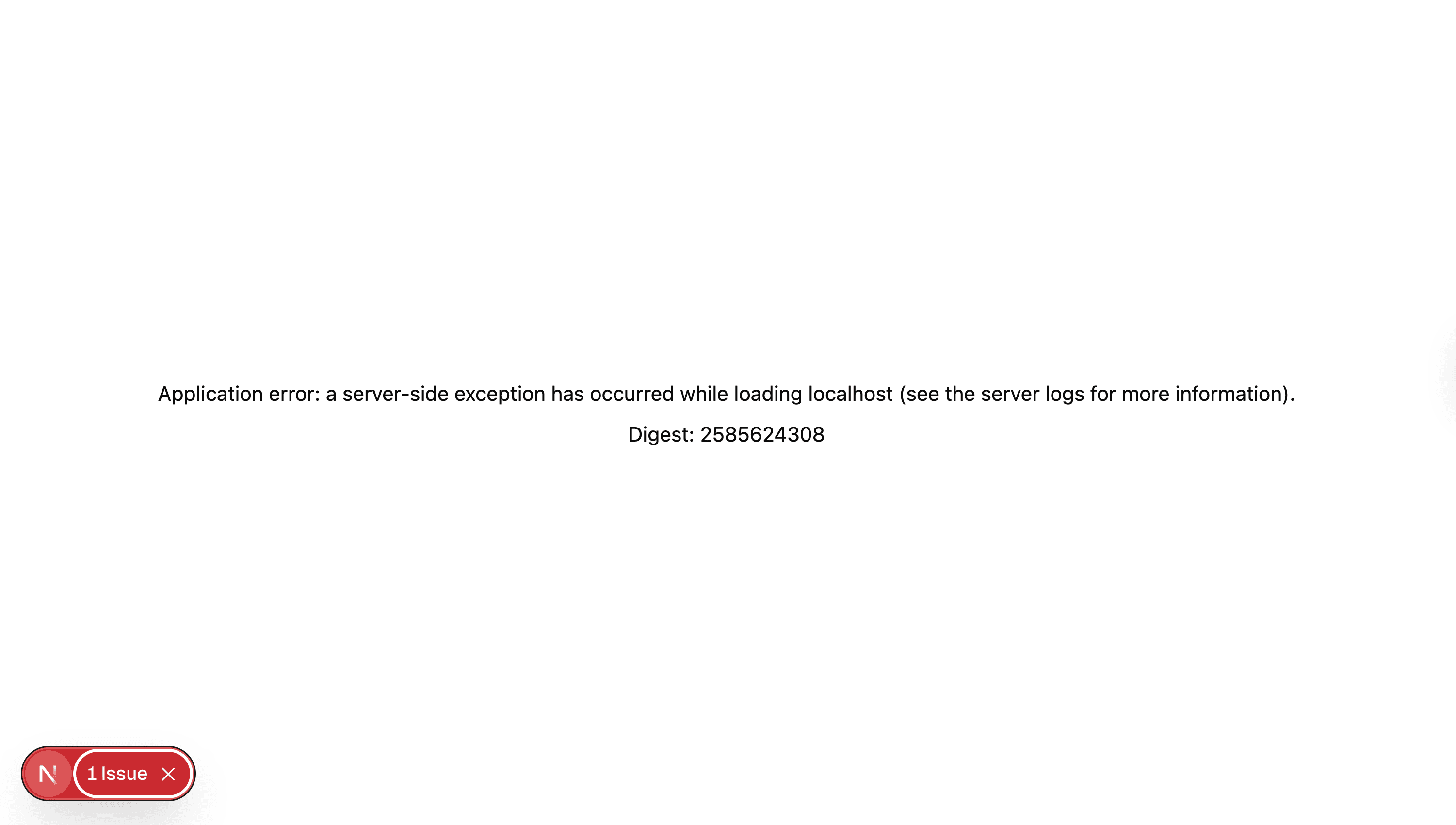
}When you restart the application, and... you will see the following error.
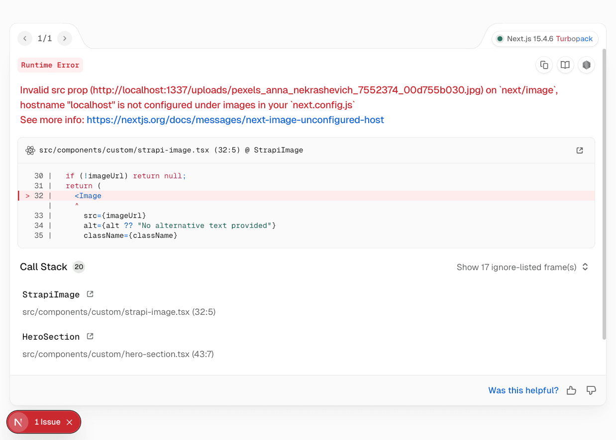
Clicking on the link in the error will take you here, which explains the steps to fix this.
Inside the root of your project, locate the next.config.ts file and make the following change.
import type { NextConfig } from "next";

const nextConfig: NextConfig = {
  /* config options here */
  images: {
    remotePatterns: [
      {
        protocol: "http",
        hostname: "localhost",
        port: "1337",
        pathname: "/uploads/**/*",
      },
    ],
  },
};

export default nextConfig;
Now, when you restart your application, you should see the following with your image.

Nice, now let's work on our Features Section
Building Out Our Features Section
Modeling Our Features Section Data In Strapi
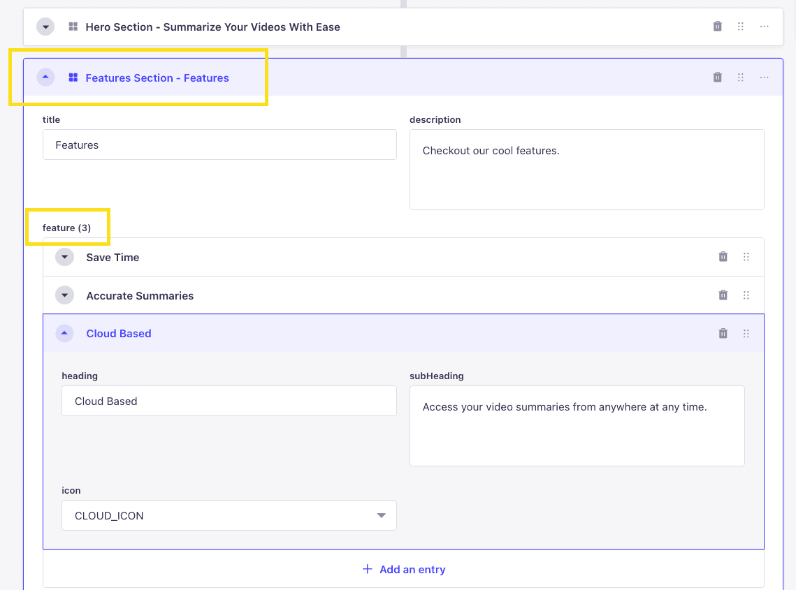
Looking at our Features Section UI, we can break it down into the following parts.

We have a section that has repeatable components with the following items.
- Icon
- Heading
- Subheading
So, let's jump into our Strapi Admin and create our Features Section Component.
Let's start by navigating to Content-Type Builder under COMPONENTS, clicking on Create new component, and let's call it Features Section and save it under the layout category.
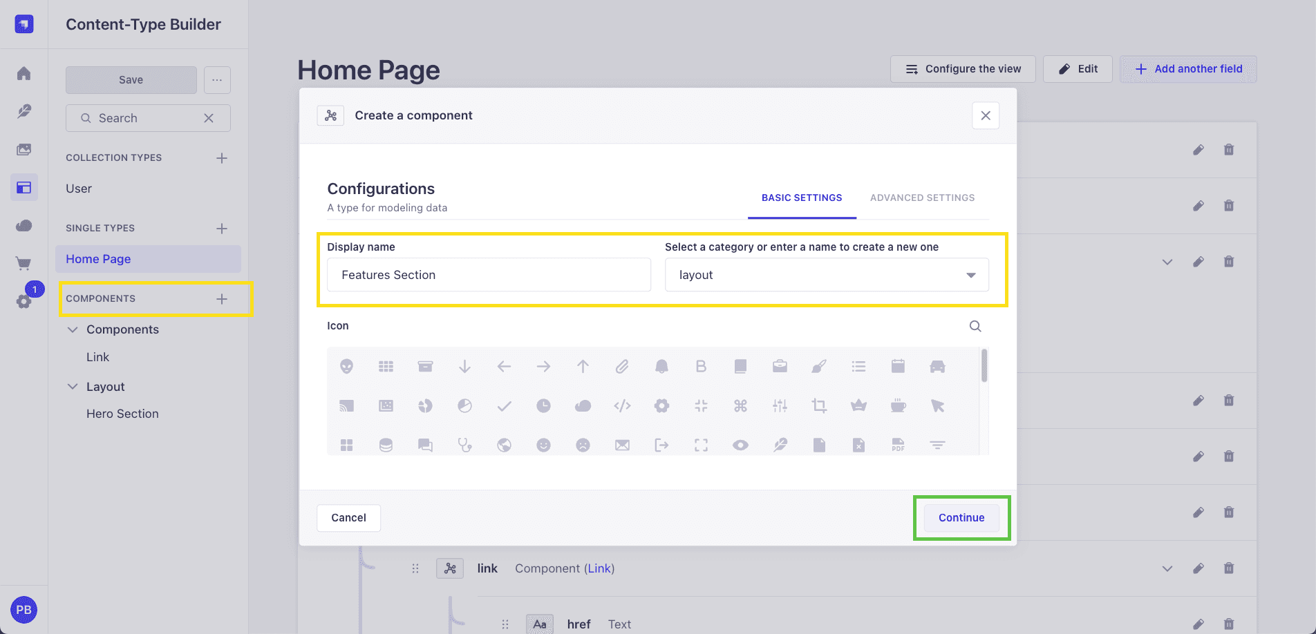
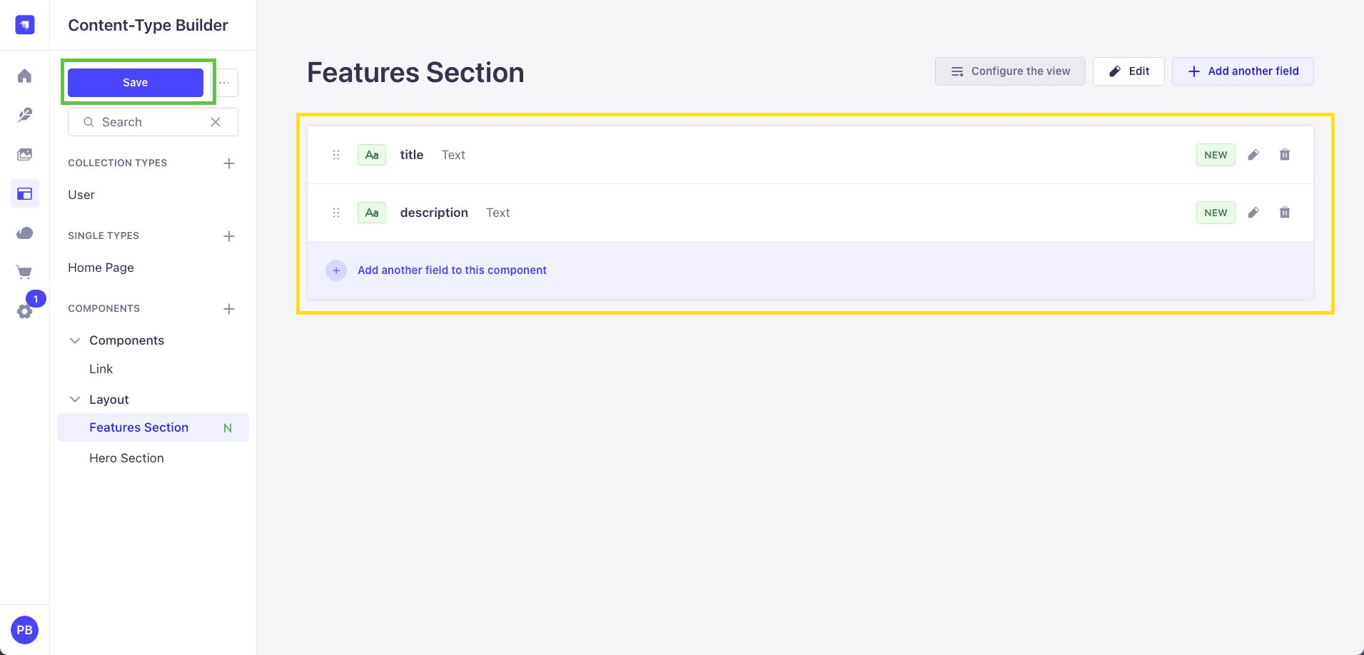
We will create the following fields.
Text -> Short Text - title Text -> Long Text - description
Finally, let's create a repeatable component called Feature and save it under components.
Display Name -> Feature Category -> components Type: repeatable component Name: features
And add the following fields.
heading -> Text -> Short Text - heading subHeading -> Text -> Long Text - subHeading icon -> Enum -> with the following options
- CLOCK_ICON
- CHECK_ICON
- CLOUD_ICON
Let's add our newly created Feature Section component to our home page.
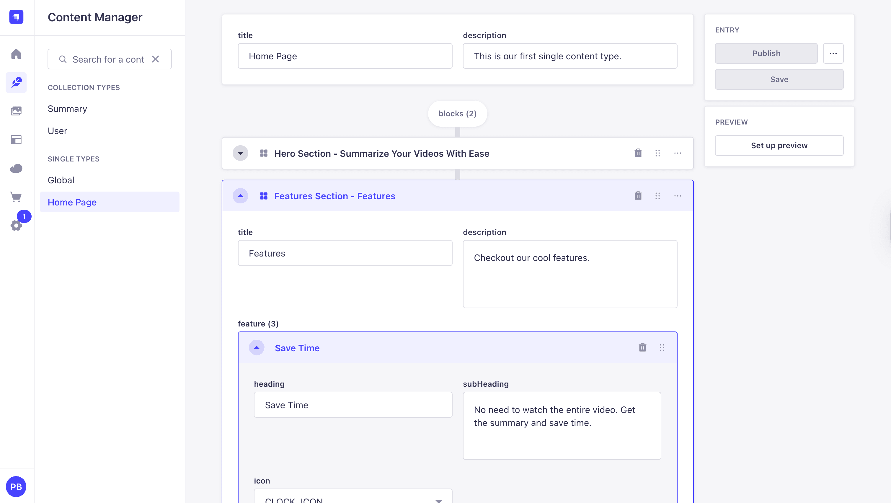
Now, let's add some features data and save.
Navigate to Content Manager, select the Home Page, add the new Features Section block, and fill in your features.
We are already getting our page data; let's navigate to src/app/page.tsx and update our query to populate our feature repeatable component.
Let's update the homePageQuery query with the following changes. Remember in Strapi 5 we have to user the on flag to populate our dynamic zone components.
const homePageQuery = qs.stringify({
  populate: {
    blocks: {
      on: {
        "layout.hero-section": {
          populate: {
            image: {
              fields: ["url", "alternativeText"],
            },
            link: {
              populate: true,
            },
          },
        },
        "layout.features-section": {
          populate: {
            features: {
              populate: true,
            },
          },
        },
      },
    },
  },
});
Also, let's update our getStrapiData function to use our new helper method, getStrapiURL. So it will look like the following.
So don't forget to import it.
import { getStrapiURL } from "@/lib/utils";async function getStrapiData(path: string) {
const baseUrl = getStrapiURL();
const url = new URL(path, baseUrl);
url.search = homePageQuery;
try {
const response = await fetch(url.href);
const data = await response.json();
return data;
} catch (error) {
console.error(error);
}
}Now, let's console log our block and see what the response looks like.
console.dir(blocks, { depth: null });We should see the following data.
[
  {
    __component: "layout.hero-section",
    id: 4,
    heading: "Summarize Your Videos With Ease",
    subHeading:
      "Get back your time by getting all the key points with out watching the whole video.",
    image: {
      id: 2,
      documentId: "bqs73cv7n0r7c08bsi2rdsww",
      url: "/uploads/pexels_anna_nekrashevich_7552374_00d755b030.jpg",
      alternativeText: null,
    },
    link: { id: 4, href: "/login", label: "Login", isExternal: null },
  },
  {
    __component: "layout.features-section",
    id: 2,
    title: "Features",
    description: "Checkout our cool features.",
    feature: [
      {
        id: 4,
        heading: "Save Time",
        subHeading:
          "No need to watch the entire video. Get the summary and save time.",
        icon: "CLOCK_ICON",
      },
      {
        id: 5,
        heading: "Accurate Summaries",
        subHeading: "Our AI-powered tool provides summaries of your content.",
        icon: "CHECK_ICON",
      },
      {
        id: 6,
        heading: "Cloud Based",
        subHeading: "Access your video summaries from anywhere at any time.",
        icon: "CLOUD_ICON",
      },
    ],
  },
];
Notice that we are getting both our Hero Section and Features Section
Now, let's create a component to display our feature data.
Building Our Features Section Data In Next.js
Let's navigate to src/app/components/custom, create a file called features-section.tsx, and paste it into the following code.
import React from "react";
import { TFeature } from "@/types";

export interface IFeaturesSectionProps {
  id: number;
  __component: string;
  title: string;
  description: string;
  features?: TFeature[] | null;
}

function getIcon(name: string) {
  switch (name) {
    case "CLOCK_ICON":
      return <ClockIcon className="w-12 h-12 mb-4 text-gray-900" />;
    case "CHECK_ICON":
      return <CheckIcon className="w-12 h-12 mb-4 text-gray-900" />;
    case "CLOUD_ICON":
      return <CloudIcon className="w-12 h-12 mb-4 text-gray-900" />;
    default:
      return null;
  }
}

const styles = {
  container: "flex-1",
  section: "container px-4 py-6 mx-auto md:px-6 lg:py-24",
  grid: "grid gap-8 md:grid-cols-3",
  featureCard: "flex flex-col items-center text-center",
  icon: "w-12 h-12 mb-4 text-gray-900",
  heading: "mb-4 text-2xl font-bold",
  description: "text-gray-500",
};

export function FeaturesSection({ data }: { data: IFeaturesSectionProps }) {
  if (!data?.features) return null;
  return (
    <div>
      <div className={styles.container}>
        <section className={styles.section}>
          <div className={styles.grid}>
            {data.features.map((item: TFeature) => (
              <div className={styles.featureCard} key={item.id}>
                {getIcon(item.icon)}
                <h2 className={styles.heading}>{item.heading}</h2>
                <p className={styles.description}>{item.subHeading}</p>
              </div>
            ))}
          </div>
        </section>
      </div>
    </div>
  );
}

function CheckIcon(props: React.SVGProps<SVGSVGElement>) {
  return (
    <svg
      {...props}
      xmlns="http://www.w3.org/2000/svg"
      width="24"
      height="24"
      viewBox="0 0 24 24"
      fill="none"
      stroke="currentColor"
      strokeWidth="2"
      strokeLinecap="round"
      strokeLinejoin="round"
    >
      <polyline points="20 6 9 17 4 12" />
    </svg>
  );
}

function ClockIcon(props: React.SVGProps<SVGSVGElement>) {
  return (
    <svg
      {...props}
      xmlns="http://www.w3.org/2000/svg"
      width="24"
      height="24"
      viewBox="0 0 24 24"
      fill="none"
      stroke="currentColor"
      strokeWidth="2"
      strokeLinecap="round"
      strokeLinejoin="round"
    >
      <circle cx="12" cy="12" r="10" />
      <polyline points="12 6 12 12 16 14" />
    </svg>
  );
}

function CloudIcon(props: React.SVGProps<SVGSVGElement>) {
  return (
    <svg
      {...props}
      xmlns="http://www.w3.org/2000/svg"
      width="24"
      height="24"
      viewBox="0 0 24 24"
      fill="none"
      stroke="currentColor"
      strokeWidth="2"
      strokeLinecap="round"
      strokeLinejoin="round"
    >
      <path d="M17.5 19H9a7 7 0 1 1 6.71-9h1.79a4.5 4.5 0 1 1 0 9Z" />
    </svg>
  );
}
Let's navigate to src/app/page.tsx, import our newly created component, and see what we get.
import { FeaturesSection } from "@/components/custom/features-section";And update the return statement with the following code.
return (
  <main>
    <HeroSection data={blocks[0]} />
    <FeaturesSection data={blocks[1]} />
  </main>
);
When we restart our application and refresh the page with command + r, we should see the following.

Before getting too far let's update the way we load data. We will create a simple SDK that will allows us to easily fetch and mutated data.
In src folder, create a new folder called data with a new file called data-api.ts and add the following code:
fetch-data.tsx
import type { TStrapiResponse } from "@/types";

type HTTPMethod = "GET" | "POST" | "PUT" | "PATCH" | "DELETE";

type ApiOptions<P = Record<string, unknown>> = {
  method: HTTPMethod;
  payload?: P;
  timeoutMs?: number;
  authToken?: string;
};

/**
 * Unified API function with timeout and optional authentication
 *
 * Features:
 * - Supports all HTTP methods (GET, POST, PUT, PATCH, DELETE)
 * - Optional authentication (includes Bearer token when authToken provided)
 * - Timeout protection (8 seconds default)
 * - Consistent error handling and response formatting
 * - Handles DELETE requests without response body parsing
 */

async function apiWithTimeout(
  input: RequestInfo,
  init: RequestInit = {},
  timeoutMs = 8000 // 8 seconds default - good balance between patience and UX
): Promise<Response> {
  // Create controller to manage request cancellation
  const controller = new AbortController();

  // Set up automatic cancellation after timeout period
  const timeout = setTimeout(() => controller.abort(), timeoutMs);

  try {
    const response = await fetch(input, {
      ...init,
      signal: controller.signal, // Connect the abort signal to fetch
    });
    return response;
  } finally {
    // Always clean up the timeout to prevent memory leaks
    // This runs whether the request succeeds, fails, or times out
    clearTimeout(timeout);
  }
}

export async function apiRequest<T = unknown, P = Record<string, unknown>>(
  url: string,
  options: ApiOptions<P>
): Promise<TStrapiResponse<T>> {
  const { method, payload, timeoutMs = 8000, authToken } = options;

  // Set up base headers for JSON communication
  const headers: Record<string, string> = {
    "Content-Type": "application/json",
  };

  // Include Bearer token if provided (public requests when no token, authenticated when token provided)
  if (authToken) {
    headers["Authorization"] = `Bearer ${authToken}`;
  }

  try {
    // Make the actual API request with timeout protection
    const response = await apiWithTimeout(
      url,
      {
        method,
        headers,
        // GET and DELETE requests don't have request bodies
        body:
          method === "GET" || method === "DELETE"
            ? undefined
            : JSON.stringify(payload ?? {}),
      },
      timeoutMs
    );

    // Handle DELETE requests that may not return JSON response body
    if (method === "DELETE") {
      return response.ok
        ? { data: true as T, success: true, status: response.status }
        : {
            error: {
              status: response.status,
              name: "Error",
              message: "Failed to delete resource",
            },
            success: false,
            status: response.status,
          };
    }

    // Parse the JSON response for all other methods
    const data = await response.json();

    // Handle unsuccessful responses (4xx, 5xx status codes)
    if (!response.ok) {
      console.error(`API ${method} error (${response.status}):`, {
        url,
        status: response.status,
        statusText: response.statusText,
        data,
        hasAuthToken: !!authToken,
      });

      // If Strapi returns a structured error, pass it through as-is
      if (data.error) {
        return {
          error: data.error,
          success: false,
          status: response.status,
        };
      }

      // Otherwise create a generic error response
      return {
        error: {
          status: response.status,
          name: data?.error?.name ?? "Error",
          message:
            data?.error?.message ??
            (response.statusText || "An error occurred"),
        },
        success: false,
        status: response.status,
      };
    }

    // Success case - extract Strapi data field to avoid double nesting
    // Strapi returns: { data: {...}, meta: {...} }
    // We want to return: { data: {...}, meta: {...}, success: true, status: 200 }
    const responseData = data.data ? data.data : data;
    const responseMeta = data.meta ? data.meta : undefined;
    return {
      data: responseData as T,
      meta: responseMeta,
      success: true,
      status: response.status,
    };
  } catch (error) {
    // Handle timeout errors specifically (when AbortController cancels the request)
    if ((error as Error).name === "AbortError") {
      console.error("Request timed out");
      return {
        error: {
          status: 408,
          name: "TimeoutError",
          message: "The request timed out. Please try again.",
        },
        success: false,
        status: 408,
      } as TStrapiResponse<T>;
    }

    // Handle network errors, JSON parsing errors, and other unexpected issues
    console.error(`Network or unexpected error on ${method} ${url}:`, error);
    return {
      error: {
        status: 500,
        name: "NetworkError",
        message:
          error instanceof Error ? error.message : "Something went wrong",
      },
      success: false,
      status: 500,
    } as TStrapiResponse<T>;
  }
}

/**
 * Convenience API methods that support both public and authenticated requests
 *
 * Usage examples:
 * // Public request
 * const homePage = await api.get<THomePage>('/api/home-page');
 *
 * // Authenticated request
 * const userProfile = await api.get<TUser>('/api/users/me', { authToken: 'your-token' });
 */
export const api = {
  get: <T>(
    url: string,
    options: { timeoutMs?: number; authToken?: string } = {}
  ) => apiRequest<T>(url, { method: "GET", ...options }),

  post: <T, P = Record<string, unknown>>(
    url: string,
    payload: P,
    options: { timeoutMs?: number; authToken?: string } = {}
  ) => apiRequest<T, P>(url, { method: "POST", payload, ...options }),

  put: <T, P = Record<string, unknown>>(
    url: string,
    payload: P,
    options: { timeoutMs?: number; authToken?: string } = {}
  ) => apiRequest<T, P>(url, { method: "PUT", payload, ...options }),

  patch: <T, P = Record<string, unknown>>(
    url: string,
    payload: P,
    options: { timeoutMs?: number; authToken?: string } = {}
  ) => apiRequest<T, P>(url, { method: "PATCH", payload, ...options }),

  delete: <T>(
    url: string,
    options: { timeoutMs?: number; authToken?: string } = {}
  ) => apiRequest<T>(url, { method: "DELETE", ...options }),
};
Overview of API Utility Code
The code provides a unified API request utility with built-in authentication, error handling, and timeout protection. It ensures all HTTP requests are handled consistently across the application.
Key Components
Type Definitions
- HTTPMethod: Defines supported methods (
GET,POST,PUT,PATCH,DELETE). - ApiOptions: Options object including
method, optionalpayload, andtimeoutMs.
apiWithTimeout
-
Wraps the native
fetchwith an AbortController. -
Prevents requests from hanging indefinitely by automatically cancelling them after a specified timeout (default: 8 seconds).
-
Ensures proper cleanup with
clearTimeout. -
Response Parsing: Extracts
dataandmetafrom Strapi responses for cleaner results.
Convenience Methods
Exposes a simplified api object with methods for common operations:
api.get(url)api.post(url, payload)api.put(url, payload)api.patch(url, payload)api.delete(url)
Each method automatically applies the unified logic from apiRequest.
Benefits
- Consistency: All requests use the same logic and error formatting.
- Resilience: Timeout protection prevents UI freezes from stalled servers.
- Security: Automatically includes authentication tokens when available.
- Convenience: Provides shorthand methods for common request types.
- Flexibility: Supports all HTTP methods and customizable timeouts.
Example Usage:
// Public request
const homePage = await api.get<THomePage>("/api/home-page");

// Authenticated request
const userProfile = await api.get<TUser>("/api/endpoint", { authToken });

// Creating data
const newPost = await api.post<TPost, TPostData>("/api/posts", {
  title: "Hello",
});
Now, let's utilized this by creating a specific loader to get our home page data.
In the data folder create a new file called loaders.ts and add the following code:
import qs from "qs";
import type { TStrapiResponse, THomePage } from "@/types";

import { api } from "@/data/data-api";
import { getStrapiURL } from "@/lib/utils";

const baseUrl = getStrapiURL();

async function getHomePageData(): Promise<TStrapiResponse<THomePage>> {
  const query = qs.stringify({
    populate: {
      blocks: {
        on: {
          "layout.hero-section": {
            populate: {
              image: {
                fields: ["url", "alternativeText"],
              },
              link: {
                populate: true,
              },
            },
          },
          "layout.features-section": {
            populate: {
              features: {
                populate: true,
              },
            },
          },
        },
      },
    },
  });

  const url = new URL("/api/home-page", baseUrl);
  url.search = query;
  return api.get<THomePage>(url.href);
}

export const loaders = {
  getHomePageData,
};
Placing this logic in a dedicated loaders.ts file brings several advantages:
- Clear separation of concerns – Pages handle only rendering, while all data-fetching logic lives in one place.
- Type safety – Using TStrapiResponse ensures compile-time error checking and provides full IntelliSense support when working with API data.
- Reusability – The fetchData utility can be used by multiple loaders, while each loader focuses on its specific query requirements.
- Easier maintenance – Centralizing API logic in a single location makes debugging and testing simpler compared to having data-fetching scattered across components.
Before updating our page.tsx to use our new loader, let's create one more utility to help us with simple error handling.
In the src/lib folder create a file called error-handler.ts and add the following:
import { notFound } from "next/navigation";
import type { TStrapiResponse } from "@/types";

/**
 * Handles API response errors consistently across all routes
 *
 * @param data - The API response data
 * @param resourceName - Optional name of the resource for better error messages (e.g., "summary", "user")
 * @throws Error when the response indicates failure (non-404 errors)
 * @returns void - Function either succeeds silently or throws/redirects
 */
export function handleApiError<T>(
  data: TStrapiResponse<T> | null | undefined,
  resourceName?: string
): void {
  if (!data) {
    throw new Error(`Failed to load ${resourceName || "resource"}`);
  }

  // Handle 404 errors specifically with notFound()
  if (data?.error?.status === 404) {
    notFound();
  }

  // Handle all other API errors
  if (!data?.success || !data?.data) {
    const errorMessage =
      data?.error?.message || `Failed to load ${resourceName || "resource"}`;
    throw new Error(errorMessage);
  }
}

/**
 * Validates and extracts data from API response, handling errors automatically
 *
 * @param data - The API response data
 * @param resourceName - Optional name of the resource for better error messages
 * @returns The extracted data from the response
 * @throws Error when the response indicates failure
 */
export function validateApiResponse<T>(
  data: TStrapiResponse<T> | null | undefined,
  resourceName?: string
): T {
  handleApiError(data, resourceName);
  return data!.data!;
}
Now let's update our page.tsx file to use the new loader and validation function with the following code:
import { loaders } from "@/data/loaders";
import { validateApiResponse } from "@/lib/error-handler";

import { HeroSection } from "@/components/custom/hero-section"; // add this
import { FeaturesSection } from "@/components/custom/features-section";

export default async function Home() {
  const homePageData = await loaders.getHomePageData();
  const data = validateApiResponse(homePageData, "home page");
  const { blocks } = data;

  return (
    <main>
      <HeroSection data={blocks[0]} />
      <FeaturesSection data={blocks[1]} />
    </main>
  );
}
Everything will still work as before, but we can make an improvement. Right now, our components are hardcoded, which works fine for now—but if we ever want to add more components in the future, it would be nice to handle them more dynamically.
To do this, we can create a block renderer function:
function blockRenderer(block: TBlocks, index: number) {
  switch (block.__component) {
    case "layout.hero-section":
      return <HeroSection key={index} data={block as IHeroSectionProps} />;
    case "layout.features-section":
      console.log("Sections data:", block);
      return (
        <FeaturesSection key={index} data={block as IFeaturesSectionProps} />
      );
    default:
      return null;
  }
}
Import the IHeroSectionProps and IFeaturesSectionProps interfaces from their appropriate components.
import {
  HeroSection,
  type IHeroSectionProps,
} from "@/components/custom/hero-section";
import {
  FeaturesSection,
  type IFeaturesSectionProps,
} from "@/components/custom/features-section";
And create the following union type:
// Union type of all possible block components
export type TBlocks = IHeroSectionProps | IFeaturesSectionProps;
Update the code in the return with the following:
<main>{blocks.map((block, index) => blockRenderer(block, index))}</main>And finally in the srs/types/index.ts file make the following updates"
Import the TBlocks union type.
import type { TBlocks } from "@/app/page";And update the following
export type THomePage = {
  documentId: string;
  title: string;
  description: string;
  createdAt: string;
  updatedAt: string;
  publishedAt: string;
  blocks: TBlocks[]; // we remove the any type
};
The completed code should look as follows:
import { loaders } from "@/data/loaders";
import { validateApiResponse } from "@/lib/error-handler";

import {
  HeroSection,
  type IHeroSectionProps,
} from "@/components/custom/hero-section";
import {
  FeaturesSection,
  type IFeaturesSectionProps,
} from "@/components/custom/features-section";

// Union type of all possible block components
export type TBlocks = IHeroSectionProps | IFeaturesSectionProps;

function blockRenderer(block: TBlocks, index: number) {
  switch (block.__component) {
    case "layout.hero-section":
      return <HeroSection key={index} data={block as IHeroSectionProps} />;
    case "layout.features-section":
      console.log("Sections data:", block);
      return (
        <FeaturesSection key={index} data={block as IFeaturesSectionProps} />
      );
    default:
      return null;
  }
}

export default async function Home() {
  const homePageData = await loaders.getHomePageData();
  const data = validateApiResponse(homePageData, "home page");
  const { blocks } = data;

  return (
    <main>{blocks.map((block, index) => blockRenderer(block, index))}</main>
  );
}
Nice. Let's move on and start working on our Header and Footer
Building Our Header and Footer With Strapi and Next.js


Taking a quick look at our Header and Footer, we see that they are simple enough. In the header, we have two items, logo text and button.
In the footer, we have logo text, text, and social icons.
Let's first start by taking a look at how we have represented this data in Strapi.
Modeling Our Header and Footer Data in Strapi
We are going to store the data for our' Header' and' Footer' using a single type.'
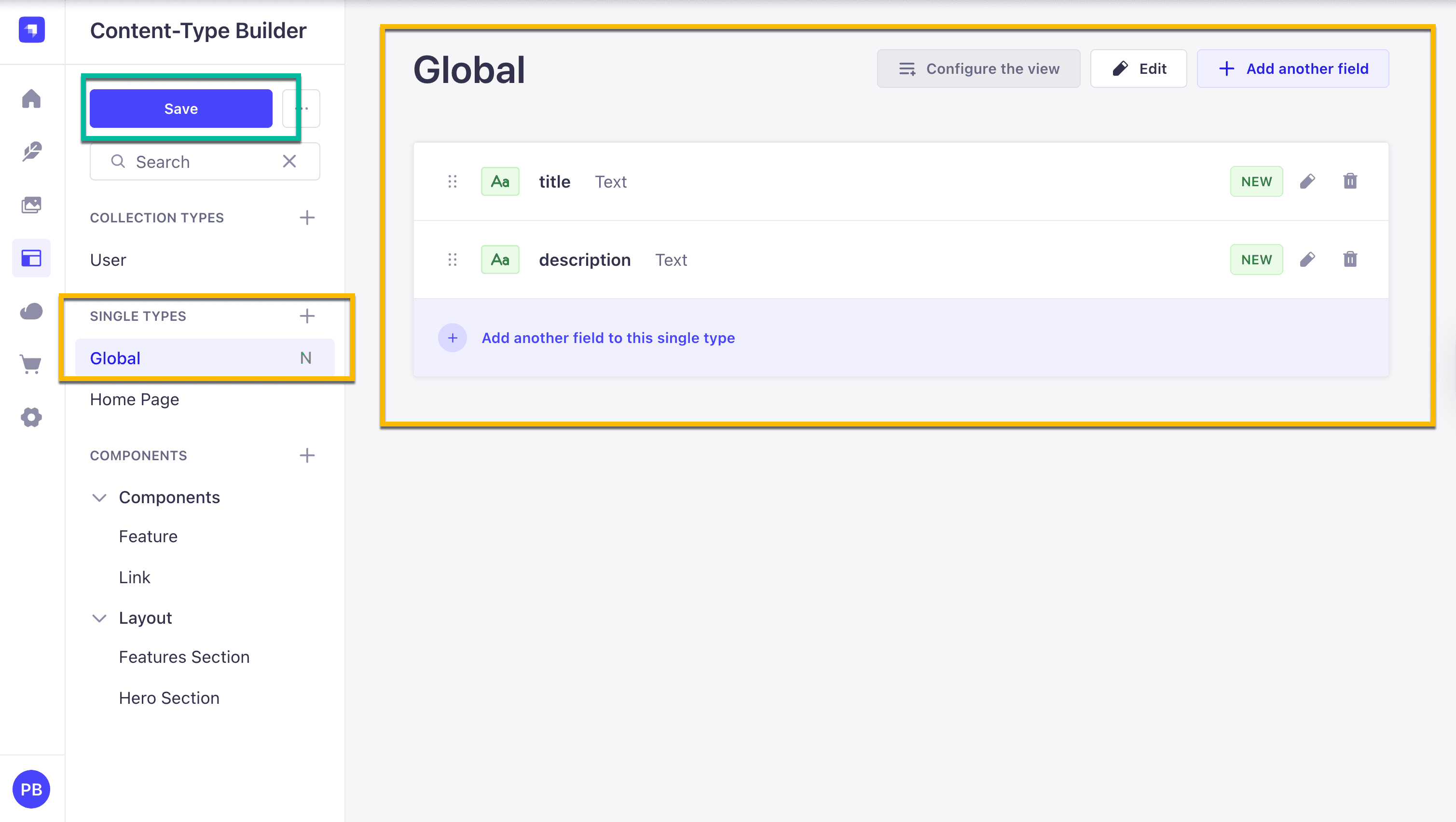
Navigating to Content-Type Builder under SINGLE TYPE and clicking on Create new single type.
We are going to call it Global. Go ahead and add the following fields. It should follow the same steps when we built our Home Page single type.
Text -> Short Text - title Text -> Long Text - description
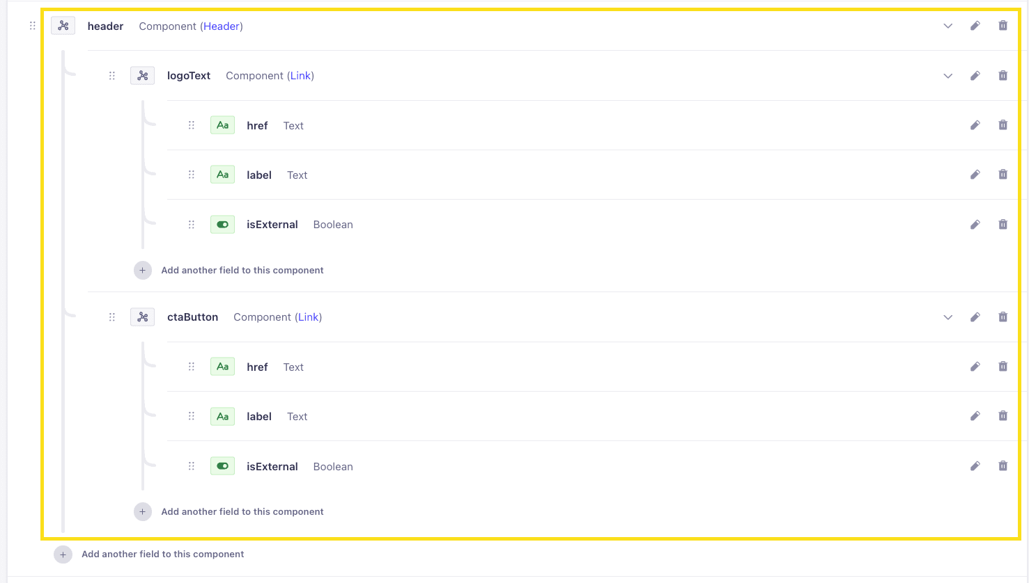
Now, let's create the Header component. To start with and we will add our
In Strapi, inside the global page, let's add the following component.
- Click on
add another field to this single type. - Select the
Componentfield type Display Namewill be Header- Select
Categorywill belayout - Click on
Configure the componentbutton - In the
Namefield, we will enter header - Finally, click on the
Add the first field to componentbutton
Now let's create two additional components called logoText and ctaButton to store our logo text and call to action button data.
Since both will be links, we can reuse a previously created Link component.
-
Select the
Componentfield type -
Click on
Use an existing component -
Click on the
Select componentbutton -
Inside the
Select a componentfield, select Link component -
In the
Namefield, we will enter logoText -
Select
Single componentand click theFinishbutton -
Select
Add another field to this component -
Select the
Componentfield type -
Click on
Use an existing component -
- Click on the
Select a componentbutton
- Click on the
-
In the
Namefield, we will enter ctaButton -
Inside the
Select a componentfield, select Link component -
Select
Single componentand click theFinishbutton -
Select Single component and click the Finish button
The final Header component should look like the following.
 Now that we are getting the hang of modeling content think about how we can represent our footer.

- logoText
- text
- socialLink
We can create the Footer the same way we made our Header.
Can you do it on your own?
Our Footer will have the following fields.
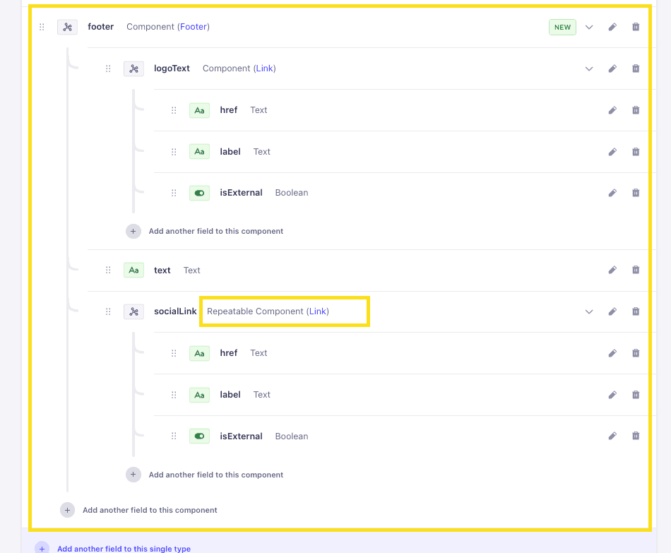
Our footer has the following three items.
If you get stuck at any point, you can always ask in the comments or join us at Strapi Open Office hours on Discord 12:30 pm CST Monday - Friday.
Now just add some data in your Global compoent for both your header and footer.
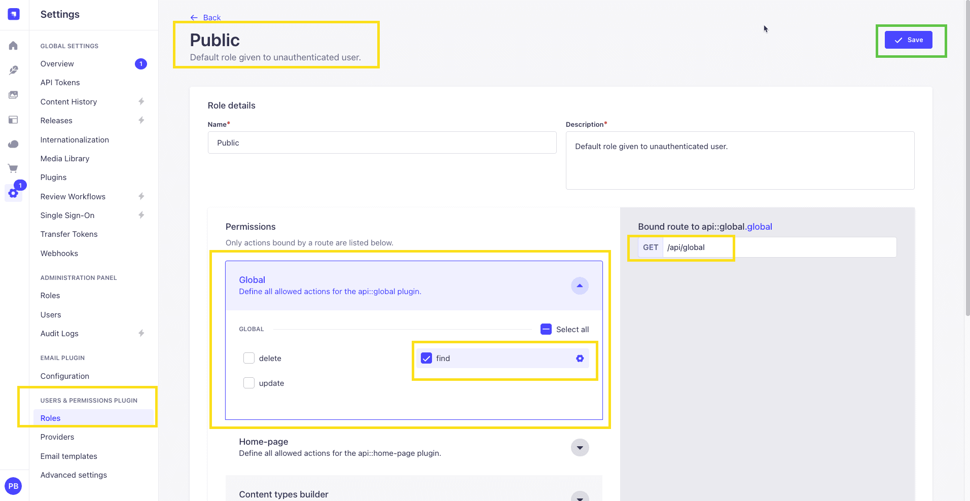
Now, let's give the proper permissions so we can access the data from our Strapi API.
Navigate to Setting -> USERS AND PERMISSION PLUGIN -> Roles -> Public -> Global and check the find checkbox. We now should be able to make a GET request to /api/global and see our data.
Since we have already learned about Strapi's Populate, we can jump straight into our frontend code and implement the function to fetch our Global data.
Fetching Our Global Header and Footer Data
Let's navigate to src/data/loaders.ts and create a new function called getGlobalData; it should look like the following.
async function getGlobalData(): Promise<TStrapiResponse<TGlobal>> {
  const query = qs.stringify({
    populate: [
      "header.logoText",
      "header.ctaButton",
      "footer.logoText",
      "footer.socialLink",
    ],
  });

  const url = new URL("/api/global", baseUrl);
  url.search = query;
  return api.get<TGlobal>(url.href);
}
Don't forget import TGlobal types at the top:
import type { TStrapiResponse, THomePage, TGlobal } from "@/types";And export the new loader:
export const loaders = {
  getHomePageData,
  getGlobalData,
};
One thing to notice here is that we are using array notation in populate, which is a great way to populate items that don't have many nested items.
If you need more help with Populate and Filtering in Strapi, check out this post.
Your loaders.ts file should look like the following:
import qs from "qs";
import type { TStrapiResponse, THomePage, TGlobal } from "@/types";

import { api } from "@/data/data-api";
import { getStrapiURL } from "@/lib/utils";

const baseUrl = getStrapiURL();

async function getHomePageData(): Promise<TStrapiResponse<THomePage>> {
  const query = qs.stringify({
    populate: {
      blocks: {
        on: {
          "layout.hero-section": {
            populate: {
              image: {
                fields: ["url", "alternativeText"],
              },
              link: {
                populate: true,
              },
            },
          },
          "layout.features-section": {
            populate: {
              features: {
                populate: true,
              },
            },
          },
        },
      },
    },
  });

  const url = new URL("/api/home-page", baseUrl);
  url.search = query;
  return api.get<THomePage>(url.href);
}

async function getGlobalData(): Promise<TStrapiResponse<TGlobal>> {
  const query = qs.stringify({
    populate: [
      "header.logoText",
      "header.ctaButton",
      "footer.logoText",
      "footer.socialLink",
    ],
  });

  const url = new URL("/api/global", baseUrl);
  url.search = query;
  return api.get<TGlobal>(url.href);
}

export const loaders = {
  getHomePageData,
  getGlobalData,
};
Now that we have our getGlobalData function let's use it.
Since our Header and Footer will live int the layout.tsx file, let's call our function there.
Since we can load data within our React Server Component, we can call the function there directly.
First, let's import our function.
import { loaders } from "@/data/loaders";
import { validateApiResponse } from "@/lib/error-handler";
Then, update the RootLayout with the following code.
export default async function RootLayout({
  children,
}: Readonly<{
  children: React.ReactNode;
}>) {
  const globalDataResponse = await loaders.getGlobalData();
  const globalData = validateApiResponse(globalDataResponse, "global page");
  console.dir(globalData, { depth: null });

  return (
    <html lang="en">
      <body
        className={`${geistSans.variable} ${geistMono.variable} antialiased`}
      >
        {children}
      </body>
    </html>
  );
}
The complete code should look like the following.
import type { Metadata } from "next";
import { loaders } from "@/data/loaders";
import { validateApiResponse } from "@/lib/error-handler";
import { Geist, Geist_Mono } from "next/font/google";
import "./globals.css";
const geistSans = Geist({
variable: "--font-geist-sans",
subsets: ["latin"],
});
const geistMono = Geist_Mono({
variable: "--font-geist-mono",
subsets: ["latin"],
});
export const metadata: Metadata = {
title: "Create Next App",
description: "Generated by create next app",
};
export default async function RootLayout({
children,
}: Readonly<{
children: React.ReactNode;
}>) {
const globalDataResponse = await loaders.getGlobalData();
const globalData = validateApiResponse(globalDataResponse, "global page");
console.dir(globalData, { depth: null });
return (
<html lang="en">
<body
className={`${geistSans.variable} ${geistMono.variable} antialiased`}
>
{children}
</body>
</html>
);
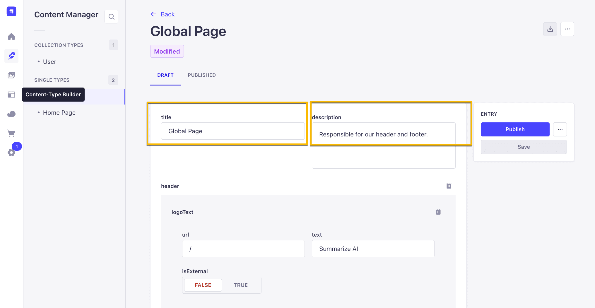
}Nice. Now restart your Next.js application, and we should see the following output in the terminal console.
{
  data: {
    id: 2,
    documentId: 'vcny1vttvfqm1hd8dd6390rp',
    title: 'Global Page',
    description: 'Responsible for our header and footer sections.',
    createdAt: '2025-08-14T00:02:31.328Z',
    updatedAt: '2025-08-14T00:02:31.328Z',
    publishedAt: '2025-08-14T00:02:31.336Z',
    header: {
      id: 2,
      ctaButton: { id: 12, href: '/signin', label: 'Sign In', isExternal: null },
      logoText: { id: 11, href: '/', label: 'Summarize AI', isExternal: false }
    },
    footer: {
      id: 2,
      text: 'Built with love by Paul 2025',
      socialLink: [
        {
          id: 14,
          href: 'www.youtube.com',
          label: 'YouTube',
          isExternal: true
        },
        {
          id: 15,
          href: 'www.linkedin.com',
          label: 'LinkedIn',
          isExternal: true
        },
        {
          id: 16,
          href: 'www.twitter.com',
          label: 'Twitter',
          isExternal: true
        }
      ],
      logoText: { id: 13, href: '/', label: 'Summarize AI', isExternal: null }
    }
  },
  meta: {}
}
That is amazing.
Building Our Header In Next.js
Alright, let's build out our Header component for our top navigation.
Just as a reminder, our logo has two items. A logo and button , so let's first create our Logo component.
Navigate to src/app/components/custom, create a file called logo.tsx, and add the following code.
import Link from "next/link";

const styles = {
  link: "flex items-center gap-2",
  icon: "h-6 w-6 text-pink-500",
  text: {
    base: "text-lg font-semibold",
    light: "text-slate-900",
    dark: "text-white",
  },
};

function MountainIcon(props: React.SVGProps<SVGSVGElement>) {
  return (
    <svg
      {...props}
      xmlns="http://www.w3.org/2000/svg"
      width="24"
      height="24"
      viewBox="0 0 24 24"
      fill="none"
      stroke="currentColor"
      strokeWidth="2"
      strokeLinecap="round"
      strokeLinejoin="round"
    >
      <path d="m8 3 4 8 5-5 5 15H2L8 3z" />
    </svg>
  );
}

interface ILogoProps {
  text: string;
  dark?: boolean;
}

export function Logo({ text, dark = false }: ILogoProps) {
  return (
    <Link className={styles.link} href="/">
      <MountainIcon className={styles.icon} />
      <span
        className={`${styles.text.base} ${
          dark ? styles.text.dark : styles.text.light
        }`}
      >
        {text}
      </span>
    </Link>
  );
}
It is a simple component that expects text as a prop to display the name of our site and a dark prop to allow us to make the text white on dark backgrounds.
Next, let's create our Header component. Navigate to src/app/components/custom, create a file called header.tsx, and add the following code.
import Link from "next/link";
import type { THeader } from "@/types";

import { Logo } from "@/components/custom/logo";
import { Button } from "@/components/ui/button";

const styles = {
  header:
    "flex  items-center justify-between px-4 py-3 bg-white shadow-md dark:bg-gray-800",
  actions: "flex items-center gap-4",
  summaryContainer: "flex-1 flex justify-center max-w-2xl mx-auto",
};

interface IHeaderProps {
  data?: THeader | null;
}

export async function Header({ data }: IHeaderProps) {
  if (!data) return null;

  const { logoText, ctaButton } = data;
  return (
    <div className={styles.header}>
      <Logo text={logoText.label} />
      <div className={styles.actions}>
        <Link href={ctaButton.href}>
          <Button>{ctaButton.label}</Button>
        </Link>
      </div>
    </div>
  );
}
Let's navigate to src/app/layout.tsx file and make the following updates.
First, let's import our Header component.
import { Header } from "@/components/custom/header";Next, make the following change in the return statement.
return (
  <html lang="en">
    <body className={`${geistSans.variable} ${geistMono.variable} antialiased`}>
      <Header data={globalData?.header} />
      {children}
    </body>
  </html>
);
Restart your project, and you should now see our awesome top navigation.

Building Our Footer In Next.js
Now, let's go ahead and build out our footer.
Our footer will display the following items.
Navigate to src/app/components/custom, create a file called footer.tsx, and add the following code.
import Link from "next/link";
import type { TFooter } from "@/types";
import { Logo } from "@/components/custom/logo";

const styles = {
  footer: "dark bg-gray-900 text-white py-8",
  container:
    "container mx-auto px-4 md:px-6 flex flex-col md:flex-row items-center justify-between",
  text: "mt-4 md:mt-0 text-sm text-gray-300",
  socialContainer: "flex items-center space-x-4",
  socialLink: "text-white hover:text-gray-300",
  icon: "h-6 w-6",
  srOnly: "sr-only",
};

function selectSocialIcon(url: string) {
  if (url.includes("youtube")) return <YoutubeIcon className={styles.icon} />;
  if (url.includes("twitter")) return <TwitterIcon className={styles.icon} />;
  if (url.includes("github")) return <GithubIcon className={styles.icon} />;
  return null;
}

interface IFooterProps {
  data?: TFooter | null;
}

export function Footer({ data }: IFooterProps) {
  if (!data) return null;
  const { logoText, socialLink, text } = data;
  return (
    <div className={styles.footer}>
      <div className={styles.container}>
        <Logo dark text={logoText.label} />
        <p className={styles.text}>{text}</p>
        <div className={styles.socialContainer}>
          {socialLink.map((link) => {
            return (
              <Link
                className={styles.socialLink}
                href={link.href}
                key={link.id}
              >
                {selectSocialIcon(link.href)}
                <span className={styles.srOnly}>Visit us at {link.label}</span>
              </Link>
            );
          })}
        </div>
      </div>
    </div>
  );
}

function GithubIcon(props: React.SVGProps<SVGSVGElement>) {
  return (
    <svg
      {...props}
      xmlns="http://www.w3.org/2000/svg"
      width="24"
      height="24"
      viewBox="0 0 24 24"
      fill="none"
      stroke="currentColor"
      strokeWidth="2"
      strokeLinecap="round"
      strokeLinejoin="round"
    >
      <path d="M15 22v-4a4.8 4.8 0 0 0-1-3.5c3 0 6-2 6-5.5.08-1.25-.27-2.48-1-3.5.28-1.15.28-2.35 0-3.5 0 0-1 0-3 1.5-2.64-.5-5.36-.5-8 0C6 2 5 2 5 2c-.3 1.15-.3 2.35 0 3.5A5.403 5.403 0 0 0 4 9c0 3.5 3 5.5 6 5.5-.39.49-.68 1.05-.85 1.65-.17.6-.22 1.23-.15 1.85v4" />
      <path d="M9 18c-4.51 2-5-2-7-2" />
    </svg>
  );
}

function TwitterIcon(props: React.SVGProps<SVGSVGElement>) {
  return (
    <svg
      {...props}
      xmlns="http://www.w3.org/2000/svg"
      width="24"
      height="24"
      viewBox="0 0 24 24"
      fill="none"
      stroke="currentColor"
      strokeWidth="2"
      strokeLinecap="round"
      strokeLinejoin="round"
    >
      <path d="M22 4s-.7 2.1-2 3.4c1.6 10-9.4 17.3-18 11.6 2.2.1 4.4-.6 6-2C3 15.5.5 9.6 3 5c2.2 2.6 5.6 4.1 9 4-.9-4.2 4-6.6 7-3.8 1.1 0 3-1.2 3-1.2z" />
    </svg>
  );
}

function YoutubeIcon(props: React.SVGProps<SVGSVGElement>) {
  return (
    <svg
      {...props}
      xmlns="http://www.w3.org/2000/svg"
      width="24"
      height="24"
      viewBox="0 0 24 24"
      fill="none"
      stroke="currentColor"
      strokeWidth="2"
      strokeLinecap="round"
      strokeLinejoin="round"
    >
      <path d="M2.5 17a24.12 24.12 0 0 1 0-10 2 2 0 0 1 1.4-1.4 49.56 49.56 0 0 1 16.2 0A2 2 0 0 1 21.5 7a24.12 24.12 0 0 1 0 10 2 2 0 0 1-1.4 1.4 49.55 49.55 0 0 1-16.2 0A2 2 0 0 1 2.5 17" />
      <path d="m10 15 5-3-5-3z" />
    </svg>
  );
}
The code is responsible for rendering our Footer data.
selectSocialIcon(url: string): A function that determines which social media icon to display based on the URL provided. It supports YouTube, Twitter, and GitHub, returning the corresponding icon component or null if the URL does not match these platforms.
note: When adding social links, I only included Twitter, Github, and YouTube. If you have additional links, you will need to add more icons to represent them.
Now that we have completed our footer, let's add it to the layout.tsx file in the root of our app folder.
First, let's import our Footer component.
import { Footer } from "@/components/custom/footer";Next, make the following change in the return statement.
return (
    <html lang="en">
      <body
        className={`${geistSans.variable} ${geistMono.variable} antialiased`}
      >
        <Header data={globalData?.data?.header} />
        {children}
        <Footer data={globalData?.footer} />
      </body>
    </html>
  );
);
The complet file looks like the following:
import type { Metadata } from "next";

import { loaders } from "@/data/loaders";
import { validateApiResponse } from "@/lib/error-handler";

import { Header } from "@/components/custom/header";
import { Footer } from "@/components/custom/footer";

import { Geist, Geist_Mono } from "next/font/google";
import "./globals.css";

const geistSans = Geist({
  variable: "--font-geist-sans",
  subsets: ["latin"],
});

const geistMono = Geist_Mono({
  variable: "--font-geist-mono",
  subsets: ["latin"],
});

export const metadata: Metadata = {
  title: "Create Next App",
  description: "Generated by create next app",
};

export default async function RootLayout({
  children,
}: Readonly<{
  children: React.ReactNode;
}>) {
  const globalDataResponse = await loaders.getGlobalData();
  const globalData = validateApiResponse(globalDataResponse, "global page");
  console.dir(globalData, { depth: null });

  return (
    <html lang="en">
      <body
        className={`${geistSans.variable} ${geistMono.variable} antialiased`}
      >
        <Header data={globalData?.header} />
        {children}
        <Footer data={globalData?.footer} />
      </body>
    </html>
  );
}
Ï;
Now, if you restart the Next.js application, you should see the following changes.

Yay, we are now getting our data from our Strapi API.
How To Populate Our Metadata Dynamically In Next.js
We have a title and description on our Global page in Strapi.
Let's use it as our metadata information in our app.
Let's look at the src/app/layout.tsx file. We will see the following.
export const metadata: Metadata = {
  title: "Create Next App",
  description: "Generated by create next app",
};
This is one way to set metadata in Next.js, but as you notice, it is hardcoded. Let's look at how we can add metadata dynamically.
To dynamically populate our metadata, we must fetch it using our metadata function.
We already have our getGlobalData, but that function returns not just the title and description but also the rest of our data to populate our Header and Footer.
Let's create a new function called getGlobalPageMetadata, which only returns the title and description fields.
Let's navigate to src/data/loaders.ts and add the following code.
async function getMetaData(): Promise<TStrapiResponse<TMetaData>> {
  const query = qs.stringify({
    fields: ["title", "description"],
  });

  const url = new URL("/api/global", baseUrl);
  url.search = query;
  return api.get < TMetaData > url.href;
}
In the function above, we ask Strapi to return only the title and description, which are the only data we need for our metadata.
The response will look like the following.
 data: {
    id: 3,
    documentId: 'vcny1vttvfqm1hd8dd6390rp',
    title: 'Epic Next Tutorial',
    description: 'Learn Next.js 15 with Strapi 5.'
  },
Don'f forget to import TMetaData type at the top:
import type { TStrapiResponse, THomePage, TGlobal, TMetaData } from "@/types";```

And export it:

```ts
export const loaders = {
  getHomePageData,
  getGlobalData,
  getMetaData,
};
Your loaders.ts file should look like the folllowing:
import qs from "qs";
import type { TStrapiResponse, THomePage, TGlobal, TMetaData } from "@/types";

import { api } from "@/data/data-api";
import { getStrapiURL } from "@/lib/utils";

const baseUrl = getStrapiURL();

async function getHomePageData(): Promise<TStrapiResponse<THomePage>> {
  const query = qs.stringify({
    populate: {
      blocks: {
        on: {
          "layout.hero-section": {
            populate: {
              image: {
                fields: ["url", "alternativeText"],
              },
              link: {
                populate: true,
              },
            },
          },
          "layout.features-section": {
            populate: {
              features: {
                populate: true,
              },
            },
          },
        },
      },
    },
  });

  const url = new URL("/api/home-page", baseUrl);
  url.search = query;
  return api.get<THomePage>(url.href);
}

async function getGlobalData(): Promise<TStrapiResponse<TGlobal>> {
  const query = qs.stringify({
    populate: [
      "header.logoText",
      "header.ctaButton",
      "footer.logoText",
      "footer.socialLink",
    ],
  });

  const url = new URL("/api/global", baseUrl);
  url.search = query;
  return api.get<TGlobal>(url.href);
}

async function getMetaData(): Promise<TStrapiResponse<TMetaData>> {
  const query = qs.stringify({
    fields: ["title", "description"],
  });

  const url = new URL("/api/global", baseUrl);
  url.search = query;
  return api.get<TMetaData>(url.href);
}

export const loaders = {
  getHomePageData,
  getGlobalData,
  getMetaData,
};
Let's implement dynamic metadata inside our layout.tsx file.
Let's update our current metadata function with the following.
We are already importing our loaders.
import { loaders } from "@/data/loaders";Now, replace the previous export const metadata: Metadata with the following code.
export async function generateMetadata(): Promise<Metadata> {
  const metadata = await loaders.getMetaData();

  return {
    title: metadata?.data?.title ?? "Epic Next Course",
    description: metadata?.data?.description ?? "Epic Next Course",
  };
}
Now, our metadata is dynamically set from our Strapi Api.
The completed code should look like the following:
import type { Metadata } from "next";

import { loaders } from "@/data/loaders";
import { validateApiResponse } from "@/lib/error-handler";

import { Header } from "@/components/custom/header";
import { Footer } from "@/components/custom/footer";

import { Geist, Geist_Mono } from "next/font/google";
import "./globals.css";

const geistSans = Geist({
  variable: "--font-geist-sans",
  subsets: ["latin"],
});

const geistMono = Geist_Mono({
  variable: "--font-geist-mono",
  subsets: ["latin"],
});

export async function generateMetadata(): Promise<Metadata> {
  const metadata = await loaders.getMetaData();

  return {
    title: metadata?.data?.title ?? "Epic Next Course",
    description: metadata?.data?.description ?? "Epic Next Course",
  };
}

export default async function RootLayout({
  children,
}: Readonly<{
  children: React.ReactNode,
}>) {
  const globalDataResponse = await loaders.getGlobalData();
  const globalData = validateApiResponse(globalDataResponse, "global page");
  console.dir(globalData, { depth: null });

  return (
    <html lang="en">
      <body
        className={`${geistSans.variable} ${geistMono.variable} antialiased`}
      >
        <Header data={globalData?.header} />
        {children}
        <Footer data={globalData?.footer} />
      </body>
    </html>
  );
}
Nice job.
How To Create A Not Found Page In Next.js
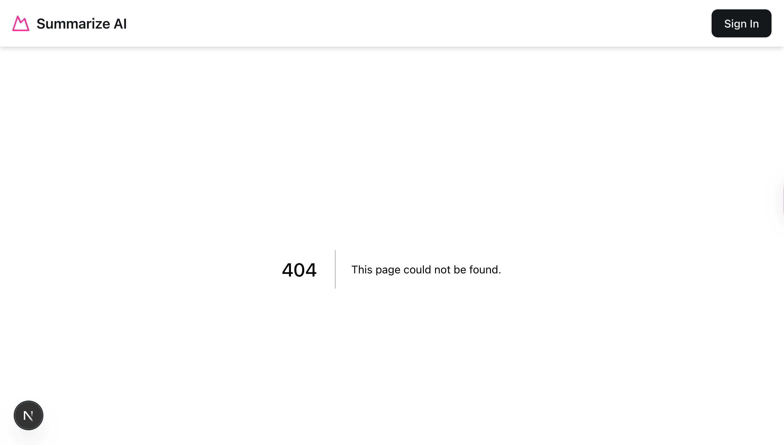
Our landing page looks great, but we have a small problem. We have not yet implemented the login page, so when we click our link, we get the default not found page.
But why, if we wanted to make it prettier, how can we accomplish this?
Well, we can create the not-found.js page. You can learn more about it here in the Next.js docs.
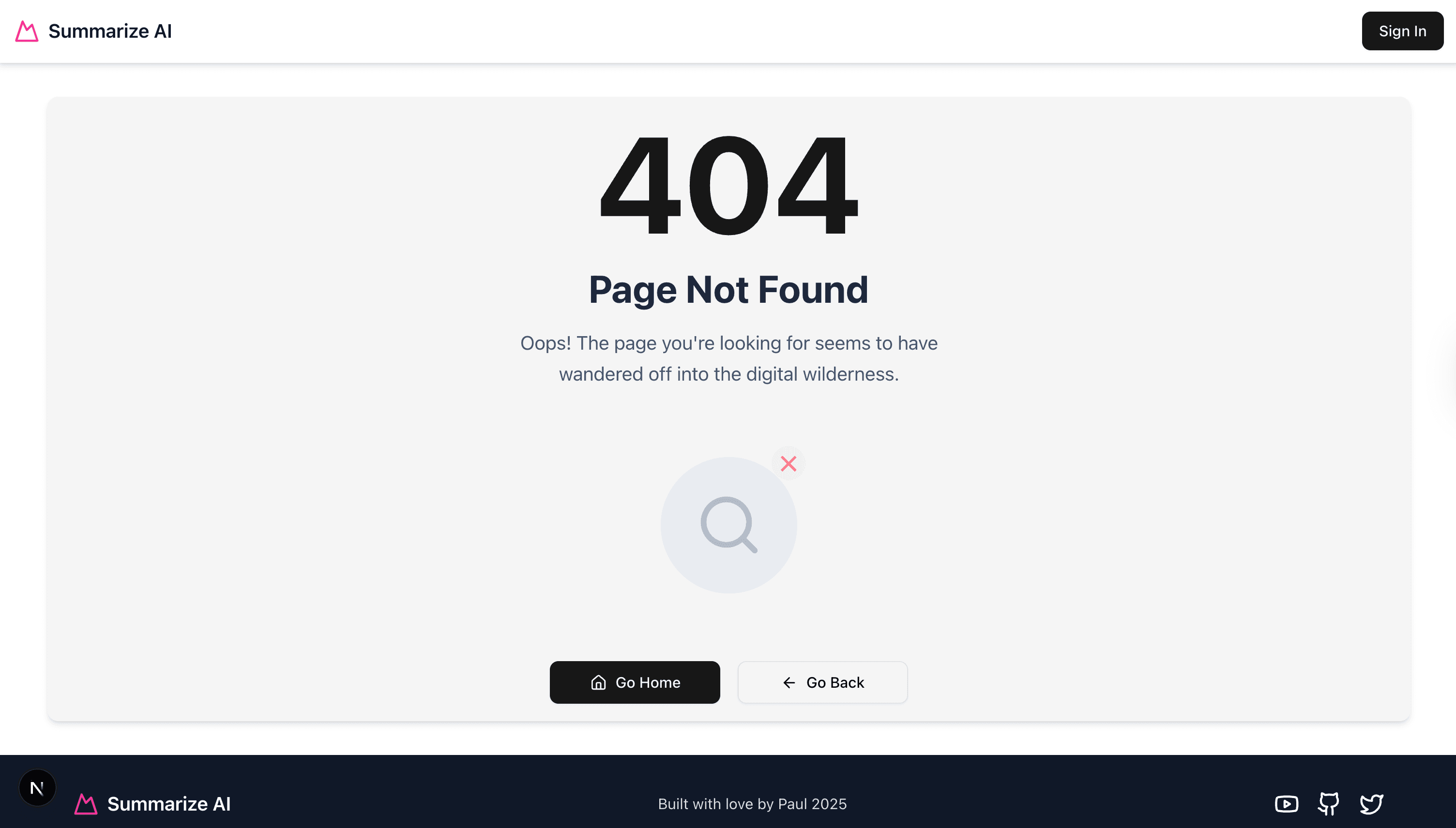
Navigate to src/app, create a file called not-found.tsx, and add the following code.
"use client";
import Link from "next/link";
import { Button } from "@/components/ui/button";
import { Home, Search, ArrowLeft } from "lucide-react";
const styles = {
container:
"min-h-[calc(100vh-200px)] mx-auto container my-8 bg-gradient-to-br rounded-lg shadow-md bg-secondary flex items-center justify-center p-4",
content: "max-w-2xl mx-auto text-center space-y-8",
textSection: "space-y-4",
heading404: "text-9xl font-bold text-primary select-none",
headingContainer: "relative",
pageTitle: "text-4xl font-bold text-slate-800 mb-4",
description: "text-lg text-slate-600 max-w-md mx-auto leading-relaxed",
illustrationContainer: "flex justify-center py-8",
illustration: "relative animate-pulse",
searchCircle:
"w-32 h-32 bg-slate-200 rounded-full flex items-center justify-center transition-all duration-300 hover:bg-slate-300",
searchIcon: "w-16 h-16 text-slate-400",
errorBadge:
"absolute -top-2 -right-2 w-8 h-8 bg-red-100 rounded-full flex items-center justify-center animate-bounce",
errorSymbol: "text-red-500 text-xl font-bold",
buttonContainer:
"flex flex-col sm:flex-row gap-4 justify-center items-center",
button: "min-w-[160px]",
buttonContent: "flex items-center gap-2",
buttonIcon: "w-4 h-4",
outlineButton: "min-w-[160px] bg-transparent",
};
export default function NotFound() {
return (
<div className={styles.container}>
<div className={styles.content}>
{/* Large 404 Text */}
<div className={styles.textSection}>
<h1 className={styles.heading404}>404</h1>
<div className={styles.headingContainer}>
<h2 className={styles.pageTitle}>Page Not Found</h2>
<p className={styles.description}>
Oops! The page you're looking for seems to have wandered off
into the digital wilderness.
</p>
</div>
</div>
{/* Illustration */}
<div className={styles.illustrationContainer}>
<div className={styles.illustration}>
<div className={styles.searchCircle}>
<Search className={styles.searchIcon} />
</div>
<div className={styles.errorBadge}>
<span className={styles.errorSymbol}>✕</span>
</div>
</div>
</div>
{/* Action Buttons */}
<div className={styles.buttonContainer}>
<Button asChild size="lg" className={styles.button}>
<Link href="/" className={styles.buttonContent}>
<Home className={styles.buttonIcon} />
Go Home
</Link>
</Button>
<Button
asChild
variant="outline"
size="lg"
className={styles.outlineButton}
>
<button
onClick={() => window.history.back()}
className={styles.buttonContent}
>
<ArrowLeft className={styles.buttonIcon} />
Go Back
</button>
</Button>
</div>
</div>
</div>
);
}Now restart your app and navigate to our login page. You will be treated to this nicer page. It can be better, but you get the point.
Wouldn't it be nice to show a loaded spinner when navigation pages are displayed? Yes, it would. Let's see how we can do that.
How To Create A Loading Page In Next.js
There are many ways to handle the loading state in Next.js; we will start with the simplest one.
This creates a file called loading.tsx. You can read about other ways here.
Navigate to src/app, create a file called loading.tsx, and add the following code.
const styles = {
  overlay:
    "fixed inset-0 flex items-center justify-center bg-gray-200 bg-opacity-50",
  spinner: "animate-spin h-12 w-12 border-t-4 border-pink-600 rounded-full",
};

export default function Loading() {
  return (
    <div className={styles.overlay}>
      <div className={styles.spinner} />
    </div>
  );
}
For now we are going to stick with this approach, but latter we can take a look how to show a skeleton while our component loads.
That is all we need to do. Now, let's restart our application and see the amazing loader in action. If you find my loader too boring, feel free to add your own design flair to your application.
Finally, let's take a look at how we can handle errors in our application.
How To Handle Errors In Next.js
Now, let's examine how to handle errors in Next.js to prevent our app from crashing completely.
Based on Next.js Docs, you can declare globarl errors, and route based. Read more here.
Right now, if I go to the src/data/loaders.ts and add the following, I can throw an error inside the getHomePageData function.
throw new Error("Test error");The complete function will look like the following.
async function getGlobalData(): Promise<TStrapiResponse<TGlobal>> {
throw new Error("Test error");
const query = qs.stringify({
populate: [
"header.logoText",
"header.ctaButton",
"footer.logoText",
"footer.socialLink",
],
});
const url = new URL("/api/global", baseUrl);
url.search = query;
return api.get<TGlobal>(url.href);
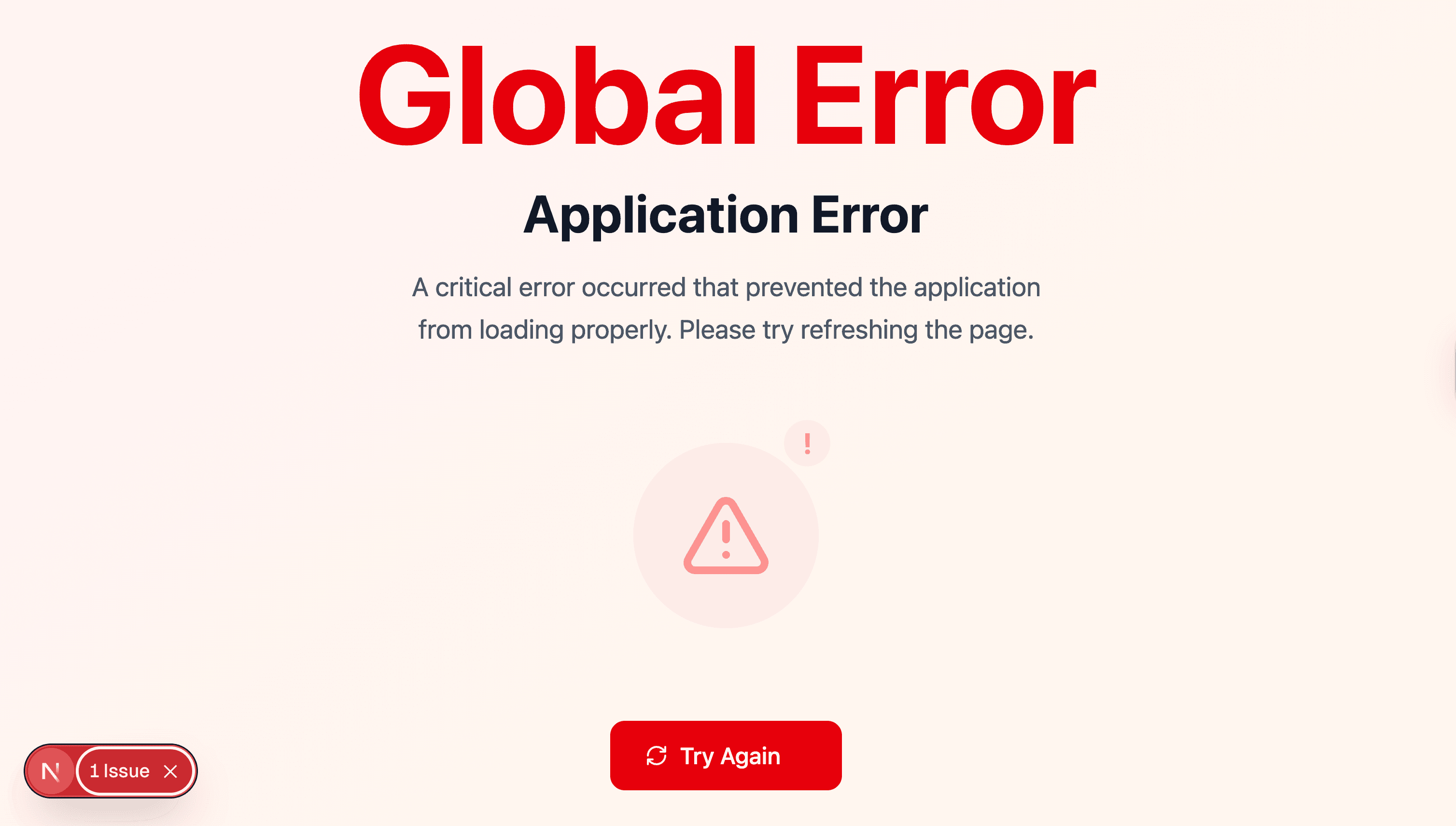
}Our app will break with an ugly error.
We can fix this by creating a global-error.ts file to break our app gracefully. You can read more about Next.js global errors here.
Let's create a file called global-error.tsx inside our app folder and paste it into the following code. I used v0 to help me make it prety.
"use client";
import Link from "next/link";
import { usePathname } from "next/navigation";
import { Home, RefreshCw, AlertTriangle } from "lucide-react";
const styles = {
container:
"min-h-screen bg-gradient-to-br from-red-50 to-orange-50 flex items-center justify-center p-4",
content: "max-w-2xl mx-auto text-center space-y-8",
textSection: "space-y-4",
headingError: "text-8xl font-bold text-red-600 select-none",
headingContainer: "relative",
pageTitle: "text-4xl font-bold text-gray-900 mb-4",
description: "text-lg text-gray-600 max-w-md mx-auto leading-relaxed",
illustrationContainer: "flex justify-center py-8",
illustration: "relative animate-pulse",
errorCircle:
"w-32 h-32 bg-red-100 rounded-full flex items-center justify-center transition-all duration-300 hover:bg-red-200",
errorIcon: "w-16 h-16 text-red-500",
warningBadge:
"absolute -top-2 -right-2 w-8 h-8 bg-orange-100 rounded-full flex items-center justify-center animate-bounce",
warningSymbol: "text-orange-500 text-xl font-bold",
buttonContainer:
"flex flex-col sm:flex-row gap-4 justify-center items-center",
button: "min-w-[160px] bg-red-600 hover:bg-red-700 text-white",
buttonContent: "flex items-center gap-2",
buttonIcon: "w-4 h-4",
outlineButton: "min-w-[160px] border-red-600 text-red-600 hover:bg-red-50",
errorDetails:
"mt-8 p-4 bg-red-50 border border-red-200 rounded-lg text-left text-sm text-red-800",
errorTitle: "font-semibold mb-2",
};
interface IGlobalError {
error: Error & { digest?: string };
reset: () => void;
}
export default function GlobalError({ error, reset }: IGlobalError) {
const pathname = usePathname();
const isHomePage = pathname === "/";
return (
<html>
<body>
<div className={styles.container}>
<div className={styles.content}>
{/* Large Error Text */}
<div className={styles.textSection}>
<h1 className={styles.headingError}>Global Error</h1>
<div className={styles.headingContainer}>
<h2 className={styles.pageTitle}>Application Error</h2>
<p className={styles.description}>
A critical error occurred that prevented the application from
loading properly. Please try refreshing the page.
</p>
</div>
</div>
{/* Illustration */}
<div className={styles.illustrationContainer}>
<div className={styles.illustration}>
<div className={styles.errorCircle}>
<AlertTriangle className={styles.errorIcon} />
</div>
<div className={styles.warningBadge}>
<span className={styles.warningSymbol}>!</span>
</div>
</div>
</div>
{/* Action Buttons */}
<div className={styles.buttonContainer}>
<button
onClick={reset}
className={`${styles.button} px-6 py-3 rounded-lg font-medium transition-colors`}
>
<div className={styles.buttonContent}>
<RefreshCw className={styles.buttonIcon} />
Try Again
</div>
</button>
{!isHomePage && (
<Link
href="/"
className={`${styles.outlineButton} px-6 py-3 rounded-lg font-medium border-2 transition-colors inline-flex`}
>
<div className={styles.buttonContent}>
<Home className={styles.buttonIcon} />
Go Home
</div>
</Link>
)}
</div>
{process.env.NODE_ENV === "development" && (
<div className={styles.errorDetails}>
<div className={styles.errorTitle}>
Error Details (Development Only):
</div>
<div>Message: {error.message}</div>
{error.digest && <div>Digest: {error.digest}</div>}
{error.stack && (
<details className="mt-2">
<summary className="cursor-pointer font-medium">
Stack Trace
</summary>
<pre className="mt-2 text-xs overflow-auto">
{error.stack}
</pre>
</details>
)}
</div>
)}
</div>
</div>
</body>
</html>
);
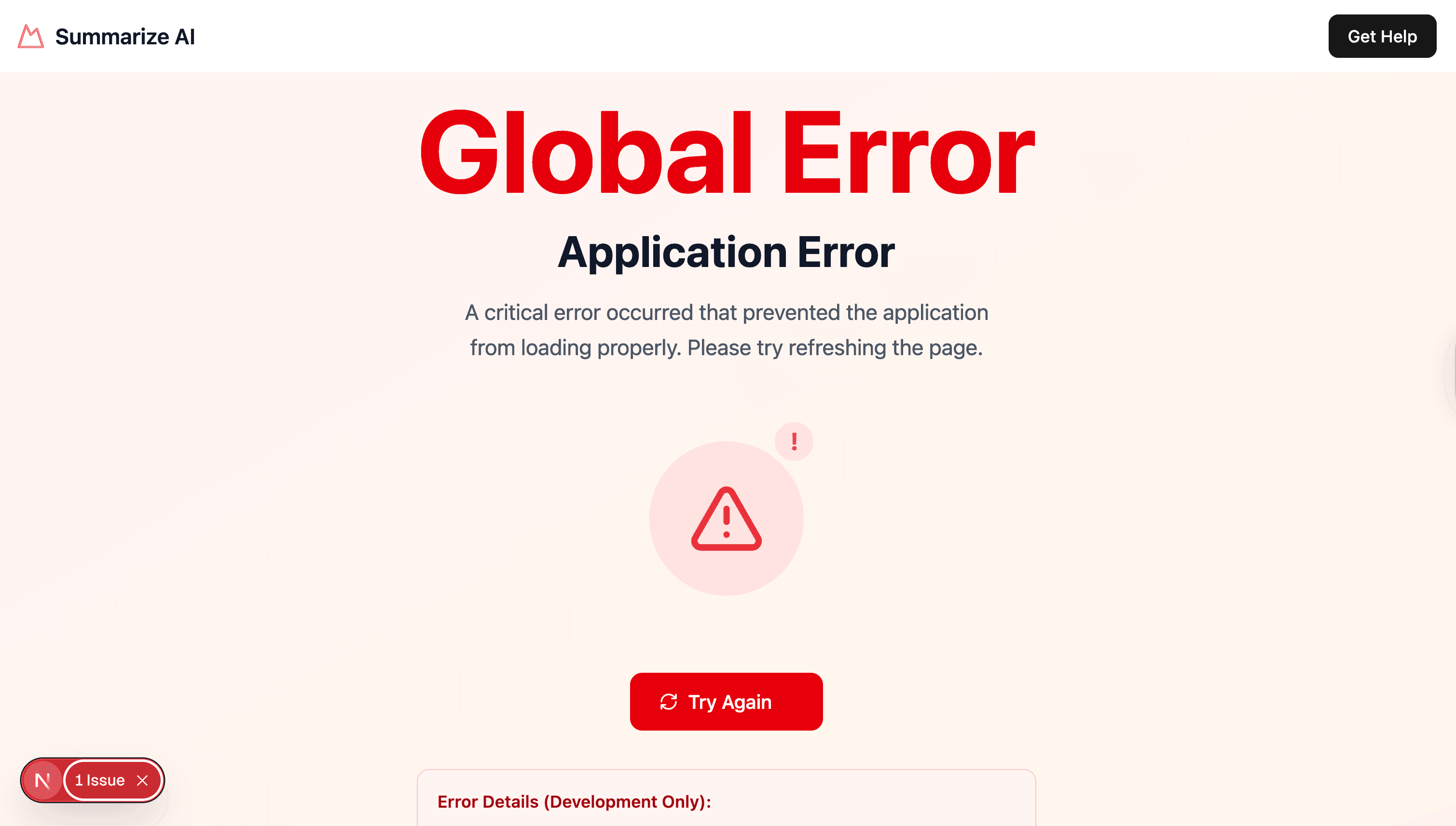
}Now, when our app crashes, it does not look as scary.
note: Global error UI must define its own and tags, since it is replacing the root layout or template when active.
So if you would like to have a fallback UI, you would need to create it. I will add a fallback header using our FallbackHeader which we are about to create.
In the src/components/custom folder create the following file fallback-header.tsx with the following code:
import Link from "next/link";
import type { THeader } from "@/types";

import { Logo } from "@/components/custom/logo";
import { Button } from "@/components/ui/button";

interface IFallbackHeaderProps {
  header?: THeader | null;
}

const styles = {
  header:
    "flex items-center justify-between px-4 py-3 bg-white shadow-md dark:bg-gray-800",
  actions: "flex items-center gap-4",
};

export function FallbackHeader({ header }: IFallbackHeaderProps) {
  if (!header) return null;

  const { logoText, ctaButton } = header;
  return (
    <div className={styles.header}>
      <Logo text={logoText.label} />
      <div className={styles.actions}>
        <Link href={ctaButton.href}>
          <Button>{ctaButton.label}</Button>
        </Link>
      </div>
    </div>
  );
}
Now add it in your globar-error.tsx component:
"use client";
import Link from "next/link";
import { usePathname } from "next/navigation";
import { Home, RefreshCw, AlertTriangle } from "lucide-react";
import { FallbackHeader } from "@/components/custom/fallback-header";

const styles = {
  container:
    "min-h-screen bg-gradient-to-br from-red-50 to-orange-50 flex items-center justify-center p-4",
  content: "max-w-2xl mx-auto text-center space-y-8",
  textSection: "space-y-4",
  headingError: "text-8xl font-bold text-red-600 select-none",
  headingContainer: "relative",
  pageTitle: "text-4xl font-bold text-gray-900 mb-4",
  description: "text-lg text-gray-600 max-w-md mx-auto leading-relaxed",
  illustrationContainer: "flex justify-center py-8",
  illustration: "relative animate-pulse",
  errorCircle:
    "w-32 h-32 bg-red-100 rounded-full flex items-center justify-center transition-all duration-300 hover:bg-red-200",
  errorIcon: "w-16 h-16 text-red-500",
  warningBadge:
    "absolute -top-2 -right-2 w-8 h-8 bg-orange-100 rounded-full flex items-center justify-center animate-bounce",
  warningSymbol: "text-orange-500 text-xl font-bold",
  buttonContainer:
    "flex flex-col sm:flex-row gap-4 justify-center items-center",
  button: "min-w-[160px] bg-red-600 hover:bg-red-700 text-white",
  buttonContent: "flex items-center gap-2",
  buttonIcon: "w-4 h-4",
  outlineButton: "min-w-[160px] border-red-600 text-red-600 hover:bg-red-50",
  errorDetails:
    "mt-8 p-4 bg-red-50 border border-red-200 rounded-lg text-left text-sm text-red-800",
  errorTitle: "font-semibold mb-2",
};

interface IGlobalError {
  error: Error & { digest?: string };
  reset: () => void;
}

export default function GlobalError({ error, reset }: IGlobalError) {
  const pathname = usePathname();
  const isHomePage = pathname === "/";

  return (
    <html>
      <body>
        <FallbackHeader
          header={{
            logoText: {
              id: 1,
              href: "/",
              label: "Summarize AI",
            },
            ctaButton: {
              id: 1,
              label: "Get Help",
              href: "https://www.youtube.com/watch?v=dQw4w9WgXcQ",
              isExternal: true,
            },
          }}
        />
        <div className={styles.container}>
          <div className={styles.content}>
            {/* Large Error Text */}
            <div className={styles.textSection}>
              <h1 className={styles.headingError}>Global Error</h1>
              <div className={styles.headingContainer}>
                <h2 className={styles.pageTitle}>Application Error</h2>
                <p className={styles.description}>
                  A critical error occurred that prevented the application from
                  loading properly. Please try refreshing the page.
                </p>
              </div>
            </div>

            {/* Illustration */}
            <div className={styles.illustrationContainer}>
              <div className={styles.illustration}>
                <div className={styles.errorCircle}>
                  <AlertTriangle className={styles.errorIcon} />
                </div>
                <div className={styles.warningBadge}>
                  <span className={styles.warningSymbol}>!</span>
                </div>
              </div>
            </div>

            {/* Action Buttons */}
            <div className={styles.buttonContainer}>
              <button
                onClick={reset}
                className={`${styles.button} px-6 py-3 rounded-lg font-medium transition-colors`}
              >
                <div className={styles.buttonContent}>
                  <RefreshCw className={styles.buttonIcon} />
                  Try Again
                </div>
              </button>

              {!isHomePage && (
                <Link
                  href="/"
                  className={`${styles.outlineButton} px-6 py-3 rounded-lg font-medium border-2 transition-colors inline-flex`}
                >
                  <div className={styles.buttonContent}>
                    <Home className={styles.buttonIcon} />
                    Go Home
                  </div>
                </Link>
              )}
            </div>

            {process.env.NODE_ENV === "development" && (
              <div className={styles.errorDetails}>
                <div className={styles.errorTitle}>
                  Error Details (Development Only):
                </div>
                <div>Message: {error.message}</div>
                {error.digest && <div>Digest: {error.digest}</div>}
                {error.stack && (
                  <details className="mt-2">
                    <summary className="cursor-pointer font-medium">
                      Stack Trace
                    </summary>
                    <pre className="mt-2 text-xs overflow-auto">
                      {error.stack}
                    </pre>
                  </details>
                )}
              </div>
            )}
          </div>
        </div>
      </body>
    </html>
  );
}
Now, that we know our error works, don't forget to remove throw new Error("Test error"); that we added for testing.
Excellent, we covered a lot in this post. Let's do a quick recap of what we covered.
Conclusion
In Part 3 of the Epic Next.js 15 Tutorial series, we focused on completing the home page design of a real-life project. The tutorial covered several key areas:
Refactoring the Hero Section: we refactored the Hero Section to use the Next.js Image component for optimized image handling. This included creating a custom StrapiImage component for additional quality-of-life improvements.
Building the Features Section: This Section involved modeling the Features Section data in Strapi, creating corresponding components in Next.js, and implementing functionality to display features dynamically from the Strapi CMS.
Displaying Dynamic Meta Data: We examined how to get our metadata from Strapi and display it on our layout.tsx page.
Top Header and Footer: We created our Header and Footer, leveraging Strapi to manage and fetch global data like logo texts and social links.
We finished by covering how to handle loading, not found, and errors pages.
I can't wait to see the next post, where we cover how to create our Sign In and Sign Up pages. This will include form validation with Zod, handling form submission with server actions, creating and storing http only cookies, and protecting our routes with Next.js middleware.
I am so excited. Thanks for checking out this post. I look forward to seeing you in the next one.
Note about this project
This project has been updated to use Next.js 15 and Strapi 5.
If you have any questions, feel free to stop by at our Discord Community for our daily "open office hours" from 12:30 PM CST to 1:30 PM CST.
Feel free to make PRs to fix any issues you find in the project, or let me know if you have any questions.
Happy coding!
Paul